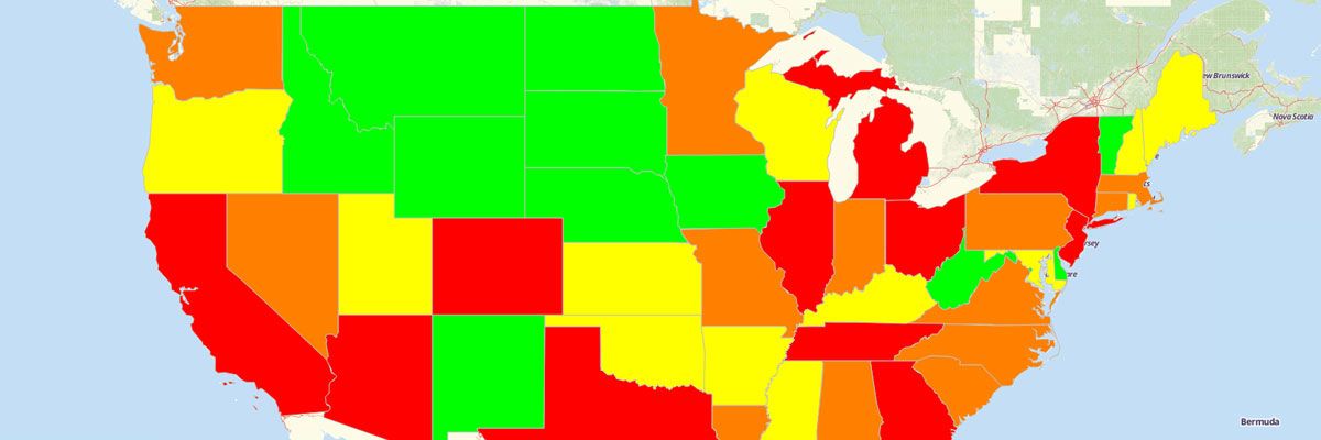
How to Create a Color-Coded Map
Add Multi-Colored Territory Boundaries to Your Maps
Creating a map that is color-coded allows you to distinguish your territory boundaries and see trends you may not have been able to before. Take an example of viewing a map of the United States. You want to better distinguish your territory boundaries, but how? Just use our color-coded feature to group states by different colors to make your boundaries stand out and help you gain deeper insights about your territories.
Follow our step-by-step instructions to make a color-coded map from Excel data.Steps on How to Make a Color-Coded Map
- Open your map.
- Click “Add.”
- Select “Boundaries.”
- Select the boundary you want to add to your map.
- Choose “Paste Colors from a Spreadsheet.”
- Click “Download a Sample Spreadsheet.”
- Open the template in Excel. You’ll see the shape name in the first column and the color you would like it to appear in the second column. Make any updates you need in the spreadsheet. Delete any rows of shapes you don’t want to appear on your map.
- Copy and paste the updated spreadsheet into Mapline. Be sure to include the column headers (Shape Name and Color)
- Click “OK.”
View Our Mapping Software Plans
Mapline offers a wide range of territory boundaries which can be added to your color coded map. Check out Mapline’s Available Territories to see what is offered as well as step-by-step instructions on how you can add them to your map or build heat maps with territory colors.


