
Coming August 2019: New and Improved Mapping Software
Good news, Mapline users! We’re hope you’re ready for what could be one of the biggest updates in Mapline’s history. Nearly everything about our mapping software is going to change. You’ll see a new User Interface, New Features, New Data storage and much, much more. For those of you in a rush, here is a quick rundown of the highlights (tl;dr):
- You Won’t Lose Anything – If you like your current plan, we’re not going to change it on you. Our pricing structure is unchanged by this update. All your maps will still exist and none of your datasets are going anywhere. You should not have to recreate anything as a result of this update. All the features you love are still there or made better. We’re not taking anything away, merely giving. It’s like Christmas in July!
- New UI – The biggest thing being changed is the styling of the site. The goal here was to make things simpler and more versatile. In my (totally unbiased) opinion, I think we killed it. There will be pictures and more explanation down below.
- Rocking Features – We’re not just putting up new drapes and painting the walls, we’re also adding a lot of new features. Look for future blog posts to dive down into the depths of the new tools being rolled out. But for now, rest assured that Mapline isn’t complacent. Get ready for some awesome new features.
Now, for those of you in a time crunch and have to go: thanks for reading! Tell your coworkers I said “Hi”. Hopefully, you got enough of a teaser to be as excited about this as we are (and we’re very excited). For those who have a minute or two, let’s take a deeper look into what you’ll be seeing. I hope you like pictures.



This blog update will focus mainly on the new User Interface (UI). I’ll cover the new features in later posts. Specifically, I’ll be focusing on the Home Page and the Mapping Page. The last thing we want is for this new UI to make your life with Mapline harder or more confusing. Therefore, how about a little sneak peek so you know what to expect. Spoilers: it’s great.
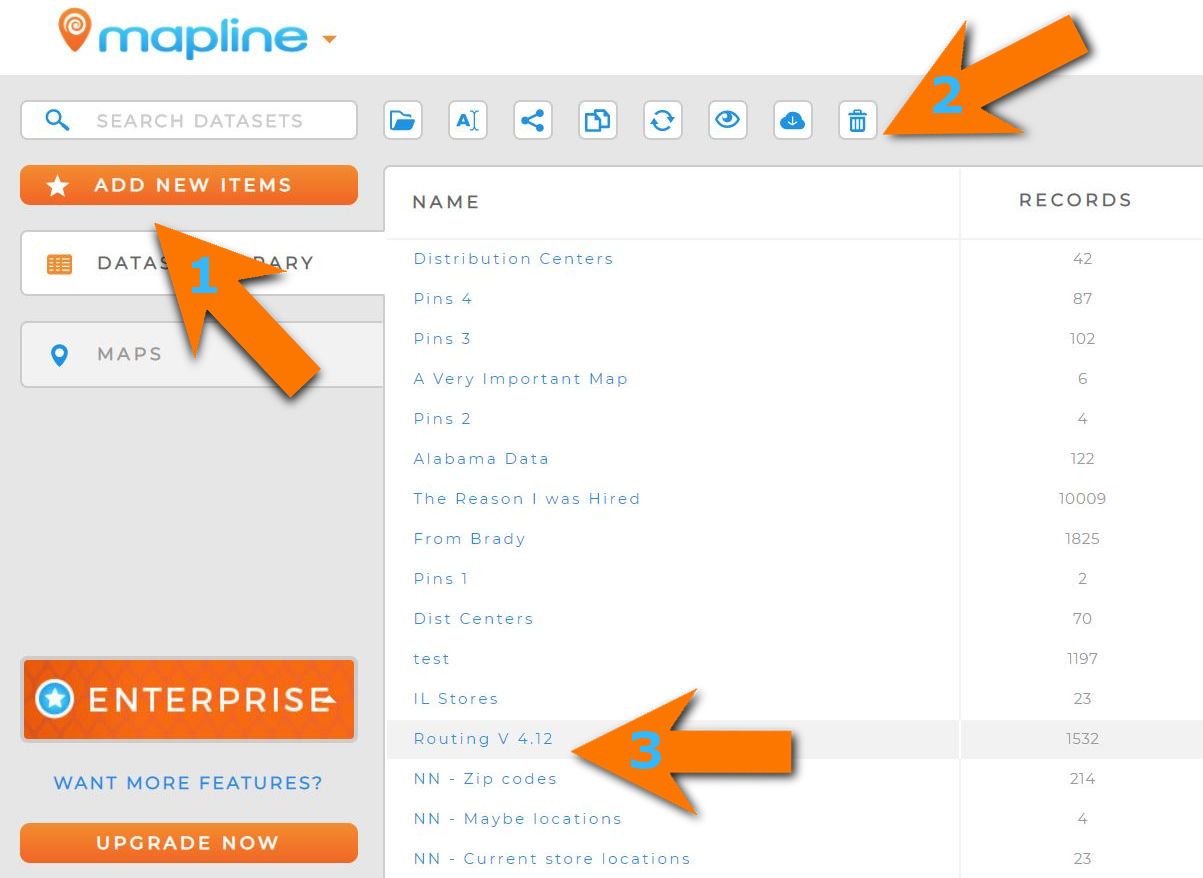
Home Page
This is the new home page (whoo)! Here’s what each of the numbers are pointing out:- Add New Items – We moved the “New” Button from the top of the page to the side of the page. It has the same functionality you are used to. You would click on this button to create your new Maps and Datasets. And as we continue to add new tools and options, expect to appear under this button as well.
- Icons – There’s a bunch of new icons now. If you hover your mouse over them, you’ll see what they’re called. From left to right they are Open, Rename, Share, Replace, Add View, Download, and Delete (Views are filtered Datasets that you can share with coworkers). All those options will also be available on your Map List as well, except for Replace, Add View, and Download as those are all Dataset Specific.
- No More Check Boxes – You may have noticed we got rid of the check boxes for your Maps and Datasets. Now if you select anywhere on the Maps/Datasets row you will select it. This makes selecting the map(s) you are trying to focus on easier. This also comes with new functionality as well. You will be able to hold CTRL to select multiple rows or Shift to select all rows in a range.
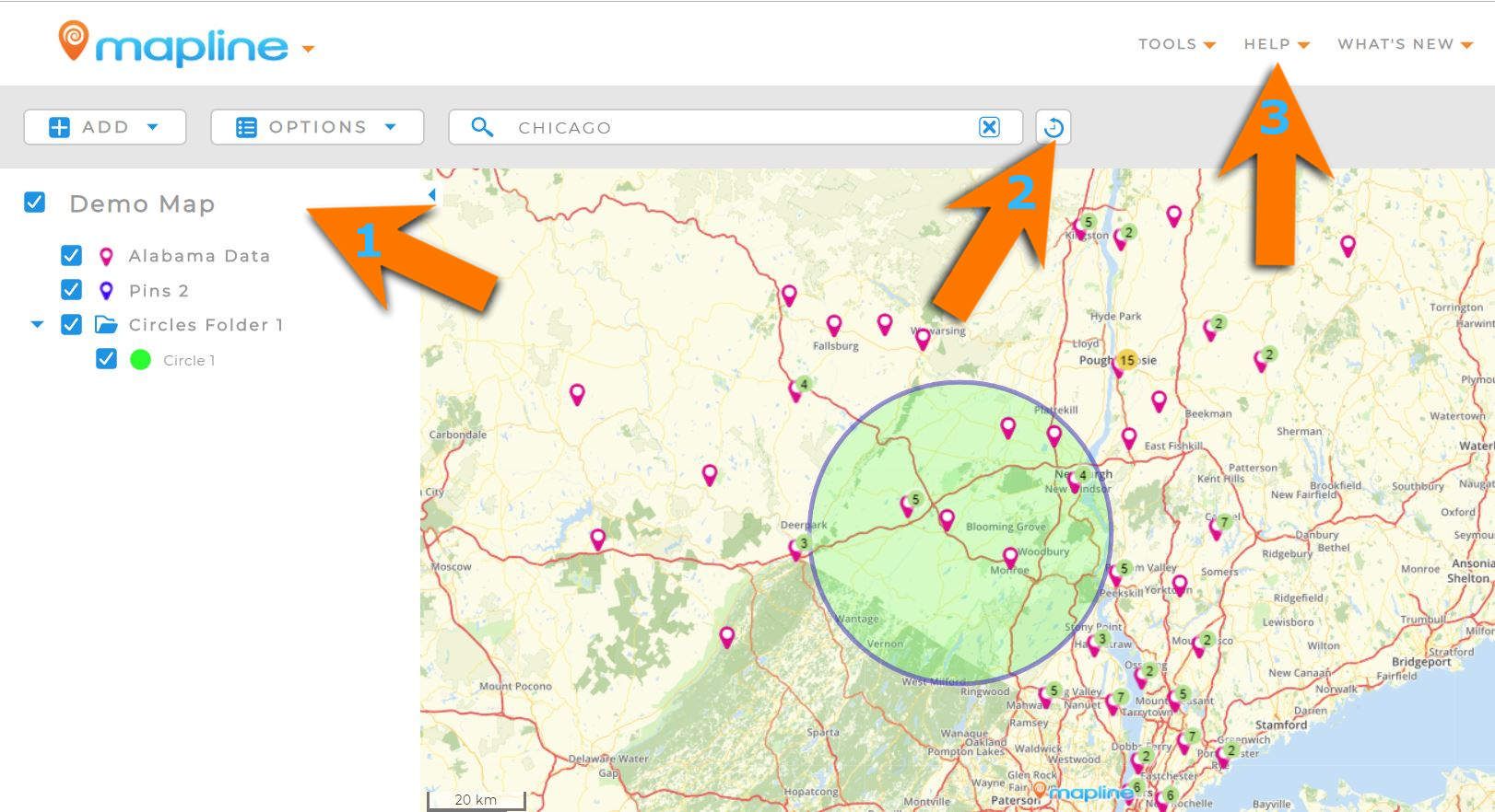
Mapping Page
I know this looks new and different but, trust me, it’s much more familiar than you might initially think. I’ll take you through one step at a time.
- Side Bar – You remember this fellow. The Side Bar is just as you remembered. We made the text a bit bigger so it can be easier to read. The “Add” Button still lets you add all the shapes and datasets you want to your map. We’ve cleaned up the drop down menu to make it easier to find what you’re looking for. There’s also going to be a cool new feature hidden under there, but you’ll have to wait to see what it is!
- Search Bar & History – We made the search bar a bit bigger for ease of use, and also added a Search History button! So you don’t have to search for the same place over and over again.
- Help Button – If at any point you get lost in our new mapping UI, please feel free to reach out us through chat, FAQ, or Email. Our support team are very skilled and friendly. We are more than happy to help you through this new UI however we can.
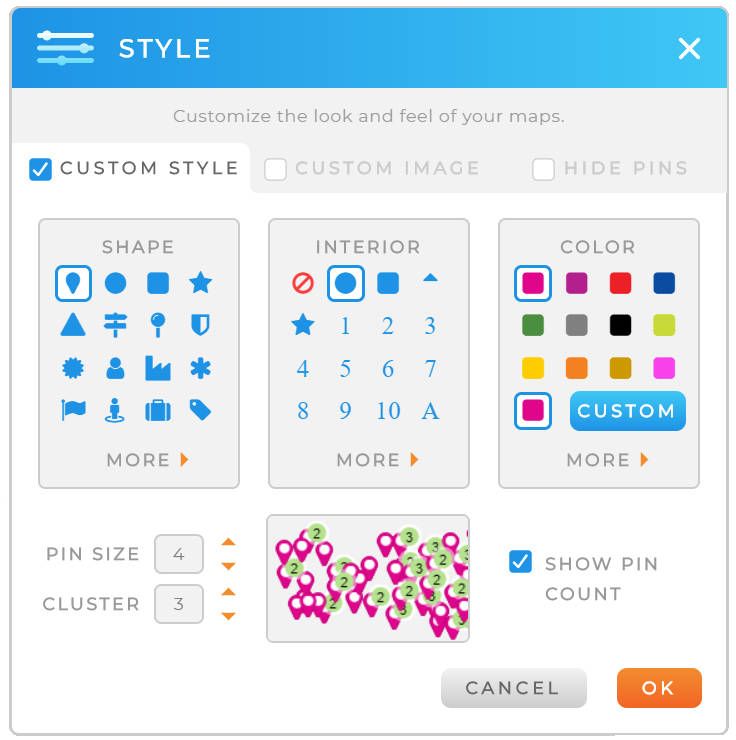
Last picture, I promise. You’ll also find that many of our menus and popups are have changed as well. We wanted to make them more intuitive and streamlined. Don’t worry, like I said at the top, you are NOT losing any features here. Everything you currently do with our mapping software will still be able to do.
And that’s it! Technically, I’m leaving out a lot here (i.e. Dataset Pages, New Features, and more), but this post is getting long as it is. We’ll be rolling out plenty of posts, articles, and videos to help you out however we can moving forward. If you have any questions, don’t be a stranger. Reach out!


