Love is in the air, and we have a strong suspicion you’re about to fall head over heels for these new updates from Mapline.
From new shortcuts and automations to deeper insights, get ready to be swept off your feet by streamlined workflows and new possibilities in data analysis and visualization.
SHARE WITH EASE
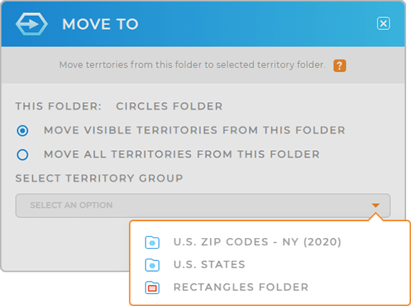
Sharing your Mapline visualizations just became effortless! Now, from any of your Libraries, you can easily select multiple objects and share them all at once.
Imagine you’ve created several charts that you’d like your team to add to their individual dashboards. With this new feature, it only takes a few clicks to select and share the new charts with the appropriate team members.
What a fantastic way to make sure the right people get exactly what they need, all in one step!
DYNAMIC DATASET CATEGORIES
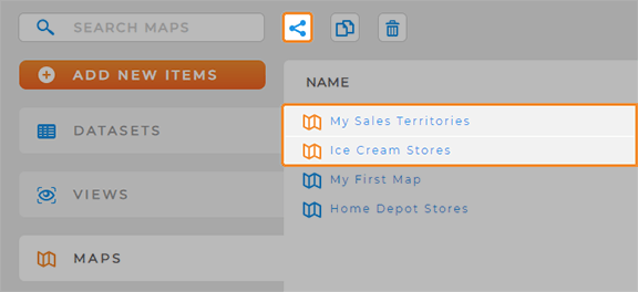
Mapline Data takes a leap forward with dynamic category assignments! Harness the power of dynamic calculations to automatically categorize your data, empowering you to create categories that adapt to changes in your dataset.
Let’s say you’re managing a product inventory and want to categorize items based on sales performance and inventory levels. By leveraging dynamic category assignments, you can automate the categorization process, ensuring products are dynamically sorted into relevant categories as sales data evolves.
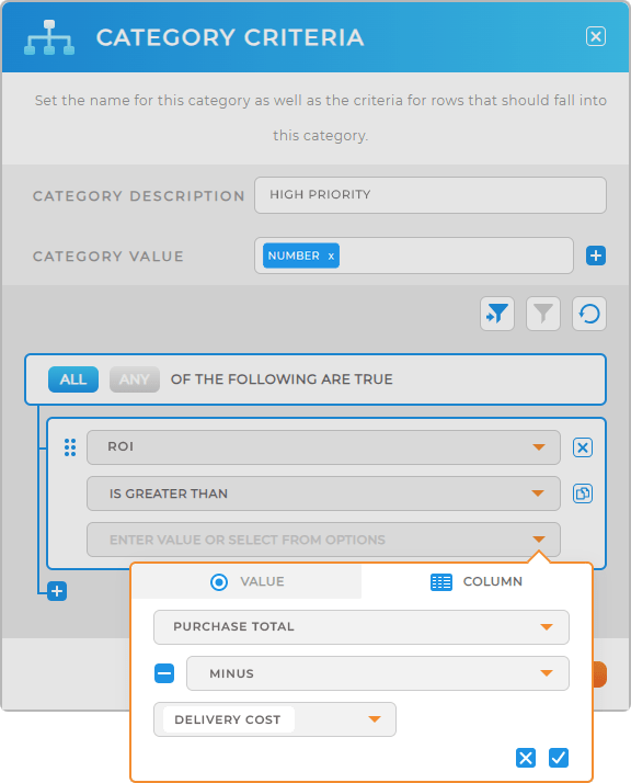
Plus, with the ability to duplicate multiple columns simultaneously, you can expedite data manipulation tasks, enabling you to work more efficiently than ever before!
MAPPING INNOVATIONS
Prepare to be amazed by this array of dynamic map upgrades! With these cutting-edge enhancements, you can effortlessly analyze data, uncover valuable insights, and create visually stunning maps that drive strategic decision-making.
EMPOWERED TERRITORY DATA
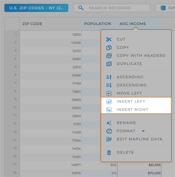
Territory datasets just became even more powerful! Not only can you quickly access your territory data right from the map, but you can also add new columns to your dataset in a flash.
Let’s say you’re managing sales territories and you need to add your most recent performance metrics to a specific set of territories. Just click the territory layer folder, select VIEW DATA, and seamlessly integrate the new data into your territory dataset!
This is a game-changer that’s sure to provide deeper insights for strategic decision-making.
SHAPES: DATA AT YOUR FINGERTIPS
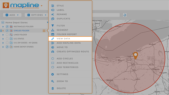
Fantastic news! The VIEW DATA shortcut is now available for Shapes. Whenever you add shapes to your map, you can click the layer folder and quickly see the data for that layer.
For example, if you need to asses rep coverage within a given area, you can easily get a quick overview of the data within each shape on your map.
This is a great way to quickly calculate key metrics within a specific radius.
COVERAGE CIRCLE ENHANCEMENTS
Experience enhanced functionality when adding circles (shapes?) to existing territories! Now, seamlessly include dataset columns before combining layer folders, ensuring comprehensive coverage analysis with every map visualization.
Imagine you’re optimizing delivery routes and need to incorporate real-time traffic data into your coverage circles. With the ability to include dataset columns, you can dynamically update circle parameters based on traffic conditions, ensuring efficient route planning and delivery scheduling.
Wow, that’s cool!
