- Blog
- Geo Mapping
- Visualize Customer Density with Heat Mapping
Heat mapping is one of the simplest ways to understand customer behavior at scale. Instead of analyzing rows of data, you can instantly see where customers are concentrated, where engagement is strongest, and where opportunities exist.
What is heat mapping?
Heat mapping is a method of visualizing data using color intensity to represent patterns, density, or performance across a geographic area. Businesses use heat maps to quickly identify trends, clusters, and gaps in their data.
How do you create a heat map?
To create a heat map, upload your data (such as Excel or CSV files), group it by location or value, and generate a map that visualizes patterns using color intensity. This allows you to quickly identify trends across regions.
Quick takeaway: Heat mapping turns complex location data into clear visual insights, helping teams make faster, more informed decisions.
What questions can heat mapping answer?
Instead of focusing on how to build a heat map, most teams use heat mapping to answer key business questions:
- Where are my customers most concentrated?
- Where should we focus next?
- Where are we missing opportunities?
If you’re ready to build your own, you can create a heat map online in seconds using modern mapping tools.
Why Heat Mapping Matters for Customer Analysis
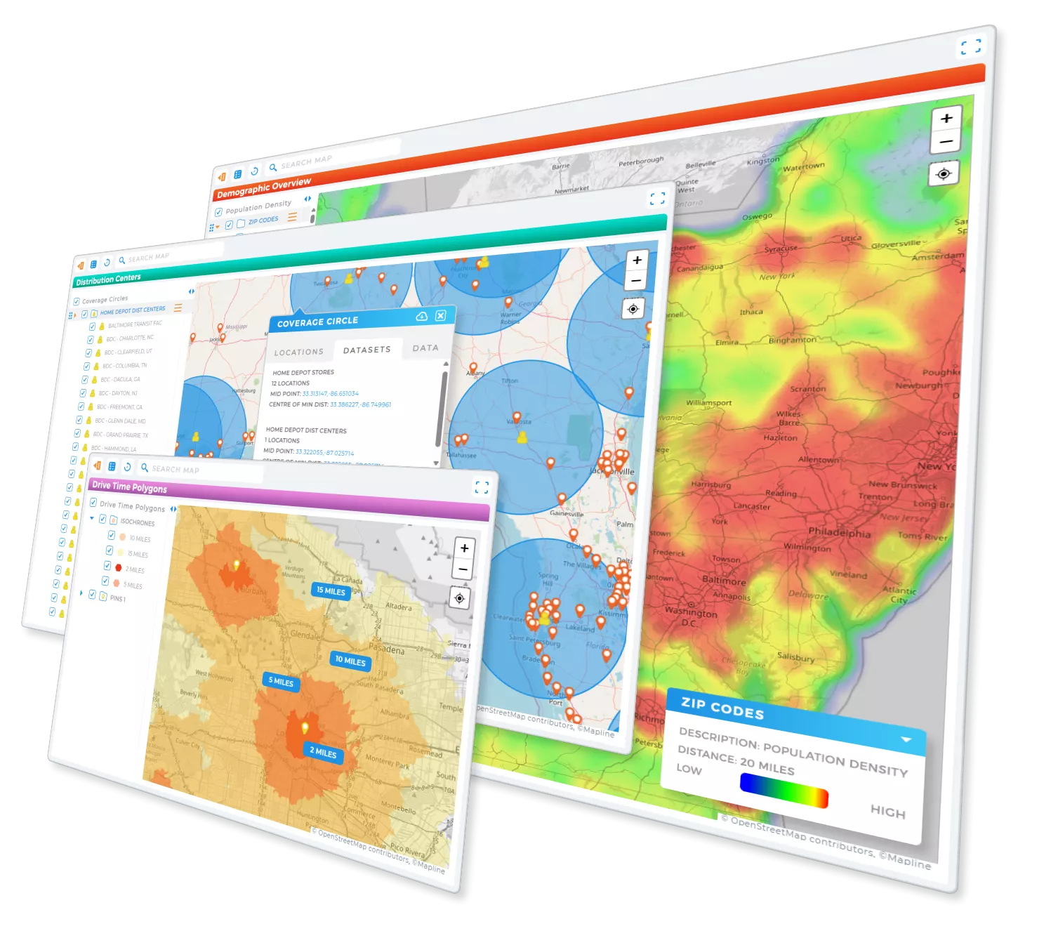
Understanding where your customers are located is critical—but raw data doesn’t tell the full story. Heat mapping allows you to see patterns instantly, helping you move from analysis to action faster.
Instead of reviewing spreadsheets, businesses use heat maps to identify high-density areas, underserved regions, and emerging opportunities.
- Customer density: See where your customers are concentrated
- Market gaps: Identify regions with high potential but low coverage
- Regional performance: Compare activity across locations
- Growth opportunities: Spot areas ready for expansion
This makes heat mapping one of the most effective tools for understanding geographic trends.

Pro Tip: Generate smart territories and track everything in real-time with Geo Mapping! Stay ahead of the game and adapt to changes on demand—no stress, no sweat, just pure efficiency.
What Heat Maps Show (and Why It Matters)
What do heat maps show?
Heat maps show patterns in data by highlighting areas of high and low intensity. The most useful heat maps help businesses quickly identify:
- High-demand regions: Areas with strong customer activity or engagement
- Low-coverage zones: Regions where demand exists but service is limited
- Behavior patterns: Trends in how customers interact across locations
- Performance differences: Variations in sales, visits, or usage
By visualizing these patterns, teams can prioritize resources and make more strategic decisions.
Heat Mapping vs Traditional Data Analysis
Heat mapping vs traditional data analysis: what’s the difference?
Traditional data analysis relies on spreadsheets and reports, while heat mapping transforms that data into visual insights. Heat maps make it easier to identify trends, compare regions, and act on data quickly.
Instead of manually analyzing rows of numbers, teams can instantly see where performance is strongest—and where improvements are needed.
Real-World Use Cases for Heat Mapping
Heat mapping is used across industries to improve decision-making and performance. Here are some of the most common applications:
Sales & Territory Planning
Sales teams use heat maps to identify high-performing regions, rebalance territories, and focus on areas with the highest potential.
Marketing & Customer Segmentation
Marketing teams analyze customer density and engagement by location to refine targeting and campaign strategy.
Operations & Logistics
Operations teams use heat maps to optimize delivery coverage, reduce inefficiencies, and improve service reach.
Retail & Expansion Strategy
Retail businesses use heat mapping to determine where to open new locations based on customer demand and geographic trends.
Creating Heat Maps from Real Business Data
Most customer data lives in spreadsheets, CRMs, or databases. Heat mapping allows you to take that data and instantly visualize it in a geographic context.
Instead of trying to build a heat map manually, many businesses use a heat map generator to upload their data and generate visual insights automatically.
This approach makes it easy to:
- Upload Excel or CSV data
- Visualize customer density instantly
- Identify patterns without manual analysis
The Fastest Way to Start Heat Mapping
If your goal is speed and simplicity, the easiest way to start heat mapping is to use a web-based mapping platform. These tools allow you to upload your data, generate a heat map instantly, and explore insights without technical setup.
Mapline provides a simple way to visualize customer density, analyze geographic trends, and turn data into decisions—all in one platform.
Heat mapping is a visualization method that uses color intensity to show patterns, density, or performance across data. It helps users quickly identify trends and make informed decisions.
Businesses use heat mapping to analyze customer distribution, identify market gaps, optimize territories, and improve operational efficiency across regions.
Yes, you can create a heat map for free online using mapping tools that allow you to upload data and generate visualizations without cost.
To create a heat map, you need location-based data such as addresses, ZIP codes, or coordinates, along with a value like sales, visits, or customer count.
Yes, heat mapping is often more effective than spreadsheets because it visualizes patterns instantly, making it easier to identify trends and act on insights.
Yes, you can create a heat map from Excel data by uploading your spreadsheet into a mapping tool that generates visual insights automatically.


