In today’s business environment, the ability to analyze data isn’t enough. Leaders, teams, and decision-makers need to communicate insights in ways that inspire action and align stakeholders. That’s where data storytelling comes in. Instead of simply presenting charts and spreadsheets, businesses can combine narrative, visuals, and context to make complex information clear and compelling. The best data stories not only explain what’s happening but also drive decisions that move organizations forward.
What Is Data Storytelling?
Data storytelling is the practice of translating raw numbers into a narrative that’s easy to understand and act upon. It blends three elements: data, visualization, and story. The data ensures accuracy, the visualization simplifies complexity, and the story connects insights to human experience. This combination transforms reports from static outputs into living tools for collaboration and strategy.
Effective storytelling starts with clarity. Businesses must focus on what matters most and communicate it in a way that’s intuitive for their audience. Whether it’s identifying market trends, presenting quarterly results, or aligning teams around a new initiative, storytelling ensures the message resonates and drives results.


Pro Tip: The best data storytelling doesn’t just explain what happened—it suggests what should happen next. With Mapline’s Geo BI and data visualization tools, you can connect insights directly to strategy, ensuring that your story drives measurable results.
Why Data Storytelling Matters for Business Leaders
Information overload is one of the biggest challenges modern businesses face. Stakeholders are bombarded with dashboards, KPIs, and reports daily. Without context, even the most accurate data can go unnoticed or misunderstood. Data storytelling cuts through the noise by focusing attention on what really matters and connecting it to clear next steps.
This approach is especially powerful in cross-functional settings. Marketing, sales, operations, and finance may all interpret raw data differently. Storytelling ensures that insights are framed in a way that every department understands and values. The result is alignment—teams not only see the same numbers but also share the same interpretation of what those numbers mean.
Essential Elements of Data Storytelling
Every effective data story rests on three essential elements. Without each of these working together, the impact of your insights diminishes significantly.
Clear and Reliable Data
The foundation of every story is accurate, clean data. Without reliable information, visualizations and narratives risk misleading audiences. This is where business analytics software and BI tools come in, ensuring that leaders have trustworthy numbers to work from. Data integrity creates confidence in the story being told.

Compelling Visualizations
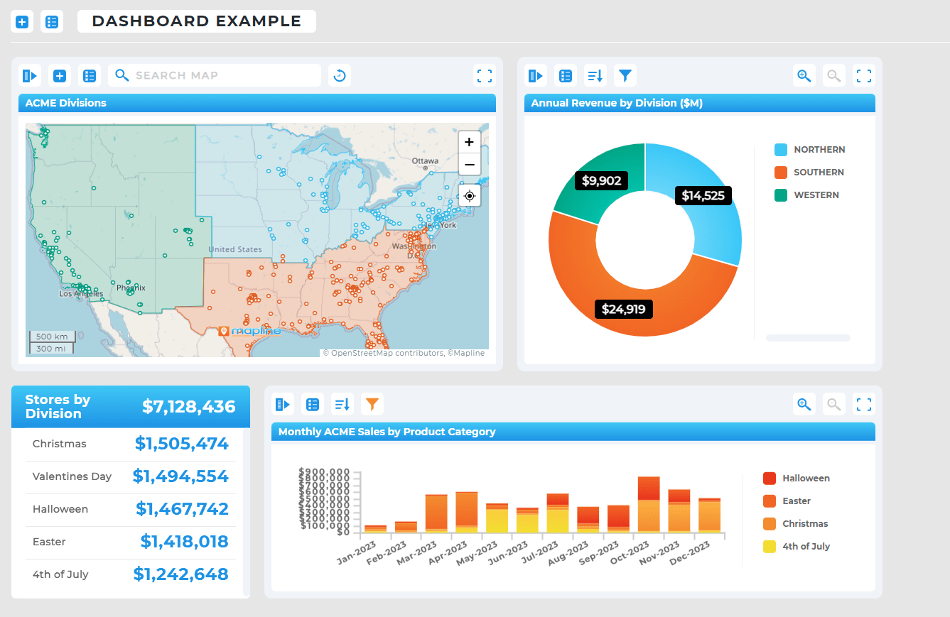
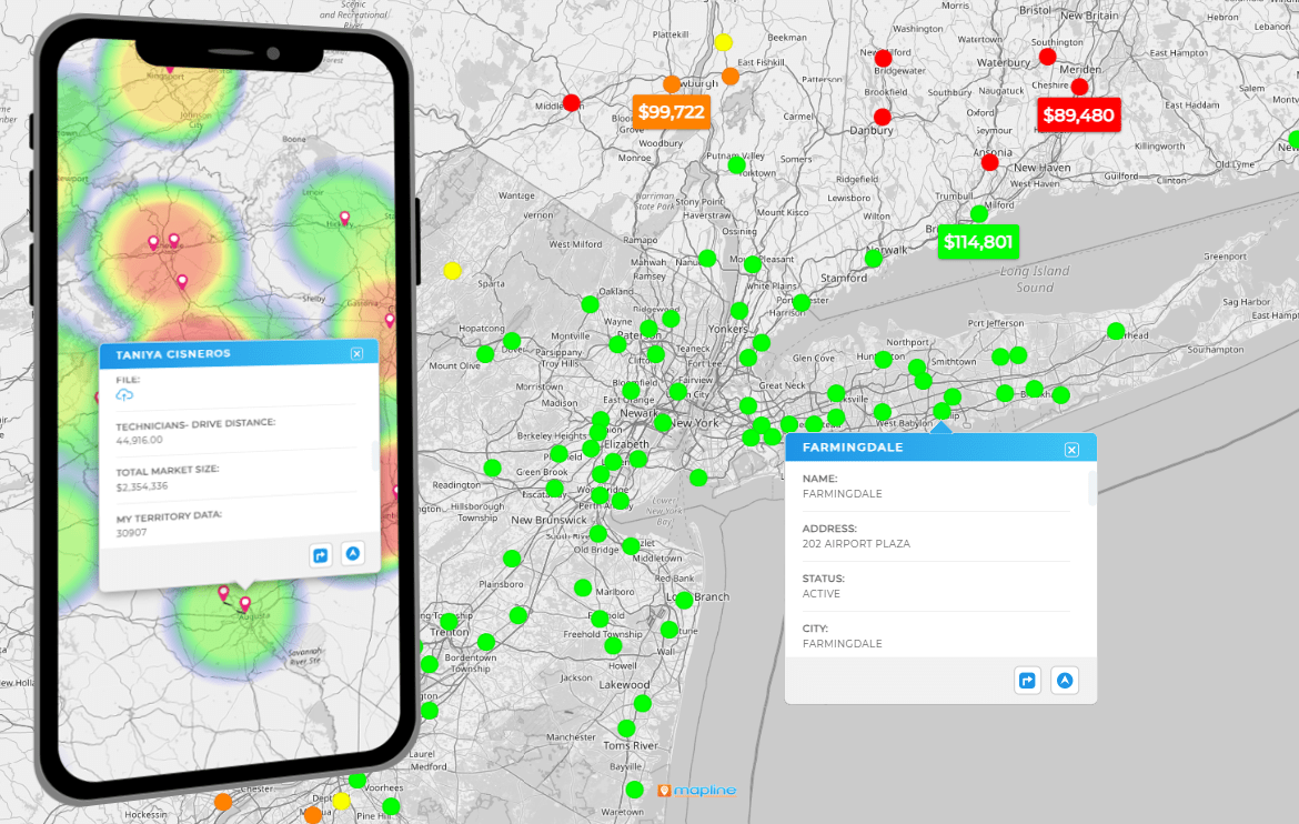
Visualization turns complexity into clarity. With tools like charts, maps, and heat maps, businesses can highlight key patterns at a glance. Instead of scanning through spreadsheets, stakeholders instantly see trends, outliers, and gaps. The choice of visualization—whether storytelling charts or geographic heat maps—shapes how effectively the story is communicated.

A Narrative That Connects
Numbers and visuals alone won’t move people to act. The narrative brings everything together by connecting data to context, goals, and strategy. Storytelling frameworks help guide stakeholders through the “what,” “why,” and “what next,” ensuring insights translate into meaningful action.

Data Storytelling in Action
The power of storytelling becomes clear when we see it in real-world applications. Here are a few examples of how businesses use storytelling to enhance decisions:
- Sales Teams: Turning pipeline data into stories about regional performance, helping reps understand where to focus efforts and why certain territories are outperforming others.
- Marketing Teams: Using customer analytics to create stories about campaign performance, making it easier to justify budget decisions and refine targeting.
- Operations: Transforming performance metrics into stories about efficiency, helping leaders identify bottlenecks and prioritize improvements.
- Executive Reporting: Presenting financial and strategic insights as stories that align boards and investors with long-term vision.
In each case, storytelling ensures that the audience doesn’t just see the data—they understand its significance and know how to act on it.
Choosing the Right Tools for Data Storytelling
Many platforms now include features that support storytelling, but not all are created equal. Tableau offers advanced visualization and dashboards, Power BI integrates with Microsoft’s ecosystem, and countless niche apps provide specialized views. However, these tools often require steep learning curves and technical expertise. Smaller teams may find themselves overwhelmed, relying on analysts or consultants to make them work.
Mapline offers a simpler path. By combining intuitive visualization tools with location-based intelligence, Mapline makes storytelling accessible to everyone—from frontline managers to executives. Instead of hours spent configuring reports, teams can create interactive maps and visuals in minutes. This speed and simplicity means stories get told faster, and insights reach decision-makers when they’re most needed.
Data storytelling combines data, visualizations, and narrative to communicate insights in a clear and compelling way that drives decision-making.
It helps stakeholders cut through information overload, align on insights, and translate data into meaningful action.
Not necessarily. While tools like Tableau or Power BI offer advanced features, platforms like Mapline provide intuitive, accessible storytelling capabilities without steep learning curves.
Yes. Small businesses often benefit most, since storytelling ensures every decision is data-driven and resource allocation is optimized.
Visualization displays the data clearly, while storytelling connects it to context and action. Together, they transform information into strategy.


