In business analytics, charts and tables can only take you so far. They show what’s happening, but not always where or why. That’s where map dashboards come in. A geographic dashboard turns raw location data into spatial patterns, real-world context, and instantly understandable insights. Whether you’re managing territories, routing drivers, scaling operations, or tracking performance across regions, map dashboards help you see what traditional visualizations can’t—and make smarter decisions faster.
The Limitations of Traditional Dashboards
Traditional dashboards rely on charts and tables to summarize performance, but they flatten the data. Without geographic context, it’s easy to miss inefficiencies, hidden patterns, or emerging trends tied to specific locations. You might see sales numbers fluctuating or delivery times increasing, but not realize the root cause is concentrated in one region. A dashboard without maps obscures spatial relationships that directly impact operational decisions. Maps remove this blind spot by adding location intelligence to your analytics stack.
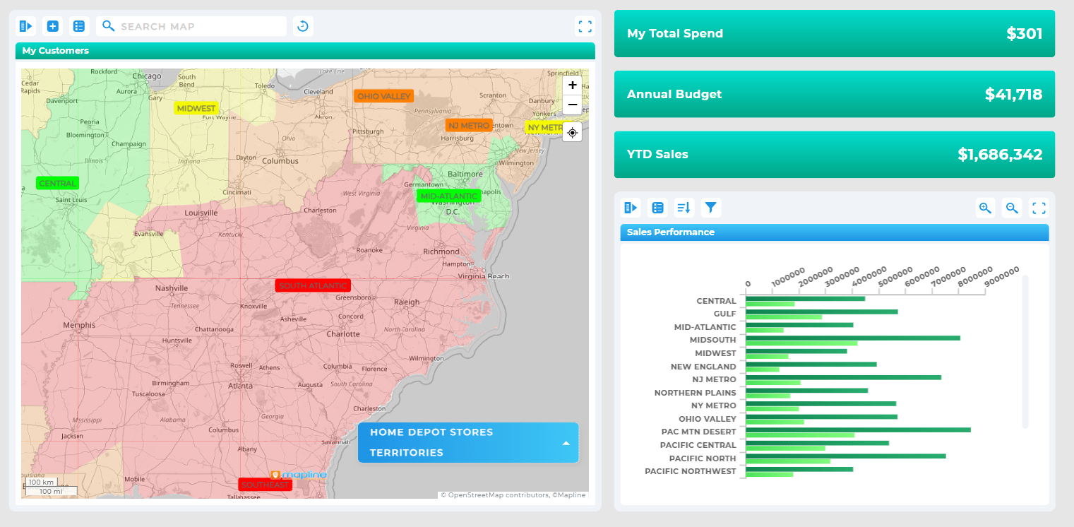

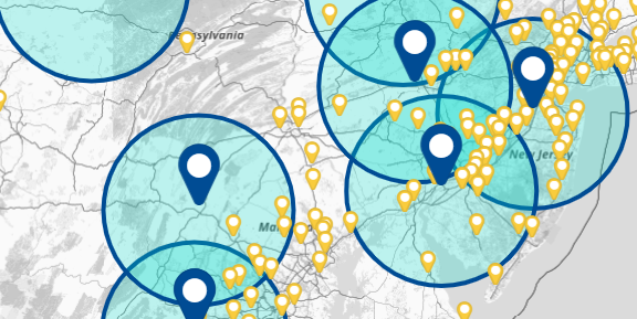
Pro Tip: Use multiple map layers—such as territories, coverage zones, and customer pins—to tell a complete story at a glance. The more context you stack, the faster your team can diagnose issues and take action.
What Map Dashboards Reveal That Charts Don’t
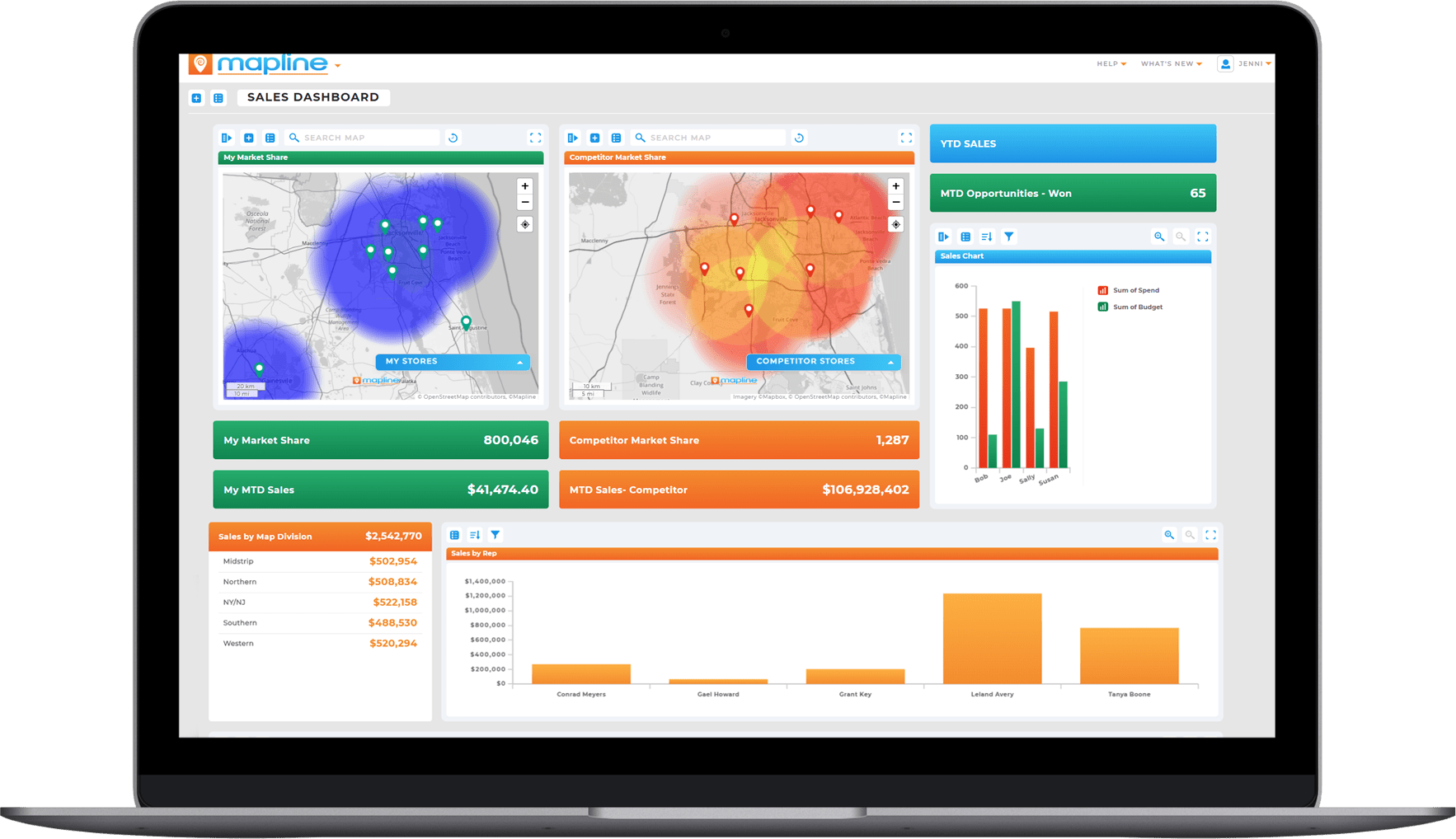
Map dashboards uncover patterns that would otherwise be invisible. Spatial clustering shows where issues or opportunities concentrate—whether it’s customer density, delivery delays, or high-performing regions. You can visualize territory imbalances, identify under-served zones, or see how nearby competitors affect performance. With an interactive map dashboard, regions become living data stories instead of disconnected numbers. This enables faster diagnosis, stronger predictions, and more confident decision-making
Geographic Hotspots and Clusters
Maps reveal hotspots in ways bar charts never can. When you plot your data spatially, you see clusters of activity, service demand, sales concentration, or risk exposure instantly. Heat maps and density views make it easy to pinpoint regions that need attention or investment. This is especially valuable for teams in sales, logistics, field services, retail, or franchise growth.
Territory-Based Performance Insights
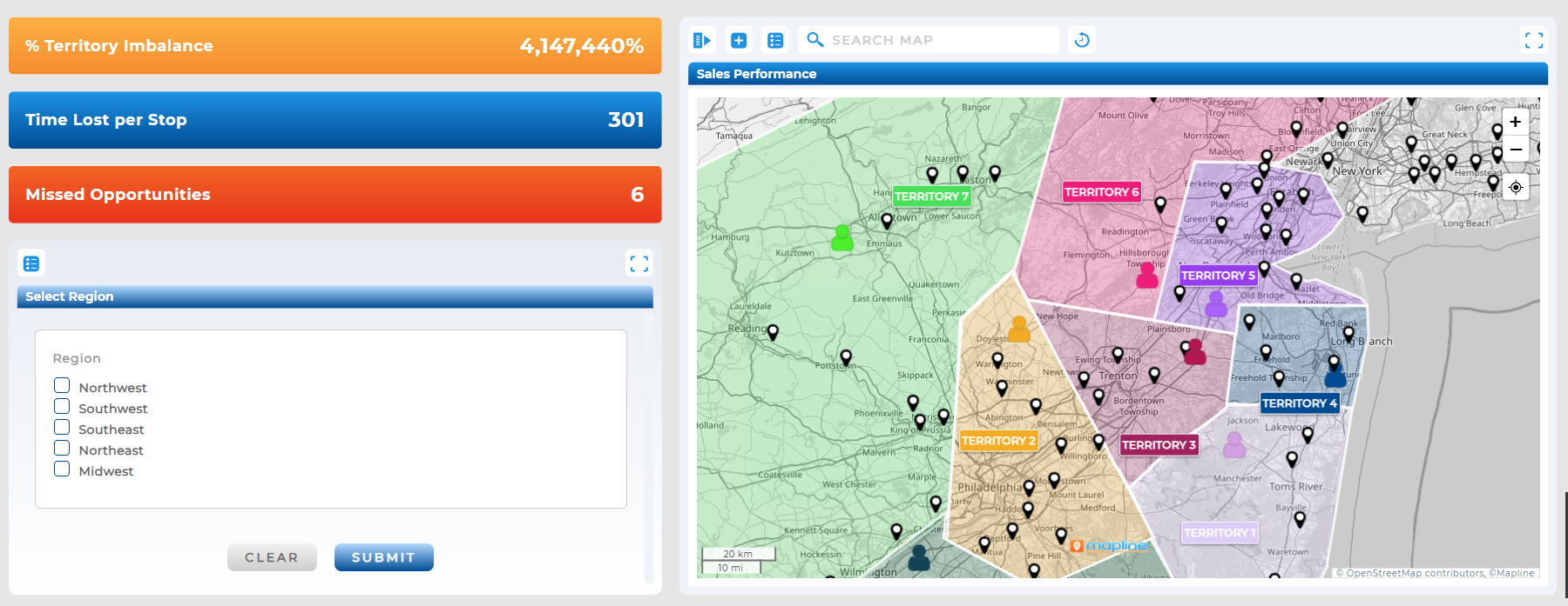
Geo dashboards allow you to evaluate performance across territories instead of generic segments. You can see which regions are hitting targets, which ones are falling behind, and where to adjust team assignments. A GIS dashboard ensures every territory has clear boundaries, accurate data, and objective comparisons that drive better resource allocation.
Route-Driven and Operational Patterns
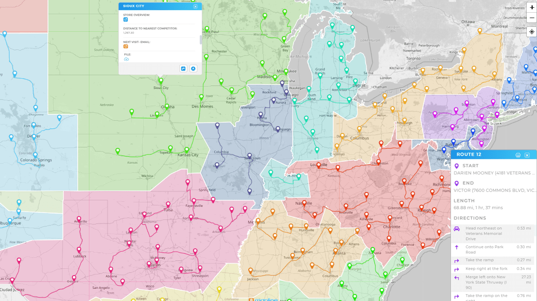
For delivery and service teams, maps reveal the inefficiencies behind workload imbalance or poor productivity. You can track delays by location, evaluate service zones, compare route densities, and optimize drive patterns. Mapline’s interactive map dashboard goes a step further by allowing teams to integrate live routes, coverage areas, and geospatial analysis directly into their dashboards.
Customer Distribution and Market Opportunities
Customer behavior changes dramatically from one region to another. With a geographic dashboard, you can spot untapped territories, high-value clusters, or underserved regions. This helps guide marketing budgets, sales strategies, site selection, or expansion planning with confidence—because you’re seeing the market as it actually exists on the ground.
Why Every Business Benefits From Map-Enabled Dashboards
No matter your industry—logistics, healthcare, retail, utilities, real estate, or field services—maps create layers of understanding that charts alone can’t deliver. They reveal proximity relationships, competition zones, regional inefficiencies, and real-world travel constraints. A geo dashboard makes analytics more intuitive, more accurate, and far more actionable. Simply put: the moment you add maps, your dashboard becomes a strategic command center.
How Mapline Makes Map Dashboards Effortless
Mapline turns your raw datasets into dynamic, location-aware dashboards in minutes. You can overlay maps, charts, KPIs, and heat maps in a single view—no GIS expertise needed. Every dashboard is interactive, shareable, and automatically synced to your data. Add territories, pin layers, boundaries, routing insights, or demographic overlays and instantly enrich your dashboards with real-world intelligence. Mapline gives you the power of an advanced GIS dashboard without the complexity.
Maps reveal spatial patterns that charts simply can’t show—things like geographic clusters, territory gaps, drive-time patterns, underserved regions, and distance-based inefficiencies. They turn raw location data into visual insights that are instantly clear, even to non-technical stakeholders.
Absolutely. The most powerful dashboards combine maps with charts, graphs, and summary metrics. Mapline lets you place maps directly next to KPIs, funnels, tables, or trend lines so every data point has geographic context.
Any data with a location—addresses, ZIP codes, sales territories, customer locations, delivery stops, store footprints, service regions, and more. You can also layer in demographic data, performance metrics, coverage areas, and boundaries for deeper analysis.
Not at all. Mapline is built for business teams, not GIS specialists. You can upload your data, choose your map type, and start visualizing immediately—no complex tools or geospatial training required.
Mapline dashboards update automatically whenever your data refreshes. If you’re connected to a CRM, spreadsheet, warehouse, or operational system, your maps stay accurate in real time with no manual work.
Yes. Maps highlight problems you can’t see with charts alone—like routing inefficiencies, market gaps, high-density opportunity zones, or regional performance changes. They’re especially valuable for field teams, logistics leaders, sales managers, and executives who rely on geography-based decisions.
Yes. Mapline dashboards can be shared with simple permissions or embedded in tools your team already uses. Everyone gets live, interactive visibility without downloading files or opening spreadsheets.
Very. Maps make complex data intuitive and easy to understand. Even stakeholders who don’t typically analyze data can quickly grasp trends, patterns, and opportunities when they see them visually on a map.


