Charts are the backbone of modern data storytelling, especially when operations shift hour-to-hour, and leaders need clarity fast. The right chart type can illuminate patterns, surface risks, and highlight opportunities long before static reports catch up. But the wrong chart type can bury insights, confuse teams, or slow decision-making at critical moments. This guide walks through the best charts for business scenarios, how to choose visualizations that reveal operational truth, and the data visualization best practices that help teams make fast, confident decisions. When charts match the reality of the workflow, teams unlock clarity they didn’t know they were missing.
Why Chart Selection Matters for Fast-Moving Operations
When your business changes hour-to-hour, chart selection becomes more than a design choice — it becomes a strategic advantage. Some charts highlight trends; others capture real-time shifts or show comparisons that matter in the moment. Static BI tools often rely on outdated snapshots that miss sudden changes or emerging bottlenecks. In contrast, the best business charts reveal what’s happening now, not what happened last week. Teams that understand which charts to use for which scenario can spot risks earlier, respond faster, and stay aligned even during chaotic periods.
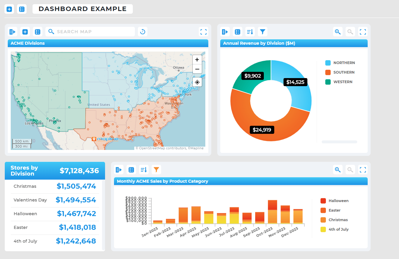

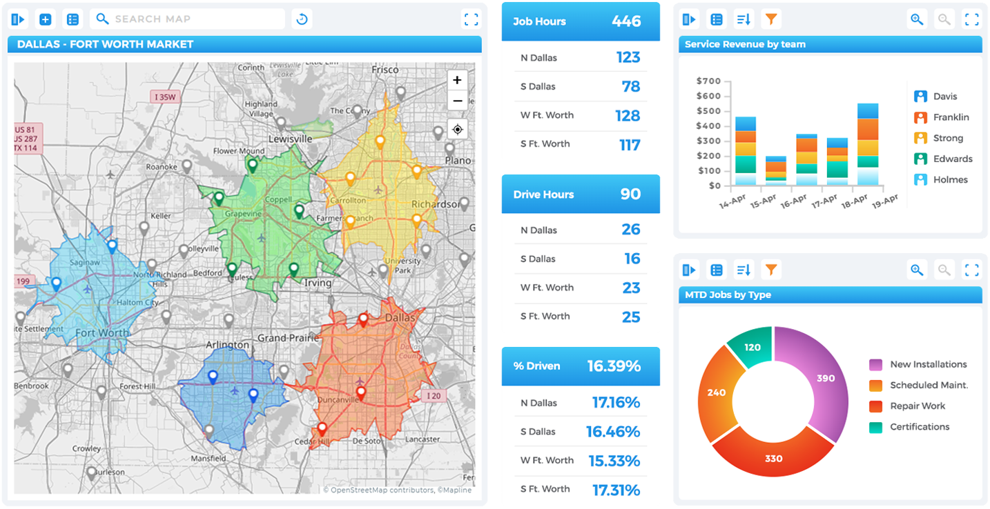
Pro Tip: When dashboards include maps, charts, and metrics together, operational clarity skyrockets. Pairing visual layers with real-time updates brings hidden patterns to the surface—helping teams take action the moment performance shifts.
Clarity Drives Faster Decisions
Each chart communicates differently, and selecting an inappropriate visualization can slow interpretation or hide the metric that matters most. A line chart may reveal trends clearly, but it can obscure category-specific differences that a bar chart would highlight. In time-sensitive operations, clarity becomes more valuable than complexity. Teams who match charts to their data avoid misunderstandings and gain the confidence to act immediately.
Real-Time Visibility Outperforms Static Reporting
Static charts generated from traditional BI tools often lag behind the moment, creating blind spots during peak operational hours. Real-time charts refresh automatically, updating metrics as fast as the business evolves. This allows teams to monitor critical KPIs, spot anomalies instantly, and prevent cascading delays. Real-time charting is especially important for industries that depend on operational agility, such as logistics, field service, and delivery-based organizations.
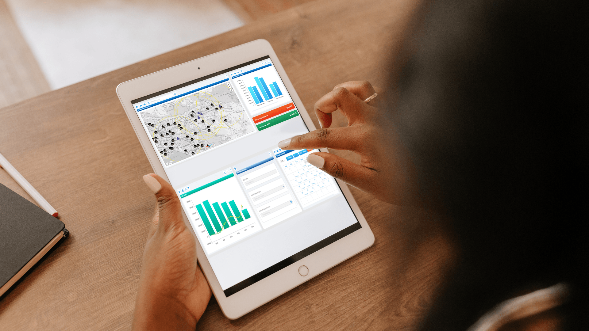
Chart Types Reveal Different Kinds of Insights
Charts are not interchangeable, and using the wrong one can distort the story your data is trying to tell. Bar charts highlight category comparison, whereas heat maps reveal geographic intensity and demand distribution. Line charts show directional movement over time, and scatter plots surface correlations that might impact strategic decisions. Understanding the purpose of each chart type helps teams choose the most appropriate visualization for any scenario, improving accuracy and reducing cognitive load.

Best Chart Types for Real-Time Business Scenarios
The best data visualization strategy pairs each business scenario with the chart type that communicates its performance quickest and most accurately. Fast-moving operations require charts that are easy to read at a glance, highlight meaningful trends, and adapt to rapid data shifts. By selecting charts that align with specific workflows, teams reduce decision friction and increase situational awareness. Below are the most valuable chart types for real-time operational clarity.
Line Charts for Monitoring Trends Over Time
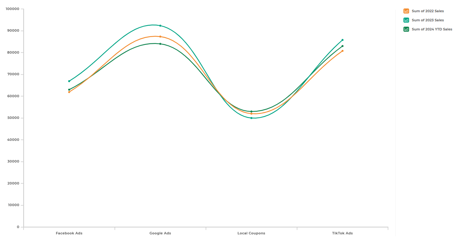
Line charts excel in situations where businesses track performance shifts throughout the day, such as order volumes, customer traffic, or technician availability. Their smooth visual flow highlights rising or falling trends instantly, making them ideal for real-time monitoring. When conditions change quickly, line charts offer immediate visual feedback that helps teams respond immediately. They are especially effective for highlighting patterns that might go unnoticed in static or tabular reports.
Bar Charts for Category Comparisons
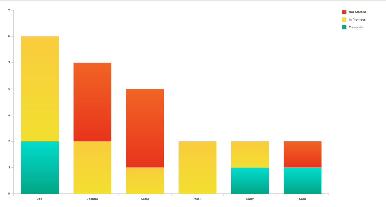
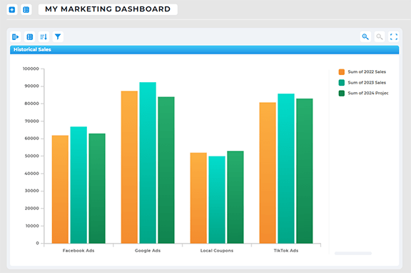
Bar charts are the best choice when comparing categories like regions, product lines, or employee performance. In real-time dashboards, bar charts help teams understand which areas are performing above or below expectations at any given moment. Because they provide clear visual differentiation, bar charts make it easy to identify outliers or underperforming segments. This enables operational leaders to reallocate resources, adjust strategies, or intervene promptly where needed.
Pie and Donut Charts for Quick Proportion Checks
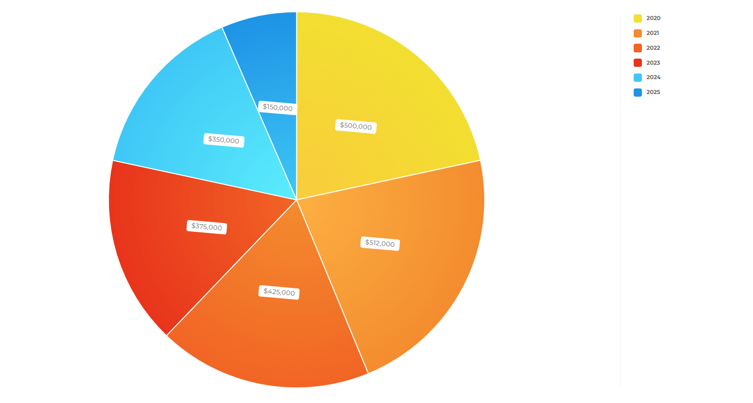
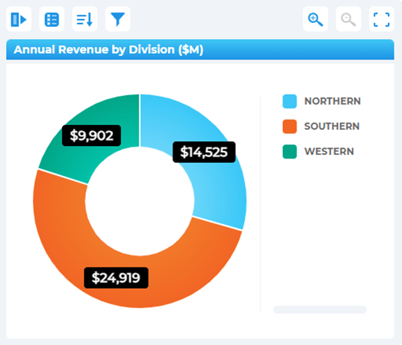
Pie and donut charts communicate proportions quickly, such as market share distributions or workload breakdowns across teams. Although best used sparingly, they can highlight shifts in real-time that indicate emerging imbalances. In scenarios like tracking technician status or order distribution categories, these charts provide an instant overview of how workflows are divided. Their simplicity makes them highly readable when time is limited.
Heat Maps for Geographic and Intensity Insights
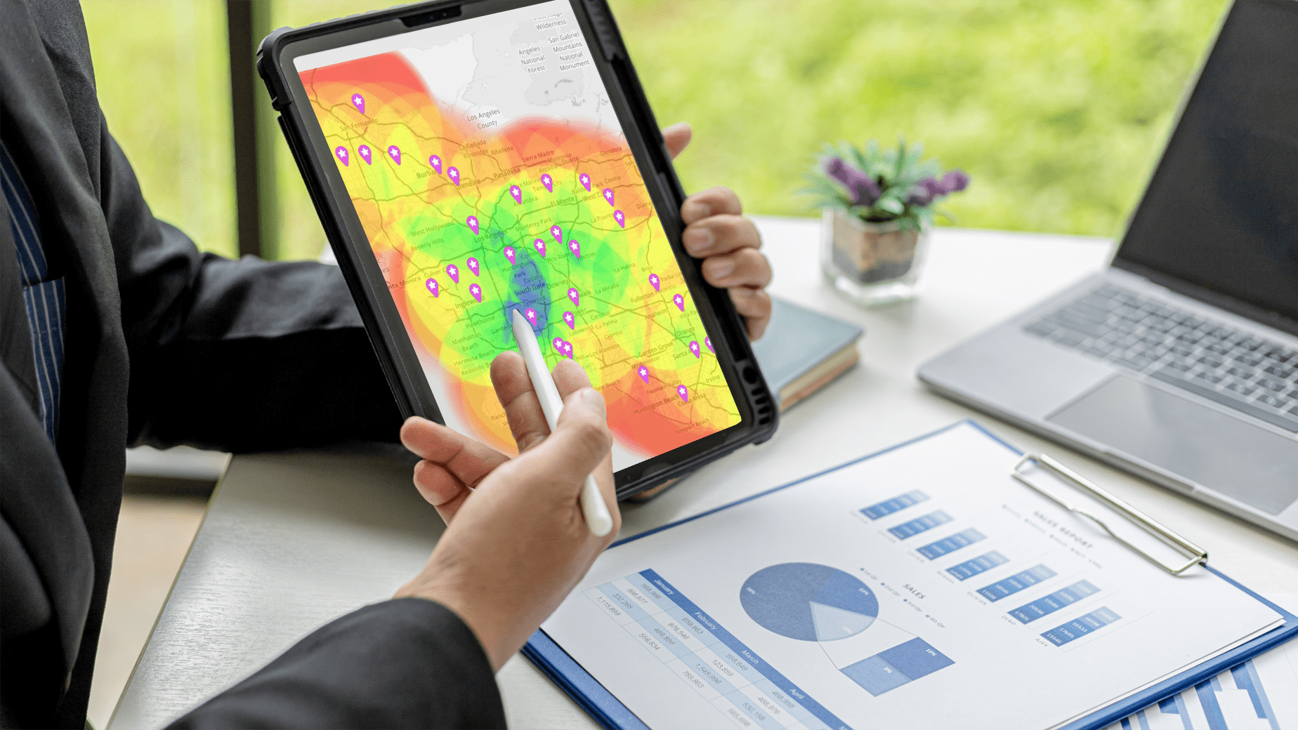
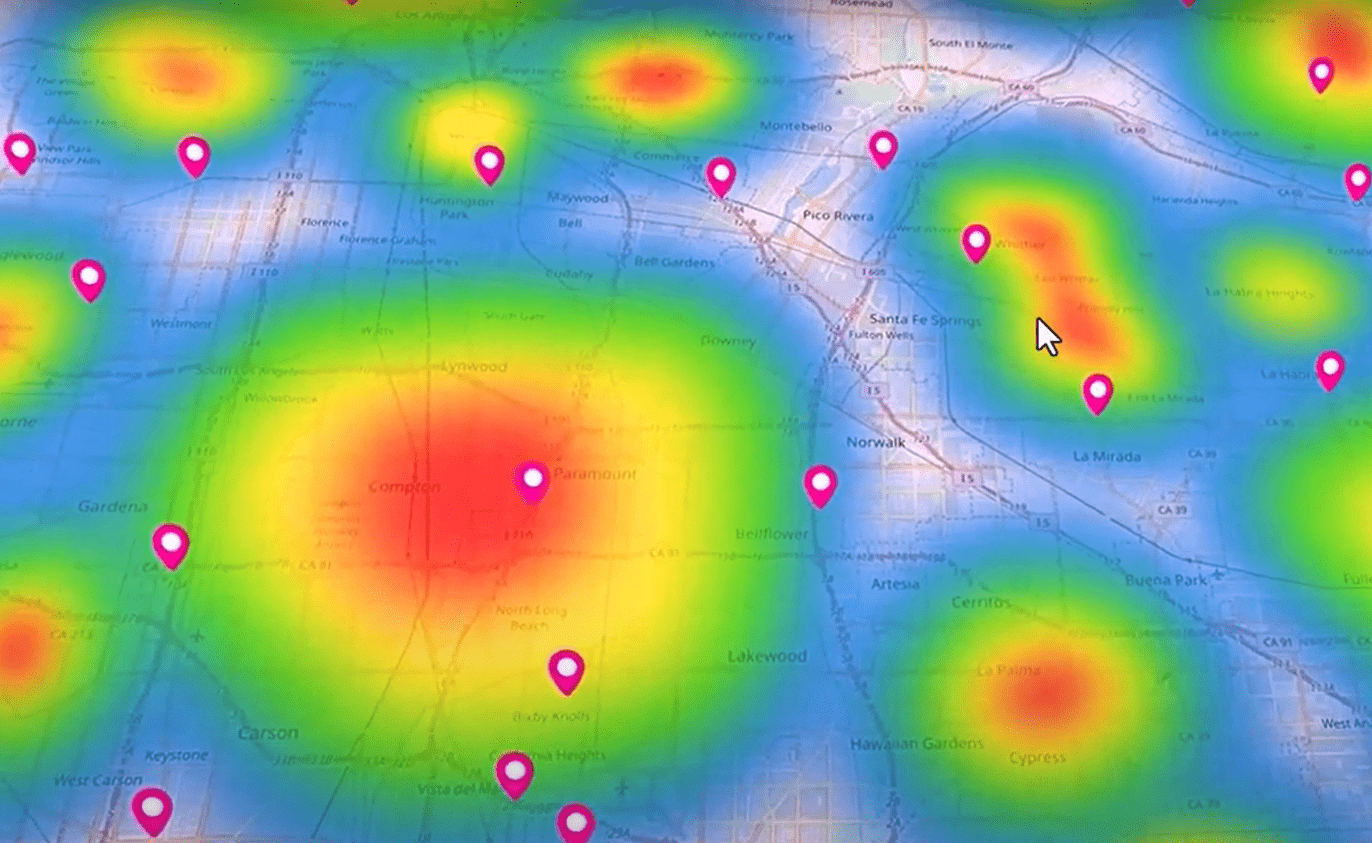
Heat maps are especially powerful in businesses that depend on geographic clarity or density analysis. They reveal clusters of activity, inefficiency, or demand that static dashboards miss. When paired with real-time geographic data, heat maps expose emerging hotspots — such as delayed deliveries or high-demand regions — allowing teams to adjust quickly. They are ideal for organizations managing territories, drivers, or region-based customer activity.
Scatter Plots for Identifying Relationships
Scatter plots help teams understand correlations between variables, such as how appointment duration impacts fuel usage or how distance correlates with delivery times. In real-time dashboards, these visualizations can uncover patterns that contribute to inefficiencies or cost spikes. Scatter plots are particularly useful in environments where performance is tied to multiple interacting factors. This insight allows teams to refine strategies based on empirical relationships rather than intuition.

Data Visualization Best Practices for Operational Clarity
Choosing the right chart type is only half the strategy — businesses must also apply visualization best practices to ensure clarity, accuracy, and speed. Real-time dashboards operate best when charts are simple, consistent, and easy to interpret under pressure. By cleaning up clutter, emphasizing high-value metrics, and organizing information thoughtfully, teams can elevate their dashboards from functional to exceptional. These practices ensure your charts support decision-making rather than complicate it.
Keep Visuals Clean and Uncluttered
Overly complex charts slow interpretation and increase cognitive load, which is costly in time-sensitive situations. Remove unnecessary gridlines, reduce color variety, and simplify labels where possible. Clean visuals allow users to focus on the story and identify actionable insights without distraction. By prioritizing clarity over decoration, teams create dashboards that perform well even during high-stress operational moments.
Use Consistent Colors and Formats
Consistency helps teams interpret data faster by reducing the mental effort needed to understand each chart. Using the same color palette for similar metrics ensures continuity across dashboards and simplifies comparisons. It also enhances readability and reduces misinterpretation when multiple departments or teams share the same reporting framework. Standardization becomes especially important in organizations with cross-functional decision-making.
Highlight Anomalies and Key Metrics
In fast-moving environments, anomalies can signal opportunities or problems that require immediate attention. Use color accents or callout metrics to draw attention to values outside the expected range. When leaders can spot irregularities at a glance, they can intervene before issues escalate. By emphasizing what truly matters, dashboards become proactive tools rather than passive displays.
Line charts and bar charts are most effective for monitoring real-time changes and comparisons.
Match the chart type to your business objective: trends, comparisons, proportions, relationships, or geographic patterns.
Yes — when used sparingly and only to represent clear, simple proportions.
Modern platforms make it easy for non-technical users to build and customize charts.
Absolutely — pairing them enhances context and operational clarity.


