For all the sophisticated BI tools and dashboards available today, one analytics tool quietly outperforms them in clarity, speed, and decision-making power—yet most organizations barely use it. Maps convert complex datasets into instant visual understanding. They reveal relationships spreadsheets hide, clarify patterns dashboards miss, and surface insights traditional data analysis tools simply can’t express. Despite this, maps remain one of the most underused assets in modern analytics. But that’s changing fast.
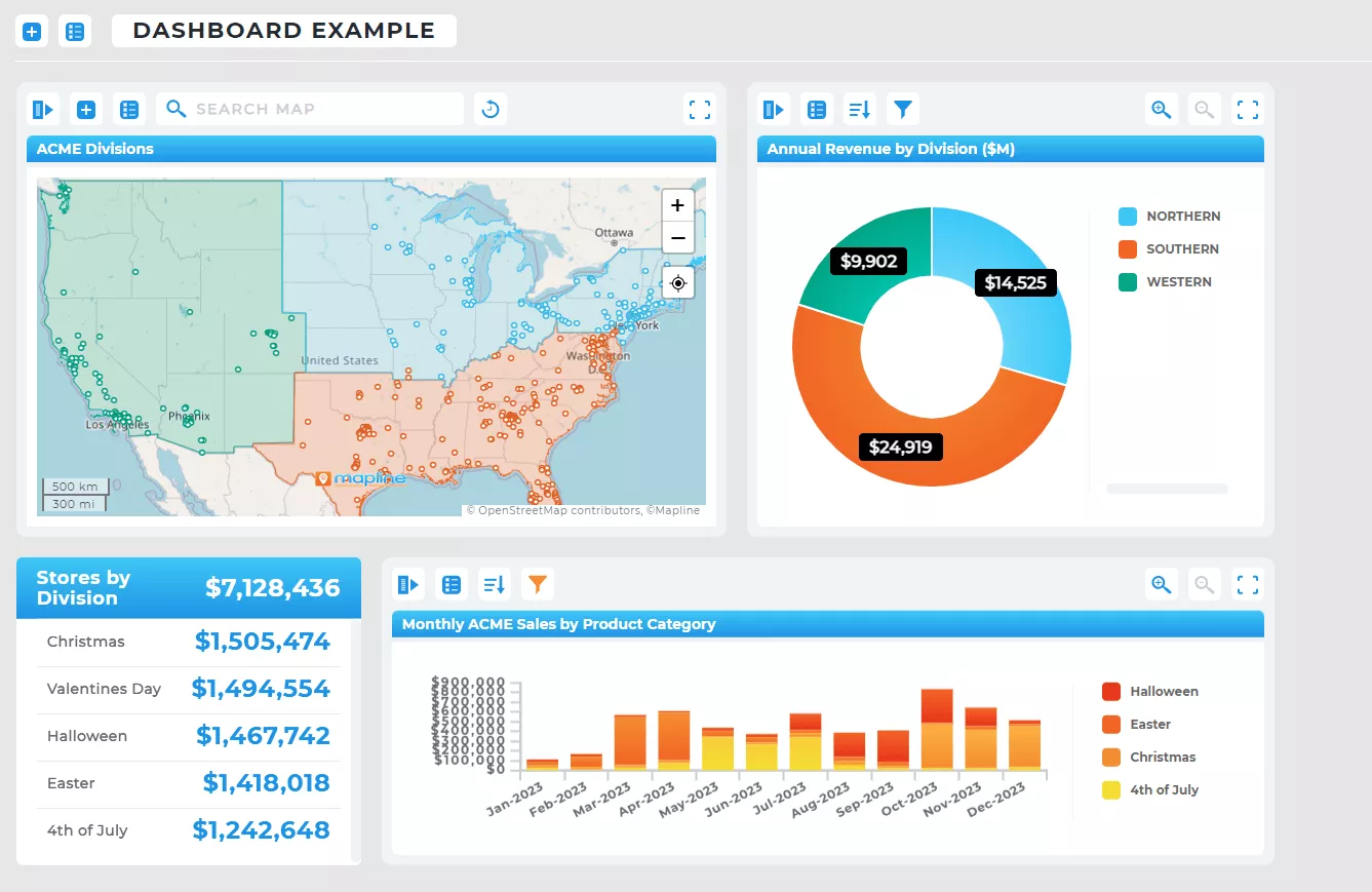
Why Maps Need to Be Part of Every Analytics Strategy
Most businesses still analyze data in tables, charts, or lists. While those formats are essential, they lack spatial context—the “where” behind the “what.” A map allows teams to spot gaps in coverage, identify clusters of activity, understand customer distribution, and visualize performance patterns geographically. In other words, maps transform raw data into actionable insight simply by showing it in the real world.
Maps also eliminate the cognitive overload of multi-tab spreadsheets. When information becomes visual, teams can make decisions in seconds rather than hours. It’s the fastest path from data to clarity—especially when you’re managing customers, assets, deliveries, or field teams.
Pro Tip: If you’re already tracking metrics in spreadsheets or dashboards, layering them on a map instantly exposes hidden trends. It’s one of the fastest ways to make your existing analytics 10× more valuable.
Why Traditional BI Tools Can’t Reveal Location-Based Insights
Even the best BI platforms rely heavily on charts, graphs, and tables. While useful, these formats compress data into trends without showing where those trends happen. For teams responsible for sales territories, field operations, logistics, store performance, or asset deployment, this missing spatial layer creates blind spots that directly impact revenue.
A map bridges these gaps by revealing the real-world patterns behind your metrics. Underperforming zones, oversaturated markets, delivery bottlenecks, and high-value clusters become immediately visible—simply by visualizing your dataset geographically.
Deep-Dive — How Maps Strengthen Every Major Analytics Category
Even the best BI and analytics platforms have blind spots, and almost all of them are geographic. By adding a map, businesses unlock a new dimension of insight that transforms how they interpret performance, demand, and operational efficiency. Suddenly, disconnected data points become patterns, clusters, and real-world stories. Every analytics category—from ecommerce to product analytics to web traffic—gets clearer and more actionable. Below, we break down exactly how maps supercharge the tools today’s teams already depend on.
Shopify Analytics (E-Commerce Performance by Region)
Shopify and other e-commerce platforms excel at showing product and revenue trends—but not where demand originates. When mapped, customer locations reveal geographic buying patterns, shipping demand, cold markets, and high-value clusters. This helps teams refine ad targeting, optimize distribution, and improve delivery efficiencies.
Web Analytics (Regional Engagement in Context)
Analytics tools highlight page views, conversions, and channels, but offer little visibility into geographic behavior. Mapping web traffic and conversions shows which regions generate engagement, which markets underperform, and where to focus SEO or advertising efforts. It bridges the gap between digital behavior and offline opportunity.

Product Analytics (Where Usage and Adoption Occur)
Product analytics platforms show usage trends but rarely display where users are concentrated. A map reveals adoption clusters, regions with low engagement, and areas ready for expansion. For SaaS and consumer brands, geographic product insight can guide sales coverage, localization strategies, and support planning.
Social Media Analytics (Audience Reach by Location)
Social analytics tools show demographics, impressions, and engagement—but mapping audiences uncovers who interacts with your brand where. This informs influencer partnerships, event planning, and region-specific messaging. It turns social engagement into a real-world strategy.
Agency Analytics (Client Performance Across Regions)
Agencies often manage multiple clients across multiple markets. A map consolidates performance across locations, helping teams track campaign impact, territory gaps, service coverage, and ROI by region. It becomes a client-facing deliverable that immediately communicates value.
The Real Power of Maps: They Reveal the “Why” Behind the Numbers
Charts tell you what’s happening. Maps tell you why it’s happening. If a region is underperforming, a map can reveal whether the cause is coverage gaps, distance barriers, demographic mismatches, or uneven territory alignment. If service teams fall behind, maps show where congestion or travel inefficiency occurs.
This spatial context makes problem-solving dramatically easier. Instead of guessing, leaders see the story instantly—and act confidently.
Why Maps Are Becoming Essential for Modern BI
As companies become more data-heavy and operations grow more complex, traditional analytics tools struggle to keep up. But maps scale effortlessly because they’re designed to visualize complexity. They support multiple datasets, layered insights, and real-time updates without overwhelming the user.
Maps are also uniquely intuitive. Anyone can look at a visual distribution of customers or territories and understand what needs attention. This accessibility makes maps a powerful alignment tool across departments—especially in fast-paced industries where decisions must be made quickly and communicated clearly.
Maps visualize data geographically, allowing teams to spot trends, clusters, and regional performance differences that charts and tables can’t reveal. They show the “where” behind every metric, making insights easier to understand and act on. In many cases, a map exposes operational issues instantly—without running additional reports or complex analysis.
Traditional BI tools focus on numerical or chart-based trends, but they often hide the geographic factors influencing performance. Maps surface distance, density, territory boundaries, market gaps, and travel inefficiencies in seconds. This spatial context helps teams make more accurate decisions and respond faster to operational changes.
Not at all. Modern mapping platforms are designed for non-technical users, allowing anyone to upload data, style a map, and uncover insights immediately. There’s no need for specialized GIS knowledge or a complex setup. If you can work with a spreadsheet, you can work with a map.
Any dataset with addresses, ZIP codes, latitude/longitude, regions, customers, assets, or field activity can be mapped. You can also layer multiple datasets to compare performance, visualize relationships, or identify patterns across locations. Maps work equally well for sales, operations, logistics, marketing, and product analytics.
Maps reveal inefficiencies that are invisible in spreadsheets—such as overlapping territories, long travel routes, under-serviced regions, and congested delivery zones. This visual clarity helps teams optimize workloads, reduce transit time, adjust scheduling, and allocate resources more effectively. The result is faster, smarter operational decisions.
Not exactly—maps complement dashboards by adding a spatial layer to performance insights. Dashboards show trends over time, while maps show where those trends occur. When combined, they create a more complete picture that improves forecasting, planning, and execution.
Field service, logistics, retail, healthcare, manufacturing, utilities, real estate, and distribution benefit enormously from mapping their data. Any business that interacts with customers, assets, or teams across locations can uncover high-impact insights with spatial analytics.
Yes. When connected to live datasets or operational systems, maps update automatically and reflect performance changes in real time. This turns maps into an immediate decision-making tool, especially for routing, scheduling, dispatching, and territory management.
Because maps communicate visually, they eliminate misinterpretation and make insights clear for everyone—from analysts to executives. Teams can quickly agree on priorities, understand geographic challenges, and coordinate strategies across departments. Maps become a shared source of truth.
Most organizations rely heavily on spreadsheets or chart-based dashboards and have never integrated spatial thinking into their analytics workflows. Historically, mapping required specialized software or GIS expertise. Modern tools have removed those barriers—yet many teams simply haven’t realized how transformative mapping can be.


