Big things are happening behind the scenes at Mapline, and this latest update is all about clarity, control, and power.
What you once knew as “Mapline Data” has been rebranded and repositioned to better reflect how your data actually works inside the platform. Instead of one broad label, your data is now clearly categorized into specific column types that show you exactly what’s happening, what’s calculated, and what’s enriched by Mapline. The result? More flexibility, more transparency, and more control over how you use your credits and build your analytics.
Let’s break it down.
What Is the New Mapline Data Structure?
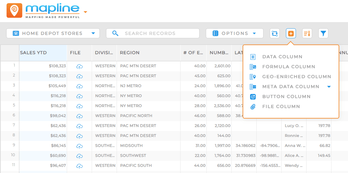
Mapline Data has now been renamed and is organized into clear, purpose-driven column types:
- Data Columns: Your standard dataset columns. These are the fields you import or manually add. Nothing new here — just clearly defined.
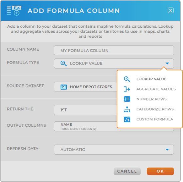
- Formula Columns: Powerful calculated columns (similar to Excel formulas) plus custom logic Excel doesn’t offer.
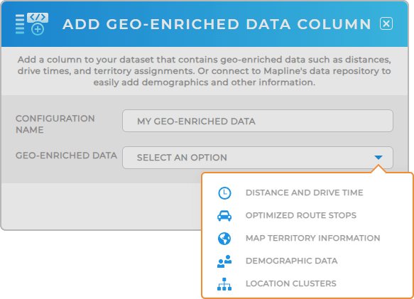
- Geo-Enriched Columns: Columns enriched by Mapline using proprietary geographic and demographic data.
- Meta Data Columns: System-level columns that pull in metadata such as user information.
- Button Columns: Action-based columns (not new).
- File Columns: File attachment columns (not new).

This structure makes it easier to distinguish between:
- What you control
- What Mapline enriches
- What’s calculated
- What’s system-driven
And that clarity translates directly into smarter data decisions.
Formula Columns: Beyond Excel
If you love Excel logic, you’re going to love this.
Formula Columns allow you to create calculated fields inside Mapline—just like Excel formulas, but with expanded functionality tailored to geographic and operational workflows.
You can:
- Build revenue projections
- Calculate drive-time efficiency ratios
- Create performance scoring models
- Apply conditional logic for dynamic categorization
- Run calculations Excel doesn’t support natively in mapping contexts
Instead of exporting data, calculating elsewhere, and re-importing, your intelligence now lives directly inside your map. Your dashboards update instantly. Your routes respond in real time. Your decisions move faster.
This is operational math, built for geographic action.

Geo-Enriched Columns: Nuilt-In Proprietary Intelligence
Geo-Enriched Columns are where Mapline’s proprietary data engine shines.
These columns allow Mapline to enrich your dataset with exclusive geographic data, such as:
- Demographics
- Population statistics
- Income levels
- Market density indicators
- And more
This isn’t data you uploaded. This is intelligence layered on top of your data.

By distinguishing Geo-Enriched Columns, you can easily see what insights are powered by Mapline’s data ecosystem versus what originated in your own dataset. That transparency gives you greater flexibility in managing credits and greater confidence in your analytics.
It also makes it easier to explain your reporting to stakeholders. You’ll know exactly what’s internal and what’s enriched.
How to Use This to Drive Smarter Decisions
Clearer column structure isn’t just cosmetic; it changes how you work.
When you know which columns are raw data, calculated data, enriched data, or system metadata, you can design smarter workflows. Sales teams can build scoring models using Formula Columns layered on top of Geo-Enriched demographics. Operations managers can create automated performance tracking tied to Meta Data Columns. Marketing teams can dynamically segment territories based on proprietary enrichment factors.
Instead of static spreadsheets, you get a live intelligence engine.
This structure also improves auditability. When reviewing dashboards or presenting insights, teams can quickly identify where numbers originate. That level of transparency builds trust internally and externally.

Unlocking Operational Flexibility and Credit Control
One of the most powerful advantages of this repositioning is control.
By clearly separating Geo-Enriched Columns from standard Data Columns, you can intentionally decide when to apply enrichment, where to apply it, and how deeply to analyze.
For organizations managing multiple users, this clarity simplifies governance. Admins can confidently oversee datasets, automation triggers, and dashboard logic without second-guessing what powers each field.
More visibility. More flexibility. More ownership.

How to Start Using the New Column Structure Today
Now that Mapline Data is clearly re-categorized, you can apply these column types strategically across your workflows. Whether you’re refining dashboards, optimizing territories, or building automations, these distinctions make your data architecture more intentional. Here’s how you can put it into action:
- Create Formula Columns to build scoring models, KPIs, and operational metrics directly inside your dataset
- Use Geo-Enriched Columns to identify high-potential markets and prioritize territories
- Leverage Meta Data Columns to track user-based reporting and workflow ownership
- Combine enrichment + formulas to build weighted opportunity indexes
- Add calculated fields to dashboards for real-time performance monitoring
- Use column distinctions to better manage and forecast credit usage
- Standardize reporting by clearly separating internal vs enriched data

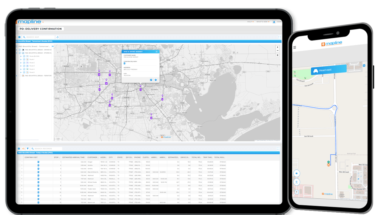
Your maps don’t just display data anymore. They calculate, enrich, and activate it.
No. Your dashboards will continue functioning exactly as they did before. This update reorganizes and clarifies column types — it does not remove or invalidate existing data, and it does not change your existing elements in Mapline.
Aside from the UI interface, no visual changes will occur to your maps unless you choose to modify your datasets. The update is structural and organizational, not disruptive.
Note: All former “Mapline Data” functions now live within your dataset. To add demographics or other geo-enriched insights directly to a map territory, click the territory layer, select View Data, and create a new Geo-Enriched Data Column from the dataset. This ensures your enriched data powers both your maps and your reporting workflows.
No. Everything continues to work as expected. You can simply begin taking advantage of the clearer structure moving forward.
No. Automations continue to run normally. Column categorization does not interrupt automation logic.
It’s more than a rename. While existing columns remain intact, they are now clearly categorized into defined types that distinguish calculated, enriched, metadata-driven, and user-controlled fields.
The biggest change is the UI interface and where things are located (click the blue plus ‘+’ sign in your dataset to add different data column types).
Not yet, but this expansion will allow us to introduce new types of geo-enriched data in the future, such as traffic and weather data. Stay tuned for more updates soon!
This update brings clarity, flexibility, and control to how your data operates inside Mapline. By clearly defining column types, you gain better visibility into what powers your insights — and more strategic ownership over how you build them.
In other words… your data hasn’t changed. But your control over it has. That’s an upgrade in itself!


