In competitive markets, understanding where your business is gaining traction—and where you’re being crowded out—is essential. Market saturation analysis helps companies identify over-served areas, discover geographic gaps, and strategically plan for growth. With custom pin mapping tools, teams can visually analyze saturation by plotting customer locations, competitor sites, or store footprints on a shared map. The process is fast, clear, and scalable—especially when you can map multiple locations in seconds. Here’s how to use Mapline to create a custom map with pins and unlock new growth opportunities through spatial data.
Why Visual Saturation Analysis Matters
Knowing where your business operates isn’t enough—you also need to understand how that presence stacks up against competitors, customer density, and market potential. Visualizing this on a map makes patterns obvious that would otherwise hide in spreadsheets. Are you clustering too many stores in one region? Are your competitors dominating an area with no presence from your team? With a custom location mapping solution, these questions are answered at a glance. This visibility allows leaders to take immediate action—whether it’s reallocating resources, adjusting coverage areas, or optimizing marketing efforts.


Pro Tip: Need to analyze your current market reach? Use Mapline’s Geo Mapping tools to create a custom map with pins and apply filters for competitor saturation, rep assignments, or performance tiers—all in one view.
How to Create a Custom Map With Pins
Building a pin map starts with your location data. Whether it’s customer addresses, sales activity, competitor stores, or retail site plans, all you need is a simple spreadsheet. Once uploaded, Mapline’s mapping tools for business make it easy to drop pins for each address and apply visual cues like color, shape, and grouping. You can categorize pins by business type, rep ownership, revenue tier, or any field in your dataset. From there, zoom in on specific markets, view saturation patterns, and adjust strategy accordingly. In just minutes, you’ve turned static data into powerful geospatial insights.
Upload and Plot Multiple Locations
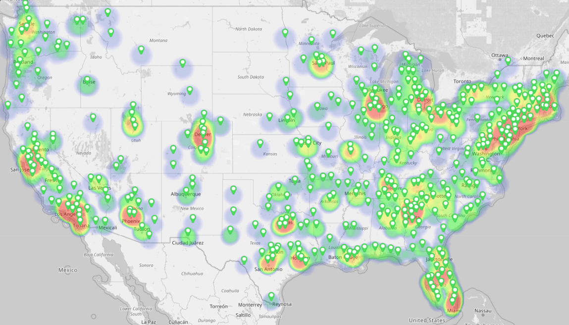
Start by uploading a CSV or Excel file with all relevant location data. Mapline’s address plotting software geocodes the addresses and drops a pin for each one onto a live map. With no coding required, your team can map hundreds—or thousands—of locations in seconds. It’s perfect for businesses tracking field teams, retail stores, partner sites, or even service areas across multiple territories.
Customize Pins by Category or Performance
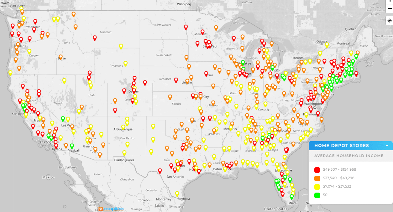
Once your pins are mapped, apply customizations to make your map easier to read and interpret. Use color or shape variations to differentiate store types, territory owners, performance bands, or any segment of interest. This step turns your business pin mapping into a true analysis tool—allowing for quick pattern recognition and deeper insight into what’s working and where change is needed.
Layer Competitor or Partner Locations
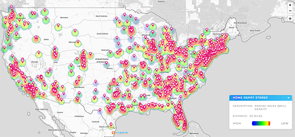
For a more complete market saturation analysis, add layers for competitor locations, franchise partners, or known market barriers. Viewing your pins alongside others offers valuable context and identifies areas of saturation or opportunity. Mapline makes it easy to overlay external datasets, giving your internal planning team the full geographic picture.
Use Case Examples of Pin Mapping for Saturation
Businesses across industries rely on visual pin maps to assess growth potential and avoid oversaturation. Whether you’re expanding a retail chain, assigning field reps, or analyzing healthcare outreach, a custom map with pins offers real-world guidance for territory planning and resource alignment. Below are several ways Mapline customers use this feature to sharpen strategy.
Retail Store Expansion
Retail brands often use pin maps to identify optimal locations for new stores. By mapping current sites alongside competitor locations and customer density, they can determine where the brand is oversaturated and where market whitespace exists. This keeps expansion efforts focused, profitable, and aligned with long-term goals.

Field Rep Allocation
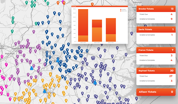
Sales and service teams use pin mapping to analyze rep distribution by region. If one rep is managing 20 customers in a crowded urban area and another is spread thin across rural zip codes, productivity and satisfaction can suffer. Mapping these patterns allows managers to rebalance coverage and align resources where they’re needed most.
Healthcare Service Planning
Healthcare organizations and nonprofits use custom maps to visualize patient reach and identify underserved areas. By mapping clinics, community centers, and outreach events, teams can spot coverage gaps and deploy services accordingly. This ensures programs are equitable and efficient—maximizing community impact.
Making Saturation Maps Actionable
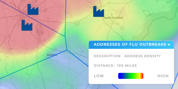
Once your pins are live, the next step is drawing insights and taking action. Use grouping filters and summary metrics to quantify density by region. Adjust visibility to view individual reps, markets, or store types separately. With Mapline’s competitive coverage map features, you can even simulate territory changes or forecast new site impacts. The goal is to turn visual awareness into tactical improvements. And with cloud-based sharing, your entire team can work from the same real-time map—fostering collaboration and alignment.
A pin map is a visual representation of location data where each address is marked by a pin on the map. Businesses use them to track customers, competitors, reps, or assets across territories.
With Mapline, you can upload your Excel file and automatically generate pins for each address. The tool geocodes each row and plots the data instantly—no formulas or coding required.
Market saturation analysis examines how crowded a market is with similar businesses or services. Mapping helps visualize where your brand is overrepresented—or where new opportunities may exist.
Yes, Mapline lets you color-code, reshape, or group pins based on any data column—like performance, ownership, type, or region—so you can instantly identify patterns and segments.
Maps provide instant clarity, while spreadsheets can hide geographic trends. Visual mapping tools help teams make faster, more strategic decisions based on real-world patterns.


