In today’s fast-moving world, static reports just can’t keep up. Businesses need instant insights—data that moves, updates, and tells a story in real time. That’s where dynamic dashboards come in. Unlike traditional reports, a dynamic dashboard updates automatically as new data flows in, empowering teams to act faster and smarter. Whether you’re managing a Business Central dashboard, monitoring KPIs in Power BI, or building a smart dashboard in Mapline, the goal is the same: simplify complex data into interactive visuals that fuel confident decisions.
Mapline takes dynamic dashboards to the next level by connecting live datasets, geographic insights, and automation tools—all in one view. From interactive sales dashboards that highlight top-performing territories to smart data analytics that predict trends before they happen, Mapline turns everyday metrics into a real-time control center for your business.
What Is a Dynamic Dashboard?
A dynamic dashboard is an interactive, real-time display that automatically updates as your data changes. Unlike static dashboards that require manual refreshes, dynamic dashboards continuously pull in new information from connected sources like Excel, Google Sheets, CRMs, or business intelligence systems. This ensures teams always have access to the most current metrics, trends, and performance indicators. Dynamic dashboards can show everything from live sales numbers to territory performance, helping decision-makers react quickly and accurately. With Mapline, businesses can go beyond traditional visuals—combining spatial data, charts, and KPIs into one intelligent dashboard that adapts the moment new data arrives.
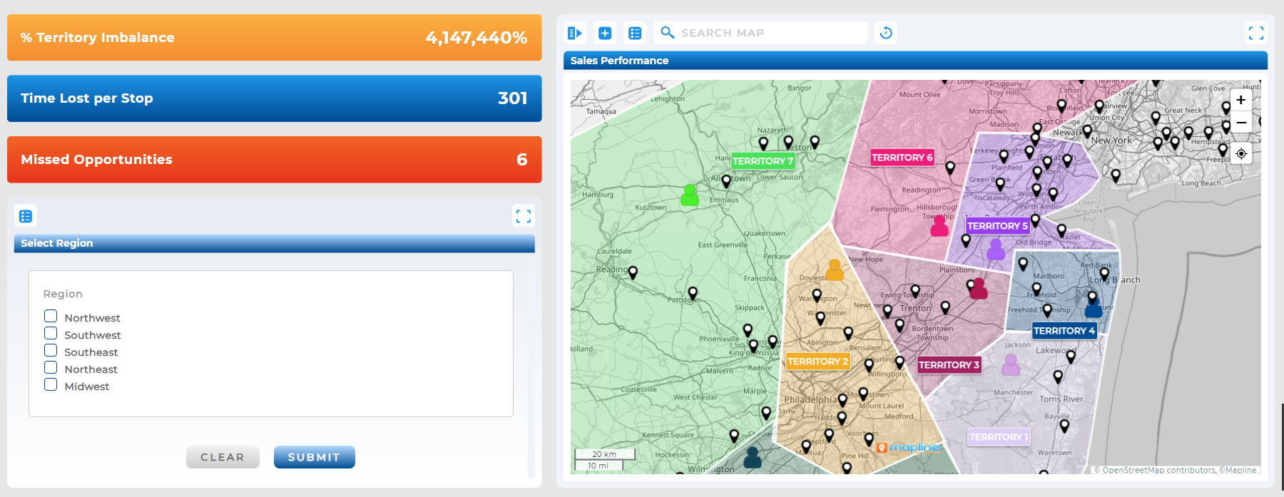

Pro Tip: Connect your existing spreadsheets or CRM data to Mapline’s dynamic dashboards to instantly turn raw numbers into insights. Try creating a live sales or delivery dashboard with Geo Mapping that updates every time new data hits your source—it’s the fastest way to see ROI from your data strategy.
How Dynamic Dashboards Drive Better Decisions
Dynamic dashboards transform the way organizations make decisions. By providing a clear, real-time snapshot of operations, they help leaders identify trends, spot inefficiencies, and track progress instantly. For example, a logistics manager can view fleet performance live on a smart dashboard, while a sales executive monitors regional growth without waiting for end-of-month reports.
The key advantage is context—numbers alone mean little without visual clarity. With Mapline’s Geo BI platform, businesses can connect maps, charts, and metrics together to visualize what’s really happening across locations. This blend of geographic and operational data makes it easier to prioritize high-impact actions and respond before issues escalate.
Dynamic Dashboard Examples
Dynamic dashboards come in many forms, each designed to visualize data in a way that supports faster, smarter decisions. From sales performance to field operations, these dashboards give teams a clear, live view of what’s happening across every department. Unlike static reports that only provide snapshots, dynamic dashboards update automatically as new data comes in—so insights are always current. Whether your goal is to track KPIs, monitor customer activity, or oversee logistics in real time, Mapline’s dashboards adapt to any use case. Below are a few examples of how businesses use Mapline’s dynamic dashboards to simplify workflows, improve visibility, and drive measurable results.
Sales and Performance Dashboards
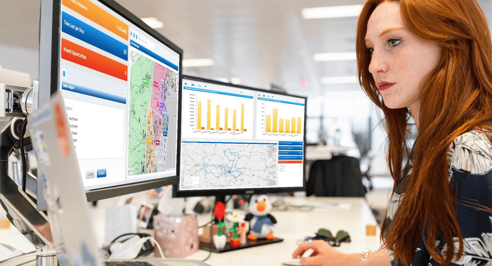
Monitor sales performance, territory growth, and customer distribution in real time. Mapline’s dashboards allow you to segment by region, track KPIs, and visualize which territories drive the most revenue—all with instant updates.
Operations and Logistics Dashboards
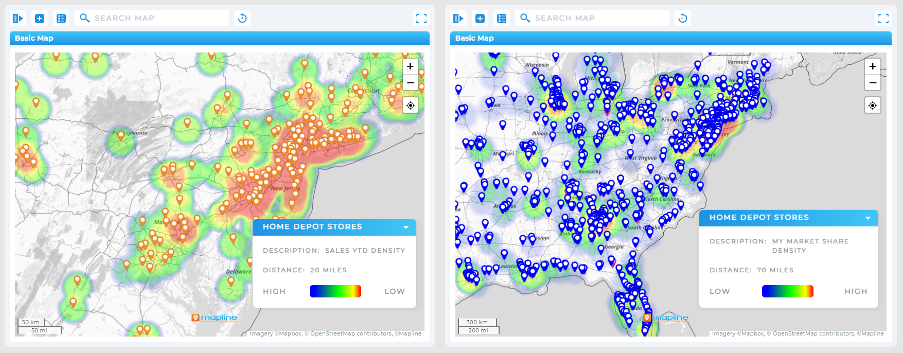
Manage field teams, routes, and delivery schedules from one dashboard. Mapline’s real-time dashboards pair with Geo Routing to display current driver locations, route progress, and delivery times as they happen.
Marketing and Customer Analytics Dashboards
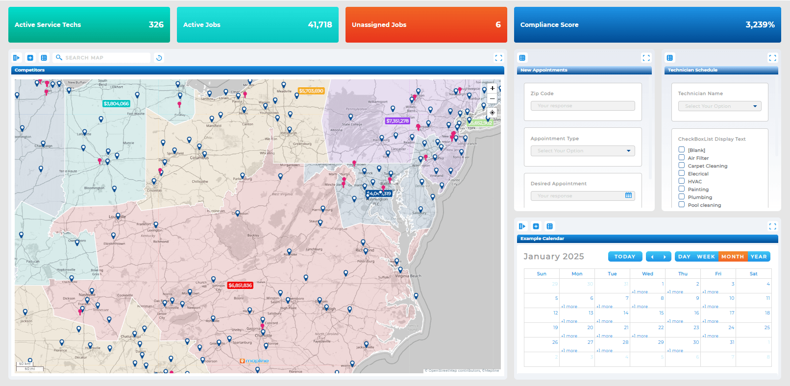
Understand campaign reach, customer demographics, and conversion trends through live visuals. Mapline integrates with CRMs and ad platforms, turning marketing data into actionable insights you can act on daily.
Executive Dashboards
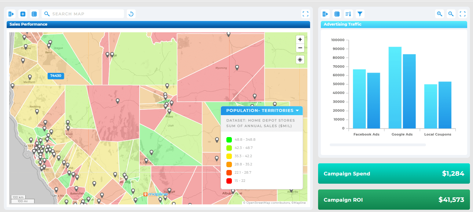
Bring every department into one central view. Mapline connects multiple datasets—from finance to HR to logistics—so leadership can monitor key metrics at a glance and make informed, cross-functional decisions.
How Different Industries Use Dynamic Dashboards
Dynamic dashboards are transforming the way organizations operate across every sector. By turning live data into actionable visuals, they help teams make faster, smarter decisions grounded in real-time performance. From logistics to finance, nearly every industry can benefit from seeing key metrics evolve as they happen—without waiting for static reports or manual updates.
Logistics and Transportation
For logistics companies, timing and visibility are everything. Dynamic dashboards in Mapline show live route progress, driver locations, and delivery status, helping dispatchers make immediate adjustments to avoid delays. Fleet managers can track mileage, fuel costs, and maintenance schedules in one place while visualizing which routes perform most efficiently. With real-time updates, issues like late deliveries or equipment downtime can be addressed before they impact customers.

Retail and Sales
Retailers use dynamic dashboards to monitor store performance, inventory levels, and regional sales patterns as they shift throughout the day. By connecting Mapline dashboards to point-of-sale or CRM data, leaders can instantly see which territories are trending up or underperforming. This visibility allows for rapid restocking decisions, dynamic promotions, and smarter regional targeting—turning sales analytics into a live growth engine.
Field Services and Utilities
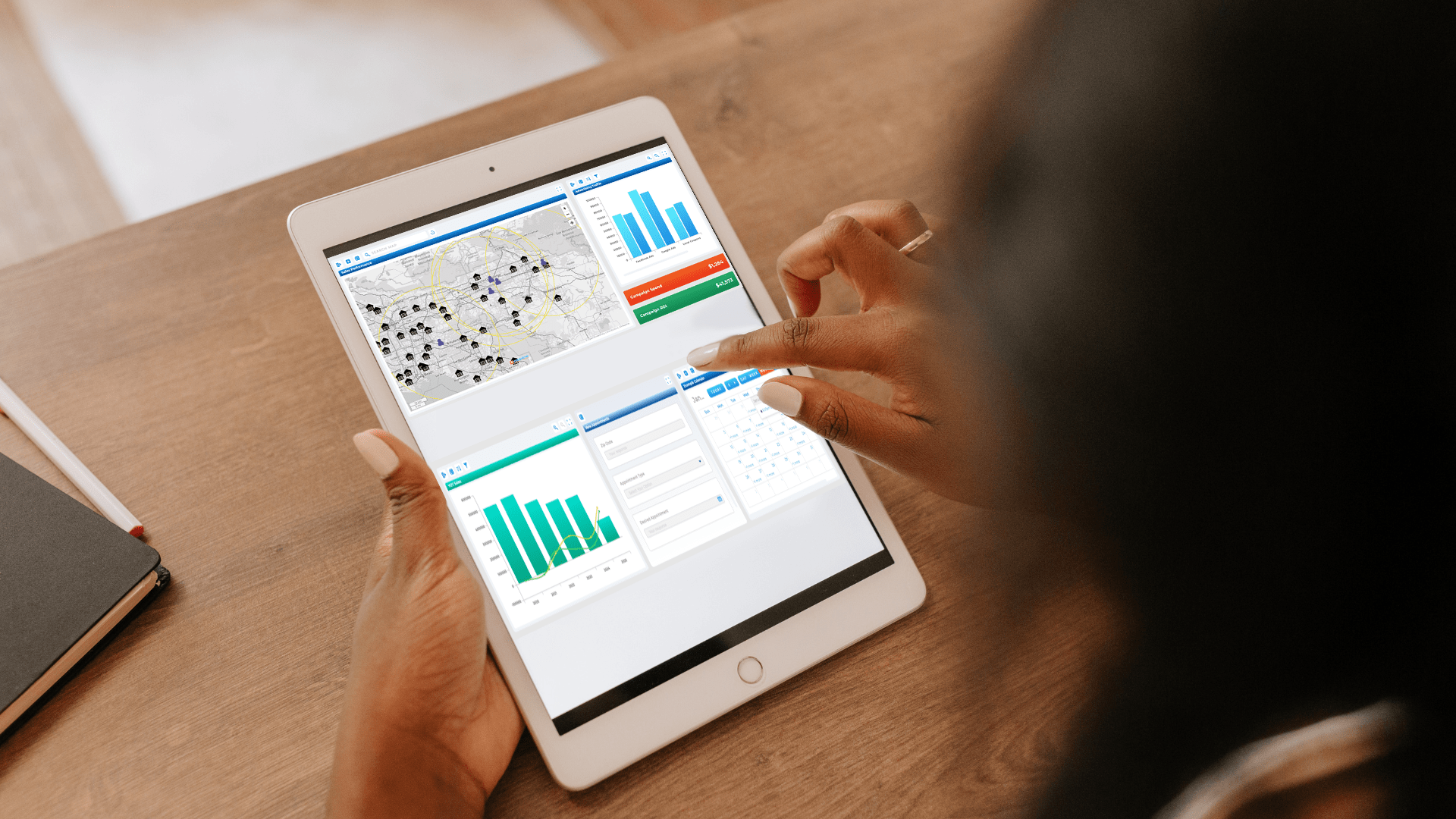
For organizations managing large service teams, dynamic dashboards display technician assignments, job completion rates, and time-on-site metrics. Mapline’s Geo Routing integration allows managers to visualize service coverage areas, detect gaps, and optimize scheduling in real time. Instead of waiting for end-of-day reports, supervisors can see where technicians are, what jobs are completed, and how efficiently each region is operating.

Manufacturing and Supply Chain
Manufacturers use dynamic dashboards to monitor production lines, supply levels, and delivery timelines from multiple facilities. When paired with geographic mapping, Mapline visualizes supplier networks and distribution hubs, revealing bottlenecks and performance trends across plants or warehouses. This live visibility ensures that supply chains stay agile and responsive to market demand.

Healthcare and Public Services
Hospitals, clinics, and public agencies depend on up-to-the-minute data for staffing, patient flow, and resource allocation. Mapline’s dashboards connect live data from multiple sources to track patient volumes, appointment scheduling, and equipment utilization across facilities. With dynamic dashboards, administrators can anticipate shortages, streamline operations, and make informed decisions that directly improve service quality.

Finance and Operations
Dynamic dashboards give finance and operations teams an instant, consolidated view of budgets, forecasts, and KPIs. Mapline’s real-time dashboards pull data from accounting systems and performance metrics into one interactive interface, allowing executives to monitor expenses, profit margins, and revenue targets as they evolve. When financial data is visualized geographically, organizations can even identify which regions contribute most to profitability.

How Mapline Simplifies Smart Data Analytics
Traditional BI platforms like Tableau or Power BI require heavy setup and constant maintenance. Mapline eliminates that friction with a plug-and-play interface that links directly to your data sources. You can create dashboards that display live metrics, charts, and mapped visuals—all in minutes, not days.
What sets Mapline apart is how seamlessly it merges Geo Mapping with smart data analytics. Instead of just seeing numbers, you see where they happen, why they matter, and how they change over time. That level of visibility empowers every department—sales, operations, marketing, or logistics—to make real-time, data-backed decisions.
A dynamic dashboard is a live, interactive display that automatically updates when your data changes. It connects to real-time data sources like spreadsheets, CRMs, or business intelligence tools, allowing teams to make faster, more accurate decisions without manual refreshes.
Static dashboards show a fixed snapshot of data at one point in time, while dynamic dashboards refresh automatically as new information becomes available. This makes them ideal for tracking KPIs, sales, or operations that change throughout the day.
Yes. Mapline makes it easy to create dynamic dashboards that combine maps, charts, and key metrics into one view. Your dashboards automatically update whenever your connected data sources—like Excel, Google Sheets, or CRM systems—change.
You can visualize sales performance, delivery routes, customer activity, regional trends, marketing campaigns, or any business metric that benefits from real-time visibility. Mapline’s dynamic dashboards work seamlessly with both spatial and tabular data.
Dynamic dashboards help leaders monitor live performance metrics, identify emerging trends, and make informed decisions instantly. By displaying critical insights visually, teams can act faster and stay aligned with company goals.
Absolutely. Mapline supports a wide range of integrations, allowing you to pull live data from popular business tools and visualize it in one unified dashboard. This ensures consistent, up-to-date insights across every department.
Yes. Mapline uses secure data connections and permission-based sharing, so only authorized users can view or edit dashboards. You control access at every level—from teams to individuals.
Yes. Dashboards can be shared via link, embedded in presentations, or exported for reports. You can even create live dashboards that refresh automatically for stakeholders or clients.


