- Blog
- Geo Mapping
- Heatmap Analytics vs. Traditional BI: What’s the Difference?
Business leaders have no shortage of data—but turning that data into insight is a different challenge entirely. Traditional BI dashboards have long been the go-to, but there’s a new approach gaining traction: the heatmap analytics tool.
While BI platforms organize and report on metrics through tables and charts, heatmap tools reveal location-based trends at a glance. For teams dealing with territory management, customer density, or performance by region, heatmaps unlock a level of visual clarity that static dashboards just can’t match.
What Is a Heatmap Analytics Tool?
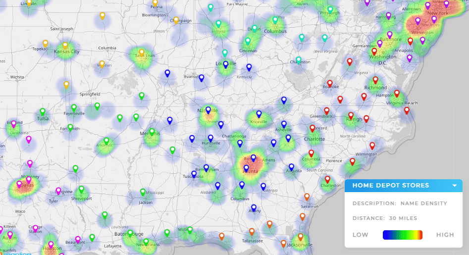
A heatmap analytics tool visualizes data geographically, showing intensity or frequency using gradients of color. Whether it’s plotting customer density, order volume, or resource usage, the goal is simple: make patterns instantly visible—so decisions can be made faster.
Instead of reading rows of data or interpreting complex graphs, users can see exactly where things are happening—and where they aren’t.


Pro Tip: Don’t just visualize your data—put it to work. With Mapline, you can turn heatmaps into actionable strategies by layering sales data, assigning territories, and identifying growth opportunities in seconds. It’s more than a map—it’s a decision-making engine.
Traditional BI Tools: Power and Limitations
Platforms like Power BI and Tableau are built for deep, customizable reporting. They’re powerful—but not always user-friendly. Building a heat map Power BI visualization or creating a heat map in Tableau takes time, expertise, and clean data pipelines.
They work well for technical teams, but for frontline managers who need quick geographic insights, these tools can slow down the decision process. Even a geographical heat map in Power BI often requires a steep setup and ongoing maintenance.
Heat Map Sales Insights for Performance Tracking
Heat Map Sales
Sales teams thrive on visibility. A heat map sales view can show which regions are closing deals, which reps are hitting targets, and where there’s untapped potential.
Overlaying sales data onto a map connects the dots between:
- Sales performance tracking
- Sales KPIs
- Sales metrics
- Key sales metrics
Instead of scanning reports, teams can spot trends and act quickly—from reallocating reps to identifying growth zones.
Heat Map for Logistics and Operations
Heat Map Logistics
For logistics teams, efficiency is everything. A heat map logistics layout shows areas with heavy delivery volume, delayed shipments, or underserved regions.
Logistics Heat Map
With a logistics heat map, operations managers can instantly visualize:
- Shipping frequency by ZIP code
- Hub-to-destination travel time
- Pickup and drop-off bottlenecks
This kind of location-aware insight can help reduce costs and improve service speed without needing a full BI overhaul.
Understanding Population and Demographic Trends
Population Heat Map
Whether you’re a nonprofit planning service expansion or a retailer deciding where to open your next location, a population heat map shows where people are—and how densely they’re concentrated.
Heat Map of Population Density
A heat map of population density provides a strategic view of target markets and underserved zones. This allows teams to layer customer or prospect data over existing demographics and plan with precision.
Heatmap Analytics Tool vs. Traditional BI Dashboards
Here’s how heatmap tools stack up against traditional BI platforms:
| Feature | Heatmap Analytics Tool | Traditional BI (e.g., Power BI, Tableau) |
|---|---|---|
| Ease of Use | Simple, fast setup | Requires training and data modeling |
| Geographic Visualization | Built-in location mapping | Manual setup required |
| Ideal For | Sales, logistics, market planning | Complex reporting and BI dashboards |
| Speed to Insight | Minutes | Hours or days |
When to Use a Heatmap Analytics Tool
Here are scenarios where a heatmap analytics tool delivers more value than a traditional dashboard:
- Visualizing sales activity by ZIP code or region
- Planning service coverage based on order volume
- Tracking customer density for market expansion
- Assessing logistics routes and delivery zones
These use cases require clarity and speed—exactly what heatmaps are built for.
Conclusion
Traditional BI tools are powerful for in-depth reporting, but they aren’t always the best fit for fast, location-based insights. A heatmap analytics tool offers a faster, clearer path to understanding geographic patterns in your sales, operations, or market strategy.
If your business depends on territory management, logistics planning, or visualizing key sales metrics, a heatmap tool gives you the edge to act faster and plan smarter—without the BI baggage.


