A great metrics dashboard doesn’t just display data — it tells a clear, intuitive story that anyone on your team can follow. When dashboards are cluttered, inconsistent, or overly technical, they create confusion instead of clarity. But when dashboards are thoughtfully designed, they unify teams, simplify decision-making, and make insights accessible to everyone from executives to frontline staff. Mapline makes dashboard building simple, flexible, and visual so you can turn your data into an easy-to-read operational command center. With a few smart choices in layout, visualization, and structure, you can build a dashboard that drives real action instead of overwhelming your team.
Start With the Metrics That Matter Most
The best dashboards begin with a clear sense of purpose. Instead of including every metric available, choose only the KPIs that directly support operational goals. This keeps your dashboard focused and prevents users from drowning in unnecessary information. Identify which metrics reflect productivity, reliability, workload, customer experience, or process health in your organization. A dashboard becomes truly effective when every chart and number supports a meaningful outcome.
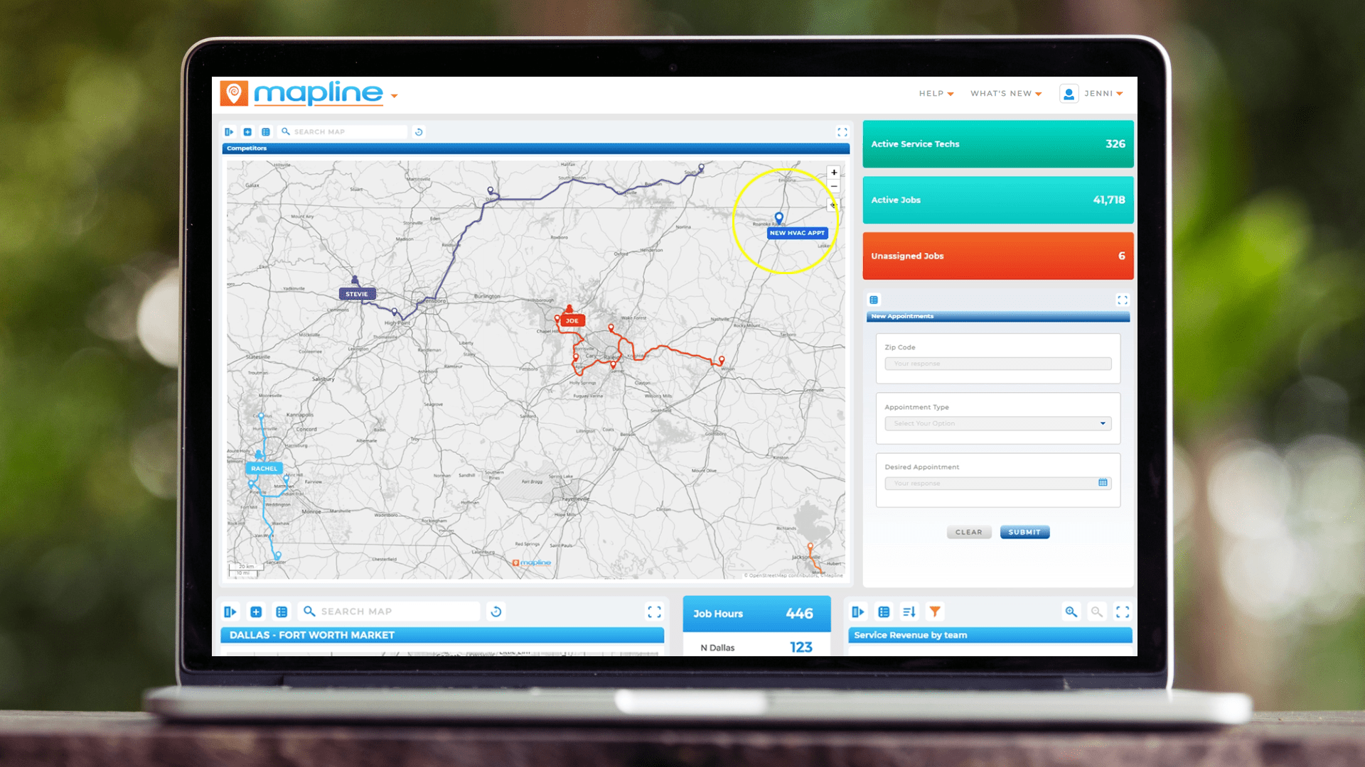

Pro Tip: Add brief text labels or descriptions beneath key visuals to clarify what each metric means. A single sentence of context can dramatically improve understanding and ensure every user interprets the data correctly.
Tie Each Metric to a Business Objective
Every visualization should answer a specific question — such as on-time performance, route efficiency, or technician productivity. When metrics are tied to objectives, users instantly understand why each KPI is relevant. This clarity helps them make faster, more confident decisions. If a metric doesn’t support action, it doesn’t belong on the dashboard.

Prioritize Real-Time Indicators
High-velocity teams benefit most from KPIs that update in real time, such as active job counts, route deviations, or live completion rates. Real-time indicators reveal emerging issues before they escalate. By keeping these KPIs front and center, your dashboard becomes a proactive decision-making tool instead of a historical report.
Use Consistent Formatting to Reduce Cognitive Load
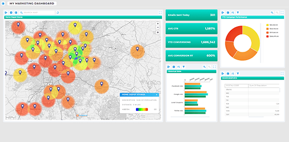
Standardize number formats, colors, and time ranges across the dashboard. Consistency helps users process information faster and prevents them from misinterpreting values. When formatting is predictable, the entire dashboard feels intuitive — even for users unfamiliar with the underlying data.
Build Your Dashboard in Mapline in Just a Few Clicks
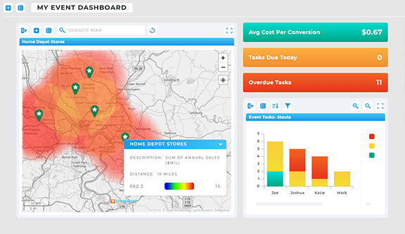
Mapline makes dashboard building fast and intuitive so teams can spend more time acting on insights instead of fighting with tools. You can assemble charts, maps, metrics, and reports into a single unified view without needing a designer or analyst. With flexible layout options and a broad range of visualizations, every team can create a dashboard that matches their workflow.
Step 1 — Create a New Dashboard
To begin, go to the ADD menu in Mapline and select NEW DASHBOARD. This creates a blank workspace where you’ll build your command center. Starting fresh gives you full control over structure and layout. From here, you can organize KPIs by category, workflow, or priority based on your team’s needs.

Step 2 — Add Visuals With the Blue Plus Button
Click the blue + sign to add your first dashboard item. You can place any visualization on a dashboard — maps, charts, summary metrics, reports, images, or text. Each element can be resized or rearranged as needed. This modular approach makes it easy to mix high-level summaries with deeper, drillable visuals. The more flexible your layout, the more valuable the dashboard becomes.

Step 3 — Connect Data and Customize Filters
Each visualization pulls from the datasets you already have in Mapline. You can add filters to refine what appears on the dashboard — such as region, technician, vehicle, date, or status. Custom filters help teams zoom in on the details that matter without overwhelming them with noise. With smart filtering, one dashboard can serve multiple teams and use cases.
Use Visuals That Are Instantly Understandable
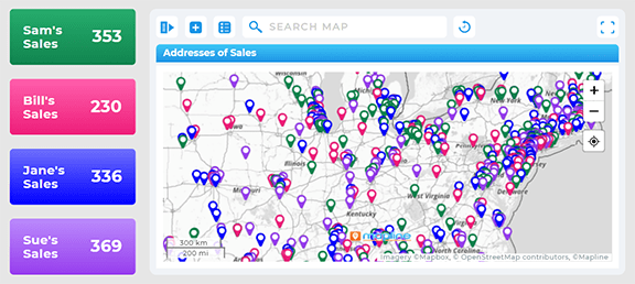
Not all charts tell the story equally well. The right visualization helps teams absorb information at a glance, while the wrong one creates confusion. Choose visuals that make patterns, gaps, and outliers easy to identify. When visuals align with how the data behaves, the dashboard becomes more intuitive for everyone who uses it — regardless of technical background.
Maps Reveal Spatial Patterns and Regional Performance
Use maps when geographic context matters — such as stop clusters, delivery coverage, or regional performance trends. Spatial insights help teams understand workload distribution and identify bottlenecks that charts alone can’t show. Maps are especially powerful for routing, scheduling, and sales operations.

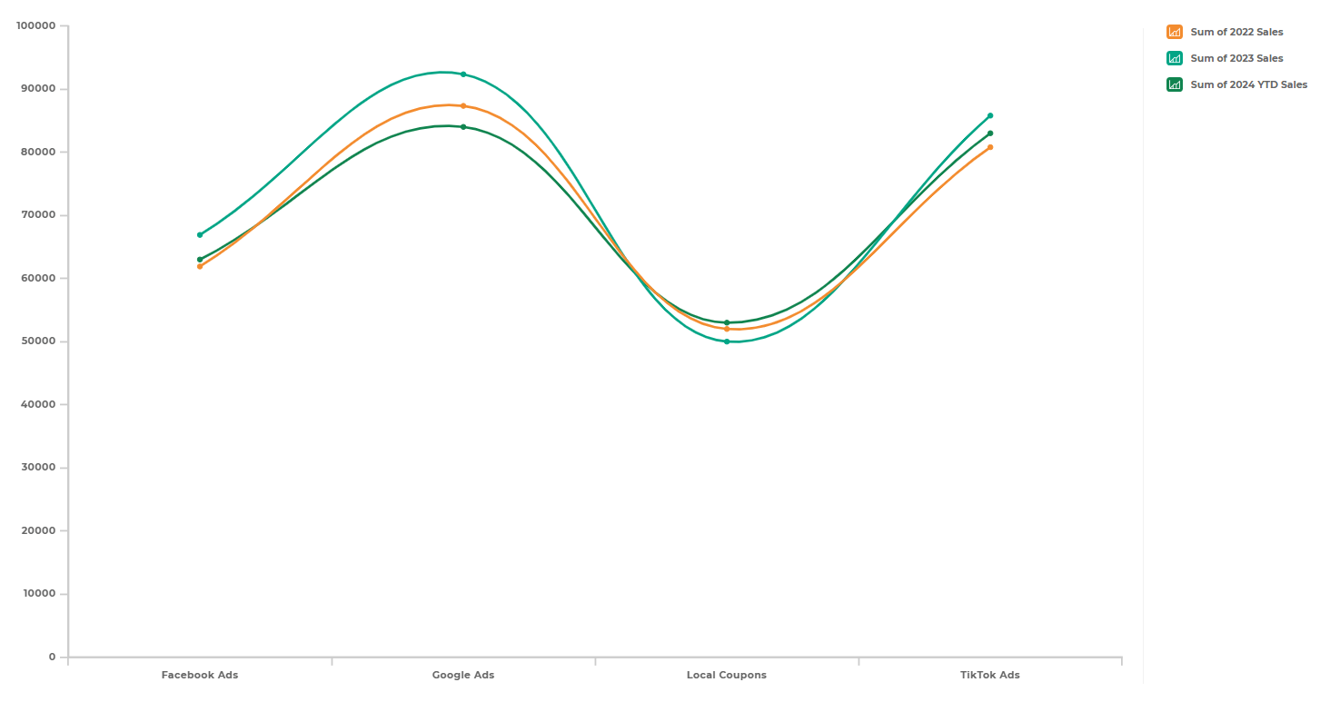
Line Charts Show Trends Over Time
Line charts are ideal for metrics that evolve daily, weekly, or hourly. They help teams see directionality — whether performance is improving, declining, or plateauing. Trendlines turn raw numbers into visual narratives that guide smarter decisions.
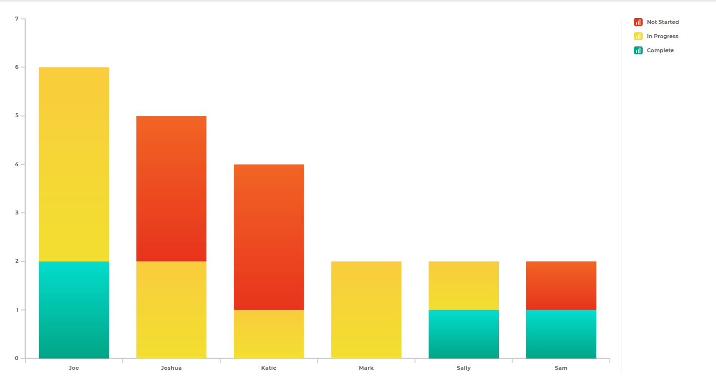
Bar and Column Charts Compare Teams, Regions, or Categories
When comparing performance across groups, bar charts offer clean, instantly readable insights. They highlight uneven workloads, productivity differences, or success rates across the organization. Visual comparisons help teams identify where intervention or support is needed most.
Single-Value Metrics Highlight What’s Most Important
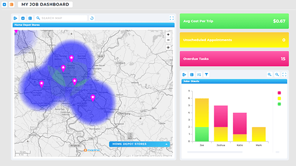
Some KPIs don’t need a full chart — they need to be seen instantly. Single-value metrics work perfectly for on-time percentage, jobs completed, or current daily volume. These visuals anchor the dashboard around high-impact numbers that everyone watches closely.
Make Your Dashboard Easier to Use With Smart Layouts
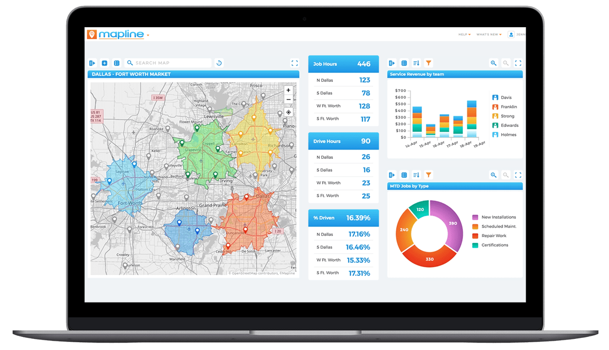
A dashboard’s structure can determine whether users understand insights quickly or get stuck deciphering them. Clear organization, logical grouping, and thoughtful spacing turn a set of charts into an actual workflow tool. With Mapline’s drag-and-drop layout, you can create a visual order that leads users through the story step by step.
Group Related KPIs Together
Place similar metrics side by side — such as productivity KPIs, quality KPIs, or routing KPIs. Grouping helps users compare patterns easily and reduces the time needed to interpret information. Logical grouping also makes dashboards easier to navigate during meetings or daily huddles.
Put High-Priority Metrics at the Top
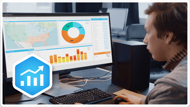
Place your most critical KPIs — on-time completion, daily volume, route deviation — at the top for immediate visibility. Lower-priority charts and deeper analysis can go beneath. Prioritization ensures that busy teams never miss what matters most. This structure keeps dashboards usable even when teams are under pressure.
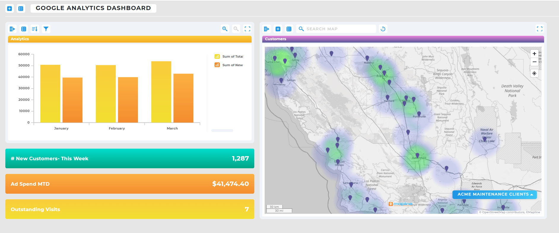
Keep the Layout Clean and Avoid Overcrowding
Too many visuals create noise and reduce clarity. A clean, spacious layout helps users understand each metric without feeling overwhelmed. White space is not wasted space — it’s a tool that improves readability and keeps the dashboard approachable for all teams.
Go to the ADD menu and select NEW DASHBOARD, then click the blue + sign to add visuals.
Maps, charts, KPI metrics, reports, text boxes, and more — any visualization you can build in Mapline.
Use consistent formatting, group related KPIs, and prioritize the most important metrics at the top.
Yes — real-time updates help teams catch issues early and react faster.
Absolutely. Use filters and logical grouping to make a single dashboard useful across departments.


