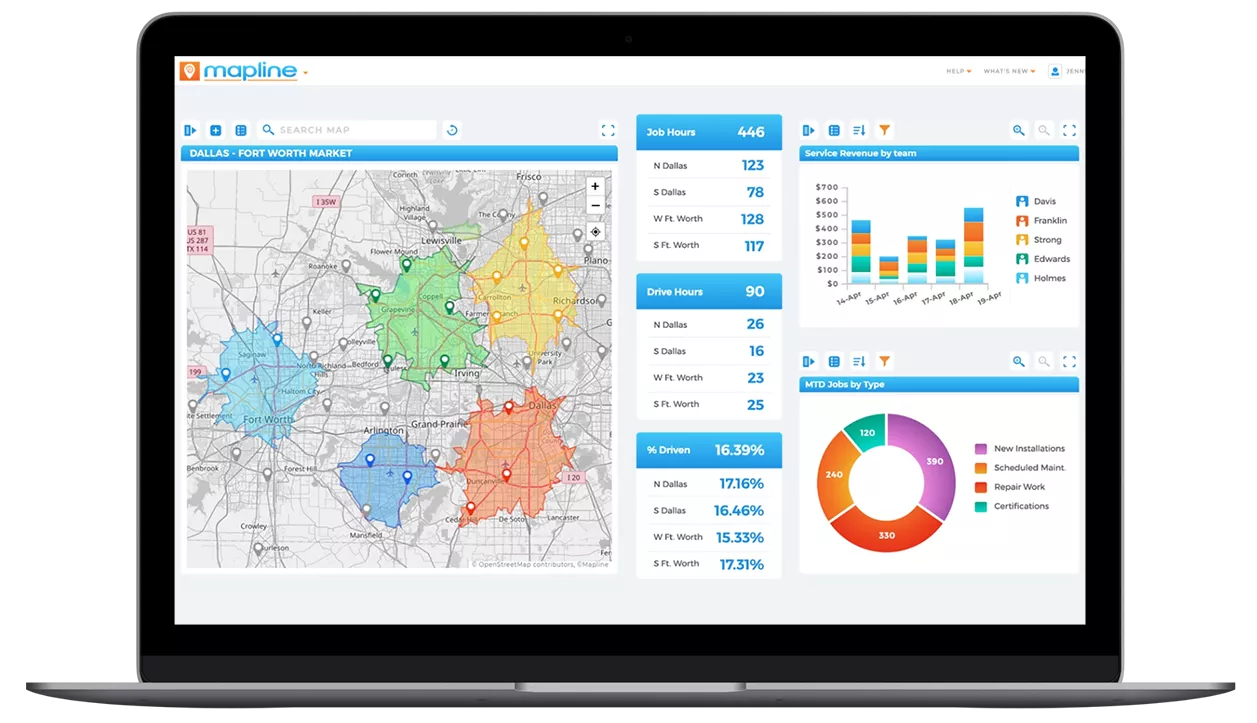
Why Every Operation Needs a Unified Command Center
When insights are scattered across multiple tools, teams spend more time searching for information than acting on it. High-volume operations — especially those involving routing, scheduling, or field teams — need a streamlined way to see what’s happening at any moment. A command center brings everything together, allowing leaders to monitor performance, spot exceptions, and coordinate across departments instantly. This unified view eliminates blind spots and helps teams make faster, more confident decisions.

Pro Tip: Build your command center in layers — start with the map, then add your KPIs, then bring in charts that explain why those KPIs move. When each layer reinforces another, you create a dashboard that makes insights obvious.
Fragmented Data Slows Down Decision-Making
Switching between mapping tools, spreadsheets, and standalone BI dashboards creates gaps in visibility. Teams hesitate, second-guess information, or waste time reconciling conflicting reports. A command center delivers clarity by consolidating all data sources in one place. With a single source of truth, operations become more efficient and reliable.

Without Maps, You Miss Critical Context
Charts show performance trends, but maps reveal the *why* behind them. Spatial patterns expose uneven workloads, regional delays, or shifting demand hotspots that are invisible in tabular data. Integrating maps into your command center ensures you see the full picture — not just the numbers.

KPIs Anchor the Dashboard Around What Matters Most
High-impact KPIs serve as the dashboard’s guiding indicators. They give teams instant awareness of operational health and show whether the day is on track or at risk. When KPIs are front and center, teams stay aligned around clear performance goals and act faster when issues arise.

Step 1: Create a New Dashboard
Open the ADD menu and select NEW DASHBOARD. This gives you a blank workspace to build your command center from the ground up. Starting fresh allows you to organize insights by category, workflow, or priority. Think of this as laying the foundation for your operational HQ.

Step 2: Add Maps Using the Blue Plus Button
Click the blue + sign and add your main map. This map becomes the visual anchor of the command center, showing live routes, territory performance, customer locations, or real-time tracking. Position the map prominently — it sets the geographic context for every metric and chart that follows.

Step 3: Layer in Charts to Tell the Performance Story
Use the blue + sign again to add trend charts, bar charts, or category comparisons. These visuals help teams understand productivity, regional differences, and time-based patterns. Pair charts with the map to explain *why* certain regions are performing better or worse. When visuals are paired strategically, operational stories become clearer and decisions easier.

Step 4: Add KPI Blocks for Instant Insight
KPI blocks (called Metrics in Mapline) spotlight the high-priority numbers your team watches daily: completion rates, active jobs, route deviation, exception volume, customer promises, or technician utilization. Place these KPIs at the top of the dashboard where they provide immediate visibility. KPIs act as the heartbeat of the command center, flagging when something needs attention.
Maps Reveal Where the Action Is
Location is often the missing variable in traditional BI. Maps show how geography affects performance — from traffic-driven delays to regional demand spikes. When teams can see routes, clusters, and territories visually, they make smarter decisions about workload balance and field coverage. The map grounds the entire command center in real-world context.

Charts Highlight Trends and Performance Shifts
Time-based charts expose patterns that maps alone can’t show. Rising backlogs, fluctuating productivity, or recurring exceptions become obvious when plotted over time. Charts help teams understand whether issues are isolated or systemic. When charts align with the map, the story becomes crystal clear.

KPIs Provide the Operational Pulse
KPIs turn complex data into a quick, scannable health check. They help teams instantly identify red flags and know where to focus. When KPIs are tied directly to visuals on the dashboard, operational leaders understand both *what* is happening and *why* — the key to fast, accurate decision-making.

Real-Time Visibility Reduces Operational Risk
When teams can see issues emerge in real time, they control outcomes instead of reacting too late. Live updates help dispatchers redirect resources, adjust schedules, and intervene early. Real-time dashboards turn operations from reactive to proactive.

Centralized Insight Improves Communication Across Teams
With everyone working from the same command center, teams avoid misaligned expectations and conflicting information. This shared visibility strengthens coordination between dispatchers, managers, and field crews. Clear communication is the foundation of operational excellence.

Smarter Decisions Drive Higher Throughput
Integrated insights reduce guesswork and improve daily performance. When teams understand workload, trends, exceptions, and geographic patterns at a glance, they make faster, more accurate decisions. Better decisions lead to smoother routes, fewer delays, and more reliable outcomes for customers.
