When most people think of heat maps, they picture website click tracking. But the google analytics heat map feature is much more powerful — it can help businesses understand where their users are coming from and how customer behavior varies by geography. By combining traffic data with mapping tools, companies gain location based customer insights that reveal how different regions perform. Instead of only knowing how customers navigate a website, leaders can see which markets engage most with their brand and adjust strategies accordingly. This approach turns basic reports into actionable intelligence that drives both better marketing and stronger UX optimization.
What Is a Heat Map in Google Analytics?
A heat map in Google Analytics is a visual representation of data intensity by region. Rather than showing numbers in a table, it highlights where traffic or engagement is strongest, using color to indicate concentration. This geographic view makes it easy to spot patterns in customer activity. For example, a business might notice high engagement in one city but low conversions in another. By understanding these patterns through a google analytics map overlay, companies can adapt campaigns, redesign content, or adjust offers to meet customer needs in specific regions.
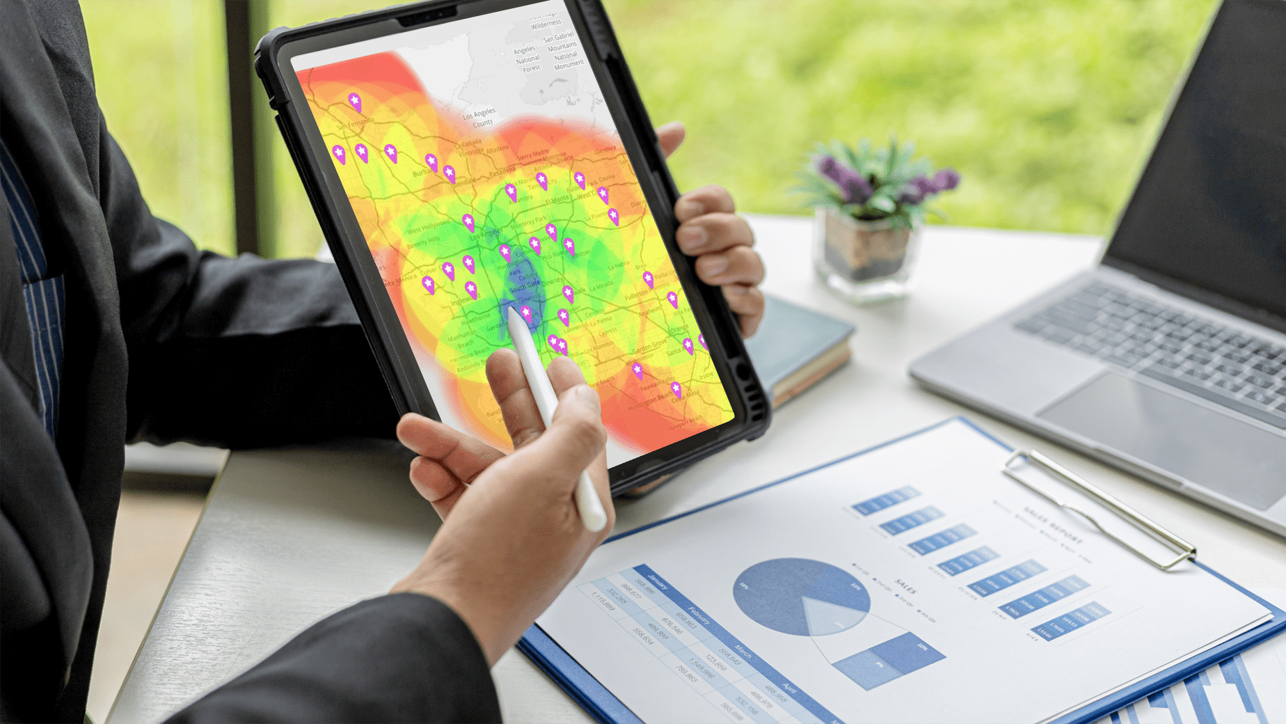

Pro Tip: Combine your google analytics heat map data with Mapline’s Geo Mapping product for deeper insights. By layering traffic patterns with sales and demographic data, you’ll transform basic reports into actionable strategies that drive growth.
Why Geographic Segmentation Matters
Traditional analytics only tell part of the story. Businesses also need to know where their audience comes from and how engagement varies across regions. Geographic customer segmentation makes this possible by grouping users based on location. The benefits of geographic segmentation are clear: companies can target campaigns more effectively, allocate resources where they’ll have the most impact, and refine customer experiences to match local preferences. When combined with geographic target market segmentation strategies, Google Analytics data becomes a foundation for better UX and stronger ROI.
Using Mapline Heat Maps for Geographic Segmentation
Heat maps are one of the easiest ways to visualize segmentation. They highlight not only where customers are, but how they interact with a brand online. This insight can be the difference between generic campaigns and targeted strategies that resonate. By building a geographic segmentation strategy, businesses can focus on the regions that matter most. Below are examples of how companies can put this into practice.
Campaign Targeting by Region
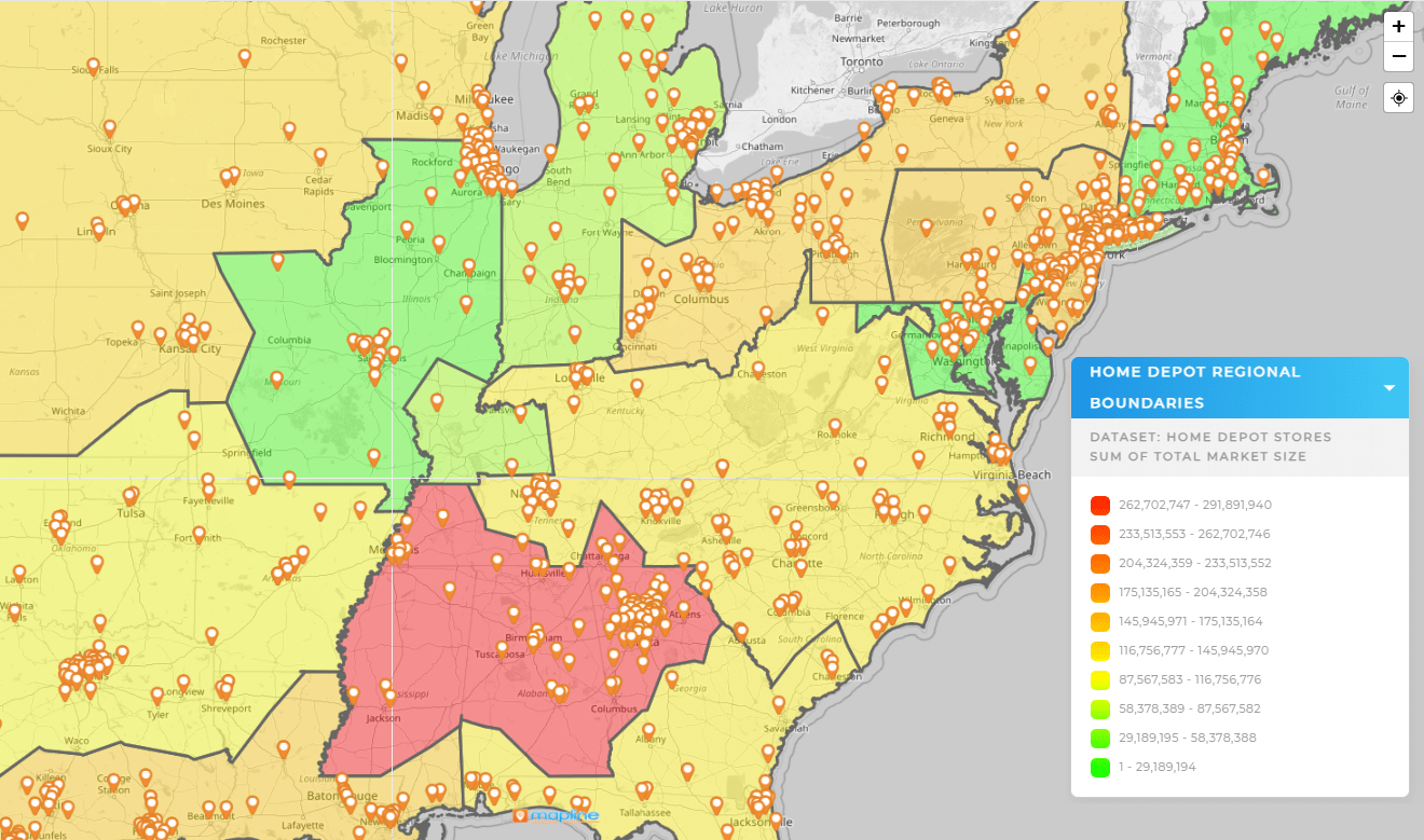
A geographic segmentation strategy example might involve identifying which states or cities respond best to specific promotions. Businesses can double down on those regions with customized messaging, while testing new approaches in underperforming areas. The heat map ensures these efforts are backed by real data, not assumptions.
Improving Conversion Rates
By comparing traffic and conversion data geographically, companies can identify regions with strong engagement but weak sales. These insights help teams adjust offers, pricing, or messaging to better meet customer expectations. This combination of geographic segmentation strategy and UX improvements often results in stronger conversion rates across markets.
Resource Allocation
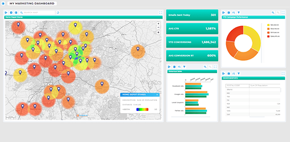
Geographic heat maps also support smarter allocation of marketing spend. Instead of spreading budgets evenly, businesses can invest more in regions with proven demand. By visualizing performance with a google analytics map overlay, leaders can make confident decisions about where to allocate resources for maximum return.
Beyond Google Analytics — Combining Data with Mapline
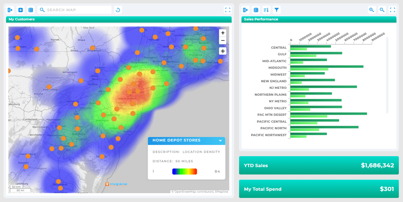
While the google analytics heat map is powerful, it becomes even more valuable when combined with external data sources. By exporting location-based insights into Mapline, businesses can merge web traffic with sales data, distribution coverage, or customer demographics. This integrated approach goes beyond surface-level reporting to uncover deeper location based customer insights. For example, a company can compare online engagement with offline store performance to find new opportunities. Mapline simplifies this process with intuitive tools for geographic customer segmentation and visualization, enabling teams to act faster and more strategically.
It’s a visualization that shows where traffic is strongest geographically, helping businesses understand customer behavior by region.
It allows companies to group customers by location, target campaigns more effectively, and improve ROI.
Yes. By showing where engagement is strong or weak, businesses can adjust strategies to improve customer experiences in specific regions.
It improves targeting, strengthens messaging, and ensures resources are allocated where they’ll deliver the greatest impact.
Focusing promotions on high-performing cities while testing new approaches in underperforming ones.
Yes. Export your data into Mapline to compare traffic with sales, demographics, or territory coverage.
Mapline provides advanced geographic customer segmentation and visualization tools, making insights more actionable.
Retail, e-commerce, logistics, and service-based businesses all gain from tailoring strategies by location.


