In today’s data-driven world, clarity is everything. Businesses collect mountains of information, but without visual context, it’s almost impossible to act on it quickly. Visual reporting transforms complex datasets into intuitive visuals—turning spreadsheets and static reports into dashboards that tell a story. By combining interactive charts, graphs, and dashboards, companies can uncover trends, track performance, and make smarter decisions with confidence.
Mapline’s visual dashboards take this a step further. Built on a foundation of Geo BI, they connect real-time data to maps, charts, and metrics—helping teams see not only what’s happening but where. Whether you’re visualizing sales trends, logistics performance, or customer activity, Mapline turns complex data into clear, actionable insight.
What Are Visual Dashboards?
Visual reporting is the process of transforming raw data into interactive visuals that reveal meaning at a glance. Instead of scrolling through spreadsheets or reading endless tables, visual dashboards let you explore data through charts, graphs, and maps. These visuals simplify complex information and make it easier to spot trends, measure performance, and communicate results.
In Mapline, visual reporting happens automatically. Every time your connected data updates—whether from Excel, Google Sheets, or a CRM—your visuals refresh in real time. The result: live insights that replace static reports with continuous, interactive intelligence.
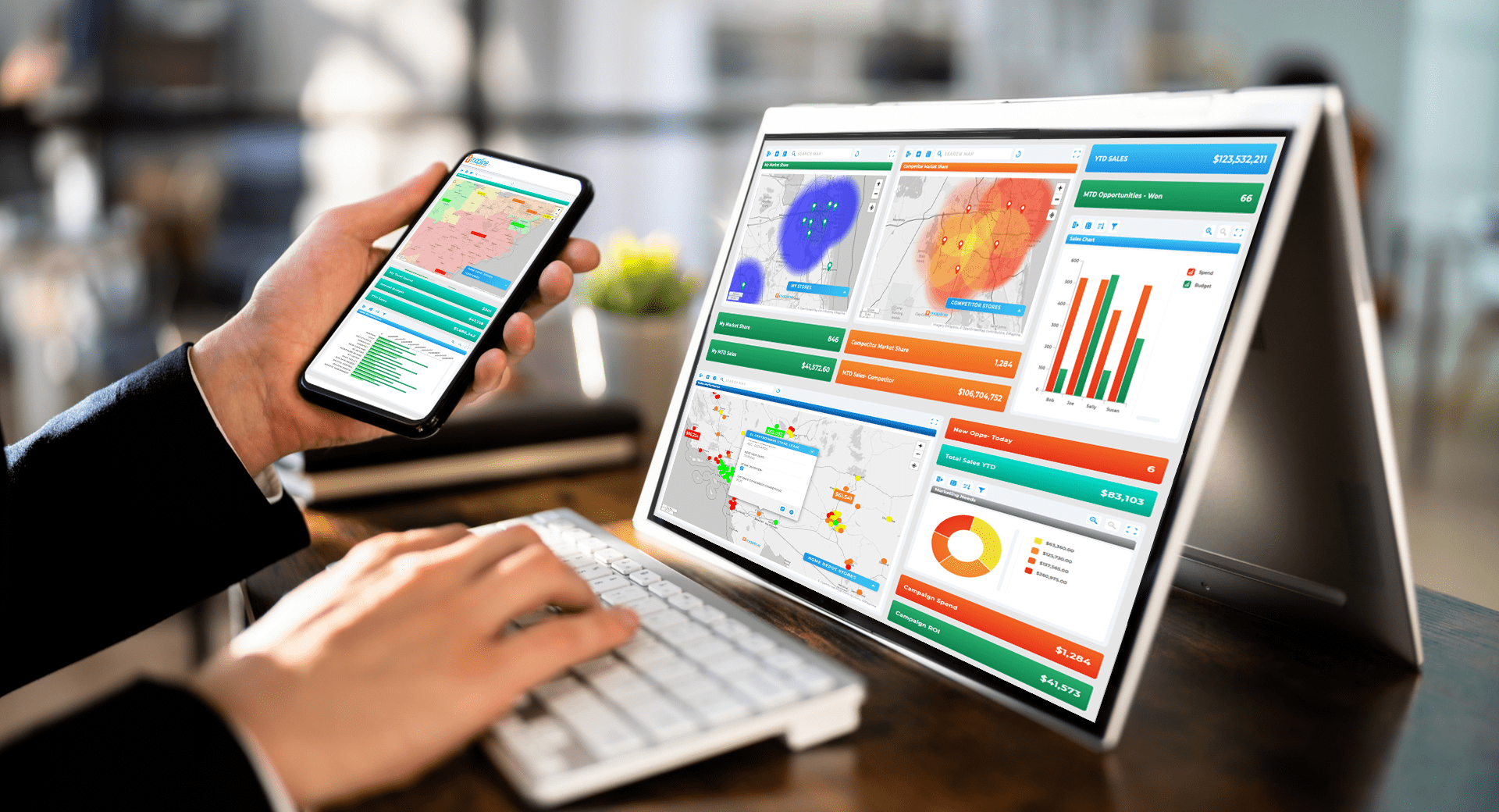

Pro Tip: When building your first visual dashboard, start simple. Choose one metric that matters most—like sales by region or on-time deliveries—and connect it to Mapline. Once your dashboard updates live, add supporting charts and filters to tell the full story behind your data.
Why Visual Dashboards Matter
Visual dashboards are the centerpiece of modern business intelligence. They consolidate charts, KPIs, and geographic data into one easy-to-read view. Instead of relying on multiple reports, users can explore everything from sales performance to regional metrics through a single interface.
Mapline’s dashboards go beyond static visuals. They’re interactive dashboards, meaning every element—chart, graph, or metric—responds to clicks, filters, and real-time data updates. This empowers teams to ask deeper questions, explore “what-if” scenarios, and uncover opportunities hidden within their data.
The Power of Interactive Charts and Graphs
Interactive visuals transform traditional reporting into a hands-on experience. Instead of passively reading static charts, users can explore data by hovering, filtering, and zooming into the details that matter most. Interactive charts and graphs make it easier to uncover hidden trends, compare results, and answer new questions in real time. In Mapline, these visuals connect directly to live datasets, so every interaction reflects the latest information. Whether you’re tracking sales, customer activity, or operational metrics, interactive reporting turns observation into action—and makes your data work harder for you.
Interactive Charts
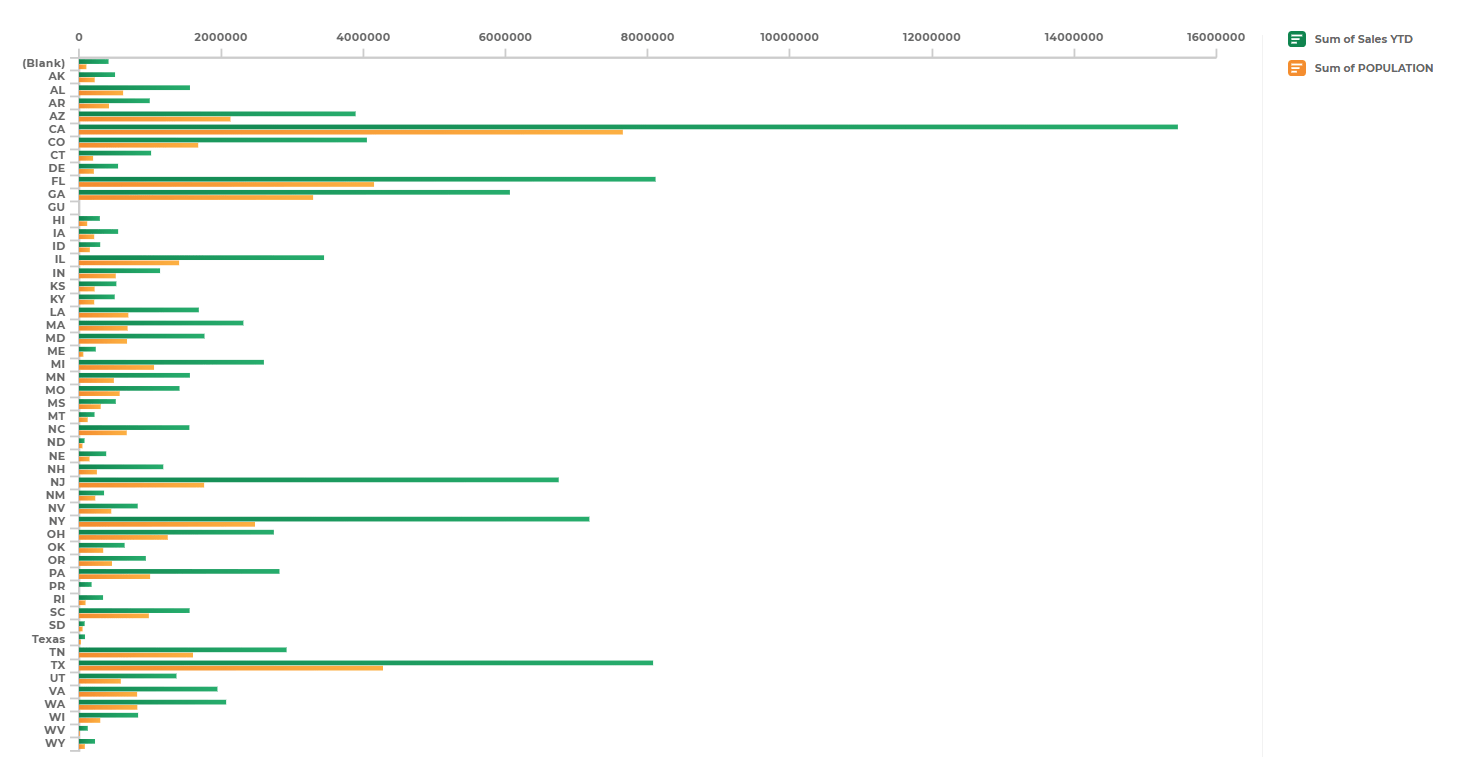
Interactive charts turn traditional reporting into a dynamic experience. Users can hover over data points, filter results, and zoom into time periods or regions for granular insight. Mapline’s interactive chart maker lets you visualize trends instantly—no coding or design skills required. Each chart updates in real time as data changes, ensuring decisions are always based on the most current information.
Interactive Graphs
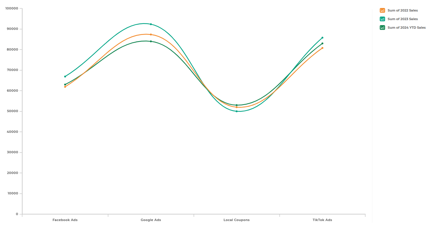
An interactive graph helps you see relationships between metrics—like how marketing spend influences sales or how delivery time affects customer satisfaction. With Mapline’s interactive graph maker, you can track these relationships visually and even overlay them on geographic maps for deeper spatial context. These graphs make it simple to identify patterns, correlations, and performance drivers that might otherwise go unnoticed.
Business Intelligence Dashboard Examples
Every business runs on data, but few teams use it to its full potential. Business intelligence dashboards bring together metrics, visuals, and geographic context to turn that data into a unified story. With Mapline, you can design dashboards tailored to any department—sales, marketing, finance, or logistics—each updating automatically as new data flows in. These dashboards combine interactive charts, maps, and KPIs so leaders can see patterns, monitor performance, and act quickly. The examples below highlight how visual reporting adapts to different business needs and helps every team make data-driven decisions with confidence.
Sales and Operations Dashboards
Sales leaders use visual dashboards to monitor revenue, pipeline activity, and territory performance in real time. Operations teams rely on similar dashboards to track fulfillment rates, inventory flow, and delivery routes. With Mapline, both can connect to live data sources and analyze results across geographic regions, all in one visual platform.
Marketing and Web Analytics Dashboards
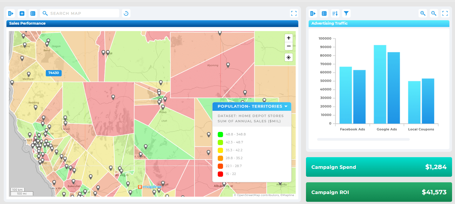
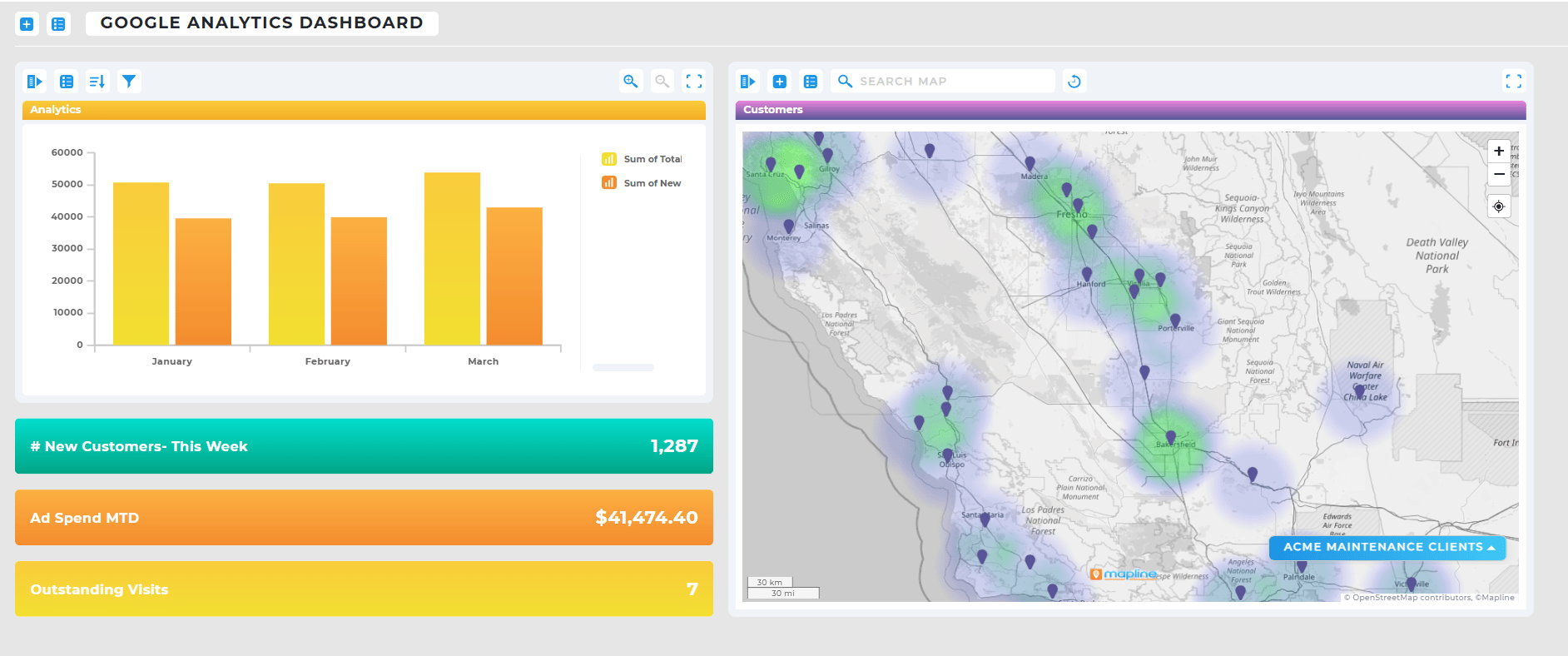
A business intelligence dashboard for marketing might combine website traffic, campaign performance, and conversion metrics into one visual hub. Mapline’s integration capabilities make it easy to visualize data from Google Analytics, CRMs, or ad platforms—showing how each campaign performs by audience and region.
Financial and Executive Dashboards
Finance and leadership teams use visual reporting to monitor budgets, revenue forecasts, and expenses. In Mapline, these dashboards update automatically, displaying interactive charts that make it easy to drill down by department or time period. This gives executives a real-time snapshot of organizational performance without waiting for static reports.
How Mapline Simplifies Data Visualization
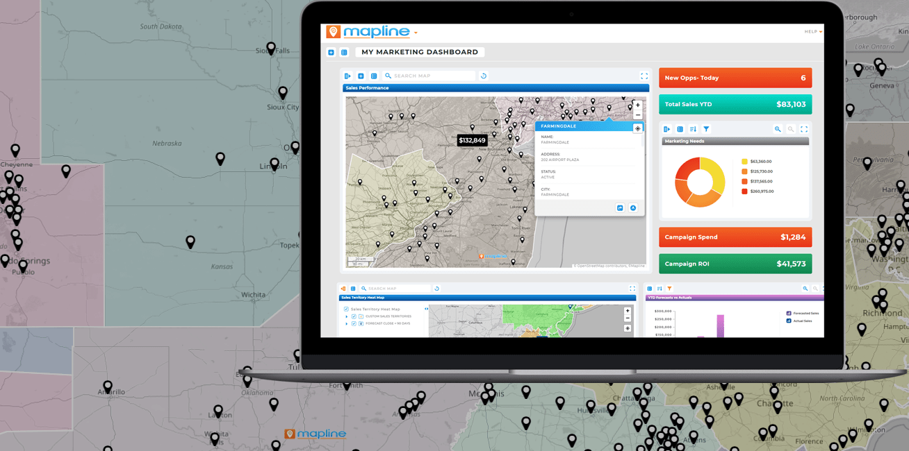
Traditional analytics tools often require extensive setup or coding just to create a single dashboard. Mapline eliminates that complexity. Its interactive dashboard builder connects directly to your data sources and automatically generates visuals that update as information changes.
More importantly, Mapline’s platform combines Geo BI—geographic business intelligence—with classic data visualization. That means your charts and graphs aren’t just numbers—they’re spatial insights that reveal where performance is strongest, where inefficiencies occur, and where new opportunities are emerging.
Visual reporting is the process of turning raw data into charts, graphs, and dashboards that make insights easier to understand. Instead of reviewing long spreadsheets, you can see trends and performance instantly through interactive visuals. Mapline’s visual dashboards automatically update with your data, giving you real-time clarity.
Visual dashboards consolidate data from multiple sources—sales, operations, marketing, or finance—into one interactive view. This eliminates the need for manual reporting and makes it easier to identify patterns or outliers. Mapline’s dashboards bring everything together with intuitive visuals and geographic context for deeper insights.
A static report shows fixed data that must be updated manually. An interactive dashboard, on the other hand, updates automatically and allows users to explore information by clicking, filtering, and zooming into key metrics. Mapline’s dashboards are fully interactive, keeping your team aligned with live data at all times.
Yes! Mapline includes an interactive chart maker and interactive graph maker that let you build visuals directly from your datasets. You can link charts to maps, dashboards, or live KPIs to explore performance across time and geography.
Mapline supports a wide range of business intelligence dashboards, including sales analytics, marketing performance, logistics tracking, and executive overview dashboards. Each dashboard can be customized to your metrics, updated automatically, and shared securely across teams.
Unlike traditional BI software, Mapline combines Geo BI with interactive data visualization. This means you can see not just your numbers—but where they happen. Mapline integrates mapping, charts, and automation into one platform, simplifying both analysis and storytelling.
Not at all. Mapline’s drag-and-drop interface makes it easy for anyone to create interactive dashboards and charts without technical setup. You can connect data from Excel, Google Sheets, CRMs, or APIs and start visualizing instantly.
Yes. Mapline dashboards are cloud-based, allowing you to securely share live, interactive reports with team members or stakeholders. Everyone sees the same up-to-date data—no exporting or emailing required.


