As the air gets crisper and summer transitions to fall, we’re excited to introduce new Mapline updates that will elevate your workflow and enhance your data insights. Whether you’re mapping territories, building charts, or creating reports, these September updates are designed to help you get more out of your data in less time. Let’s dive into the features we’ve launched to streamline your operations and unlock deeper insights!
Smarter Chart & Report Customizations
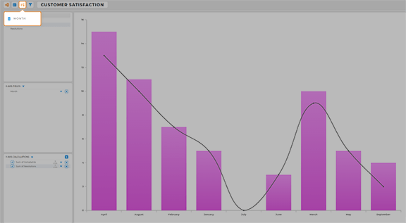
We’ve added new options to make charts and reports more flexible. You can now sort charts by fields on the X or Y axis, and reports can be sorted by column or row. This makes it easier to compare data and find trends. Plus, you can now use territory datasets as the source for your charts and reports, allowing you to pull in territory-specific data for custom visualizations. These updates give you more control over how you analyze and display your data.

Seamless Messaging with Slack & Google Chat
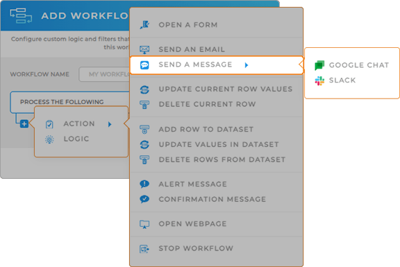
Communication just got easier! Now you can send messages directly through Slack or Google Chat from your Mapline workflows. Whether you’re notifying the team of a completed task or sharing updates, you can do it without leaving Mapline. This integration streamlines collaboration, keeping everyone on the same page with minimal effort.

Global Data at Your Fingertips
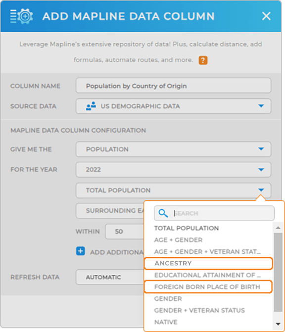
Mapline has expanded its global data capabilities with two key updates. You can now add population data by country of origin to your maps, helping you better understand the demographic makeup of different areas. We’ve also added Korean postal codes to our maps, making it easier to analyze and optimize routes in South Korea. These updates help you make data-driven decisions with more accuracy and detail.


