Every business collects data—but not every business can see what that data is trying to say. That’s where dashboard reporting comes in. A well-built dashboard brings maps, charts, and KPIs into one unified view, turning scattered insights into clear visual stories. Instead of digging through spreadsheets or switching between tools, leaders can spot trends, compare regions, and track performance in real time. With Mapline, dashboards become a living snapshot of your operations—easy to read, effortless to update, and powerful enough to guide daily decisions.
Why Dashboard Reporting Matters for Every Team
In growing organizations, stakeholders need instant clarity—not more complexity. Dashboards help teams cut through the noise by translating raw information into visuals that highlight patterns, performance gaps, and trends. Whether you’re managing sales, HR, finance, operations, or customer experience, dashboards provide a consistent, centralized source of truth. They make your data accessible across teams, helping everyone work from the same version of reality. In fast-moving industries, that alignment becomes a competitive advantage.
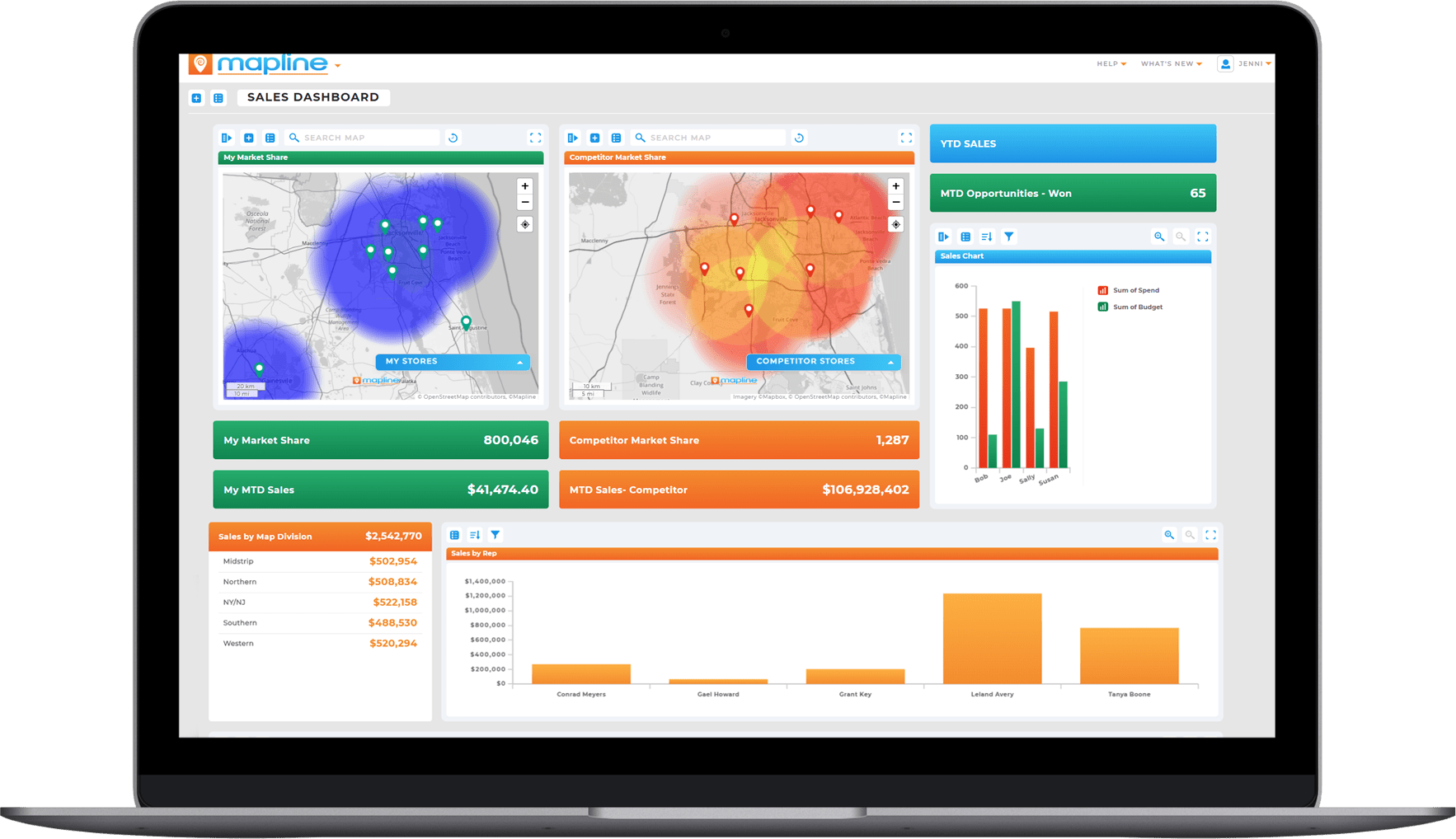

Pro Tip: Start with one dashboard that solves one specific problem—like monitoring daily performance or tracking regional sales. Once it’s working well, expand it with maps and KPIs to tell a fuller story without overwhelming your team.
See Insights Faster
Dashboards eliminate manual reporting by updating automatically as your data changes. Your team spends less time building reports and more time acting on them.
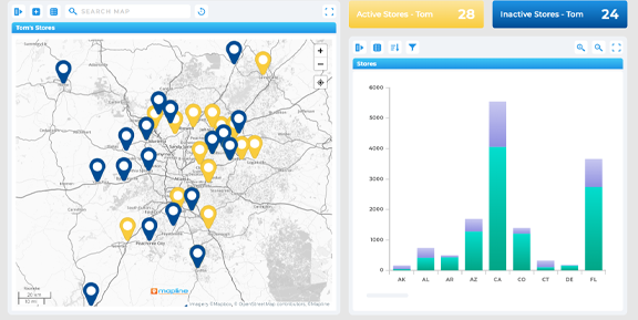
Spot Problems Before They Escalate
Visual KPIs highlight areas that need attention—like slipping sales, rising costs, or underperforming regions—before they become serious risks.
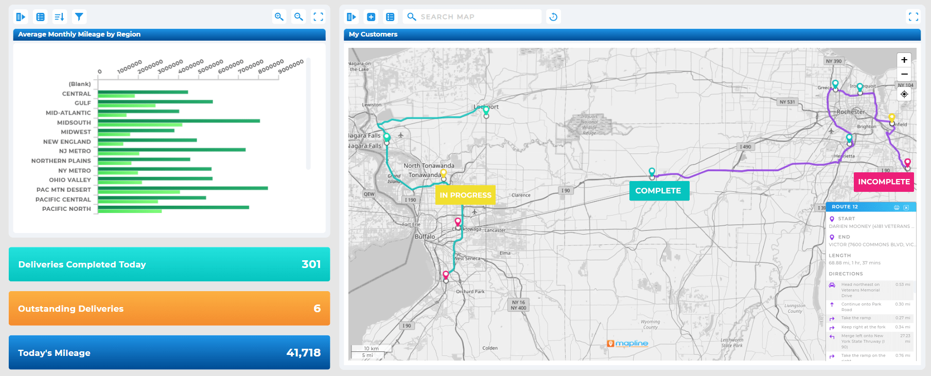
Improve Collaboration Across Departments
With shared dashboards, leaders and frontline teams gain a unified view of performance, creating better communication and clearer priorities.

What Goes Into a High-Performance Dashboard?
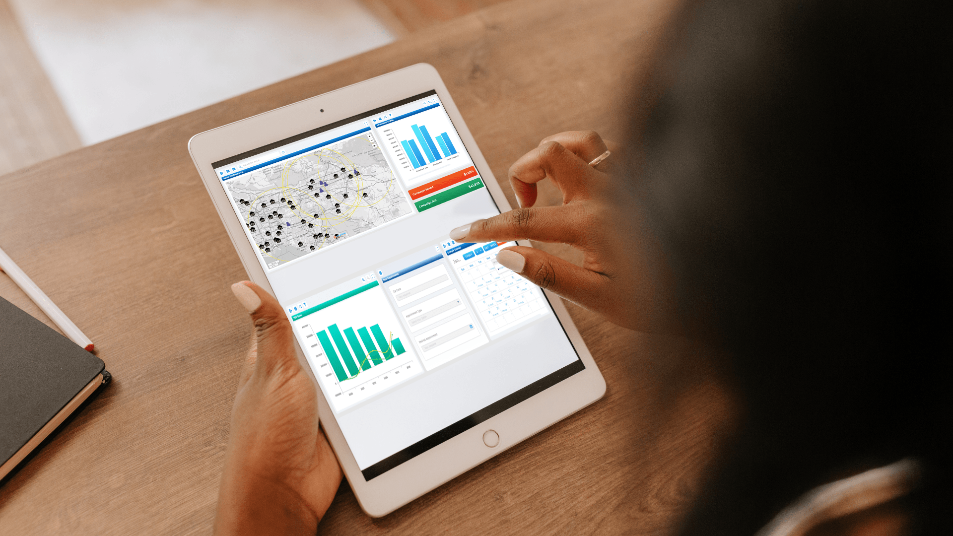
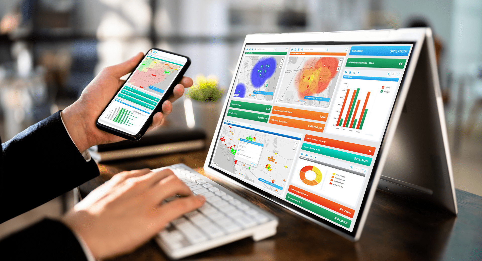
A truly effective dashboard blends three elements: geographic context, visual clarity, and real-time data. Many tools only offer one or two, leaving teams with incomplete views. Mapline brings all three together, combining maps, charts, and KPIs into a single view that updates the moment your data does. This gives you an operational command center where insights stay fresh, actionable, and easy to interpret.
Interactive Maps for Geographic Insights
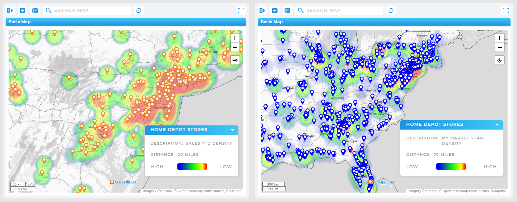
Maps show where performance is concentrated, where trends shift, and where opportunities emerge. Whether you’re analyzing customers, sales territories, assets, or delivery regions, maps add spatial meaning to your metrics.
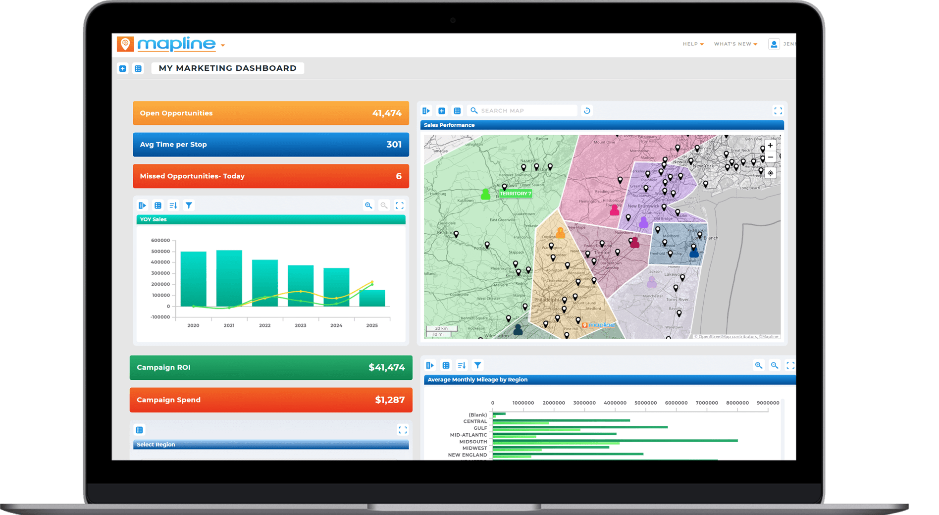
Charts That Surface Trends Instantly
Line charts, bar charts, area charts, and pie charts help teams compare performance over time, by category, or by region. Combined with map layers, they give you a complete story instead of isolated snapshots.
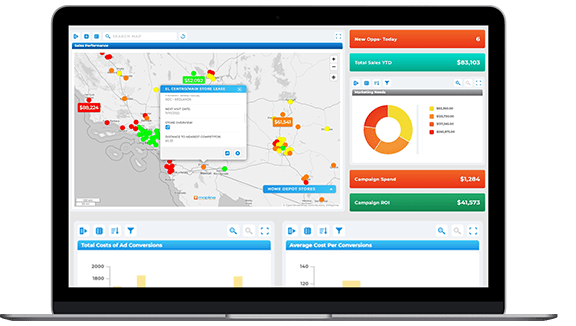
KPI Cards for At-a-Glance Metrics
KPI cards highlight the numbers that matter most—such as revenue, job completion rates, churn, or workforce capacity. Leaders can see progress in seconds without hunting for the right spreadsheet tab.
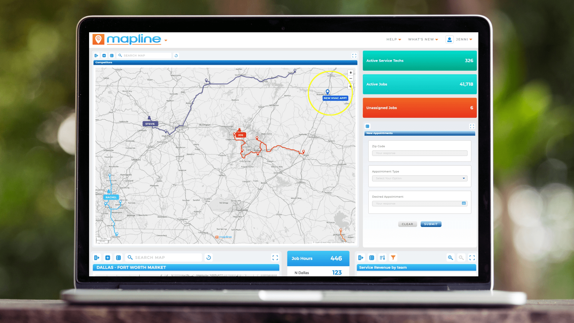
Types of Dashboards That Drive Business Clarity
Different teams require different dashboards, but the underlying goal stays the same: clarity. Below are some of the most used dashboard types—and how each one helps leaders make smarter decisions with less effort.
Sales Dashboard
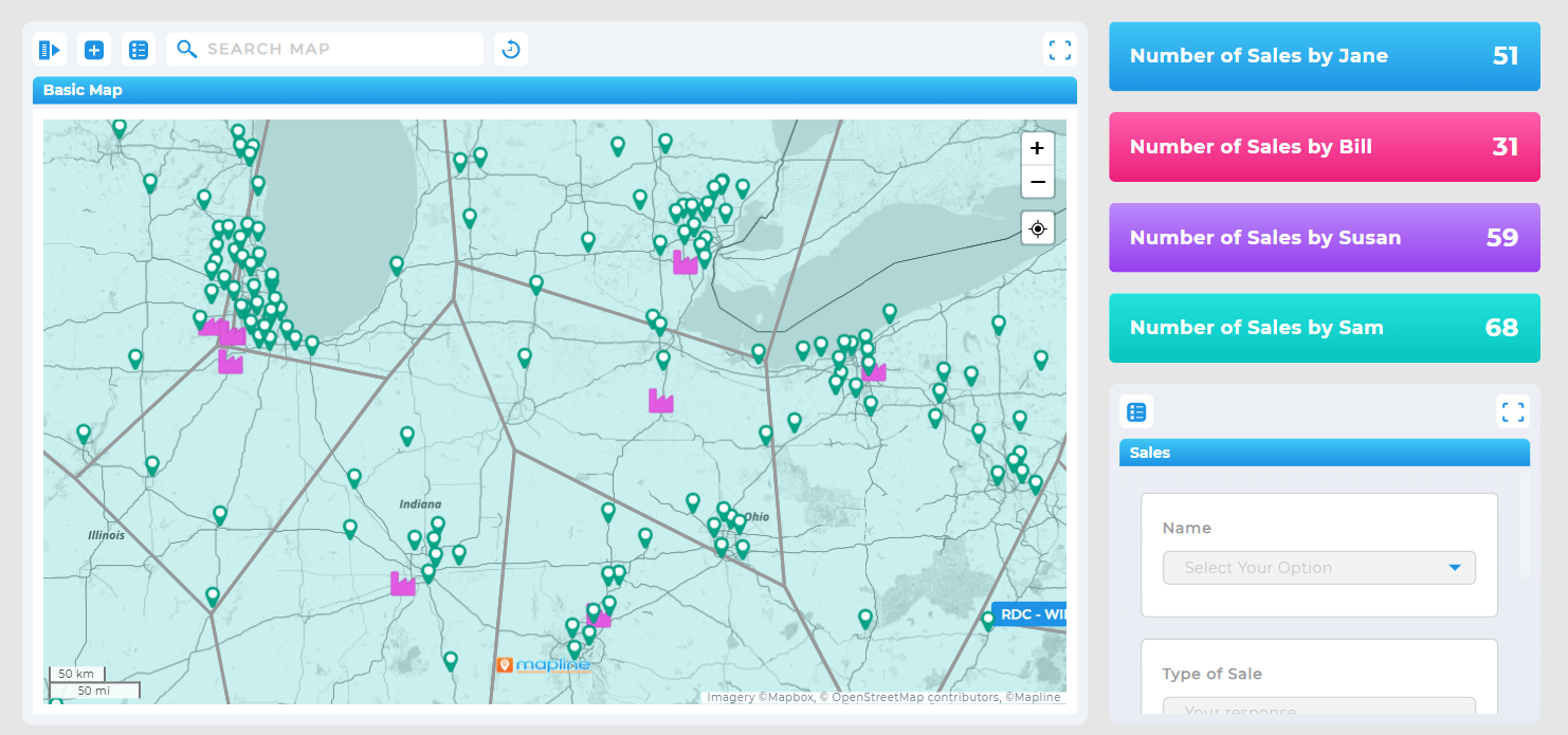
Track pipeline health, regional performance, closed deals, rep activity, and territory-based outcomes. Map overlays show which areas are outperforming or underserved.
Marketing Dashboard
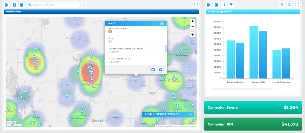
Monitor campaign performance, funnel progress, lead quality, and geographic response patterns. Trend charts help you attribute what’s working and what needs adjustment.
Financial Dashboard
Visualize revenue trends, expense categories, profit margins, and budget performance. Combine KPIs with charts for a clear picture of financial health.
HR Dashboard
Analyze staffing levels, employee performance, hiring pipelines, training progress, and retention risk. Geography helps identify hiring hotspots or coverage gaps.
Operations Dashboard
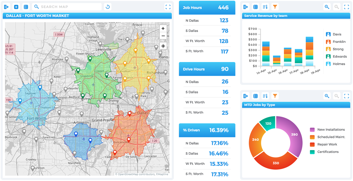
Monitor job completion, route efficiency, team workload, service SLAs, and asset utilization in real time. These dashboards often blend maps with KPIs for full situational awareness.
Project Dashboard
Track deadlines, task completion, dependencies, risks, and cross-team progress. Visual charts help expose bottlenecks before they slow down delivery.
Executive / CEO Dashboard
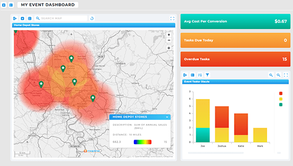
High-level KPIs consolidate performance across departments—sales, finance, operations, HR, and customer teams. This “single pane of glass” enables fast, strategic decision-making.
Other dashboard types to consider include:
- Customer experience dashboards
- Supply chain dashboards
- Inventory dashboards
- Funnel dashboards
- Workforce capacity dashboards
- Performance scorecards
- Territory assignment dashboards

How Mapline Makes Dashboard Reporting Effortless
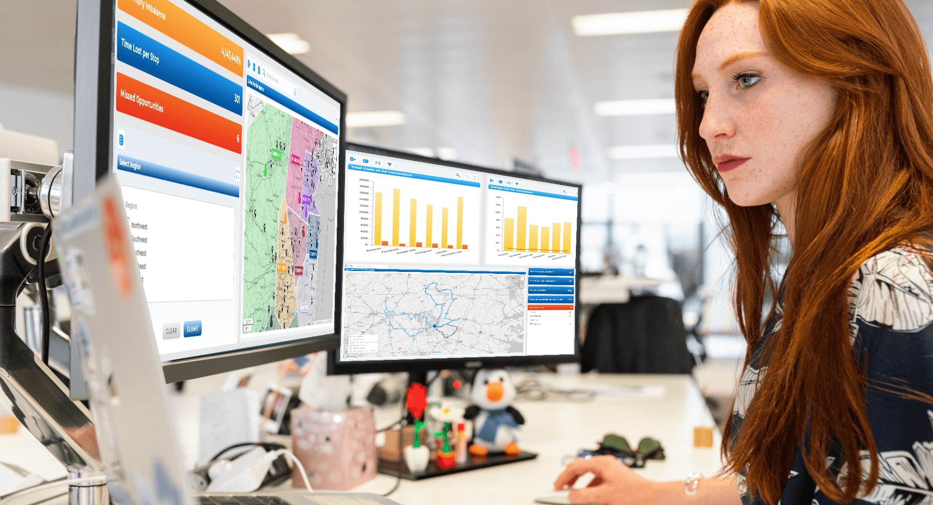
Most dashboard tools require complicated setup, integrations, or constant manual adjustments. Mapline simplifies everything by letting you build dashboards directly from your live datasets, maps, and routes. Your visuals remain in sync automatically, and you can combine multiple layers—mapping, metrics, reports, and charts—into a single, interactive view. It’s the fastest way to transform raw data into daily intelligence for your team.
All-In-One Visual Intelligence
Maps, charts, metrics, and reports live in one place, giving your team full visibility without switching between tools.
Fast Setup, No Coding
Drag-and-drop components make it easy to build dashboards in minutes, not weeks, even for non-technical users.
Designed for Real-Time Decision Making
Dashboards update instantly when datasets change, keeping everyone aligned throughout the day.

Yes. Mapline supports unified dashboards where maps, charts, metrics, and reports work together seamlessly.
No. Mapline is designed so anyone can build dashboards quickly with drag-and-drop simplicity.
Absolutely. Dashboards stay in sync with your datasets in real time.
Yes. You can share dashboards with your team or external stakeholders, with permission controls included
Mapline includes bar charts, line charts, pie charts, area charts, scatter plots, vertical/horizontal bar charts, and more.


