Dashboards are the foundation of modern data analytics—but not all dashboards are built the same. The difference between static and dynamic dashboards can mean the difference between reacting late and acting fast. A static dashboard offers a fixed snapshot in time, while a dynamic dashboard updates automatically as new data flows in. Knowing which one your business needs depends on how quickly your environment changes and how critical real-time visibility is to your success.
Mapline helps businesses bridge that gap. Its dynamic dashboards connect live datasets, maps, and metrics so leaders can see the full picture instantly—no refresh button required. Whether you’re managing sales territories, marketing performance, or field operations, Mapline transforms your data into live, actionable insights that scale with your business.
What Is a Static Dashboard?
A static dashboard is a visual report built from a single dataset that doesn’t automatically update when new data becomes available. It’s perfect for quarterly reports, performance summaries, or presentations where the data doesn’t change frequently. For example, a company might export monthly numbers from Excel into a chart to show sales trends or department performance.
However, static dashboards require manual updates, which means they’re only as accurate as the last time someone refreshed the data. Tools like Excel are still widely used for static dashboards, but as datasets grow and business speed accelerates, this approach becomes limiting. You can’t see live sales performance, route progress, or campaign conversions in real time—and that’s where dynamic dashboards step in.
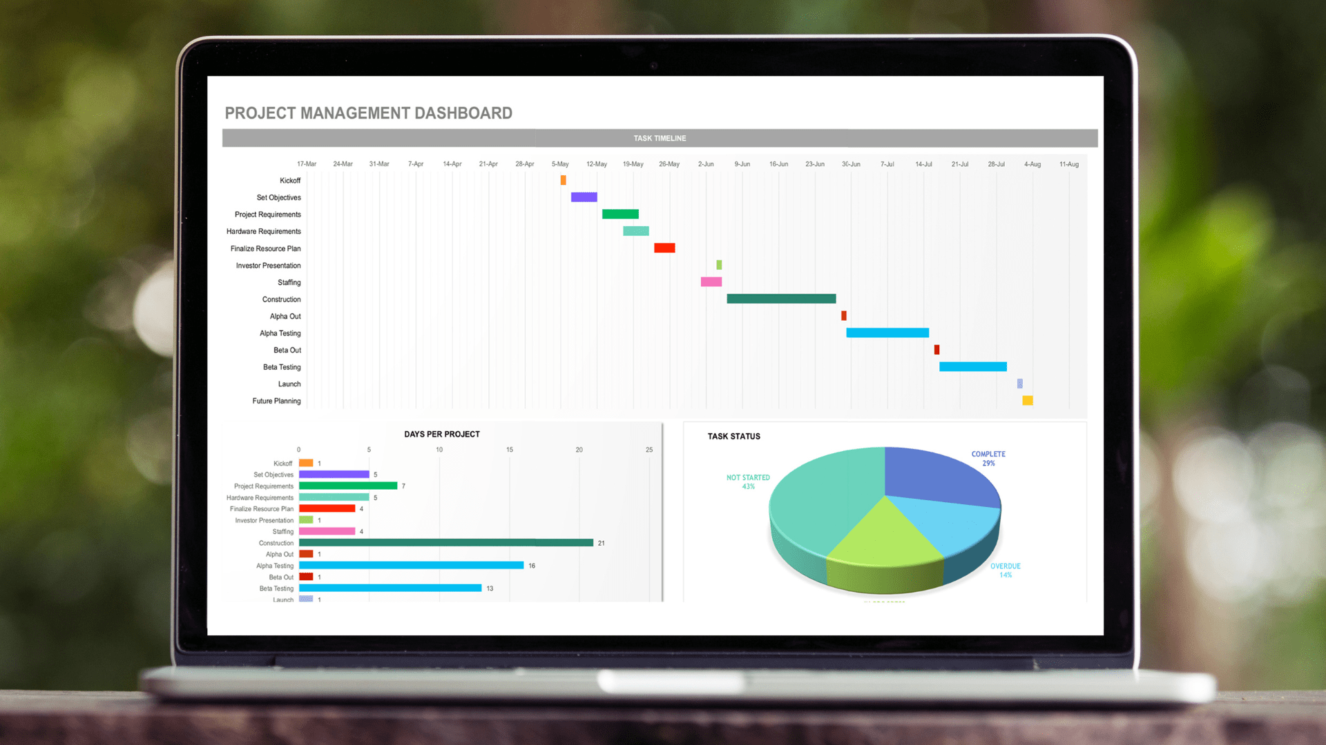

Pro Tip: Leverage Geo BI to turn your most frequently-updated spreadsheet into a live dashboard. You’ll instantly see how much time you save when your data updates automatically—no manual refreshes, no broken formulas, and no waiting for reports.
What Is a Dynamic Dashboard?
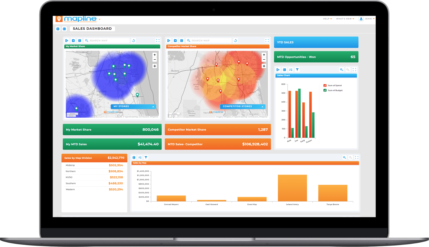
A dynamic dashboard automatically refreshes as your data changes. It connects directly to live data sources—such as CRMs, databases, or spreadsheets—so every chart, metric, and map stays up to date. With Mapline, these dashboards aren’t just visual—they’re interactive and geographic, giving teams a clear, real-time view of their operations anywhere in the world.
Dynamic dashboards make it easy to compare performance across time, location, and department without exporting or rebuilding reports. As soon as a new sale is made, a route is completed, or a form is submitted, your Mapline dashboard reflects it instantly. That means faster reactions, better forecasting, and more confident decision-making.
Static vs. Dynamic Dashboards: Key Differences
Choosing between static and dynamic dashboards depends on how fast your business moves and how often your data changes. Static dashboards offer a stable snapshot of performance—useful for quarterly reviews or fixed reports—but they quickly fall behind when new data arrives.
Dynamic dashboards, on the other hand, update automatically and deliver live visibility into sales, operations, and customer activity. This real-time insight empowers leaders to react faster, identify trends sooner, and make smarter, data-driven decisions. The comparison below highlights how static and dynamic dashboards differ in flexibility, collaboration, and overall business impact.
| Feature | Static Dashboards | Dynamic Dashboards |
|---|---|---|
| Data Updates | Manual | Automatic, real-time |
| Interactivity | Limited | Fully interactive |
| Ideal Use Case | Periodic reports or summaries | Continuous performance tracking |
| Scalability | Harder to scale across teams | Seamlessly scales with your data |
| Data Sources | Single file or spreadsheet | Live, connected datasets |
| User Collaboration | Requires file sharing | Cloud-based, shareable dashboards |
Examples of Dynamic Dashboards in Action
Dynamic dashboards are redefining how teams interact with their data. Instead of waiting for static reports, businesses now rely on real-time visuals that reveal performance the moment it happens. From marketing analytics to field operations, dynamic dashboards connect directly to live data sources so you can track KPIs, campaigns, and regional performance all in one view. This instant visibility turns routine monitoring into strategic action—helping teams respond faster and plan smarter. The examples below show how dynamic dashboards power better decisions across departments and industries.
Marketing Analytics Dashboards
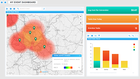
Marketing teams use dynamic dashboards to track campaign performance across multiple channels—email, events, web traffic—all in one place. Mapline integrates easily with CRMs and analytics platforms to help marketers visualize conversion rates, regional engagement, and ad spend performance in real time.
Audience Demographic Dashboards
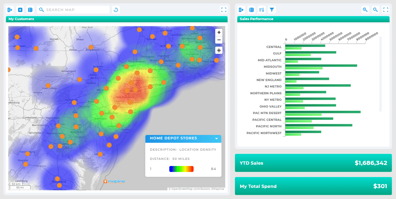
An audience demographic dashboard helps you see who your customers are and where they’re engaging. With Mapline, you can connect CRM or analytics data to visualize audience segments by age, region, or behavior. Real-time updates reveal shifts in demographics and preferences, making it easier to refine targeting and optimize campaigns. These dashboards turn static audience data into living insights that evolve alongside your market.
Sales Performance Dashboards
A sales performance dashboard keeps teams aligned on real-time goals and growth. Mapline automatically updates sales data by region, product, or rep, showing where performance is strongest and where new opportunities exist. You can view results geographically, track trends over time, and identify the drivers behind each region’s success. The result is a live, visual command center for smarter sales decisions.
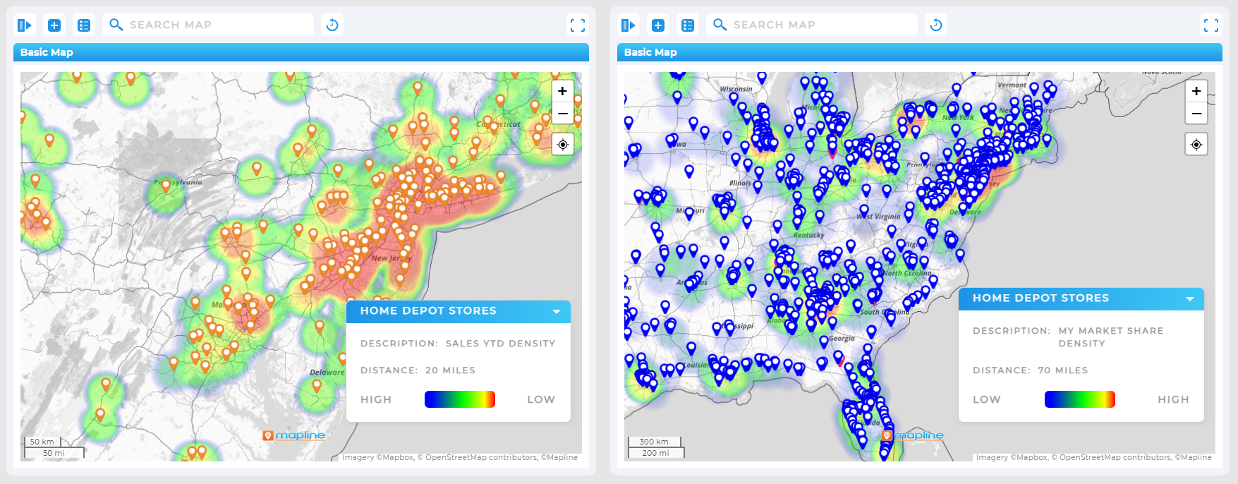
Website and Google Analytics Dashboards
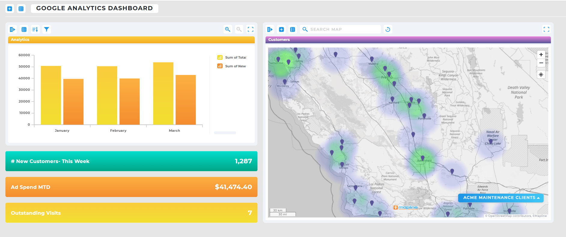
A website analytics dashboard built in Mapline shows real-time visitor data, traffic sources, and behavior metrics. For teams that use Google Analytics dashboards, Mapline adds another layer by visualizing performance geographically—so you can see exactly where your visitors come from and how location impacts engagement.
Social Media Analytics Dashboards
Social media teams track follower growth, engagement rates, and post performance using dynamic dashboards. Mapline enables them to monitor campaign results as they unfold and align content strategies with audience hotspots shown on interactive maps.
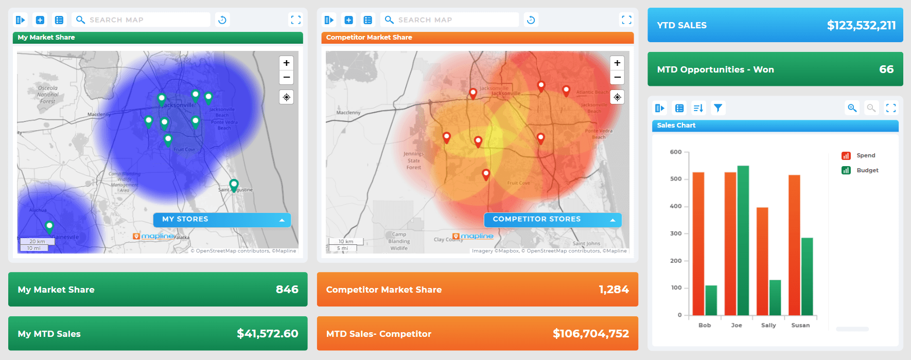
Tableau KPI Dashboards
Mapline complements platforms like Tableau, simplifying how businesses connect and analyze data geographically. In fact, one Mapline user said it “makes it easier to use Tableau” by transforming static visualizations into actionable spatial insights. You can import key KPIs, apply filters, and see performance visualized on a live map—all without additional setup.
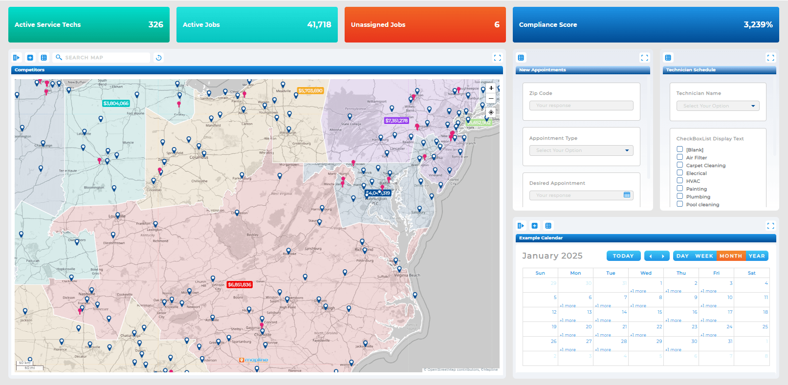
eCommerce and Shopify Analytics Dashboards
eCommerce teams use Shopify analytics dashboards to monitor sales, order fulfillment, and customer geography. Mapline adds operational intelligence by linking those dashboards to real-world delivery zones, helping businesses optimize fulfillment and reduce shipping times.
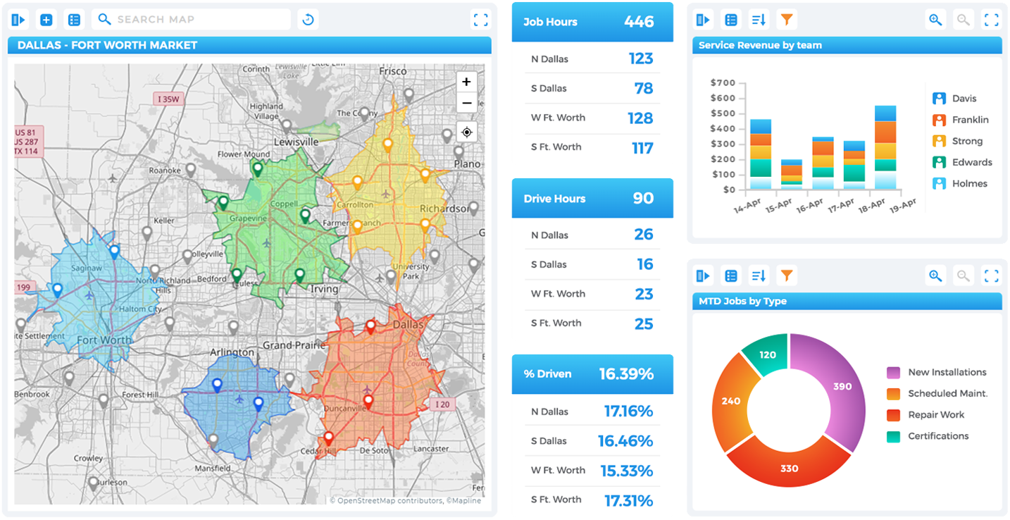
How Mapline Makes Smart Data Analysis Simple
Mapline takes the complexity out of data analytics. Instead of juggling multiple tools, teams can connect data sources directly to Mapline’s platform to visualize KPIs, routes, and regional trends instantly. Its dynamic dashboards go beyond charts—they integrate Geo Mapping, automation, and business intelligence into one unified experience.
Unlike Excel or static visualization tools, Mapline doesn’t just show data—it transforms it into an interactive, live system for managing performance. Whether you’re comparing marketing ROI, monitoring delivery times, or analyzing territory profitability, Mapline makes smart data analysis accessible to everyone.
A static dashboard shows data from a fixed point in time, while a dynamic dashboard updates automatically as new data becomes available. Dynamic dashboards connect to live data sources, allowing teams to make faster, data-driven decisions without manual refreshes.
Static dashboards work best for reports that don’t change often—like quarterly summaries or end-of-year presentations. They provide consistent snapshots but require manual updates whenever data changes.
Dynamic dashboards continuously refresh with live data, giving real-time visibility into KPIs, sales, and performance. This allows leaders to identify trends quickly, make informed decisions, and stay ahead of shifting conditions.
Excel can display charts and pivot tables, but it isn’t designed for real-time data connections or automation. For true dynamic dashboards that update automatically, platforms like Mapline offer direct integrations and live data syncing.
Mapline supports a wide variety of dashboards—including marketing analytics, sales performance, social media engagement, and website traffic. Each dashboard can combine charts, metrics, and maps to show exactly where and why results are changing.
Mapline functions as a complete CRM, powered by Geo BI. Instead of managing contacts and pipelines in isolation, Mapline connects every customer, interaction, and sales opportunity to real-world locations. You can visualize relationships geographically, track performance by region, and uncover insights that traditional CRMs miss. With live data integration, automated workflows, and dynamic dashboards, Mapline transforms customer management into a spatially intelligent system. It’s more than a CRM; it’s a full-scale business intelligence platformdesigned to help teams see the where behind every decision.
Mapline also integrates with visualization tools like Tableau and Power BI, but adds the power of geographic intelligence. Users often report that Mapline “makes it easier to use Tableau” by turning KPIs and reports into interactive, location-based insights.
Yes. Mapline connects to various data sources, including web analytics and eCommerce platforms. You can track online performance, customer behavior, and regional sales—all in one dynamic dashboard.
Absolutely. Mapline uses secure data connections and permission-based sharing, so you can control who views or edits your dashboards. Share live dashboards with your team or stakeholders and keep everyone aligned with real-time data.


