Operational efficiency doesn’t just happen—it’s measured, monitored, and built through the right metrics. But with so much data available, many businesses track the wrong things or track too much, creating noise instead of clarity. The key is identifying the metrics that highlight performance, expose bottlenecks, and guide strategic improvements. Whether you’re running a SaaS company, a logistics network, a retail chain, or a field service operation, the right KPIs become the backbone of better decision-making. With Mapline’s visual intelligence tools, those metrics transform into real-time insights your team can act on instantly.
Why Tracking the Right Metrics Matters
Many organizations collect data without knowing which numbers actually drive outcomes. As a result, teams report on vanity metrics while missing the KPIs that measure operational health. Tracking the right metrics reveals inefficiencies, uncovers hidden costs, and highlights where process improvements will have the biggest impact. It also helps leaders align departments around shared goals, ensuring every team is measuring success the same way. When these metrics show up visually—on maps, charts, or dashboards—they become easier to interpret and much faster to act on.


Pro Tip: Pick 5–7 KPIs that directly influence your operational goals, and visualize them on a single dashboard. You’ll eliminate noise, focus your team, and make faster decisions with clearer insights.
Visibility Into Performance Trends
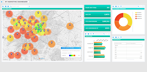
Right-fit metrics help teams spot shifts in performance as they emerge, rather than after they’ve caused a problem. Consistent tracking creates leading indicators—not just lagging ones.
Better Alignment Across Departments
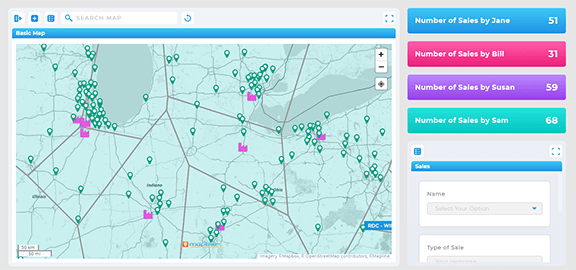
When teams track the same KPIs, they collaborate more effectively. Everyone understands how their performance fits into the bigger operational picture.
Faster, More Confident Decision-Making
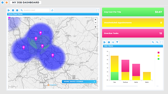
With accurate, relevant metrics, leaders can respond to challenges proactively, allocate resources better, and reduce wasted effort across the organization.
Core Metrics Every Business Should Track
While each industry has its own unique KPI set, there are universal metrics that form the foundation of operational efficiency. These highlight how well your processes run, how effectively your teams work, and how consistently you meet customer expectations. Tracking these across time—and across geography—gives you an unmatched view of performance at every level.
Throughput & Cycle Time
How long does it take to complete a process from start to finish? Cycle time metrics reveal bottlenecks, inefficiencies, and opportunities for workflow optimization. Mapline dashboards make these patterns visible instantly.
Resource Utilization
From technicians to vehicles to inventory, utilization metrics show whether your resources are overworked, underused, or unevenly distributed across geographic regions.
Error Rates & Rework
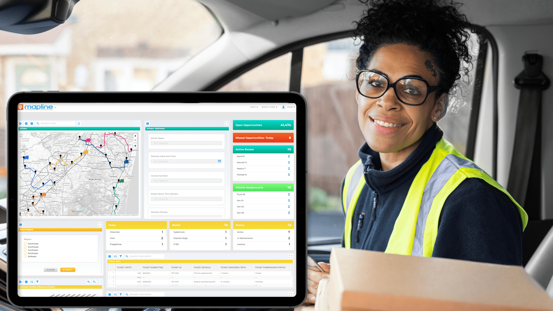
Operational inefficiencies usually hide inside rework, returns, or repeat visits. Mapping problem locations can reveal patterns you’d never see in spreadsheets.
SaaS & Product Metrics That Matter
SaaS teams operate on speed, retention, and scalability. Tracking the right KPIs shows how efficiently your product delivers value—and where users drop off or get stuck. These metrics become even more powerful when paired with geographic analysis, helping you understand adoption patterns or regional performance.
Activation & Onboarding Completion
These show whether users understand your product quickly and where they may be hitting friction. Mapline visualizations can highlight user concentration by region.
Customer Retention & Churn
Tracking who stays—and who leaves—reveals the real stability of your business. Mapping churn clusters can point to market-specific issues.
Feature Engagement
Knowing which features drive value helps teams prioritize development. These insights can also inform customer segmentation and product roadmap decisions.
Marketing KPIs That Drive Growth
Marketing teams need visibility into what actually moves the needle—not just surface-level metrics. The best KPIs illuminate customer behavior, campaign effectiveness, and geographic opportunities. Mapline supercharges these insights by helping marketing teams visualize where engagement peaks and where gaps exist.
Lead Quality & Conversion Rates
Not all leads are created equal. Tracking quality helps refine audiences, content strategies, and regional targeting.
Cost per Acquisition (CPA)
One of the most critical KPIs for budget control. Comparing CPA across regions can highlight where marketing dollars work hardest.
Campaign Performance by Geography
This is where Mapline shines—maps reveal geographic trends that traditional dashboards can’t, helping teams refine local campaigns or expansion plans.
Field Operations & Logistics Metrics
Field and delivery teams depend on metrics that highlight efficiency, drive performance, and maintain service standards. By tracking operational KPIs visually—through maps, territory analysis, and real-time routing dashboards—organizations can improve accuracy, reduce costs, and complete more jobs per day.
On-Time Completion Rate
Whether for deliveries or service visits, on-time rate is a universal indicator of route efficiency and customer satisfaction.
Miles Driven per Job
This exposes unnecessary travel and helps optimize territories and job assignments. Mapline’s geo-routing and smart scheduling make improvements here immediate.
First-Attempt Completion
Repeats cost time and money. Tracking this metric alongside map-based insights highlights training needs or territory misalignment.
How Mapline Helps You Monitor the Metrics That Matter
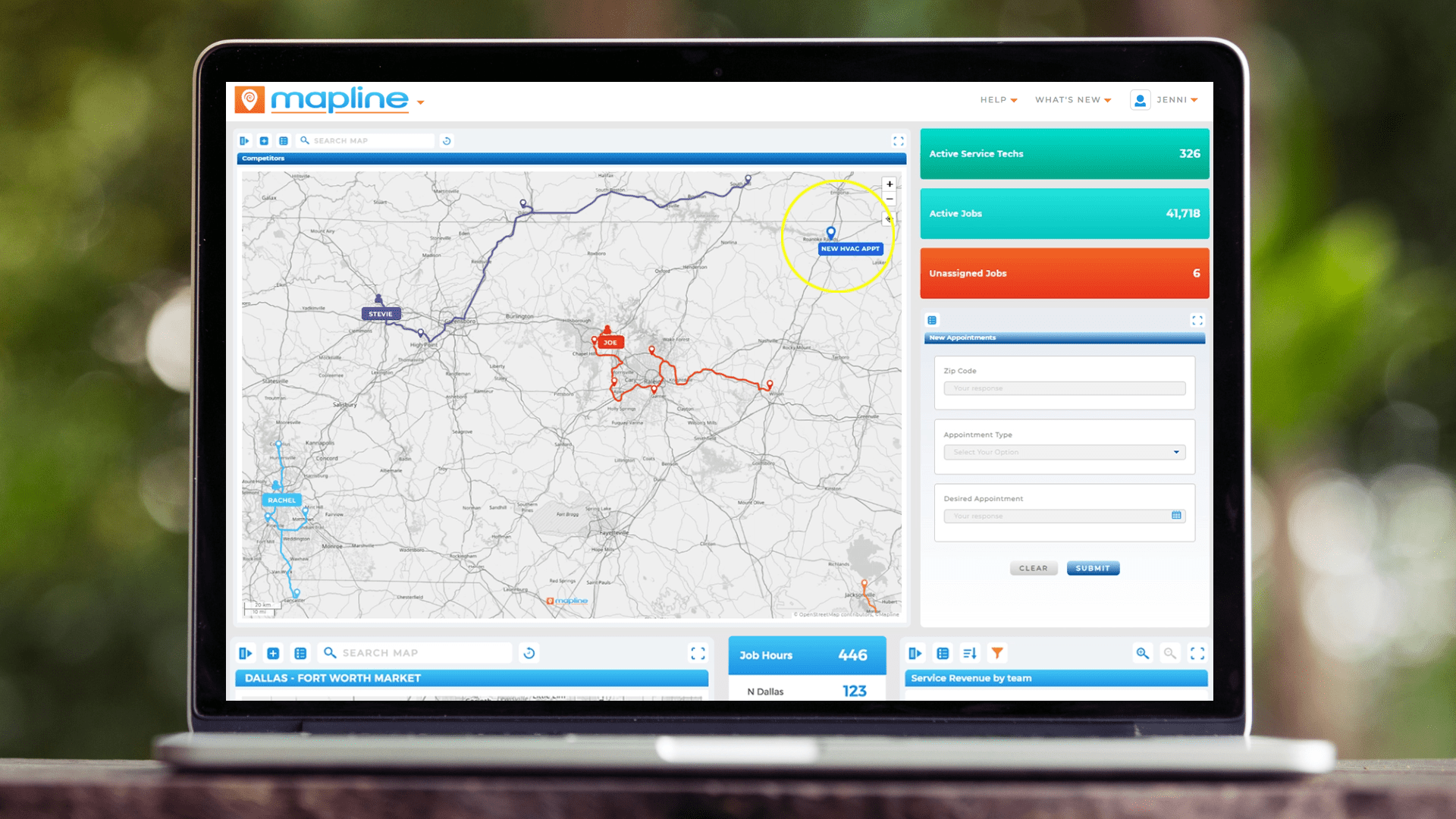
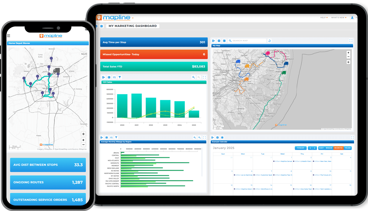
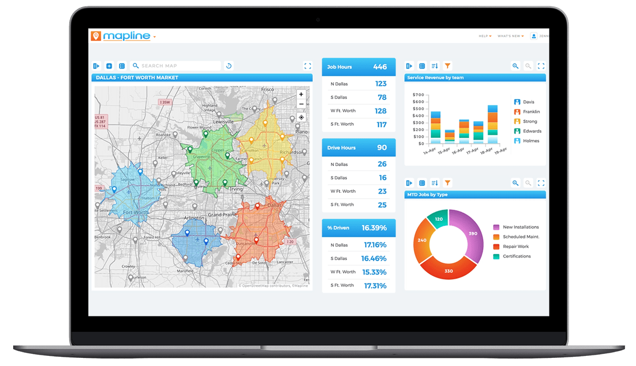
Tracking metrics is only useful if your team can interpret and act on them quickly. That’s where Mapline gives businesses a higher level of operational clarity. Mapline brings maps, charts, KPIs, reports, and live datasets into one interactive dashboard—updating automatically whenever data changes. This creates a real-time command center where the metrics that matter stay front and center, driving faster and smarter decisions.
Visual Dashboards That Update Automatically
Stop rebuilding the same reports every week. Mapline syncs instantly with your datasets and surfaces insight the moment it appears.
Geographic Intelligence for Every KPI
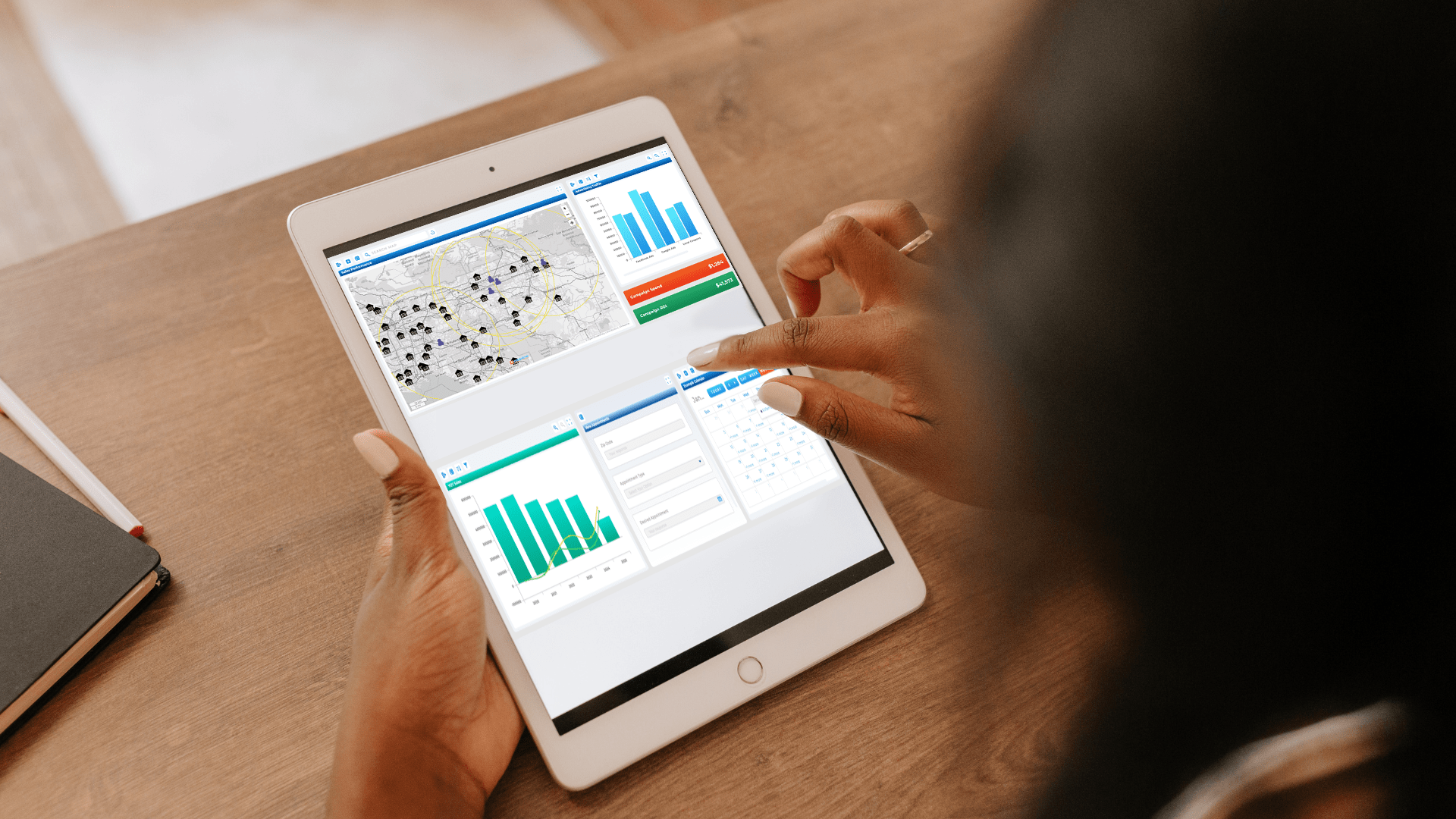
Metrics change meaning when you see them on a map—patterns appear, outliers become obvious, and regional trends become actionable.
One Platform for Maps, Charts, Metrics & Reports
Instead of juggling tools, Mapline brings all your visual intelligence into a single unified workspace built for speed and clarity.
It depends on your industry, but operational efficiency is typically measured through cycle time, workload distribution, on-time performance, and resource utilization.
Start with your operational goals—then identify the measurable factors that affect them. Choose KPIs that are actionable, not just informational.
Yes. Mapline makes geographic performance instantly visible, helping teams uncover trends that spreadsheets can’t show.
High-velocity teams review daily or weekly. With Mapline dashboards, reviews can happen any time in real time.
Absolutely. Mapline dashboards integrate maps, charts, KPIs, and datasets into a single view.


