How-To Guide
Customize Dashboards
SELECT VISUALIZATION
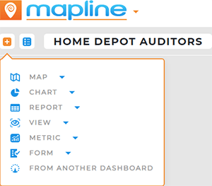
Click the blue + icon at the top-left of your dashboard and select from the following types of visualizations:
- Map
- Chart
- Report
- View
- Metric
- Form
- From Another Dashboard
Any type of Mapline visualization can be pulled directly into a dashboard. You can even select From Another Dashboard option to pull existing visualizations from dashboards you created in the past.
How cool is that?
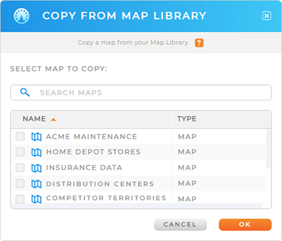
SELECT SOURCE
When you hover over your desired visualization type, a pop-out menu appears. For most visualizations, you have the following options:
- Create New
- Pull From Library
- Pull From Another Dashboard
Once you’ve selected the visualization you need, it appears right on your dashboard.
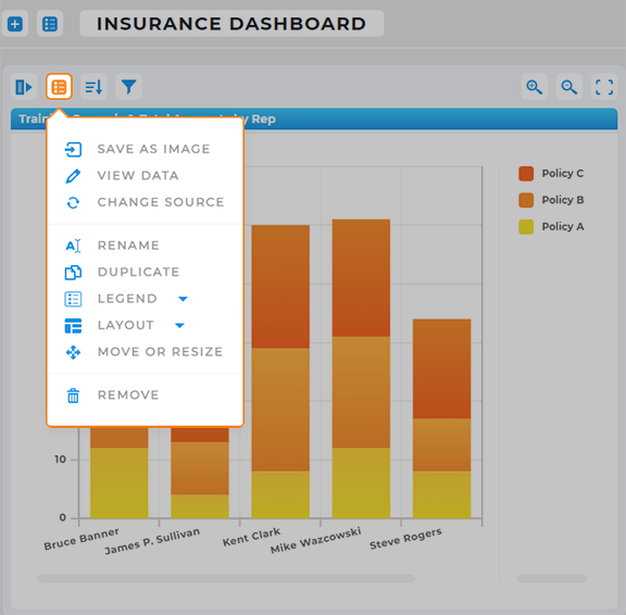
CUSTOMIZE VISUALIZATIONS
Now, customize your dashboard element(s) to get the exact appearance and utility you need.
From the Options menu on each visualization, choose from the following customization options:
- View Source Data
- Change Data Source
- Rename
- Duplicate
- Move or Resize
- Remove Visualization
Additionally, if you have a map on your dashboard, you can add pins, territories, shapes, text labels, and routes to your map, just as you would on any other map.
If you have a chart on your dashboard, you might want to change the layout or move the legend to a different location.
These changes affect the dashboard only, not the original visualization itself.