DASHBOARDS TRAINING
- MAPLINE CLASSES
- MAPLINE BASICS
PUT YOUR DATA TO WORK
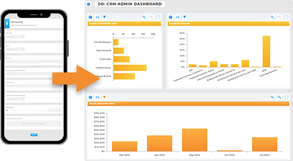
Welcome to the world of Mapline Dashboards! Dashboards allow you to bring together various visualizations, maps, reports, metrics, and charts in one centralized place. Whether for personal use or for team collaboration, dashboards help ensure you never miss critical data points and can make informed decisions with everything right at your fingertips.
By the end of this course, you’ll be familiar with the following:
- 0:23 – What is a Dashboard?: Learn how dashboards bring together various visualizations, reports, and maps into one centralized location for quick access and decision-making.
- 1:53 – Add a Map: Discover how to add a map to your dashboard, either by creating a new map or copying an existing one from your library.
- 2:56 – Customize Dashboard Items: See how you can move and resize dashboard items to arrange them according to your needs for optimal viewing.
- 3:42 – Add a Chart: Learn how to add charts to your dashboard and use them to visualize your data effectively, such as sales or performance metrics.
- 5:01 – Configure Chart: Dive into chart configuration, including selecting the right dataset, setting axes, and adjusting chart types to display data in a meaningful way.
- 5:40 – Segment Chart: Understand how to break down chart data by customer type, sales team, or other segments for deeper insights into performance.
- 7:23 – Style Chart: Explore how to style your charts, including customizing colors, labels, and other visual elements to enhance clarity and impact.
- 8:30 – Add a Report: Learn how to add reports to your dashboard to summarize your data and present it in a structured, readable format.
- 13:14 – Add a Metric: Use metrics to track specific KPIs, such as visit counts or sales totals, offering a quick snapshot of your business’s health.
- 17:38 – Add a View: Create and add views to your dashboard to filter data based on specific criteria, ensuring each user sees only the data relevant to them.
- 22:36 – Add a Form: Discover how to integrate forms into your dashboard for data collection, such as visit reports or customer feedback, directly from the dashboard.

Pro Tip: Type your Pro Tip here, or if you don’t have one, delete this section. Duplicate this section if there’s more than 1 Pro Tip in your article. When you’re done, click and drag this section to the correct area on your page.
WHY USE DASHBOARDS?
Dashboards allow you to consolidate all your key data into one place. You can include maps, reports, metrics, and charts, providing a comprehensive overview of performance, sales, and visits. This centralization saves time and allows for quicker, data-driven decision-making.
Real-Time Data at a Glance: Track KPIs and business performance in real-time, making sure nothing falls through the cracks.
Customizable for Teams: Create personalized dashboards for different teams or departments, ensuring everyone has access to the data they need.
Efficiency and Productivity: With all your data in one place, you can streamline workflows, monitor key metrics, and make informed decisions faster.
User-Centric: Views and filters ensure that the right people have access to the right data, enhancing collaboration and accuracy.
CUSTOMIZABLE LAYOUT AND POSITIONING
You can rearrange and resize dashboard components to suit your workflow. Need more space for charts? Move them around with ease. Each element is fully customizable, allowing you to tailor the dashboard for your needs.
INTERACTIVE CHARTS
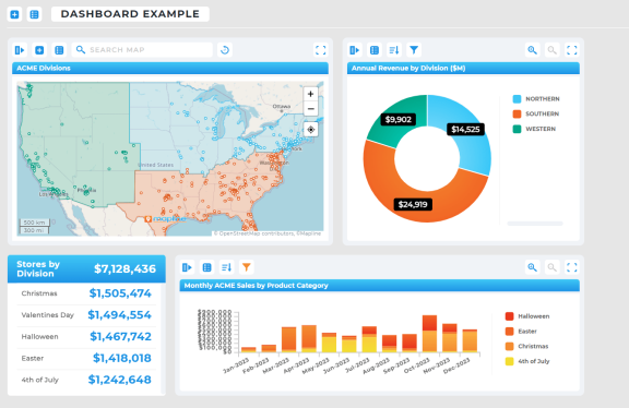
Creating charts is a breeze with Mapline’s drag-and-drop interface. Simply select fields, drag them into the chart’s x-axis or y-axis, and watch the data transform into a visual representation. Segment data by criteria like customer status to dive deeper into your numbers. Plus, you can adjust the chart’s styling, including the colors and formatting, to make the data even easier to interpret.
CHARTS + REPORTS WITH SEGMENTATION
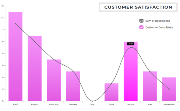
Charts and reports allow you to break down your data into more granular insights, like sales by region or team. By segmenting your data, you can easily compare and analyze different aspects of your business. These reports are interactive, so you can drill down into the data by right-clicking on any section to view more detailed information
USER-SPECIFIC DASHBOARDS
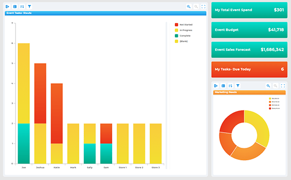
Views are incredibly powerful in Mapline. You can create user-based views, which ensure that each user sees only the data that pertains to them. For example, a user can see only the customers assigned to them, simplifying data management across multiple team members.
