Quick Reference Guide
Filters
ANY OR ALL CRITERIA
Toggle between the ANY and ALL buttons to tell Mapline exactly how you want your data filtered.
Select the ANY button to display results that match your criteria, whether it’s just one result or all of them.
Select ALL to display data that matches all of your criteria at the same time.
FILTER CRITERIA
Choose the dataset column you’d like to use for your filter.
Select from a wide range of filters, including text, number, or date filters, to get the exact insights you’re looking for.
As an example, say we want to see which of our locations are due for service. We would create a formula such as, “Next service date is on or before [DATE].” This reveals which locations are due for service by the date you select.
Or, we could track high-performing sales locations with the filters, “Sales is greater than or equal to $10,000” AND “Sales are on or after [DATE].” These filters reveal which stores made $10,000 within a certain date range.
You can even add more logic sections by clicking the blue + icon in the middle of the Filters lightbox.
SAVE AS PRESET
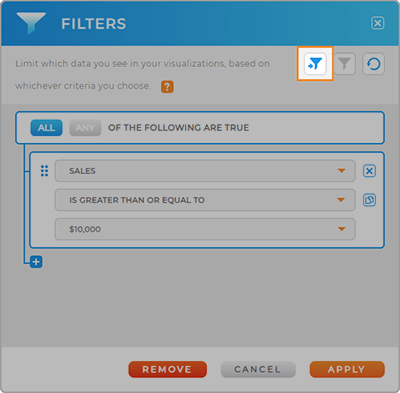
Do you foresee using this filter over and over again? Click the blue -> Save Filter button in the top right corner of the Filter Lightbox to save it as a preset.
This way, you can quickly apply preset filters whenever you need them.
Just click the blue Filter icon to load your presets into any visualization.
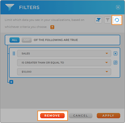
REMOVE FILTERS
No longer need a filter to appear on your visualization?
Remove your filter in one of three ways:
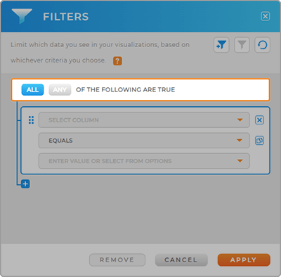
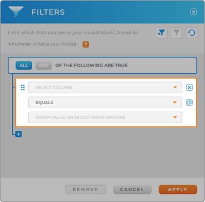
- Remove individual logic sections by clicking the blue X at the top of the logic section
- Click the blue Reset icon in the top right corner of the Filters lightbox to clear your logic
- Click the red Remove button at the bottom of the Filters lightbox to completely remove your formulas