Behind every great decision is a clear story—and the best way to tell that story is through visuals. Charts and graphs translate complex data into meaning, making patterns and trends instantly visible. Whether you’re tracking sales performance, analyzing geographic markets, or visualizing KPIs, choosing the right chart type is what turns numbers into insight.
With Mapline, building charts isn’t just about making visuals—it’s about creating data-driven stories that move your business forward. Mapline connects your data, maps, and dashboards in one place, helping you create the best charts and graphs for real-time storytelling.
Why Charts and Graphs Matter
The human brain processes visuals up to 60,000 times faster than text, which is why data visualization is such a powerful communication tool. A well-chosen chart can expose trends, compare performance, and reveal relationships that would otherwise stay hidden in spreadsheets. But not all charts are equal—each type tells a different story.
Mapline’s dynamic dashboards make it easy to create charts that automatically update as your data changes. Instead of static snapshots, you get living visuals that keep pace with your operations, empowering smarter, faster decisions across your organization.
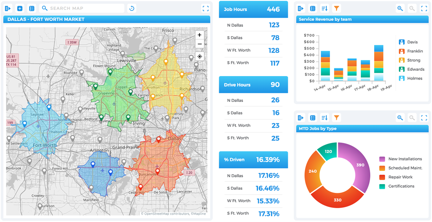

Pro Tip: Combine multiple chart types in a single Mapline dashboard to tell a full story. For example, pair a heat map of customer density with a line chart of monthly sales and a KPI card for revenue targets to create a complete, dynamic view of your growth story.
The Best Charts for Business Intelligence:
What Are the Different Types of Charts?
The right chart can make the difference between understanding your data and getting lost in it. In business intelligence, charts and graphs turn raw numbers into visuals that reveal performance, patterns, and priorities at a glance.
Each type serves a specific purpose—some highlight growth, others compare outcomes or expose relationships between metrics. When used together, they create a clear story of how your organization is performing and where to take action next. Mapline makes it simple to build and update these visuals automatically, ensuring your charts stay accurate and your insights stay relevant in real time.
Vertical Bar Charts
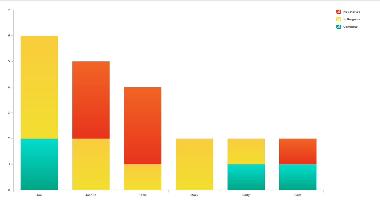
Ideal for comparing values across categories, vertical bar charts are one of the most straightforward ways to visualize change. In Mapline, they’re perfect for showing performance by region, team, or product. You can instantly identify trends, highlight outliers, and compare totals across time or geography. Because the data updates dynamically, you’ll always see the most current picture of what’s driving results.
Horizontal Bar Charts
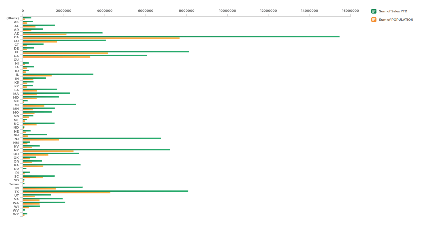
When you have long category labels or need to emphasize ranking, horizontal bar charts keep data clear and easy to scan. Mapline’s version is especially useful for leaderboards, territory performance, or customer satisfaction rankings. The horizontal layout improves readability and makes it simple to compare items side by side without visual clutter.
Line Charts
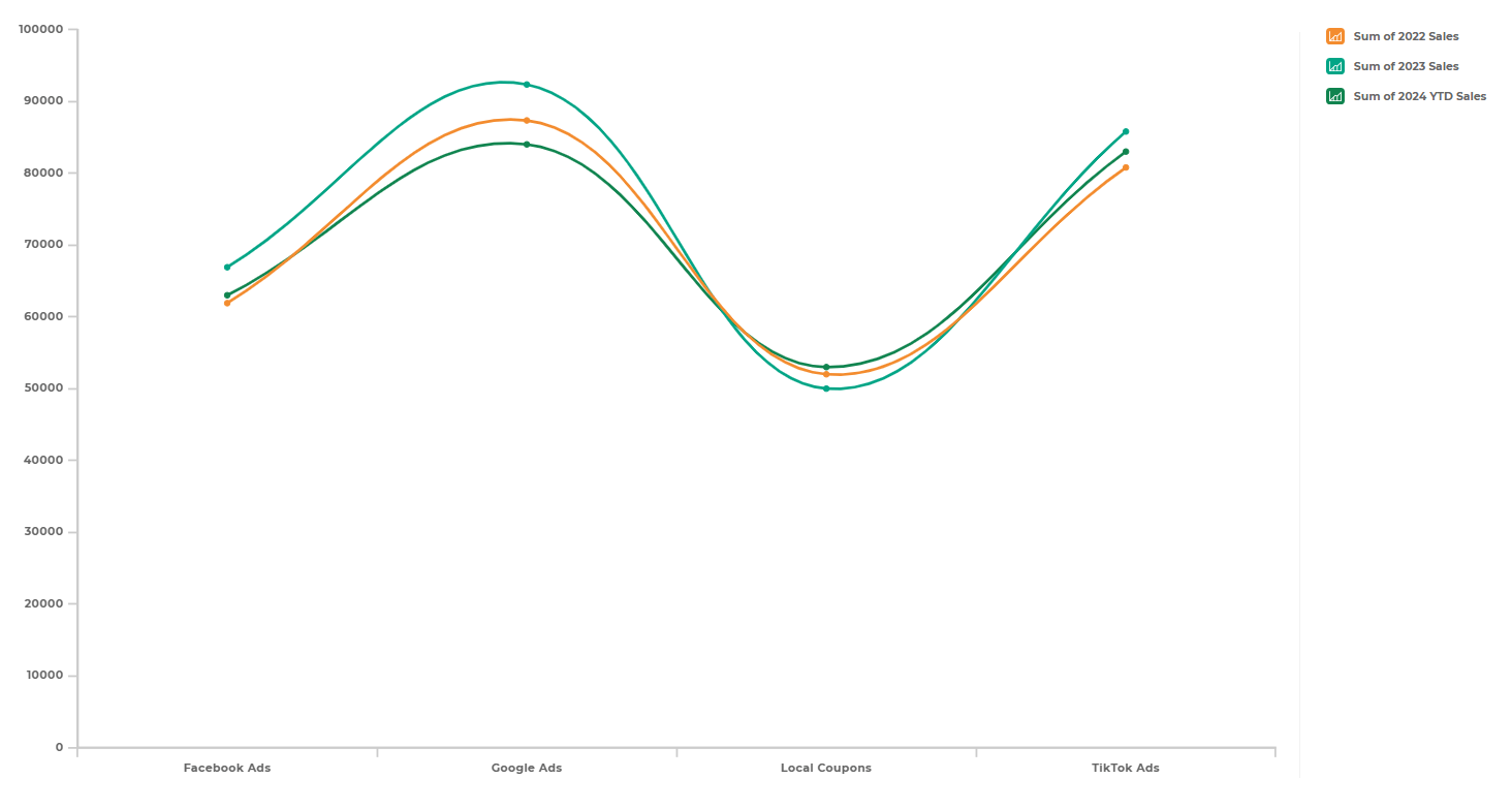
Line charts visualize change and progression. They’re ideal for tracking KPIs, revenue growth, or operational efficiency over weeks or months. Mapline’s line charts automatically adapt as new data flows in, helping you spot upward or downward trends at a glance.
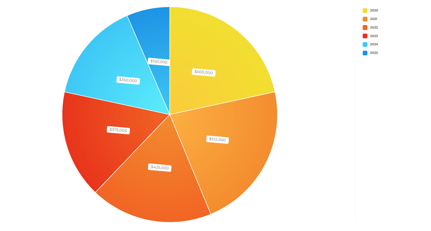
Pie Charts
Pie charts are great for visualizing proportions at a glance. In Mapline, you can use them to show how sales, resources, or customers are distributed among categories. Each slice adjusts automatically when your dataset changes, making it simple to communicate ratios and shares across your organization in real time.
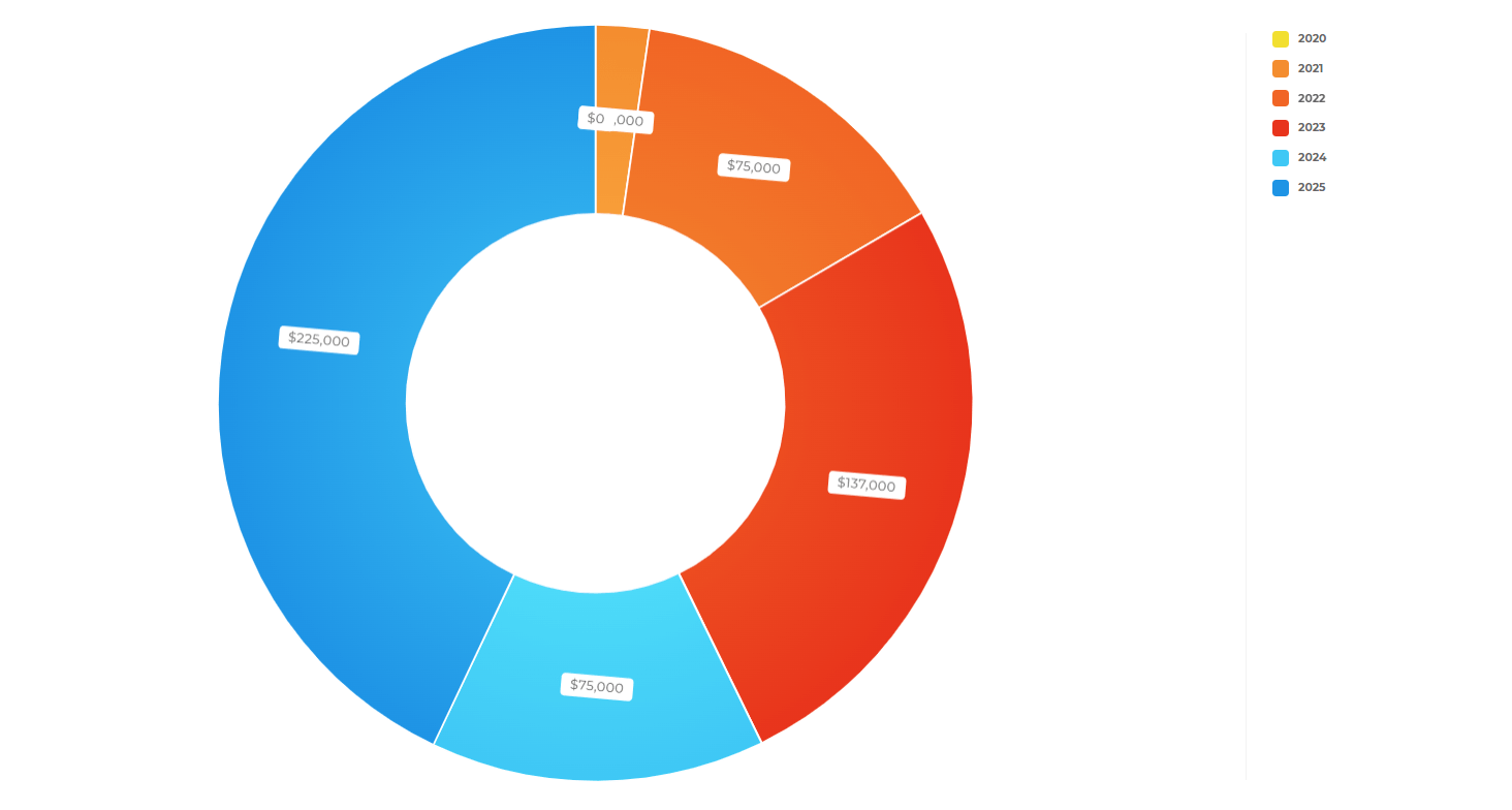
Donut Charts
Donut charts add a modern twist to pie charts—giving you the same proportion insights with extra room for contextual data in the center. In Mapline, you can display totals, percentages, or key metrics right inside the chart’s core, creating a polished, professional visual that works beautifully in dashboards and reports.
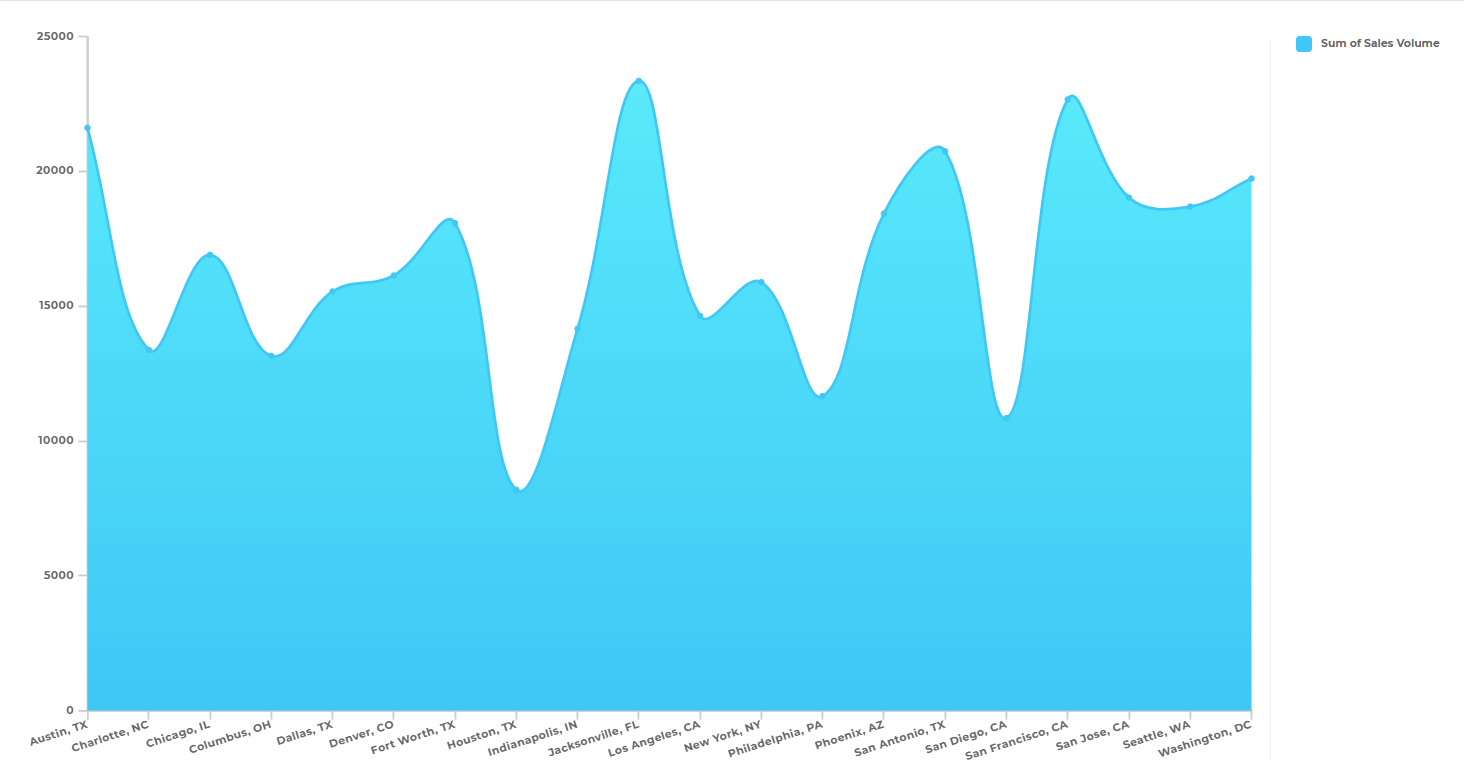
Area Charts
Area charts in Mapline help you visualize how values grow and change over time. They’re excellent for cumulative metrics like revenue growth, production output, or customer count. The shaded areas emphasize the magnitude of change, helping you see both individual trends and overall momentum in a single glance.
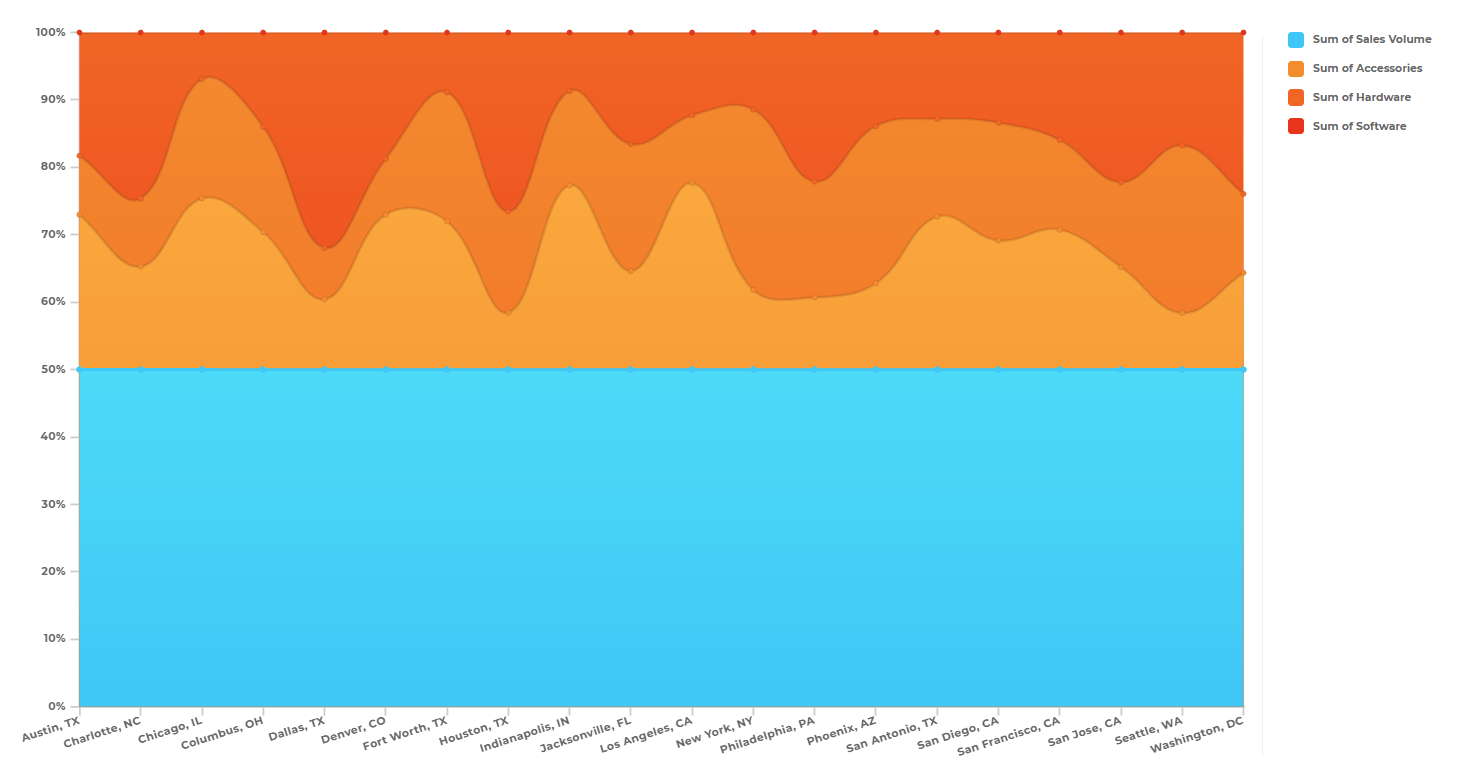
100 Percent Area Charts
When you want to show how parts contribute to a whole over time, Mapline’s 100 Percent Area Chart is the go-to visualization. It normalizes all categories to a consistent baseline, revealing how percentages shift within a total. Perfect for illustrating product mix, regional sales balance, or resource allocation over time.
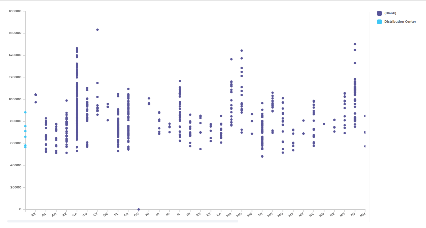
Scatter Charts
Scatter charts reveal relationships between two variables—making them ideal for performance analysis and forecasting. In Mapline, you can map patterns between metrics like delivery time vs. cost, or revenue vs. customer density. Each plotted point represents real-world data, helping you uncover correlations that lead to smarter decisions.
Advanced Charts for Smart Data Analysis
As your data grows more complex, your visuals should grow smarter. Advanced charts take analysis beyond simple comparisons, uncovering patterns, correlations, and opportunities hidden in large datasets. They turn raw information into predictive insights that drive better decisions across departments. In Mapline, these advanced visuals come to life—automatically updating with every new data point and linking directly to your geographic and business intelligence layers. Whether you’re mapping performance, forecasting demand, or spotting trends in real time, these charts make analytics intuitive, interactive, and actionable.
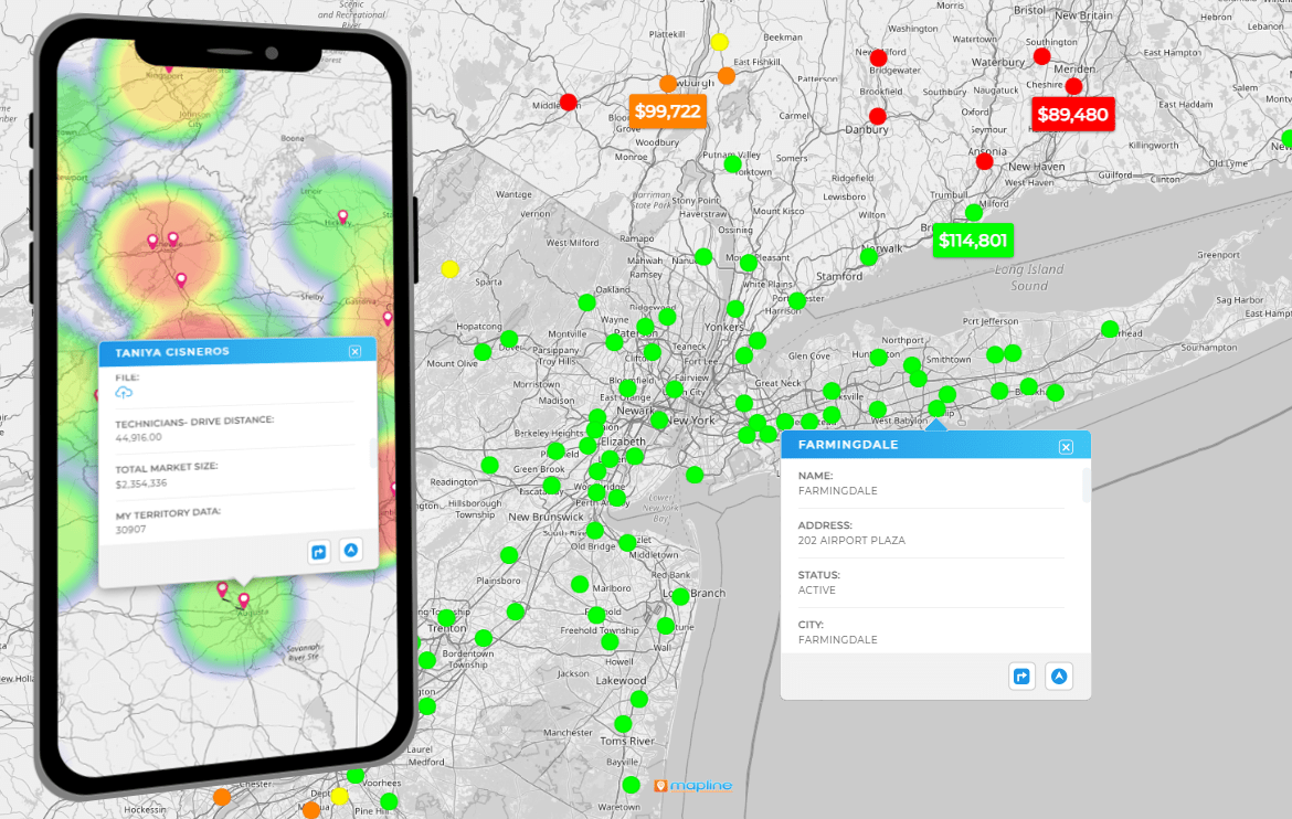
Heat Maps
Heat maps transform data density into visual gradients, revealing hot spots and opportunities instantly. Mapline’s Geo Mapping feature takes heat mapping further by overlaying your business data directly onto territories, sales regions, or delivery routes—giving you both visual and geographic context.
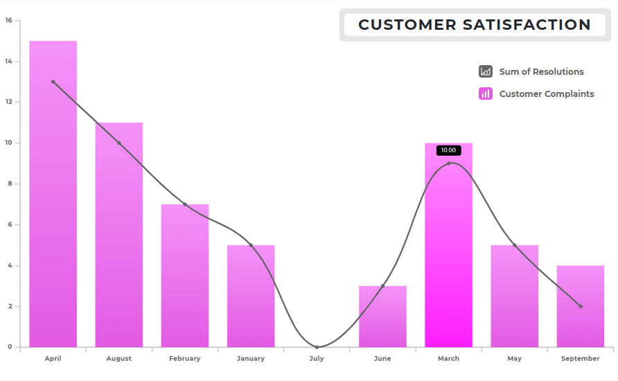
Combo Charts
Combo charts let you overlay multiple chart types—like bars and lines—so you can compare totals against trends in one view. For example, plot total sales as bars and profit margins as a line to quickly see performance balance.
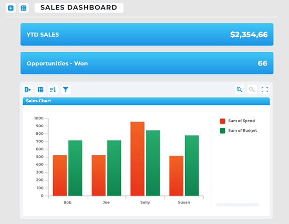
KPI Cards and Metrics
Sometimes, the simplest visuals make the biggest impact. KPI cards and gauges give teams a quick view of key metrics—sales goals, delivery rates, or customer satisfaction—without overwhelming detail. In Mapline, these visuals can sit alongside charts and maps in your dashboard, updating live as data changes.
Creating Charts That Tell a Story
The best way to create charts and graphs isn’t to cram in as much data as possible—it’s to focus on clarity and purpose. Each visual should answer a question: What’s happening? Why does it matter? What action should we take? Mapline’s smart dashboard tools make this process effortless by pairing visuals with filters, annotations, and real-time insights.
Whether you’re presenting to executives or managing day-to-day operations, storytelling through data builds trust, clarity, and confidence. With Mapline, every chart becomes part of a bigger picture—a live narrative of your business performance.
The best charts depend on what story you’re trying to tell. Bar charts and line charts are ideal for comparing performance or tracking change over time, while pie charts and heat maps highlight distribution and density. In Mapline, you can combine multiple chart types in a single dashboard for a complete visual narrative.
Charts are great for summarizing categories or trends, while graphs are better for showing relationships between variables. Mapline lets you build both with real-time data connections, so you can choose whichever format makes your insights clearest.
The best way is to use a platform like Mapline that integrates data visualization, Geo Mapping, and analytics in one place. This ensures your charts and graphs stay accurate, interactive, and automatically updated as data changes.
Yes. Mapline offers many of the same advanced visualization options found in Tableau or Power BI, with the added advantage of Geo BI—connecting every metric to its real-world location. You can even integrate Mapline charts into existing Tableau dashboards to enhance location-based analysis.
Charts and graphs work best with quantitative data—like sales numbers, revenue, or performance metrics—but Mapline also supports geographic and categorical data. This allows you to visualize not only what’s happening, but where it’s happening.
They simplify complex information into visuals that are easy to understand and remember. In Mapline, these visuals are dynamic and interactive, helping you connect data points into a compelling narrative that drives action.
Absolutely. Mapline dashboards are cloud-based, making it easy to share live, interactive visuals with your team or stakeholders. Everyone stays aligned with real-time data that updates automatically.


