It might be April Fool’s Day, but trust us—these updates are no prank. We’re rolling out seriously powerful features that are all about making your maps, dashboards, and data work harder (and smarter) for you. From smarter territory shapes to new integration superpowers, you’re about to see just how fast your workflows can go. Let’s dive in!
Real-World Travel Boundaries
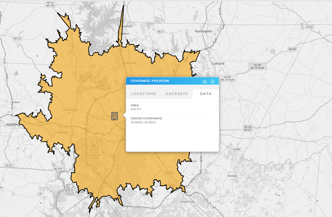
Say goodbye to generic circles and hello to the most accurate drive time polygons on the planet—only from Mapline. These aren’t just estimates; they’re real-world travel zones built from actual road data and travel speeds. Whether you’re working with drive time or drive distance, our polygons dynamically map your true reach based on how people really move—not how far a bird can fly.
No other software gives you this level of precision. Plan delivery zones, service areas, and rep territories with confidence, knowing your map reflects real conditions, not assumptions.

Pro Tip: No other mapping software gives you both drive time and drive distance polygons with real-world, data-driven boundaries. Many tools rely on rough estimates like hexagonal grids to guess how far someone can travel—but those shapes ignore real-world factors like roads, speed limits, and traffic. That kind of guesswork can lead to poor decisions.
Mapline’s drive time polygons use real road data to generate accurate, web-like boundaries that reflect how people actually drive. That means smarter service zones, better logistics, and location insights you can trust. Learn how to add drive time or drive distance polygons to your map now!
Google Analytics Integration
Ready to connect your website traffic to your map data? Mapline now integrates with Google Analytics, letting you visualize your online engagement like never before. Track visits by region, optimize campaigns based on web behavior, and get location-based insights that fuel your marketing strategy.

Calendars Meet Dashboards
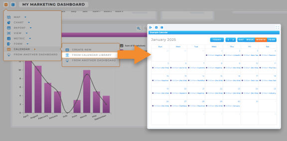
You can now add calendars directly to your dashboards! This update gives your team a unified view of upcoming tasks, appointments, or field assignments—right alongside your reports, forms, and charts. It’s a simple way to centralize your workflow and keep everyone aligned in one visual, interactive space.
Smarter Shape Placement
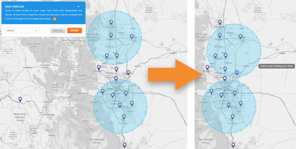
Drawing custom shapes just got a whole lot smoother. You can now rotate and drag shapes while placing them on your map, making it easier than ever to outline service areas, mark boundaries, or define regions with precision. This means fewer do-overs and more time spent analyzing the territory that matters most.


