WHAT IS A PIN MAP?
A pin map is a visual representation of data points placed on a map. Each pin marks a location, such as a store, customer, or delivery address, making it easy to see where your business activity is happening. While it’s common to map several addresses for navigation or personal use, businesses can go much deeper by analyzing multiple points on a map for patterns and trends. By plotting pins with Mapline, your data becomes interactive, visual, and immediately more meaningful. The key is moving from static pins to strategic visuals that tell a story about your operations.

Pro Tip: Don’t stop at just mapping several addresses. Layer your pin map with heat maps, territories, or routes to unlock even deeper insights. When pins work together with other visualization tools, you’ll see patterns and opportunities that static maps simply can’t deliver.
The Challenge of Raw Location Data
Raw data plotted as pins on a map can quickly become overwhelming. Hundreds of identical markers don’t tell a story, and without structure, it’s hard to know what to focus on. Businesses need ways to make those pins more meaningful—through labels, filtering, and customization—so the data becomes digestible. Otherwise, the map is just a wall of points with little direction.

Missed Opportunities Without Context
Mapping several addresses is useful, but without adding context, valuable insights remain hidden. For example, you might know where customers live, but unless you layer in revenue data or service history, you won’t know which locations drive the most value. Without context, decision-makers risk treating all pins equally, which can lead to wasted resources. Adding depth to pin maps ensures you uncover opportunities that raw location data alone can’t reveal.

From Visualization to Strategy
The ultimate goal of pin mapping isn’t just to see locations—it’s to make decisions based on them. By turning a simple visualization into a strategy dashboard, businesses can prioritize, allocate, and act more effectively. This means building maps that don’t just show where things are, but reveal why they matter and what should happen next. That’s the shift from “basic map” to “strategic tool,” and it’s where Mapline shines.

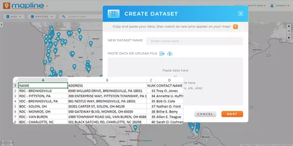
Bulk Upload and Instant Mapping
Mapline makes it easy to map multiple locations by importing an Excel or CSV file. With just a few clicks, hundreds or thousands of addresses appear as pins on a map. Unlike Google Maps, these pins can be linked to your actual data fields, so they’re never just static points. This bulk mapping capability ensures you spend less time plotting and more time analyzing.
Color-Coded Pins and Labels
Color-coded pins and labels transform a basic pin map into an instant story. Instead of seeing a sea of identical markers, you can assign colors to represent performance, status, or categories, making trends easy to spot at a glance. Labels take this further by displaying key details directly on the pins, such as revenue, customer names, or account tiers. This combination eliminates the need to cross-reference spreadsheets, because the insights are built right into the map. The result is faster decision-making and clearer communication across teams, since everyone can see exactly what matters most.

Segment & Filter Locations
When you’re managing hundreds or even thousands of locations, segmentation and filtering are essential. With Mapline, you can filter pins by region, customer type, or performance tier to focus only on the data you need in the moment. This makes it easy to drill down into specifics without losing sight of the big picture. Segmenting also helps highlight patterns that may otherwise be hidden, such as clusters of high-value customers or underperforming territories. By narrowing your view to what matters most, you get answers faster and with greater accuracy.

Heat Map Pins
Heat maps take custom pins to the next level by showing density and intensity across your locations. Instead of just seeing where pins are placed, you can see where activity is concentrated and which areas drive the most impact. This is especially powerful for analyzing customer density, regional sales performance, or service demand. Heat map pins help you identify hot spots of opportunity while also flagging areas of potential oversaturation. By layering heat mapping with pin visualization, you gain a dynamic view of your data that makes complex patterns easy to understand.

Identify Gaps in Coverage
Pin maps don’t just highlight where you’re strong—they also reveal where you’re weak. By mapping multiple points and comparing them to your service areas, you can quickly see gaps in coverage that may represent untapped opportunities. For sales teams, this could mean identifying territories without enough reps. For operations, it might highlight delivery routes that leave areas underserved. Pin maps make it clear where you should expand, invest, or reassign resources to maximize effectiveness. Gaps that might stay hidden in spreadsheets become obvious when plotted visually.

Track Team Performance in Real-Time
With dynamic pin mapping, you can track team performance as it happens. Each pin can represent an activity—like a completed delivery, an open service ticket, or a sales win—giving managers instant visibility into progress. Real-time tracking allows you to quickly identify which areas are excelling and which may need support. This kind of visibility empowers teams to be more accountable and managers to be more proactive. Instead of waiting for weekly reports, performance becomes transparent in the moment, helping everyone stay aligned and efficient.

Reports & Analytics
Pin maps become even more powerful when paired with reporting and analytics. Mapline lets you generate reports based on your mapped pins, so you can quantify trends and performance alongside your visuals. For example, you might build a report that shows revenue by territory, customer growth by region, or service response times across coverage areas. These insights can then be shared in dashboards or presentations to guide strategy. By combining pin visualization with hard analytics, you get a complete picture that drives smarter, data-backed decisions.

Sales and Territory Management
Sales teams can map multiple locations to track where customers are concentrated, giving them a clearer picture of their market landscape. By combining pins with defined territory boundaries, reps can quickly identify areas of opportunity and adjust their strategies to maximize coverage. Visualizing territories also helps balance workloads across teams, ensuring resources are distributed fairly and efficiently. With the ability to highlight high-value accounts or underperforming regions, pin maps become a critical tool for guiding sales decisions. It’s a simple but powerful way to ensure no territory is left behind and that every rep has the insights they need to succeed.

Operations and Logistics
For operations leaders, pin maps make it easy to visualize complex supply chains, delivery routes, or vendor networks in a single view. Mapping several locations at once reveals inefficiencies, bottlenecks, or gaps that may not be obvious in spreadsheets. This allows teams to streamline operations, cut unnecessary costs, and improve turnaround times. Whether it’s planning more efficient delivery routes, monitoring distribution centers, or ensuring vendors are strategically placed, pin maps provide actionable clarity. By turning logistical data into visual insights, operations managers can keep systems running smoothly and adapt quickly to challenges as they arise.

Dispatch, Pickup & Delivery
Pin maps are a powerful tool for logistics teams managing dispatch, pickup, and delivery. By mapping multiple addresses, companies can instantly see the best routes, track service coverage, and spot inefficiencies in real time. Drivers and field teams benefit from clear visuals that show exactly where they need to go and in what order, reducing wasted time and fuel. Dispatch managers can also balance workloads across teams by visualizing assignments on the map. The result is a more reliable, cost-efficient delivery network built on smarter planning.

Marketing and Campaign Tracking
Pin maps aren’t just for operations—they’re also a game-changer for marketing teams. By plotting customer locations, event signups, or campaign responses, marketers can quickly see which regions are most engaged. This helps identify high-performing markets, uncover underserved areas, and optimize ad spend with precision. For example, after a campaign launch, you can track response pins to see where messaging resonates and adjust targeting accordingly. With pin maps, marketing shifts from broad guesswork to location-driven strategy that boosts ROI.
