- Blog
- Geo Mapping
- Create Heat Maps from Excel or CSV Data
Heat maps have become one of the fastest ways to understand large datasets at a glance. Instead of scanning rows and columns in a spreadsheet, heat maps turn raw location data into clear visual patterns that reveal where activity is concentrated, where gaps exist, and where attention is needed most.
With the right heat map generator, teams can upload Excel or CSV files and instantly transform addresses, ZIP codes, or coordinates into actionable insights. Whether you’re analyzing sales performance, customer density, service coverage, or operational workload, heat maps help you see trends that are nearly impossible to spot in a table.
This guide walks through how heat maps work, why they matter in modern analytics, and how Mapline makes it easy to create powerful heat maps from your existing data—no coding required.
What Is a Heat Map Generator?
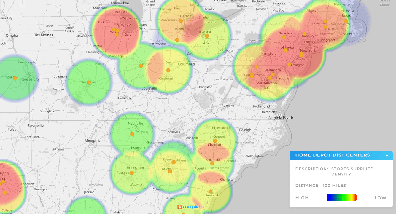
A heat map generator is a type of heat mapping software that converts location-based data into a color-coded visual representation. Areas with higher values or higher concentrations appear “hotter,” while lower activity areas appear cooler.
Instead of showing individual points, heat maps aggregate data across space, making them ideal for identifying regional patterns, clusters, and outliers. This is especially useful when working with large datasets where individual pins would otherwise overlap or obscure insights.
Modern heat map generators go beyond simple density views, allowing users to analyze performance metrics, compare regions, and layer heat maps with other geographic data.


Pro Tip: If your heat map is hard to interpret, try adjusting the metric driving the visualization or pairing it with territories or ZIP code boundaries. Context often matters as much as density when making decisions.
Why Create Heat Maps from Excel or CSV Files?
Most business data already lives in spreadsheets. Sales records, customer lists, service logs, inventory locations, and marketing results are typically stored in Excel or CSV format, making these files the natural starting point for geographic analysis.
By creating heat maps directly from Excel or CSV data, teams avoid manual rework and reduce the risk of errors. Instead of rebuilding datasets or learning new tools, they can upload existing files and immediately start exploring geographic trends.
This approach also makes heat maps accessible to non-technical users, enabling faster insights across teams without relying on analysts or GIS specialists.
Common Use Cases for Heat Mapping Software
Heat mapping software is used across industries to answer critical location-based questions. Sales teams use heat maps to identify high-performing ZIP codes and underserved regions. Operations teams visualize workload density to balance coverage and resources. Marketing teams analyze campaign response by geography to refine targeting.
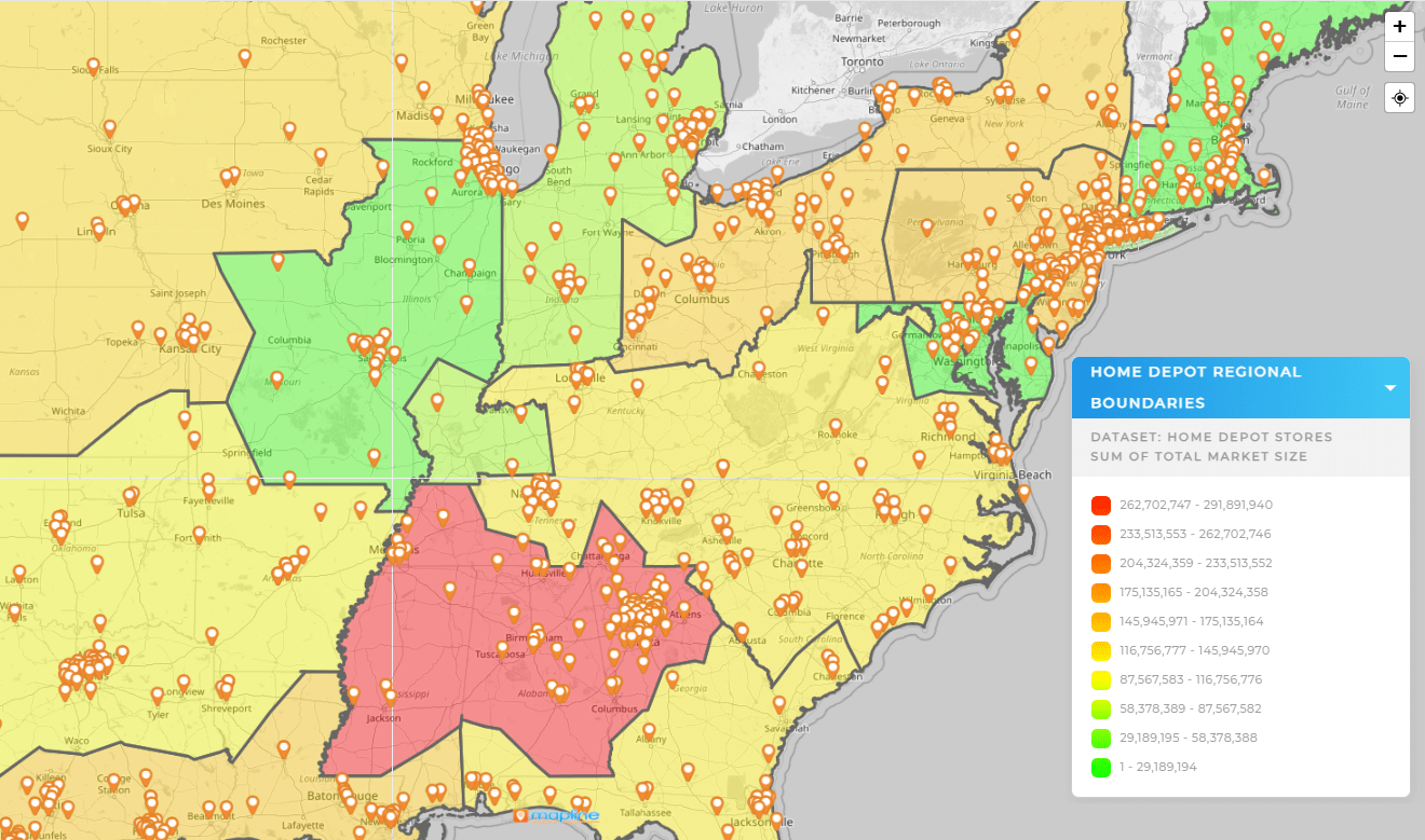
Zip code heat maps are especially popular because they align naturally with territories, service areas, and market boundaries. By aggregating data at the ZIP code level, teams can compare regions consistently while maintaining a clear, intuitive view.
Across all use cases, the goal is the same: turn complex data into clear, spatial insight that drives better decisions.
How Mapline Works as a Heat Map Generator
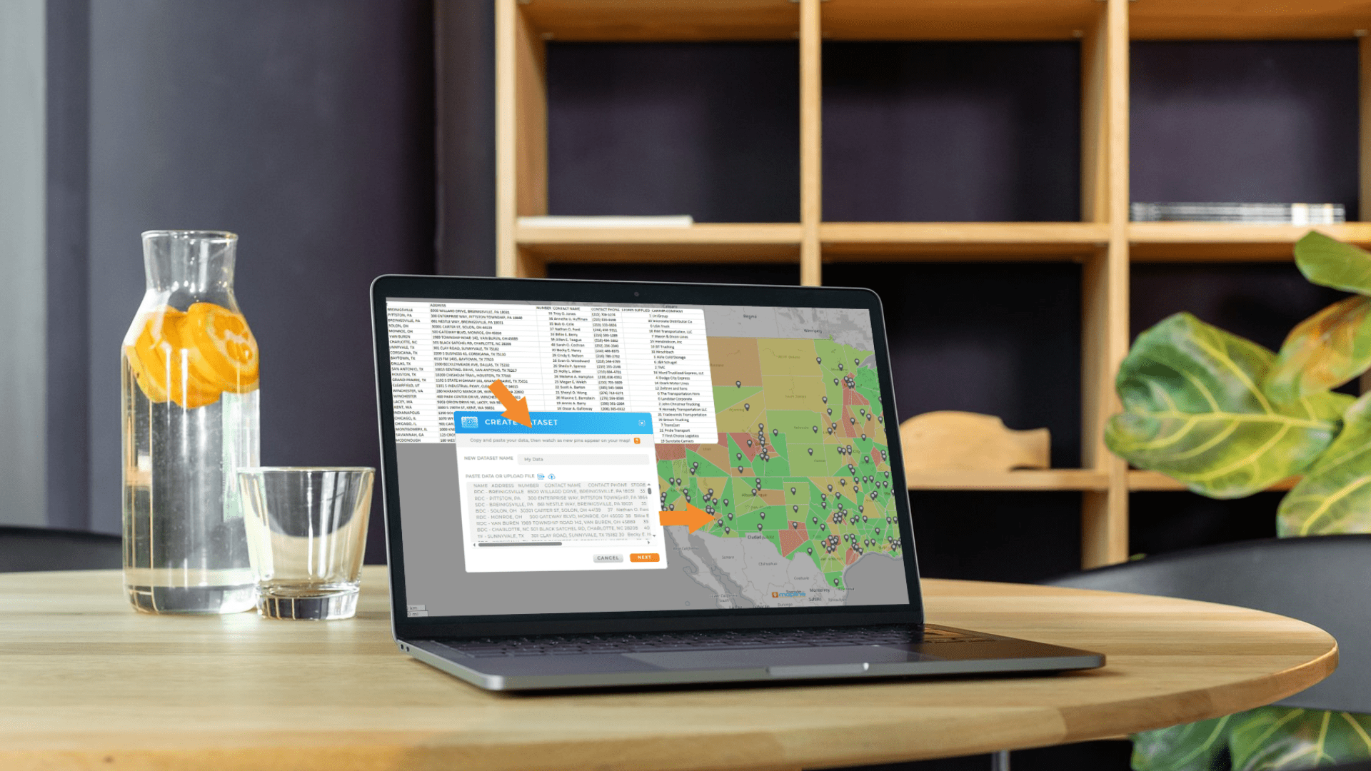
Mapline allows users to upload Excel or CSV files and instantly generate heat maps based on their data. Locations can be mapped using addresses, ZIP codes, cities, or latitude and longitude, giving teams flexibility regardless of how their data is structured.
Once uploaded, users can choose which data fields drive the heat map—such as sales volume, customer count, visit frequency, or any numeric metric in the dataset. The map updates dynamically as settings change, making it easy to explore different perspectives.
Unlike basic heat mapping tools, Mapline lets users layer heat maps alongside pins, territories, coverage areas, and filters, creating a complete geographic analysis environment instead of a single static view.

Beyond Basic Heat Maps: Deeper Geographic Insight
Heat maps are most powerful when they’re part of a broader analytics workflow. With Mapline’s Geo Mapping, heat maps can be filtered, segmented, and compared across regions to uncover patterns over time or between different datasets.
Teams can visualize performance by territory, overlay demographic data, or combine heat maps with distance analysis to understand not just where activity exists, but why it looks the way it does.
This turns heat maps from a one-time visualization into a living analytical tool that supports ongoing planning and optimization.

A heat map generator is a tool that converts location-based data into a color-coded map to show density, intensity, or performance across geographic areas.
Yes. Many heat mapping tools, including Mapline, allow users to upload Excel or CSV files and generate heat maps directly from that data.
Heat maps work best with numeric data such as sales totals, customer counts, visit frequency, or any metric that benefits from regional comparison.
A ZIP code heat map aggregates data by ZIP code boundaries, making it easier to compare performance or density across standardized geographic regions.
No. Modern heat mapping software like Mapline is designed for business users and does not require coding or technical GIS expertise.


