Data visualization isn’t just about pretty charts—it’s about unlocking real-world insights from complex data. The best visualizations don’t just display information; they clarify what matters most so teams can take immediate, confident action. Whether you’re mapping customer behavior, tracking logistics, or analyzing performance across departments, visuals help reveal patterns that spreadsheets often obscure. They make data intuitive—transforming rows of numbers into strategic direction. This shift from static reports to dynamic, visual storytelling is what enables truly data-driven decisions. And with the right mapping software, you can connect your location data to your business metrics in ways that drive real results.
What Makes Great Data Visualization?
Great visualizations are more than colorful charts. They reveal patterns you didn’t know existed, connect performance to location, and let teams move from data to decision faster than ever. Effective data visualization turns confusion into clarity and keeps every stakeholder focused on what matters most. With Mapline’s Geo BI, your dashboards aren’t just smart—they’re built to reflect the real world.
- Geography-aware dashboards that tie performance data to real-world locations
- Interactive visual filtering—zoom in, drill down, and explore patterns by region, customer, or timeframe
- Live data views so you never make decisions based on outdated reports
- Custom roles and visibility—tailor dashboards for ops leaders, field teams, or executives
- Territory heat maps and pin clusters that surface resource gaps or high-opportunity zones instantly
Mapline mapping software delivers a level of visibility no static chart can match—helping you act faster, forecast smarter, and win more often.
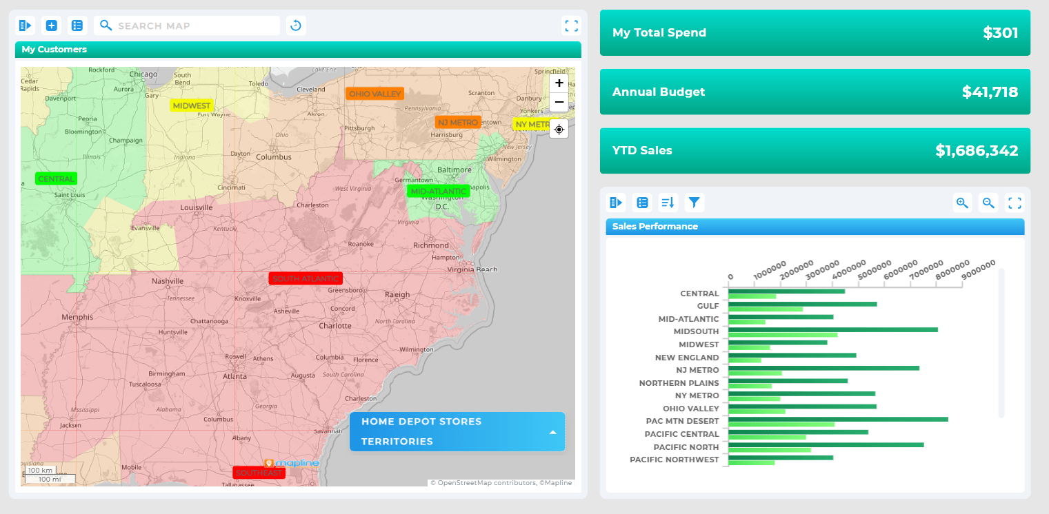

Pro Tip: Want more than charts and tables? Mapline’s Geo BI platform lets you build interactive dashboards that combine traditional analytics with map-based visualizations—so you see the whole picture, not just part of it. From mapping data visually to tracking KPIs across time and space, it’s the simplest way to connect data to action.
Turn Raw Numbers Into Actionable Insights
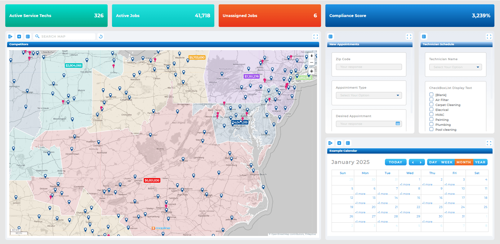
With the right data visualization software, your team can transform spreadsheets into clean, interactive visuals. These tools turn KPIs into charts, maps, or heat zones—helping everyone spot patterns at a glance.
Choose the Best Data Visualization Tools for Your Team
Whether you’re using line graphs or heat maps, the best data visualization tools should scale with your business. Look for features like automation, map integration, and drag-and-drop dashboards to speed up your decision-making process.
Why Interactivity Matters in Modern Dashboards
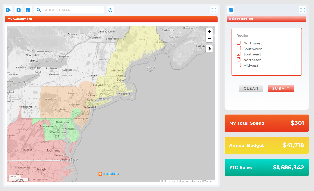
Static charts don’t cut it anymore. In today’s fast-paced business environment, teams need real-time dashboards they can explore, filter, and customize on demand. Interactivity transforms your data from a passive report into a decision-making engine—one where users can drill down by region, zoom into problem areas, or instantly apply filters to uncover trends. Instead of waiting for a weekly update or exporting endless spreadsheets, users get live, visual feedback as conditions change. This not only improves speed and clarity, but also empowers every department—from sales to operations—to act confidently based on what’s happening now, not last week. Mapline’s interactive dashboards are designed with this agility in mind, combining spatial context with real-time analytics to help you respond faster and smarter.
Build Custom Dashboards in Minutes
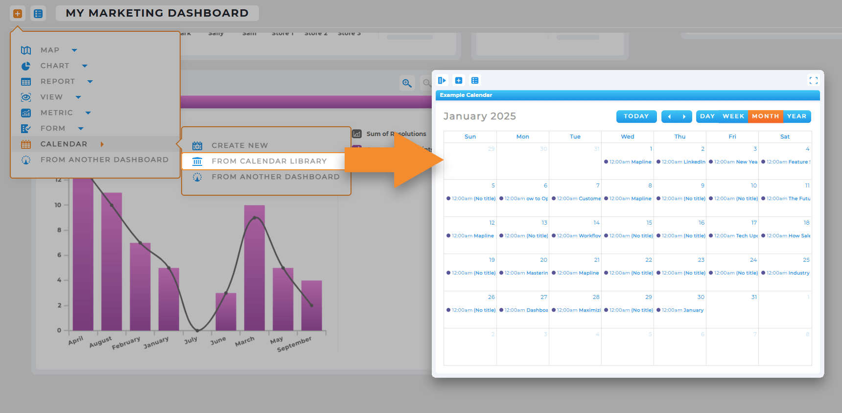
With a powerful analytics dashboard builder, you can build fully custom dashboards tailored to different teams or roles—no code required. Just plug in your data and start visualizing.
Get More from Interactive Data Dashboards
Interactive data dashboards let users toggle filters, compare time ranges, or zoom in on performance by region—all with just a few clicks. This interactivity brings depth and context to every KPI on the board.
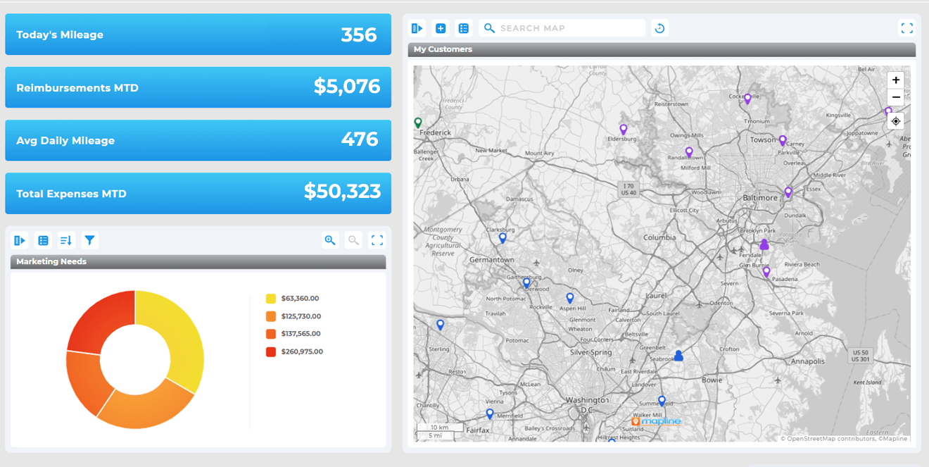
Visualize Data on a Map for Deeper Context
Geography brings clarity. Creating a map from Excel spreadsheet instantly reveals patterns you can’t see in rows and columns. Whether you’re tracking customer locations, territory coverage, or regional performance, a visual map turns raw data into intuitive insights. You can spot gaps, overlaps, and high-density zones at a glance—helping you make faster, more confident decisions. With Mapline, every map is interactive, so you can filter, zoom, and layer your data to get the exact view you need. It’s more than a map—it’s a strategic lens for your business.
Map-Based Data Visualization: More Than Just Pins
Use a map-based data visualization to overlay performance data, customer zones, or job progress directly on a live map. It’s a faster way to identify outliers and opportunities, and act on them.
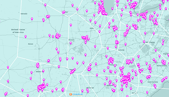
Mapping Data Visually with Heat Map Software
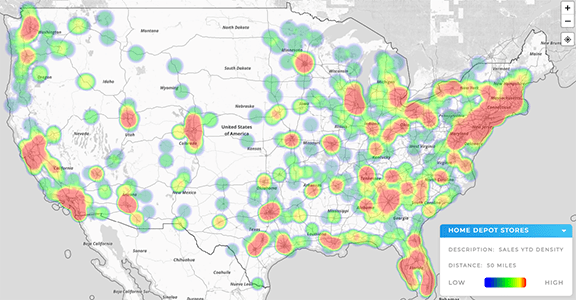
Heat map generator lets you spot high-performing areas (or bottlenecks) at a glance—perfect for teams managing territories, service coverage, or regional sales. This kind of visual prioritization is a game-changer for sales and marketing teams.
Data Presentation Tools That Make an Impact
When it’s time to present your findings, visuals should do the heavy lifting. Geo BI turns complex data into crystal-clear narratives—automatically. Whether you’re briefing stakeholders or aligning teams, Mapline helps you show not just the “what,” but the “why” and “what’s next.” Interactive dashboards, dynamic heat maps, and export-ready reports mean your audience gets the story—fast. Because when your visuals lead, decisions follow.
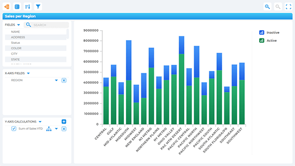
Use Data Chart Software That Speaks Clearly
Charts don’t just decorate slides—they persuade stakeholders. The right data chart software helps you build clean, compelling visuals that back up your recommendations with confidence and clarity.
Showcase Business Data with Confidence
Business data visualization should help leadership make fast, confident decisions. Mapline makes it easy to present dashboards live or export stunning visuals in one click—ideal for meetings, reports, or investor decks.
Compare Performance by Location
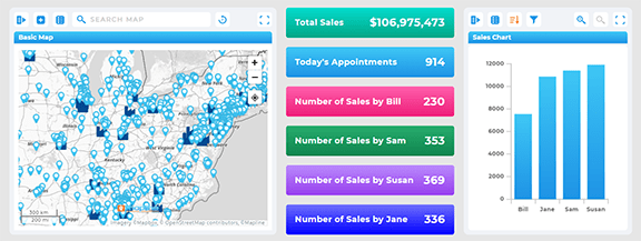
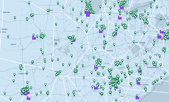
Use map-based data visualization to compare performance across regions, territories, or districts. See which zones are thriving, where reps need support, and which markets are underperforming—at a glance. Geo BI takes the guesswork out of multi-location operations.
Drive Executive Alignment with Custom Dashboards
Build interactive data dashboards tailored to each stakeholder. Executives get high-level insights, while operations and field teams get the granular views they need. With Mapline’s custom dashboard builder, you control who sees what—so everyone stays aligned, without information overload.
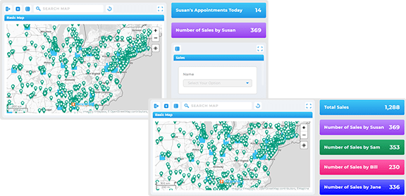
Mapline combines dashboards with powerful territory and location-based visualizations—ideal for businesses managing routes, regions, or remote teams.
Yes. With Mapline’s drag-and-drop dashboard builder, anyone can build interactive dashboards in minutes—no dev team needed.
Heat maps instantly show performance intensity by region, helping teams prioritize resources and act faster.
Business-focused visualization tools go beyond reporting. They’re built to handle scale, real-time data, and the nuanced needs of operations, sales, marketing, and logistics teams.


