Our team is ready to help you eliminate wasted time, maximize your sales coverage, and supercharge your team's efficiency. We'll provide the expert guidance and tailored solutions you need to get things right. Stop missing out on valuable opportunities. Reach out, and we'll get started on optimizing your territories today!
READY FOR MAPLINE TO
ROCK
YOUR WORLD?
WE WANT YOU TO EXPERIENCE EVERY-THING YOU'VE BEEN MISSING BY STARTING YOUR FREE TRIAL TODAY! OUR TEAM IS READY TO HELP CHANGE YOUR LIFE. SO REACH OUT AND WE'LL GET THINGS STARTED!
READY FOR MAPLINE TO
ROCK
YOUR WORLD?
Discover the potential of Mapline with a LIVE DEMO from our experts. This is your chance to see it in real-time and get all your questions answered. Connect with us to schedule your demo today!
Upload An Excel File and Visualize Your Data Instantly.
GEO
MAPPING
Upload your Excel or CSV file to visualize your data instantly—no coding or design skills required. Mapline’s powerful heat mapping tools help you uncover hidden opportunities at a glance. Spot customer hotspots, competitor overlap, or performance gaps with the world’s most intuitive and advanced heat map generator.
How Our Heat Map Generator Works
Mapline’s lightning-fast heat map generator makes it easier than ever to turn your data into powerful insights. In just a few clicks, you can:
Upload your Excel or CSV file
Select the data columns you want to visualize
Choose from heat maps, territory shading, or pin bubbles
Explore patterns, hotspots, and trends instantly
IDENTIFY TRENDS AND PATTERNS
Inefficiencies waste hours and dollars. Mapline’s heat map generator turns raw data into clear, color-coded visuals, making it easy to spot gaps, overlaps, and emerging opportunities at a glance.
Simply upload your spreadsheet and see intensity patterns instantly. Identify hotspots, uncover underserved areas, and take action faster. There’s no better way to improve performance and efficiency across your business.
Pro Tip: Use color scales to visualize patterns—like customer density, sales volume, or risk level—at a glance. For large datasets, Mapline’s heat map generator auto-adjusts your view so you can spot trends without overwhelm.
ANALYZE PERFORMANCE
Data in a spreadsheet can hide the full story. Mapline’s heat map generator brings performance metrics to life, letting you see exactly where activity is high or lagging across territories, service areas, or custom boundaries.
By shading each region according to your chosen metric, you can spot imbalances instantly, redirect resources, and adapt quickly as conditions change. It’s a smarter, faster way to optimize coverage and unlock growth opportunities.
ENHANCE WITH MAPLINE DATA
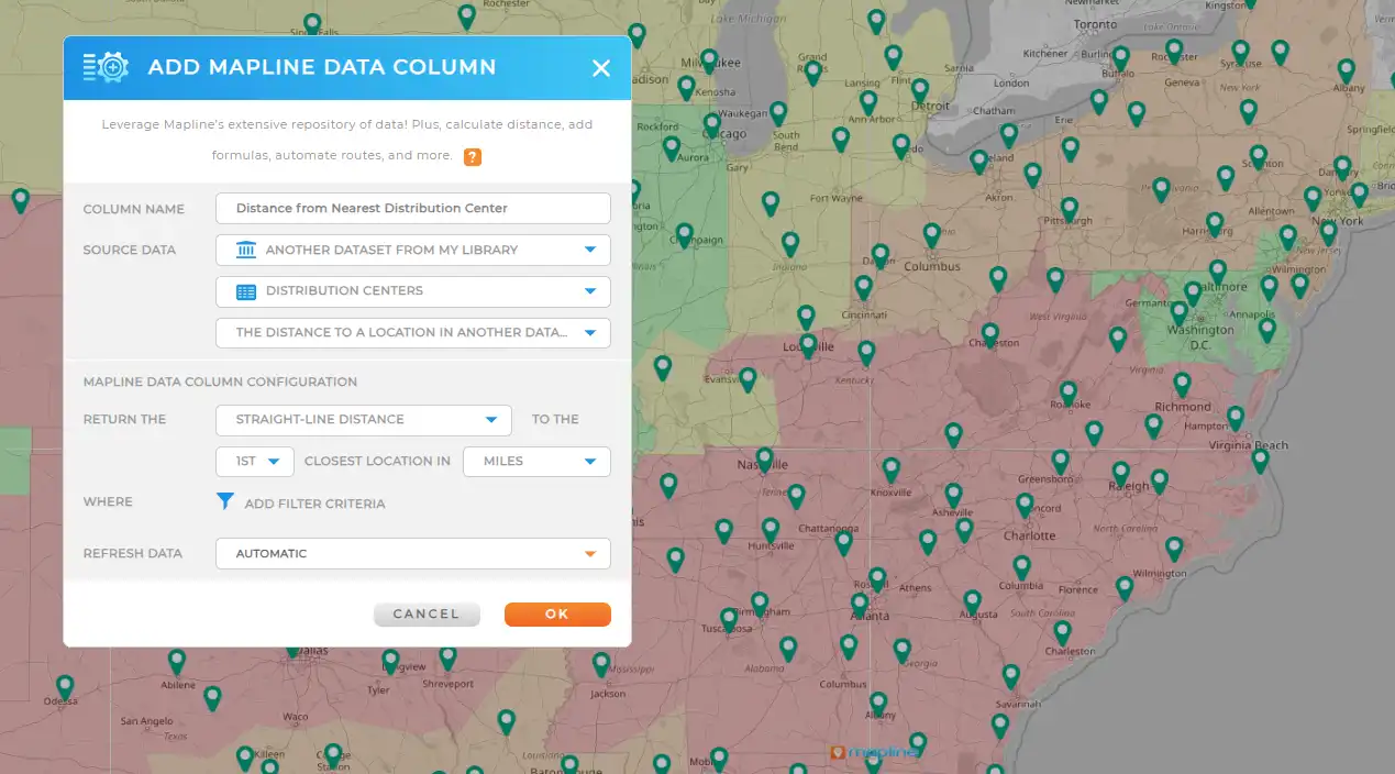
Take your heat maps further with Mapline Data. Layer in demographics, market potential, geographic boundaries, or other third-party datasets. In just minutes, you’ll see more than just where activity is happening; you’ll understand the why behind the patterns.
DRIVE STRATEGY AND ROI
But that’s not even the best part! The real value comes from using your heat map to make better decisions. Mapline’s heat map generator helps you focus resources where they’ll have the most impact—whether that’s targeting high-performing regions, improving underperforming areas, or reallocating your team for maximum efficiency.
With clear, data-backed insights, you can confidently invest in the strategies that deliver measurable returns. The result? Smarter planning, stronger performance, and a direct boost to your bottom line.
TURN YOUR DATA INTO A COMPETITIVE EDGE
Plot Locations
EASILY FROM A SPREADSHEET
VISUALIZE
YOUR DATA IN SECONDS
HEAT MAP
YOUR DATA AND UNCOVER KEY PATTERNS
CUSTOM TERRITORY
CREATION AND MANAGEMENT
INCREDIBLE STYLING
AND PIN GROUPING OPTIONS
WHICH TYPES OF HEAT MAPS ARE THERE?
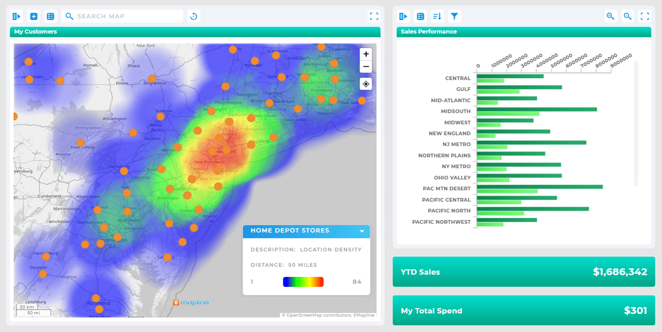
Radial Heat Map
Quickly visualize the intensity within a set radius around each location, revealing how influence or activity extends outward. In seconds, you can see service coverage areas, delivery ranges, or market reach, right at a glance.
This powerful view helps refine territory boundaries, pinpoint underserved areas, and guide more precise location-based decisions—driving efficiency and boosting ROI.
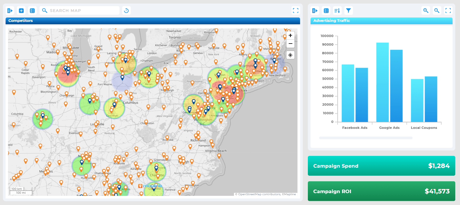
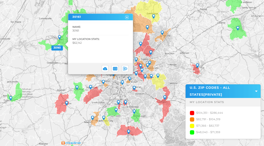
Territory Heat Map
A territory heat map visualizes performance or activity within defined boundaries, such as sales regions, ZIP codes, or custom areas, using color gradients to indicate intensity.
With a glance, you can see which territories are thriving and which need attention, making it simple to rebalance workloads, optimize resources, and align efforts with demand.
Color-Coded Pin Heat Map
A color-coded pin heat map uses varying pin colors to represent differences in performance, activity, or other key metrics at each location.
This makes it easy to compare locations side by side, spot trends, and quickly identify outliers, helping you take targeted action where it’s needed most.
TRY OURLIGHTNING-FASTHEAT MAPGENERATOR
Heat Maps Uncover insights that drive real results—fast.
Visualize Performance by Region with an Interactive Heat Map
When you generate a heat map, you’re not just displaying locations—you’re bringing your data to life. You’ll instantly hone in on demand sruges, activity lags, and regions in need of attention.
Patterns that hide in spreadsheets become crystal-clear, helping you make confident, data-driven decisions without the guesswork.
Use Heat Maps to Identify Hotspots or Service Gaps
A heat map generatro makes problem areas stand out instantly. Bright, high-intensity zones reveal hotspots of activity, while cooler, low-intensity areas expose coverage gaps and underserved regions.
This clarity makes it easy to address issues proactively, optimize resource allocation, and capture opportunities before they slip away.
Analyze customer locations with a heat map generator
Turn scattered customer addresses into a clear, color-coded picture of demand. Then, target growth opportunities, adjust sales territories, or refine your delivery routes in real time.
This visual insight enables faster, more strategic decisions that keep your business ahead of the competition.
Generate a Heat Map to Optimize Territory Planning
Territory planning gets easier, and far more precise, when you can see performance at a glance. Use Mapline’s heat map generator to shade each territory by metrics like sales, workload, or demand, so it’s instantly clear where resources are overextended and where gaps exist.
This clarity helps you rebalance coverage, align teams with the right regions, and target growth where it’s needed most.
Pinpoint New Markets and Opportunities
Turn location data into a clear visual strategy, showing exactly where your efforts will have the biggest impact. By highlighting high-performing areas, underserved markets, and emerging opportunities, you can target resources where they’ll deliver the most value.
LOCATION MATTERS —YOUR HEAT MAP GENERATOR SHOULD SHOW IT
WHATMAKES MAPLINE SODIFFERENT
SIMPLEST MAPPING SOLUTION
Visualize your spreadsheets in seconds with simple copy & paste implementation! Leverage our lightning-fast heat map generator and dive into new insights in no time! Plus, we have a team of experts ready to answer your questions and help you every step of the way, so let’s go!Visualize your spreadsheets in seconds with simple copy & paste implementation! Leverage our lightning-fast heat map generator and dive into new insights in no time! Plus, we have a team of experts ready to answer your questions and help you every step of the way, so let’s go!
POWERFUL MAP-BASED ANALYTICS
Mapline is the only software solution built from the ground up on our innovative Geospatial technology that leverages the power of distance and location in your data. We generate heat maps that let you see exactly where you are, then help you chart a course to where you want to be!Mapline is the only software solution built from the ground up on our innovative Geospatial technology that leverages the power of distance and location in your data. We generate heat maps that let you see exactly where you are, then help you chart a course to where you want to be!
Don’t just take our word for it:
“If you’re an advertiser, you want to know the markets I’m in. So, what am I going to do? Print out a spreadsheet? No, of course not. I’m going to use Mapline.”
– Sam Anthony, Your News
“I’m able to get a very complex, very deep and profound analysis.”
– Juan Hernández, RE/MAX
“Thank you Mapline for such an AMAZING program that is saving us money and building confidence in our future growth!”
– Lydia Rogers, Greenworks Commercial
“When people see it, they believe it. I show potential affiliates the map to start, just to show them how many markets we’re in and how we’re expanding.”
You can create a heat map by uploading your Excel or CSV file to a heat map generator like Mapline. Once uploaded, select the columns you want to visualize, choose your heat mapping method (e.g., intensity shading or bubble size), and your map will auto-generate in seconds—no coding required.
Mapline is one of the best free heat map generators for businesses and teams that need fast, accurate insights without the complexity of traditional GIS tools. You can upload an Excel or CSV file, choose your heat mapping style—such as radial heat maps, territory heat maps, or color-coded pins—and generate a fully interactive map in seconds. The free version lets you start mapping immediately, no credit card required, and includes powerful features like demographic data overlays, customizable styling, and easy sharing options.
Yes! Mapline’s online heat map generator runs entirely in your browser—no download or installation needed. Simply upload your file, choose your heat mapping style, and start exploring patterns across your data instantly.
Mapline supports geographic heat maps, density-based shading, intensity bubbles, and territory overlays. You can visualize sales trends, customer hotspots, coverage gaps, or even internal metrics using color gradients or pin groupings.
Heat maps apply color gradients or intensity markers to specific geographic points—like addresses, zip codes, or coordinates. The more data points in a given area, the more intense the color or shading becomes, making it easy to spot clusters and trends.
Yes! You can plot heat maps using latitude and longitude data by uploading a file with coordinate columns. Mapline will automatically detect and place each point on the map, allowing you to visualize data intensity with shading or pin bubbles.
Heat maps show data intensity—like volume, density, or frequency—using gradients or color patterns. Territory maps divide regions based on rules or assignments, such as sales zones or service areas. Both can be layered together in Mapline for deeper insight.
Heat maps reveal hidden patterns in your data—like regional sales performance, customer distribution, or service coverage. They help you optimize resource allocation, improve targeting strategies, and make smarter operational decisions.
Not at all. Mapline is designed for everyday users—no GIS background required. With a simple upload, drag-and-drop tools, and auto-generated maps, anyone can create professional-grade heat maps in minutes.
Yes, Mapline allows you to share heat maps with your team, export them as images, or embed them in presentations, dashboards, or web pages. You can also control access with view-only or editable permissions.
Mapline’s Geo Mapping platform lets you create heat maps at no cost—no credit card required. Just sign up, upload your Excel data, and turn it into powerful visualizations in seconds. You’ll get instant access to free heat mapping, pin plotting, and basic territory tools right out of the gate.
When you’re ready for more—like demographic overlays, government boundary data, and advanced Geo Mapping features—you can easily upgrade, unlocking deeper insights as your needs grow.
GEO
Mapping
GET STARTED FOR FREE
No credit card required
One map, two datsets — Completely FREE!
Access to live support and training resources
START HEAT MAPPING FOR FREE
Mapping Made Powerful Copyright Mapline Inc. Sales: +1 800.969.1454