- Blog
- Geo Mapping
- How to Create a Map With Pins for Healthcare Outreach
Whether you’re managing a network of clinics, coordinating mobile care units, or conducting community outreach, geographic clarity is crucial in healthcare. When you create a custom map with pins, you turn patient data, clinic locations, and service areas into a visual strategy—one that helps healthcare teams act faster, cover more ground, and serve communities more effectively.
From nonprofits to hospitals to government health agencies, teams across the industry are turning to Mapline for real-time, interactive maps that bring location data to life. With just a spreadsheet, you can build a medical outreach map, track service impact, and identify gaps in coverage. In this article, we’ll show how Mapline supports smarter healthcare location mapping—and how pin-based visualization helps you deliver better care to the people who need it most.
Why Mapping Matters in Healthcare Outreach
Outreach programs succeed when care reaches the right people, at the right time, in the right place. But managing patients, mobile teams, and regional needs without a map is like navigating with your eyes closed. With custom healthcare maps, you can visualize everything from clinic locations to community hot spots—giving teams the context they need to plan effectively and respond quickly.
Mapping tools also help leaders allocate resources, avoid duplication, and spot coverage gaps. Whether you’re coordinating a vaccine drive or expanding telehealth services, a live, pin-based map keeps your strategy grounded in data and geography. The result is a more equitable, more efficient healthcare operation.
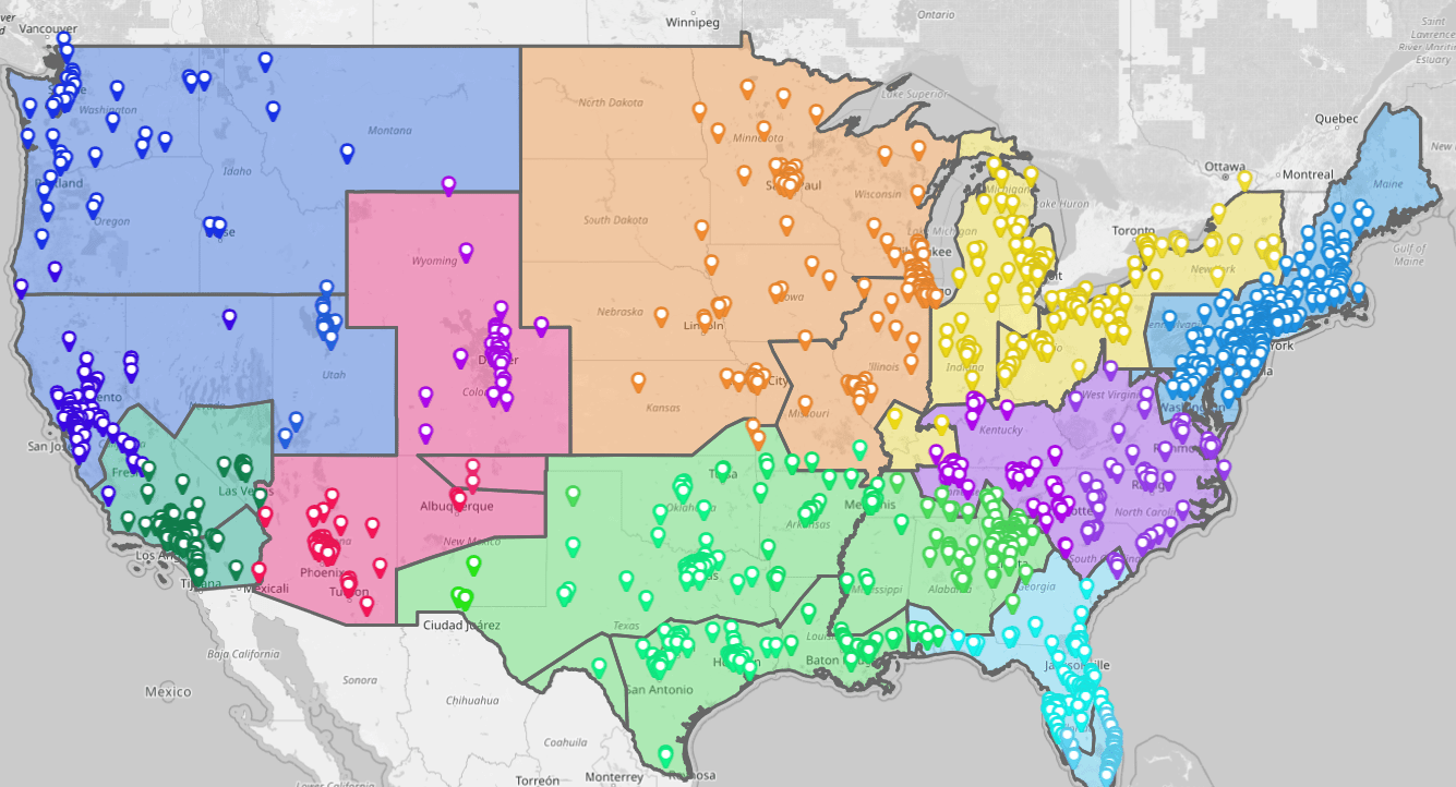

Pro Tip: Need to bring visibility to your healthcare outreach programs? Use Mapline’s Pin Mapping Software to create live, customizable maps that help you plan, track, and optimize services across communities and care networks.
Plot Clinic and Service Locations on a Custom Map
With Mapline, it takes just minutes to create a custom map with pins for all your clinics, mobile care units, or service centers. Upload a spreadsheet with address data—along with tags like clinic type, operating hours, or service availability—and Mapline will instantly generate a fully interactive map. This makes it easy to see where your resources are concentrated and where more support may be needed.
Visualizing location data is especially helpful for organizations managing multiple types of care—like primary, dental, mental health, or vaccination services. Custom pin colors and filters help differentiate clinic types, improving team coordination and outreach planning at scale.
Use Clinic Pin Mapping to Coordinate Care Delivery
Mapline’s pin tools let you differentiate clinics by specialty, status, or staffing level. This allows outreach teams to match patients with the nearest or most appropriate provider. Instead of static directories or multi-tab spreadsheets, teams get an instant, filterable view of care access points. Clinic pin mapping streamlines internal coordination and improves patient referrals across your network.

Update Facility Info in Real Time
Need to adjust hours, add new sites, or mark a clinic as temporarily closed? Mapline makes it easy to update your pin data as changes occur. This ensures field teams and partners are always working from the most current information. Real-time accuracy supports faster decision-making and reduces friction in high-pressure environments.
Share Maps With Staff and Community Partners
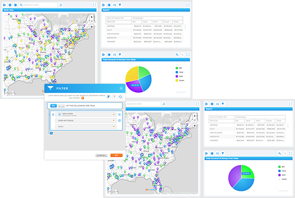
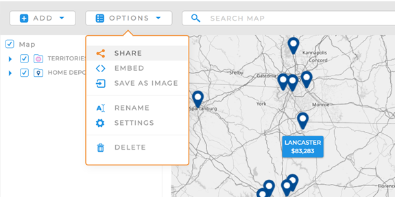
Once your map is ready, you can share it with internal teams or external collaborators using secure links or custom permissions. Shared maps help align everyone on service availability, reduce communication delays, and provide a unified view for cross-functional teams. For public health campaigns, this visibility can make the difference between average and exceptional impact.
Map Patient Data to Improve Outreach Strategy
Healthcare isn’t just about facilities—it’s about people. Mapline lets you plot patient location data to better understand service patterns, outreach effectiveness, and unmet needs. Whether you’re focused on chronic care, screenings, or follow-ups, pin mapping turns raw data into actionable insights that help your team focus resources where they’re needed most.
Using Mapline, you can visualize clusters of high-need patients, identify travel barriers, or flag underserved regions. These insights help outreach coordinators tailor programs, build local partnerships, and plan more equitable care delivery strategies.
Identify High-Priority Communities and Hot Spots
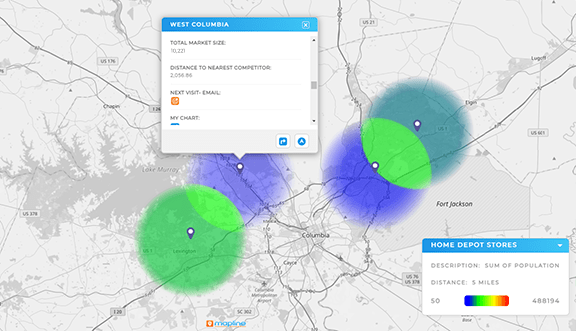
By layering demographic data or health metrics onto your patient pins, you can identify areas with the highest need or risk. These visualizations make it easier to direct resources to vulnerable populations and ensure health equity is built into every plan. It’s a foundational step in effective geographic health planning.
Monitor Follow-Up and Outreach Progress
Track which patients have been contacted, received services, or still need follow-up—all through status tags or color-coded pins. This helps outreach teams stay organized and allows supervisors to monitor progress by region. With Mapline, nothing slips through the cracks and every patient gets the attention they deserve.
Align Outreach Teams by Region or Program Type
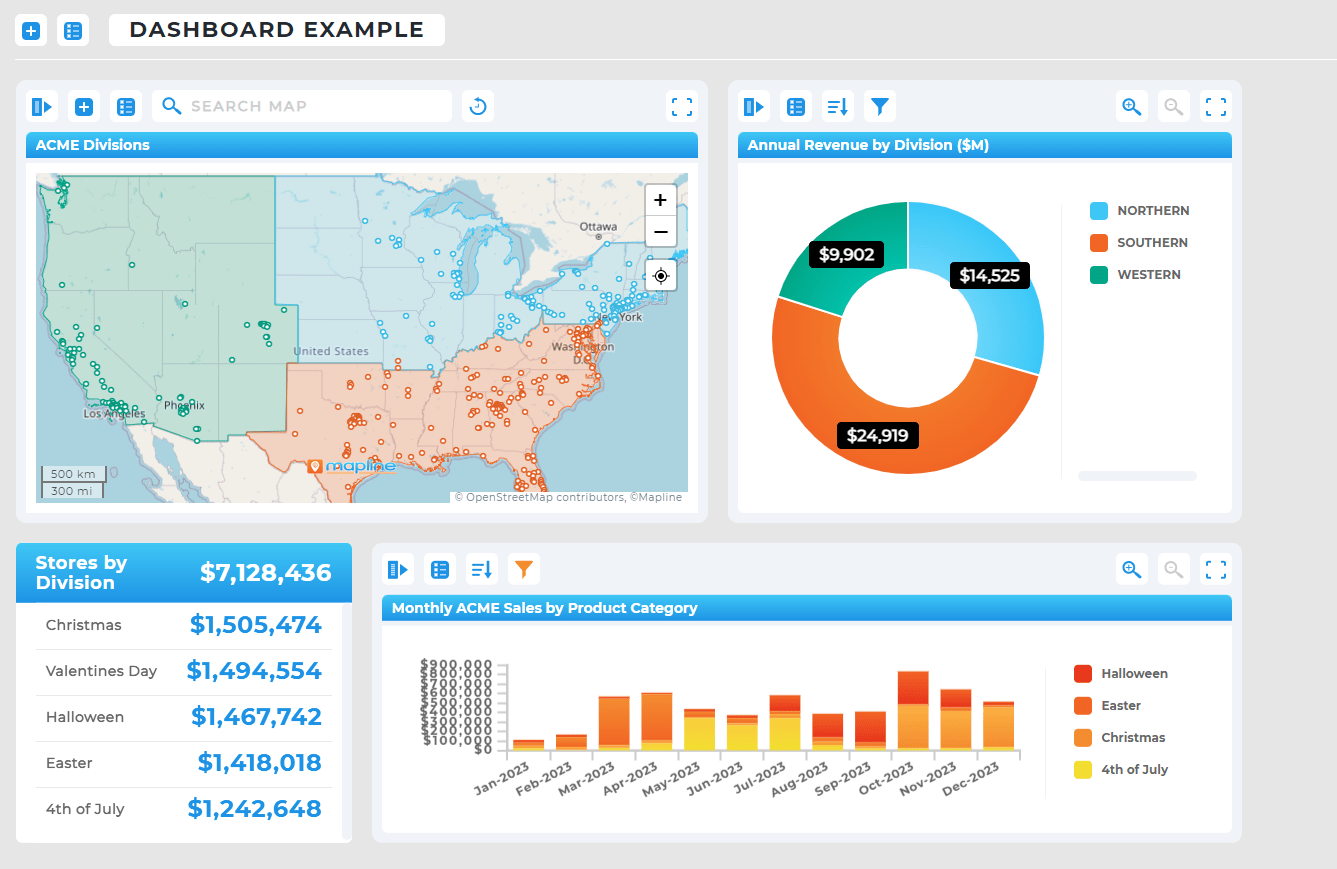
Segment maps by zip code, county, or assigned case manager to simplify team coordination. You can assign regions to different teams, view their caseloads at a glance, and balance workloads as needed. Track patient outreach across all programs with one map-based system that everyone can access and understand.

Build Map-Based Strategies for Public Health Initiatives
From vaccination campaigns to mobile health events, large-scale public health initiatives require geographic precision. With Mapline’s public health mapping software, agencies and organizations can plot event sites, visualize coverage, and measure results—all within a dynamic map. It’s the fastest way to translate goals into action on the ground.
Mapline’s filtering, grouping, and sharing tools make it ideal for multi-agency coordination, grant reporting, and cross-departmental planning. And because maps update in real time, they’re always ready to support your next campaign, initiative, or funding opportunity.
Plan Outreach Based on Real Service Areas
Instead of relying on zip code lists or district charts, Mapline lets you map health service areas using real addresses and custom boundaries. You can compare coverage by region, service type, or population density to optimize outreach zones. Planning based on geographic logic increases efficiency and helps your teams serve more people with fewer missed connections.
Track Event Turnout or Service Uptake by Location
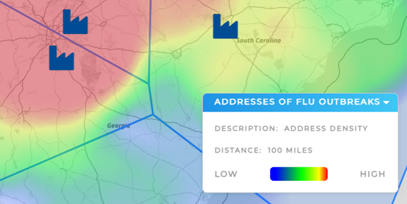
Upload attendance logs, registration lists, or service completion data to measure the success of each location-based event. With Mapline, you can compare turnout across regions, flag low-engagement areas, or analyze patterns in follow-up care. These insights help refine future campaigns and secure stakeholder support through clear, visual reporting.

Collaborate With Community Partners on Shared Maps
Invite clinics, nonprofits, and local health departments to contribute to a shared outreach map. Mapline’s role-based permissions make collaboration easy while keeping sensitive data secure. Shared mapping improves coordination, prevents overlap, and helps community coalitions work together for better outcomes. Map-based healthcare strategy thrives on shared visibility.

Upload a spreadsheet with clinic or patient addresses into Mapline, and it will generate a live, customizable pin map in seconds.
Yes. You can upload and layer multiple datasets—including facilities, patients, staff locations, or events—on the same map.
While Mapline supports secure data handling, sensitive health information should be anonymized or handled in accordance with your organization’s HIPAA compliance procedures.
Yes. You can edit pin details, add new locations, or adjust tags and filters any time. Maps update automatically to reflect changes.
Absolutely. You can share maps with specific team members or partners and control what they can view or edit.
It gives teams a clear, visual view of service areas, patient needs, and clinic activity—leading to more efficient planning, faster coordination, and better care delivery.


