- Blog
- Geo Mapping
- How to Export Clean, High-Resolution Maps for Reports and Presentations
Exporting clean, high-resolution maps is essential for reports, presentations, pitch decks, analytics reviews, and executive updates. But not all export formats are created equal — some are best for slides, others for print, and others for detailed analysis. A crisp map elevates your message, while a blurry or cluttered export can undermine even your strongest insights. This guide explains the best export formats, when to use each one, and how Mapline preserves clarity across every export. With a smart approach to exporting map images, you ensure your visuals make an impact wherever they’re shared.
Why High-Resolution Map Exports Matter
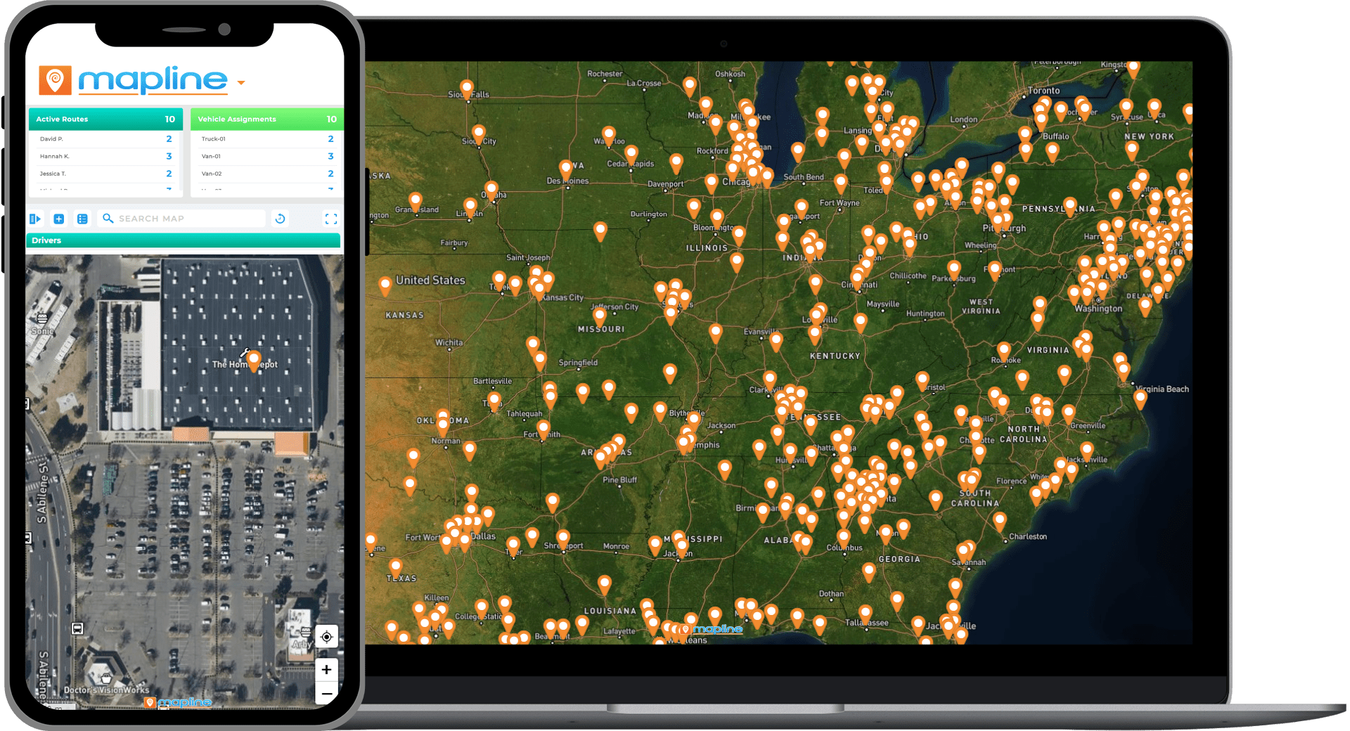
When teams present maps to leadership or clients, visual quality directly impacts credibility. Low-quality screenshots or fuzzy exports make insights harder to understand and weaken trust in the analysis. High-resolution exports show boundaries clearly, preserve label detail, and maintain color contrast — all of which make your message easier to interpret. Clean visuals also reduce confusion during meetings or review sessions, since decision-makers can immediately grasp the geographic patterns in front of them. With higher clarity comes higher confidence in your findings.

Pro Tip: Before exporting, remove unnecessary layers or clutter to keep your map clean and focused. A simplified visual not only improves clarity but also reduces file size — making your exported maps more impactful and easier to share across teams.
Poor-Quality Images Mask Important Insights
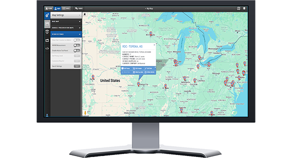
A blurry heat map or territory boundary can hide hotspots, trends, or gaps that matter to your audience. If labels or pins become unreadable, stakeholders lose context and the story becomes muddled. High-resolution exports ensure your patterns stay intact, your labels stay sharp, and your insights remain actionable no matter where the map is displayed. This prevents missed opportunities and supports stronger decision-making.
Clean Maps Improve Engagement and Retention
Well-designed maps capture attention and keep viewers focused throughout a presentation. When visuals are crisp, audiences follow along more easily and retain key takeaways. High-resolution images also make it easier for presenters to highlight specific regions, clusters, or trends. By elevating the quality of your maps, you elevate the quality of the entire discussion around them.
Consistent Quality Strengthens Professionalism
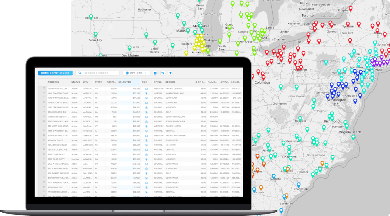
Organizations that consistently present clean, high-quality visuals build trust with clients, partners, and internal leadership. When maps look polished across PDFs, slide decks, and reports, the brand appears more credible and detail-oriented. This level of professionalism is especially important in industries like sales, logistics, franchise development, public policy, and field services. High-resolution exports ensure your visuals always match the quality of your insights.
Export Formats and When to Use Each
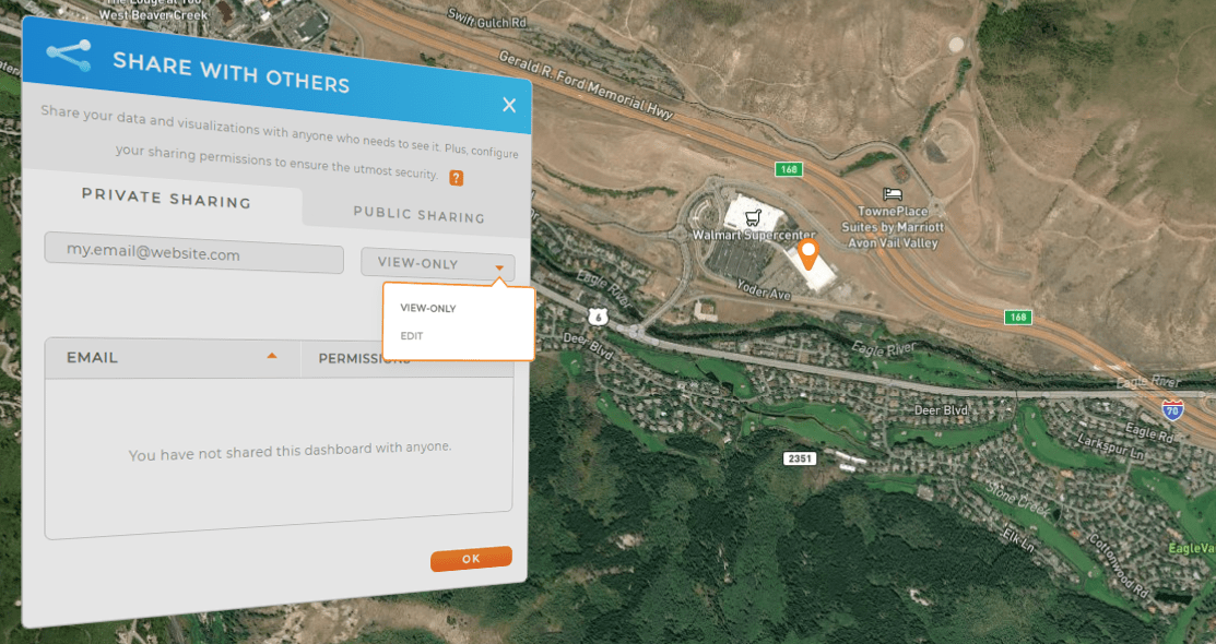
The right export format depends on where your map will be viewed and how it will be used. Each format has strengths that make it ideal for certain contexts, whether you’re preparing a printed report, a digital presentation, or a high-volume analytics review. Choosing the correct format ensures your map looks its best and preserves clarity at any scale. Here’s how to choose the right file type for each scenario.
PNG for Presentations and Digital Use
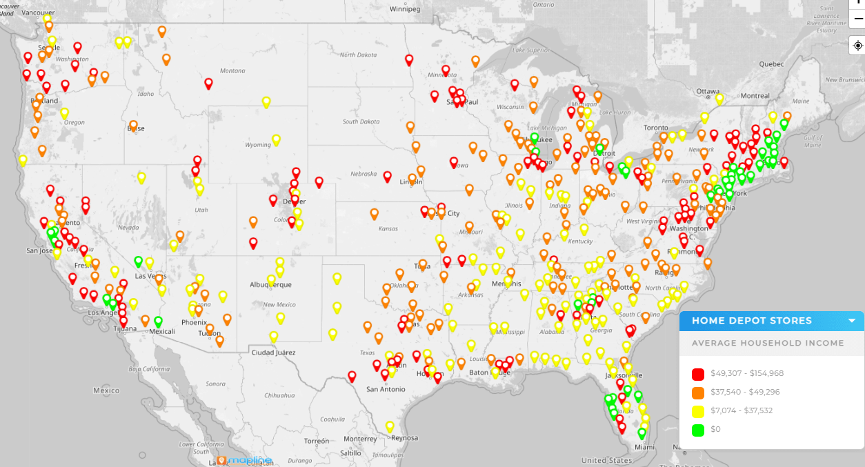
PNG is the best format for slide decks, dashboards, emails, and digital handouts. It preserves sharp lines, crisp text, and clean transparency, making it ideal for maps with labels, icons, and multiple visual elements. PNG files maintain quality at various sizes, so they look just as good on a large monitor as they do embedded in a small slide. When clarity is essential, PNG is often the safest and cleanest choice.
JPEG for Lightweight, Shareable Files
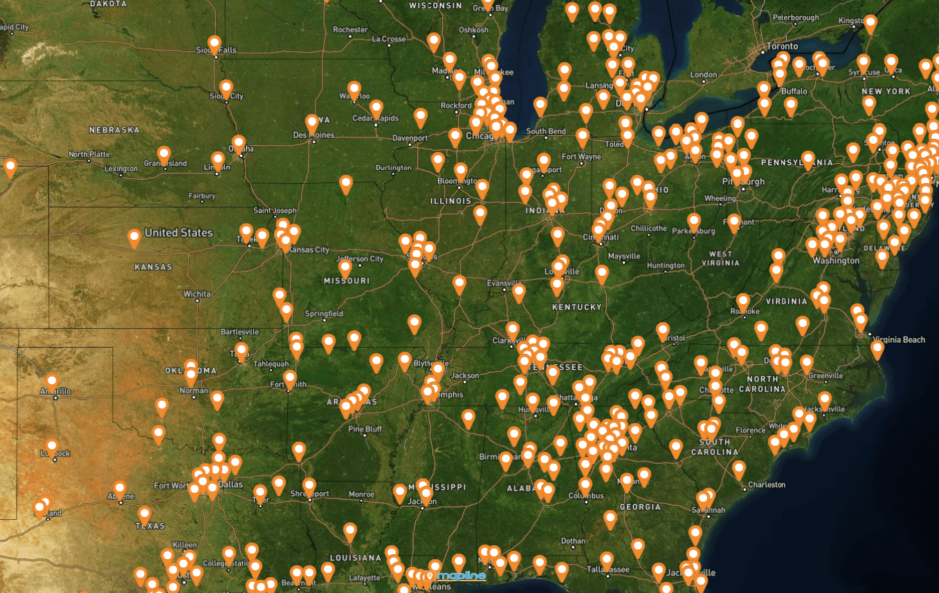
JPEG files are perfect for situations where file size matters, such as mass email distribution or web uploads with strict limits. Although JPEG uses compression that can slightly soften edges, it’s a practical choice for simple maps without extensive labeling. When you need a balance of reasonable quality and minimal file size, JPEG delivers a fast, share-friendly solution. It’s especially effective for high-level overviews and summary maps.
PDF for Print-Ready Reports
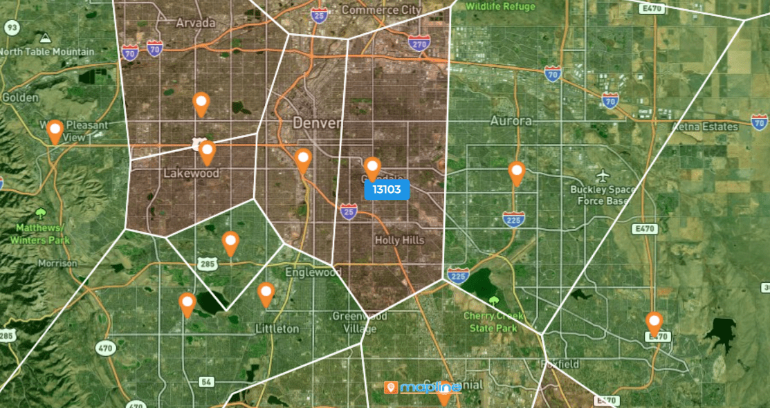
PDF exports are ideal for reports, proposals, and print materials where precision and scalability matter. PDF preserves vector-like clarity, keeping lines and shapes sharp at any zoom level. This makes it perfect for detailed boundary maps, market reports, and documents requiring professional print quality. PDF also ensures your layout stays consistent across devices, preventing misalignment or formatting issues.
How Mapline Preserves Clarity in Every Export
Mapline is built to deliver clean, high-resolution exports that maintain visual integrity across formats. The platform automatically optimizes images to prevent pixelation, preserves color accuracy, and ensures labels remain readable at any size. Whether you’re exporting a simple pin map or a multi-layer analytics view, Mapline keeps your data presentation crisp and polished. This makes it easier to share insights confidently and eliminates the frustration of blurry screenshots or inconsistent render quality.
Optimized Rendering for Sharp Labels
Mapline’s rendering engine ensures that labels, icons, and boundaries remain sharp and legible in exported images. This prevents overlapping text from turning fuzzy and helps your audience clearly distinguish regions, pins, and metrics. Because legibility is preserved, each export supports more accurate interpretation without requiring additional annotations or explanations.
Clean Layer Processing for Multi-Data Maps
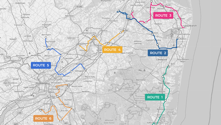
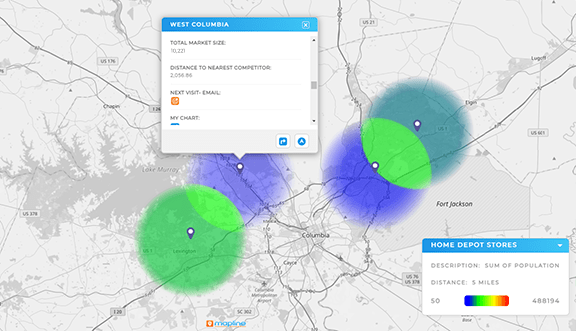
Complex maps with multiple data layers — such as heat maps, territories, and pin groupings — often lose clarity in traditional exports. Mapline processes layers independently to avoid color distortion and maintain a consistent visual hierarchy. This ensures that hotspots, density patterns, and shapes remain clear and easy to analyze. Even intricate data visualizations export cleanly without blending artifacts or visual noise.
High-Resolution Scaling for Any Screen or Print Size
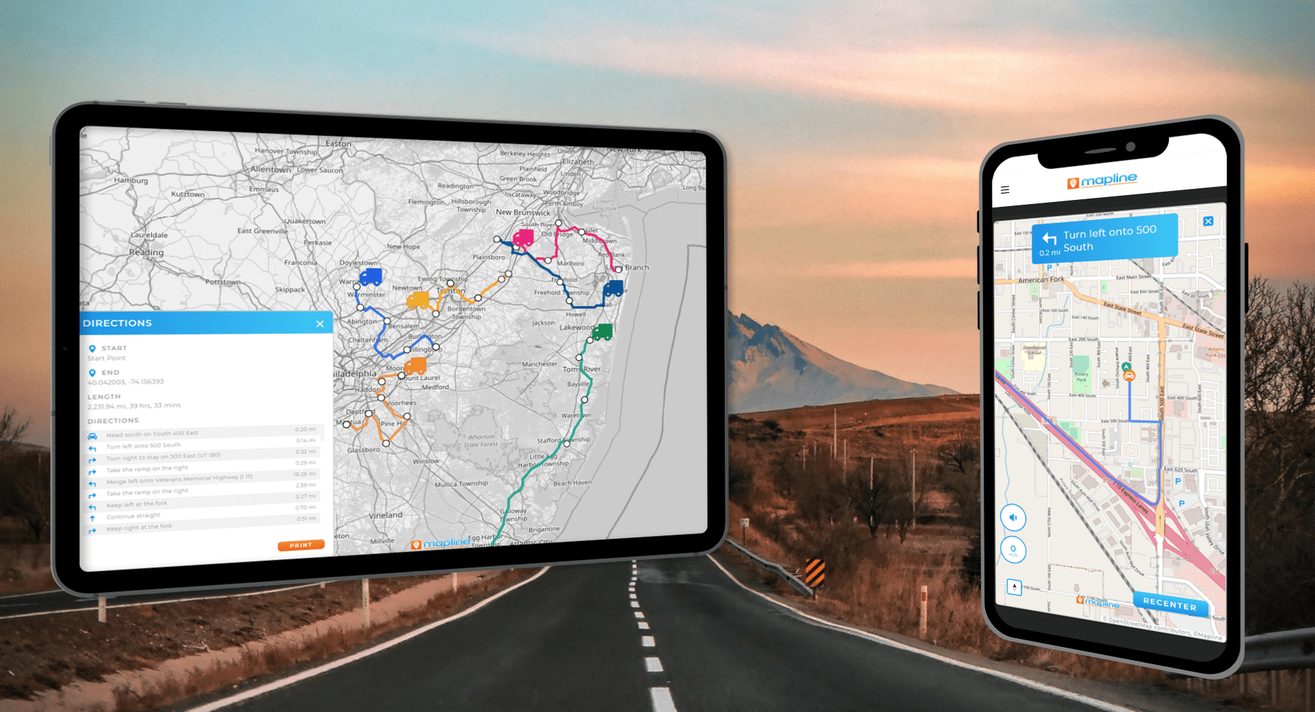
Mapline automatically scales map exports to maintain clarity across devices and print resolutions. Whether a map is displayed on a phone, a conference screen, or a full-page report, it retains sharpness and detail. This scalability ensures that your maps stay reliable and readable in any context. As a result, teams no longer worry about losing quality when repurposing visuals across formats.
PNG offers the highest clarity for slides, dashboards, and digital formats.
Use JPEG when you need a smaller file size and don’t require maximum clarity.
Yes — PDF provides the most reliable quality for print and formal reports.
Absolutely. Mapline optimizes every export to keep labels and icons sharp.
Yes — Mapline preserves each layer’s detail and visual hierarchy during export.


