- Blog
- Geo Mapping
- How to Use a Heat Map Generator to Track Market Trends
Understanding market trends used to involve guesswork, costly surveys, and manual reporting. Today, businesses are turning to visual data tools like a heat map generator to make faster, smarter decisions based on real-time data. Whether you’re looking to optimize store locations, identify high-performing sales regions, or spot shifts in customer behavior, a location heat map makes it easier to see what spreadsheets can’t. Heat maps transform raw data into color-coded insights—giving your team instant clarity on where to act next.
What Is a Heat Map and How Does a Heat Map Generator Works?
A heat map is a data visualization that uses color gradients to show density, performance, or intensity across a geographic area. With a modern heatmap generator, businesses can upload sales data, customer locations, or competitor addresses and immediately see where hot spots and gaps exist. These tools work by aggregating data points and assigning color intensity—reds and oranges typically signal high activity, while blues and greens indicate lower levels. The result? A simple, intuitive visual of your market landscape.
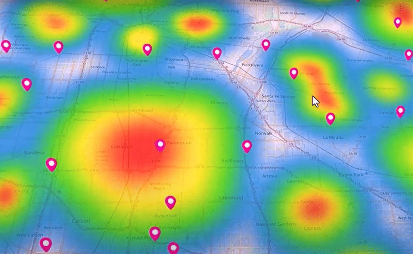

Pro Tip: Need to visualize your business trends fast? Try Mapline’s heat map generator to uncover geographic insights that drive smarter decisions.
Why Heat Maps Matter for Market Trend Analysis
Market trend analysis is all about identifying patterns and anticipating shifts. A zip code heat map or customer density map can reveal where demand is growing, where competition is crowding in, or where opportunities are being missed. These visuals give you a competitive edge by surfacing geographic trends faster than traditional reports. Whether you’re tracking foot traffic, sales growth, or product engagement, business data heat maps help you act with confidence before the window closes.
Real-World Ways to Track Market Trends using Heat Map Generator
Market trends can shift quickly—but with the right tools, your business can stay one step ahead. A heat map generator lets you visualize key performance indicators across geographic regions, helping you identify emerging trends, shifts in demand, and areas of untapped opportunity. Whether you’re tracking customer behavior, sales performance, or campaign results, mapping your data reveals patterns that spreadsheets can’t. Mapline equips businesses with powerful, real-time visualization tools that translate raw data into clear, actionable insights. Here are a few key ways to use heat maps to monitor and respond to changing market dynamics.
Track Regional Sales Trends Over Time
Use heat maps to visualize changes in sales performance by location over weekly, monthly, or quarterly periods. Mapline’s layering and filtering features make it easy to compare timeframes, helping you understand how different regions respond to product launches, seasonal cycles, or marketing pushes. Spotting a shift early gives you time to course-correct or double down on what’s working.
Visualize Customer Density by Area
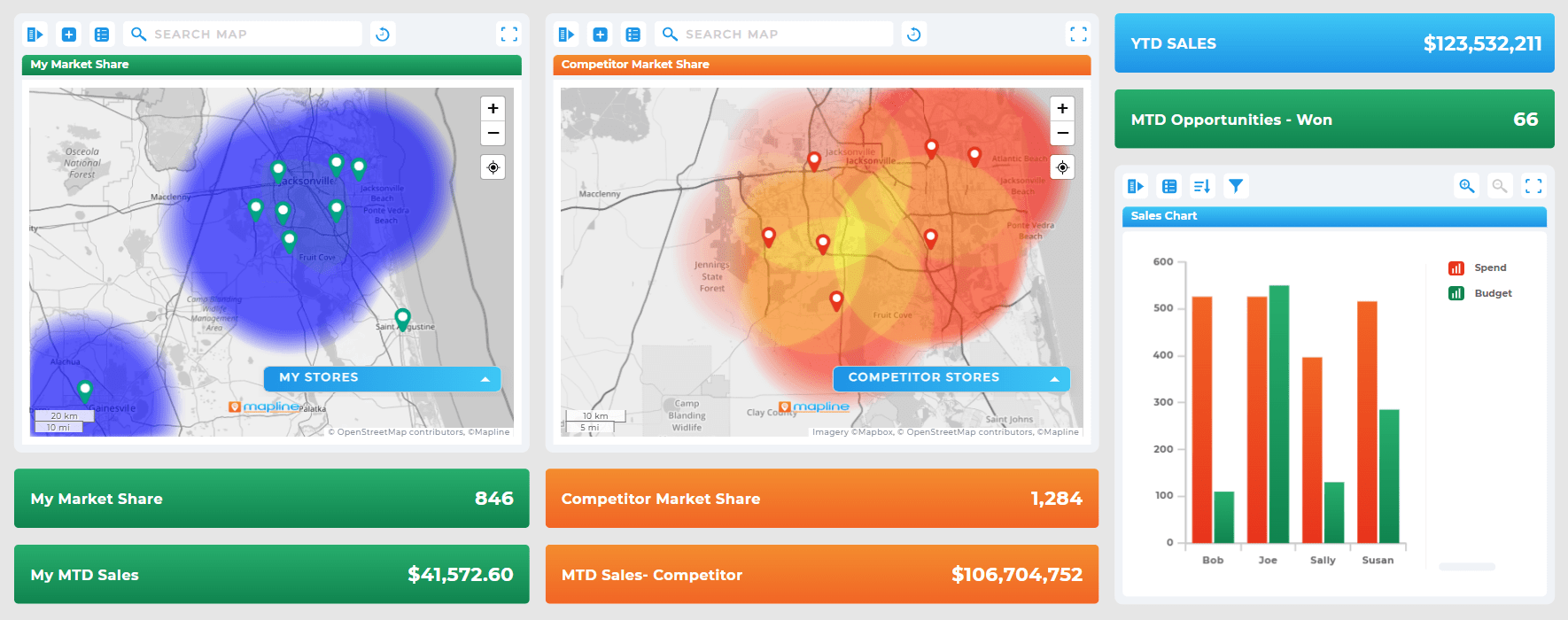
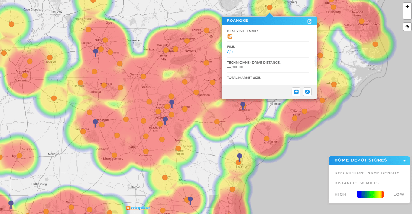
Heat maps generated from customer address data show where your demand is strongest—and where growth is slowing. This lets you adapt territory coverage, shift ad budgets, or launch promotions in high-opportunity areas. With Mapline, you can zoom in by zip code, city, or custom-drawn regions for more granular insight.
Analyze Market Penetration vs. Opportunity Zones
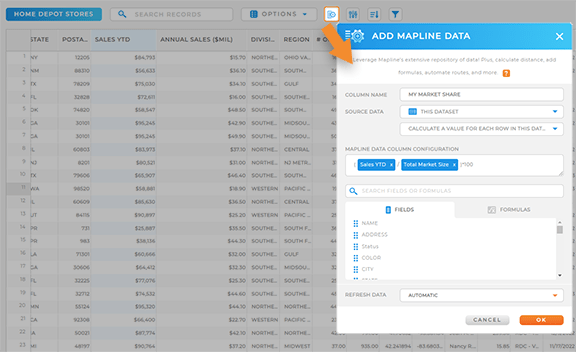
By combining customer and population data, Mapline helps you analyze where you’re gaining traction—and where your competitors might have an edge. Overlay heat maps with demographic layers to find geographic blind spots or underserved markets. These insights can shape product localization, new store launches, or targeted sales outreach.
Monitor Campaign Performance by Region
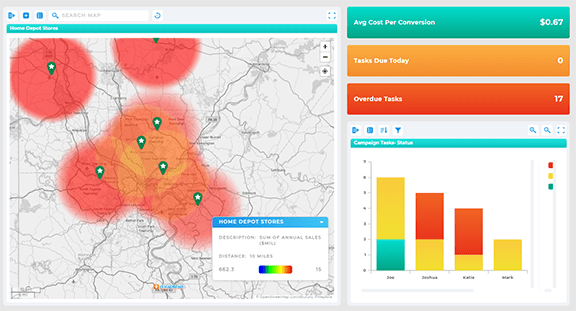
If you’re running multi-region marketing campaigns, heat maps can help you see which locations are responding best. Whether you’re tracking coupon redemptions, clicks, signups, or sales, you can visualize performance in real time and reallocate resources to the most effective markets. Mapline lets you update data on the fly and instantly see the impact.
Features to Look for in a Heat Map Generator
Not all heat map tools are created equal. For business use, the best heat map generator platforms include:
- Customizable data layers (e.g., customer, sales, demographic)
- Real-time updates and map interactivity
- Zip code, territory, and radius-level analysis
- Integrated market mapping tools for deeper drill-downs
- Exportable visuals for presentations or team reports
When paired with other location intelligence tools, heat maps can fuel smarter decisions across departments—marketing, sales, operations, and executive strategy.
Final Thoughts: Let Trends Guide Your Next Move
Markets are constantly shifting, and companies that react quickly outperform those that rely on outdated metrics. A powerful heat map generator gives you the speed and clarity to stay ahead of change. By visualizing performance across your market footprint, you can anticipate demand, spot inefficiencies, and grow with intention—not just reaction.
Traditional forecasting focuses on numerical trends across time. Spatial analysis adds a geographic layer—allowing businesses to understand where those trends are happening and why it matters.
Look for features like heat maps, territory management, route optimization, data visualization dashboards, and integrations with your data sources. These features enable comprehensive forecasting and decision-making.
Absolutely. Many tools—like Mapline—offer scalable plans and intuitive interfaces, making it easy for small businesses to visualize growth and make data-driven decisions without needing a data science team.
Forecasting accuracy depends on the quality of your data and the sophistication of your models. Mapping software improves forecasting by visualizing trends, highlighting outliers, and enabling smarter territory or market segmentation.
Absolutely. Mapping software doesn’t replace leadership judgment—it enhances it. It validates or challenges gut decisions with data, helping leaders move with more confidence and clarity.


