- Blog
- Geo Mapping
- Plot Locations on a Map Free (No Coding Required)
If you’ve ever tried to plot locations on a map using spreadsheets, manual pin drops, or developer-heavy tools, you already know how quickly it becomes frustrating. What should take minutes often turns into hours of formatting, troubleshooting, or learning software that wasn’t built for everyday users. The good news is that plotting locations on a map no longer requires coding, GIS expertise, or expensive software. With the right tool, you can upload your data and instantly visualize every location in a clean, interactive map.
This guide walks through how to plot locations on a map for free, why visual mapping matters, and how to create a custom map with pins or multiple locations in just a few steps. Whether you’re working with customer addresses, job sites, store locations, or service areas, mapping your data visually unlocks faster insights and better decisions.
Why Plotting Locations on a Map Changes Everything
Spreadsheets are great for storing data, but they’re terrible at showing patterns. When you plot locations on a map, trends that were invisible in rows and columns become immediately obvious. You can see clusters, gaps, overlaps, and geographic outliers at a glance.
Visualizing locations on a map helps teams understand coverage, proximity, and distribution in ways no chart or table can. Sales teams spot underserved territories, operations teams identify inefficiencies, and leadership gains a clearer picture of what’s actually happening in the real world. Mapping turns raw data into spatial context, which is where smarter decisions start.
Pro Tip: Start simple, then layer insights. Begin with pins to confirm your data looks right, then add territories, heat maps, or coverage areas one at a time to uncover patterns without overwhelming your map.
What You Need to Plot Locations on a Map (Hint: It’s Simple)
To create a map with multiple locations, you only need a few basic pieces of information. Most free mapping tools accept standard address fields like street address, city, state, and ZIP code. You can also plot locations using latitude and longitude if you already have them.
The key is choosing a tool that does the heavy lifting for you. A good mapping platform automatically geocodes your data, places pins accurately, and lets you interact with your map immediately—no manual pin dropping, formulas, or scripts required.
How to Plot Locations on a Map for Free
Plotting locations on a map doesn’t need to be complicated. With a no-code mapping tool, the process is straightforward and fast. You upload your data, confirm your location fields, and your map is ready in seconds.
Free mapping tools are ideal for visualizing customers, prospects, assets, events, or facilities. You can create a map with multiple locations, explore it interactively, and share it with others without paying or installing software. This makes mapping accessible not just to analysts, but to anyone who works with location-based data.
CREATE A FREE MAP IN SECONDS
Getting started in Mapline takes less time than opening a spreadsheet. Simply upload your data, give your map a name, and Mapline automatically prepares your locations for mapping. There’s no setup wizard to fight through and no coding required. As soon as your data is uploaded, you’re ready to turn rows and columns into a visual map you can actually use. This makes it easy to move from raw data to geographic insight in just a few clicks.
ADD LOCATIONS TO YOUR MAP
Once your data is uploaded, adding locations to your map is instant. Mapline reads your addresses, cities, ZIP codes, or coordinates and plots them as pins automatically. Each pin stays connected to your original data, so clicking a location reveals the full context behind it. Instead of scanning spreadsheets to understand where things are happening, you can immediately see patterns, clusters, and gaps across your entire dataset.
CUSTOMIZE YOUR FREE MAP
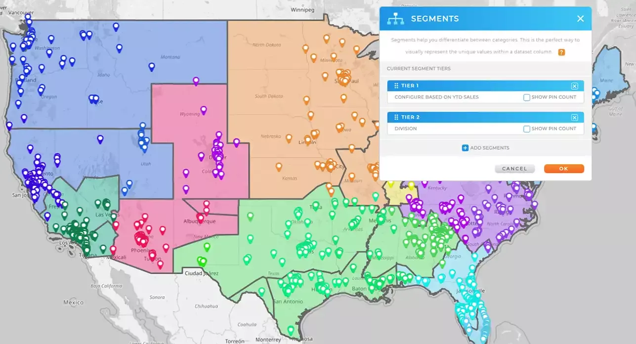
After your locations are plotted, you can customize your map to match how your business actually thinks about data. Color-code pins to highlight categories or performance, draw custom territories to define regions, and add coverage areas or heat maps to visualize reach and density. These tools help you go beyond “where things are” and start understanding what’s happening across locations. With a few adjustments, your map becomes a living visual model of your operations, customers, or market.

Pro Tip: If your spreadsheet includes extra columns like status, category, owner, or priority, upload them along with your addresses. Even when you’re plotting locations on a map for free, those extra data fields make your map far more useful by allowing filtering, grouping, and clearer visual analysis later on. A little prep in your data goes a long way once everything is on the map.
Create a Custom Map with Pins That Match Your Data
Once your locations are plotted, customization is where mapping becomes truly powerful. Instead of generic pins, you can style your map to reflect what your data actually represents. Pins can be color-coded, grouped, or filtered based on attributes like status, category, performance, or priority.
Custom maps make it easier to tell a story with your data. Whether you’re presenting to stakeholders or analyzing internally, visual cues help everyone understand what matters most without digging through spreadsheets.
Plotting Multiple Locations to See Patterns at Scale
Creating a map with multiple locations allows you to analyze large datasets without losing clarity. When hundreds or thousands of locations appear on a single map, patterns emerge quickly. You can identify dense clusters, underserved areas, or regions that need attention.
This is especially valuable for teams managing territories, routes, or service coverage. Instead of reacting to issues after they happen, mapping helps you proactively plan based on geographic reality.
When Free Mapping Is Enough—and When You’ll Want More
Free mapping tools are perfect for visual exploration, quick insights, and basic analysis. They’re an excellent starting point for anyone new to plotting locations on a map. You can upload data, create maps, and understand spatial relationships instantly.
As your needs grow, you may want additional capabilities like routing, territory management, demographic overlays, or automated updates. Starting with free mapping lets you build confidence and clarity before deciding how far you want to take your location intelligence.
Start Plotting Locations on a Map Today
If you’ve been putting off mapping your data because it felt too technical or time-consuming, now is the time to try a simpler approach. You can plot locations on a map for free, create a custom map with pins, and visualize multiple locations without writing a single line of code.
Once you see your data on a map, it’s hard to go back. Location adds context, clarity, and insight that spreadsheets alone can’t provide.
Plotting locations on a map means taking address-based or coordinate-based data from a spreadsheet and visualizing it as pins or markers on an interactive map. Instead of reviewing rows of data, you can see where everything exists geographically. This makes patterns, clusters, and gaps much easier to understand. It’s one of the fastest ways to turn raw data into insight.
No, you don’t need any coding skills to create a map with multiple locations. Modern mapping tools are built for non-technical users and handle geocoding automatically. You simply upload your data, select your location fields, and the map is created for you. Everything happens through a visual interface, not code.
Most tools allow you to plot locations using full addresses, partial addresses, ZIP codes, or latitude and longitude. You can also include additional columns like customer name, territory, sales amount, or status. These extra fields don’t affect plotting but add valuable context once your locations appear on the map.
Yes, many platforms allow you to create a custom map with pins for free. You can upload your data, visualize multiple locations, and interact with your map without paying or installing software. Free mapping is ideal for basic visualization, exploration, and sharing. More advanced features are typically available when you’re ready to scale.
Free mapping tools use the same underlying geocoding technology as paid tools, so location accuracy is typically very strong. As long as your address data is clean and complete, pins will be placed correctly. Accuracy issues usually come from inconsistent or incomplete data, not the mapping itself.
Yes, most mapping tools allow you to share your map with teammates or stakeholders. Shared maps make it easier for everyone to see the same data in context, reducing back-and-forth and misalignment. This is especially helpful for sales, operations, and planning conversations.
Plotting locations focuses on visualizing where things are. Full location intelligence goes further by adding routing, territories, demographics, performance metrics, and automation. Free mapping is a great first step, but many teams eventually expand into more advanced capabilities as their needs grow.


