
Use Tanzania Region Map for Localized Data Analysis
Region-Level Mapping – More Than Just Connecting the Dots on a Map
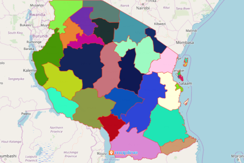
The agriculture sector depends largely on a Tanzania region map to help with localized data analysis. Tanzania is a country located in East Africa. Agriculture is its key economy. The country is divided into 31 regions. A region-level data analysis helps is identifying the key roles of each region in the agriculture industry. Researchers and data analysts simply add Excel location data to a Tanzania region map. What happens next is a mind-blowing data visualization! Not only do they easily connect the dots, but they can also easily connect the patterns and relationships of locations to their planning stage. Hence, the map is an insurmountable help in driving productivity and sustainability in the industry.
Optimize business operations using a region map. Use the distance analysis tool to grow your business and target the correct market. You will be surprised how you can extract insights and utilize them to the fullest to monitor progress or cut costs on logistics.
Region Map as Your Best Location Intelligence Tool
Start mapping by following these steps:
- Create a Mapline account and login.
- Click the orange “Add New Items” button.
- Select “New Map” on the drop down arrow.
- Give your map a name and click “OK.”
- Click the “Add” button from the left sidebar.
- Select the “Territories” option.
- Click “From Mapline’s Repository.”
- From the “Territories” select “Tanzania Regions.” You can also enter that on the search bar.
- Select how you want your boundaries to be colored in “Fill Color” (Random Colors, Uniform Color, Dynamic heat map colors, or Custom colors from spreadsheet).
- Click “OK.”
Analyzing data has never been this awesome! Sign up now to start mapping region boundaries.