
Use Serbia District Map for Business Growth Plan with Clarity
District- Level Map to Help Grow Your Business
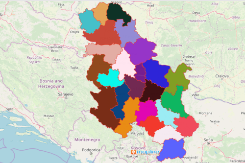
Companies in different industries rely on a Serbia district map for business process planning. Serbia is a landlocked country in Europe. It is made up of 24 districts. There are a lot of industries that comprise the success of its economy such as automotive industry, agriculture, energy, machinery, and mining. To help the companies grow their business, they use a data-driven map with an overlay of district boundaries. The powerful data visualization stimulates insights that are useful in business planning like looking for new opportunities or pinpoint existing trends.
Moreover, a district map with data locations is used for spatial analysis. Turn your territory map into a spatial distribution map. In this way, you are more able to spot geographic trends. By making a dot density map, you can turn insights into opportunities! The purpose of having a dot density map is that it helps you visualize your data in the simplest way while analyzing spatial patterns that may be hidden in rows and columns of Excel spreadsheet. Thus, it is an ideal solution for analyzing spatial patterns.
Start Your Spatial Analysis with a Serbia District Map
Struggle no more with your territory and spatial analyses! Here are the 10 simple steps in creating a map. Once generated, you can immediately start your spatial analysis:
- Create a Mapline account and login.
- Click the orange “Add New Items” button.
- Select “New Map” on the drop down arrow.
- Give your map a name and click “OK.”
- Click the “Add” button from the left sidebar.
- Select the “Territories” option.
- Click “From Mapline’s Repository.”
- From the “Territories” select “Serbia Districts.” You can also enter that on the search bar.
- Select how you want your boundaries to be colored in “Fill Color” (Random Colors, Uniform Color, Dynamic heat map colors, or Custom colors from spreadsheet).
- Click “OK.”
Sign up now and learn more on how to start and use your own dot density map.