Quick Reference Guide
Maps: Heat Maps
Pro Tip: Do you want to analyze your data with a color-coded map that gives you the best insights into your business trends? Heat mapping looks cool, but it won’t give you this type of information. What you need is territory styling!
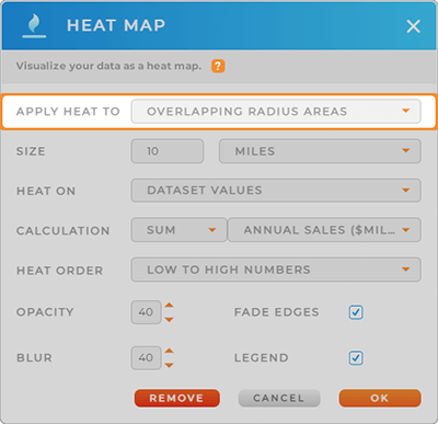
APPLY HEAT TO:
Toggle between applying heat to the area around your pins, or to overlapping radius areas.
Areas Around Pins: Apply heat to a specified radius around your pins. Pin density near the epicenter determines the level of heat.
This type of heat is good for illustrating information such as customer location density.
Overlapping Radius Areas: Display information such as the sum total of sales in the area, or high-volume stores.
Note that overlapping radius areas will have more heat.
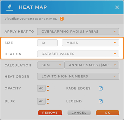
SIZE & HEAT
How many miles around each pin would you like to apply heat to?
Play around with different radius sizes and see how it changes the look of your map.
Next, consider which type of heat center you prefer.
Apply heat to your location density to display the ‘hottest’ areas around your pins. Or, leverage dataset values to track a specific numeric value.
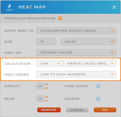
CALCULATION & HEAT ORDER
Calculation: Select from a sum or average of your dataset columns. For example, take the average of all sales in a given radius area, or sum the total number of customers visiting your locations each month.
Heat Order: Choose how the heat is applied to your map. High to low numbers apply hot colors to the highest-density pins, whereas Low to high numbers apply cool colors to the highest-density pins.
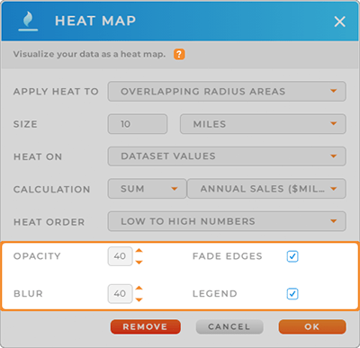
OTHER OPTIONS
Adjust the opacity of your heat map to get the best look and feel. Or, adjust the blur, and select whether you want faded edges or not.
Once you have the customized look you want, determine whether to include a legend on your map. Legends are perfect for sales meetings or presentations to your boss.
If you ever decide you want to remove your heat map, just right-click the Layer Folder, click Heat Map, then click the red Remove button at the bottom of the Heat Map lightbox.