- Blog
- Geo Mapping
- 5 Ways to Map Excel Data + Uncover Hidden Opportunities
Map Excel data is powerful for organizing data. When it comes to spotting patterns, gaps, or opportunities, rows and columns will only take you so far. By mapping Excel data, businesses turn spreadsheets into interactive visuals that highlight inefficiencies, surface hidden trends, and uncover actionable insights. Instead of digging through endless formulas, leaders get instant clarity on where their resources are going and where they should go next. Whether you’re managing sales territories, logistics networks, or customer demographics, mapping Excel data is one of the fastest ways to translate raw data into smarter decisions.
Why Mapping Excel Data Beats Spreadsheets
Spreadsheets are great at listing information, but they fall short when it comes to revealing relationships between locations. Mapping brings that data to life, helping teams instantly see coverage gaps, overlaps, and inefficiencies that might be buried in the cells of a spreadsheet. This visual clarity gives managers a faster way to identify growth opportunities and prevent costly mistakes. Instead of spending hours creating pivot tables or charts, teams can generate maps in minutes and keep their focus on strategy rather than manual reporting.
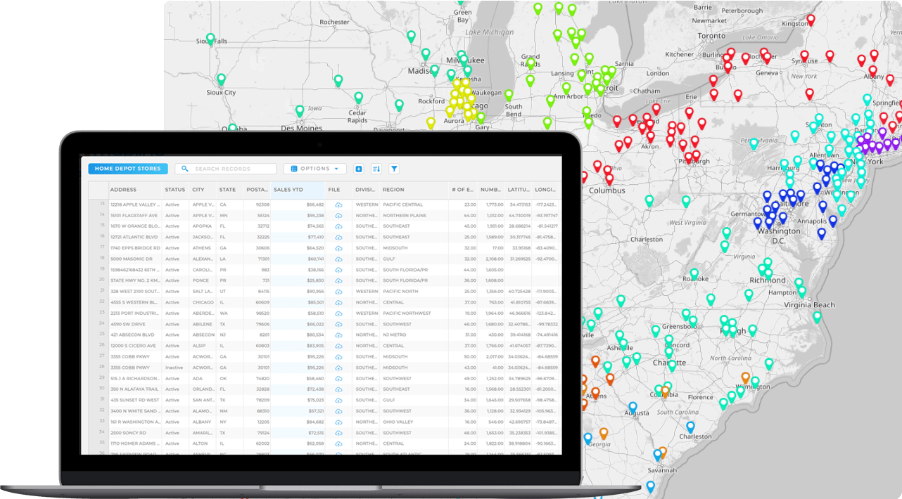

Pro Tip: Don’t just create a map from excel once and forget about it; keep uploading fresh data from your Excel sheets. With Geo Mapping, dynamic maps update automatically as your numbers change, meaning you always have the latest view of your business. This ongoing visibility transforms your maps from a one-time report into a long-term decision-making tool.
5 Ways to Map Excel Data and Find New Opportunities
Here’s how businesses use Excel mapping and map software to go beyond the basics and uncover insights they can actually act on. Instead of keeping data locked away in static spreadsheets, mapping turns rows and columns into dynamic visuals that reveal hidden patterns. From spotting regional sales trends to identifying underserved markets, Excel mapping makes it easy to see what the numbers really mean. Companies can compare performance across territories, track customer density, or visualize supply chains—all from the same data they already manage in Excel. By turning spreadsheets into interactive maps, businesses gain a competitive edge with clearer insights and faster decision-making.
Visualize Customer Locations by Category
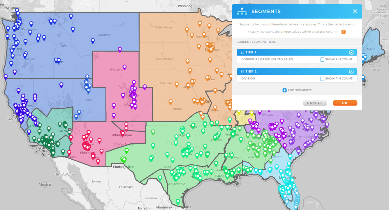
Uploading customer data into a map makes it easy to group accounts by category, region, or sales rep. This instantly shows whether customers are evenly distributed, clustered in one area, or left without coverage altogether. Businesses gain the ability to quickly rebalance territories or prioritize regions that have the most growth potential.
Create Territories That Match Business Goals
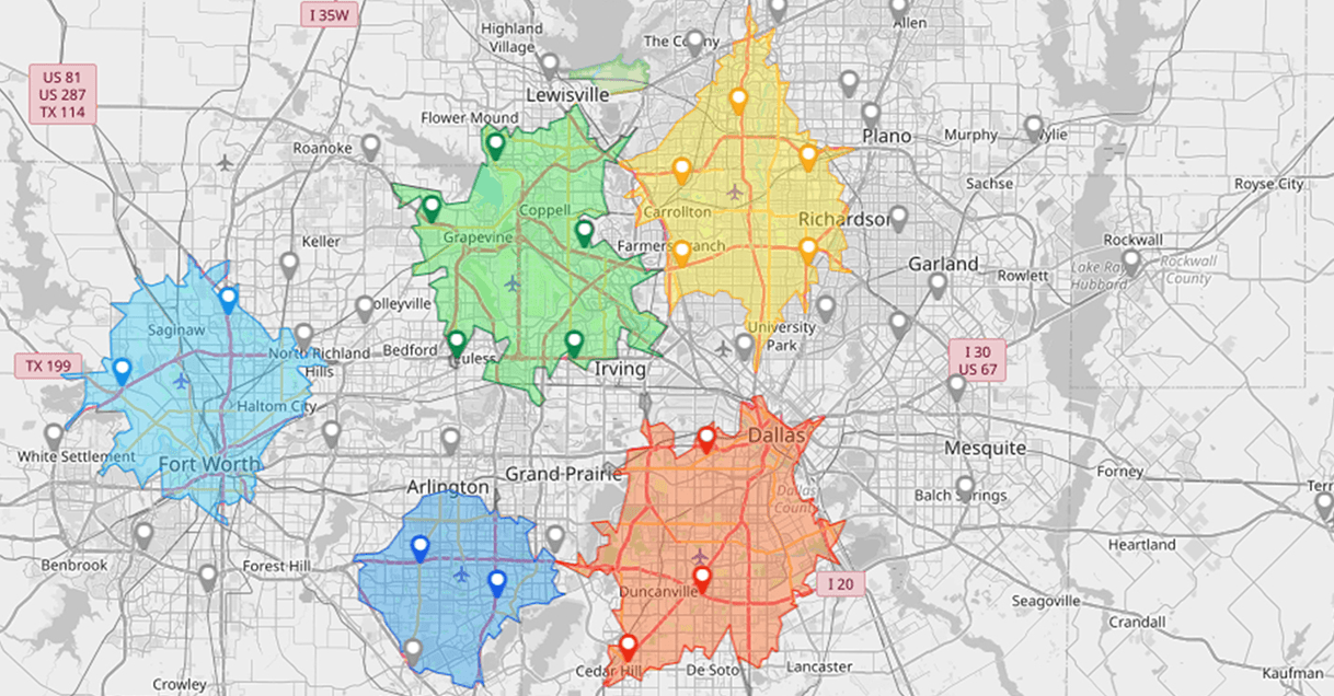
Territory creation transforms raw spreadsheets into balanced, functional regions. By assigning accounts to geographic boundaries like ZIP codes, cities, or custom polygons, teams eliminate the guesswork of coverage. This allows managers to design fair territories that reflect real-world demand, resulting in happier reps, better customer service, and fewer wasted resources.
Run Drive Time and Distance Analysis
Mapping data by drive time or drive distance polygons shows how far teams can realistically reach from a given starting point. Companies can compare which customers fall inside or outside a 30-minute service window, helping them right-size staffing levels or optimize warehouse locations. This ensures that promises made to customers—like same-day delivery—are achievable in practice.
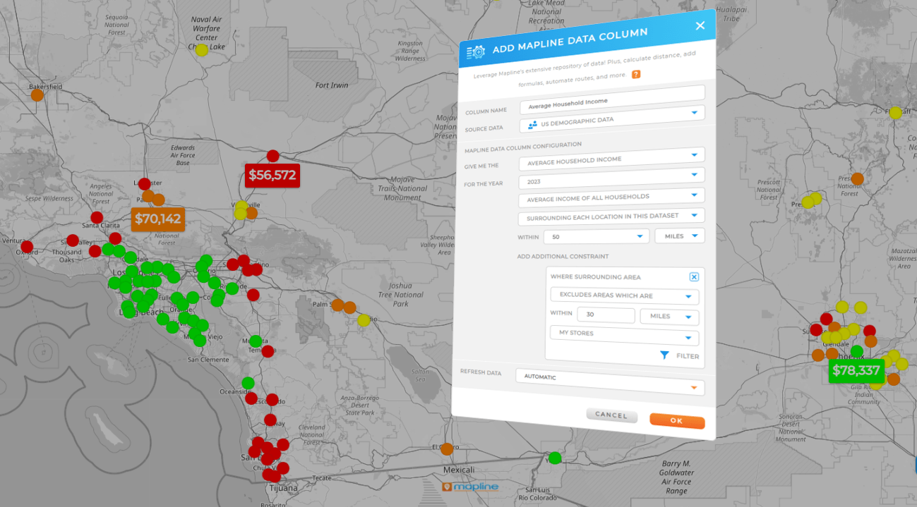
Apply Demographic Overlays for Market Analysis
Adding demographic data on top of mapped spreadsheets uncovers trends that drive smarter market decisions. Retailers can see where high-income households cluster, or service providers can spot underserved areas with growing populations. Instead of guessing where to expand, companies can use demographic overlays to invest in regions with the highest potential ROI.
Build Heat Maps That Show Hidden Hotspots
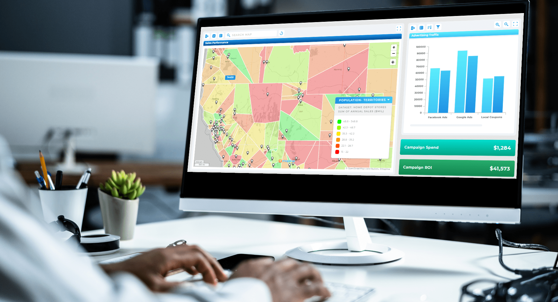
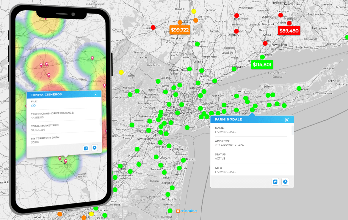
Heat maps transform a spreadsheet of numbers into a visual story. By shading areas based on revenue, customer count, or activity, managers can instantly see where the business is thriving—and where it’s not. This makes it easier to redirect resources to struggling areas, double down on top-performing markets, or identify hidden opportunities for expansion.
Metrics and Benchmarks to Track With Excel Mapping
Once you create a map from Excel data, the real value comes from tracking performance metrics tied to geography. Businesses should monitor benchmarks like sales per territory, revenue per rep, coverage ratios, and average travel time. These indicators not only highlight strengths and weaknesses but also make it easier to justify operational changes to leadership. Over time, teams can refine benchmarks to align with evolving goals, ensuring the maps remain relevant and actionable.
Get Started Mapping Today
Mapping Excel data turns static spreadsheets into actionable business intelligence. By visualizing customers, territories, drive times, demographics, and heat maps, companies can spot opportunities that would otherwise remain hidden. The ability to see both the big picture and the fine details on a map gives leaders the confidence to invest wisely, cut waste, and accelerate growth. For any team that relies on location-based data, mapping is no longer a nice-to-have—it’s a competitive necessity.
You can map addresses, ZIP codes, city names, or even latitude/longitude coordinates from your spreadsheets.
Yes. Even small teams can save time and money by visualizing customer coverage and preventing redundant visits.
Not at all. Modern platforms make it possible to upload spreadsheets and generate maps in just a few clicks.
Excel has limited visualization options. For dynamic mapping with drive times, heat maps, and demographic overlays, you’ll need a dedicated mapping platform.


