- Blog
- Geo Mapping
- Best Heat Maps for Business Insights (Examples + Use Cases)
Heat maps are one of the fastest ways to turn location data into clear, actionable insights. Instead of scanning spreadsheets, you can instantly see where demand is highest, where performance is lagging, and where opportunities exist.
What is a heat map in business?
A heat map is a visual representation of data where color intensity shows patterns like customer density, sales performance, or activity levels across geographic regions. Businesses use heat maps to quickly identify trends, gaps, and opportunities.
How do you create a heat map?
To create a heat map, upload your data (such as Excel or CSV), group it by location or value, and generate a map that visualizes patterns using color intensity. This allows you to quickly identify trends across regions.
What is the fastest way to create a heat map for business data?
The fastest way to create a heat map is to upload your data into a mapping tool that automatically generates a visual based on location and value. This allows you to go from spreadsheet to insight in seconds.
Quick takeaway: The most effective heat maps don’t just visualize data—they help you identify patterns, prioritize action, and make better business decisions in seconds.
If you’re looking to build your own, here’s how a heat map generator works and what you can actually do with the output.
What Is a Heat Map? (+ Why It Matters for Business)
A heat map is a color-coded visualization that shows the intensity or distribution of data across a geographic area. Instead of looking at individual data points, heat maps highlight trends—making it easier to identify patterns at a glance.
Businesses use heat maps to understand where activity is concentrated, where gaps exist, and how performance varies across regions. Whether you’re analyzing customer density, sales performance, or delivery coverage, heat maps make complex data easier to interpret and act on.
Pro Tip: Start by heat mapping a single key metric—like sales volume or customer count—then layer in additional data such as demographics or territories. In Mapline, this lets you move from “where is activity happening?” to “why is it happening there?”—giving you deeper insight without rebuilding your map.
What the Best Heat Maps Actually Show
Heat maps show patterns in data by highlighting areas of high and low intensity, making it easy to understand what’s happening across a region. The best heat maps go beyond basic visualization—they reveal where performance is strongest, where demand is concentrated, and where gaps exist. Instead of just showing data points, they help you interpret what those patterns mean for your business. This allows teams to quickly spot trends, compare regions, and make more informed decisions without digging through spreadsheets. When built correctly, a heat map becomes a decision-making tool—not just a visual layer. It turns complex data into clear, actionable insight at a glance.
What do heat maps show?
Heat maps show patterns in data by highlighting areas of high and low intensity. The most useful heat maps help businesses quickly identify:
- Customer density: Identify where your highest concentration of customers or users is located
- Sales performance by region: Compare revenue across ZIP codes, territories, or regions
- Market gaps: Spot underserved areas with high potential
- Operational coverage: Understand where your team is active—and where they’re not
If your current tools only show basic visuals without context, you’re missing the real value of heat mapping.
Heat map vs pin map: what’s the difference?
A heat map shows patterns and density across regions, while a pin map displays individual locations. Heat maps are best for identifying trends, while pin maps are better for viewing specific data points.
Real Business Use Cases for Heat Maps
Heat maps are used across teams to drive smarter decisions. Instead of guessing or digging through rows of data, you can instantly see where demand is highest, where performance is strongest, and where opportunities are being missed. This clarity helps teams move faster and make more confident decisions. Whether you’re planning, analyzing, or optimizing, heat maps bring your data to life. Here are some of the most common ways businesses apply them:
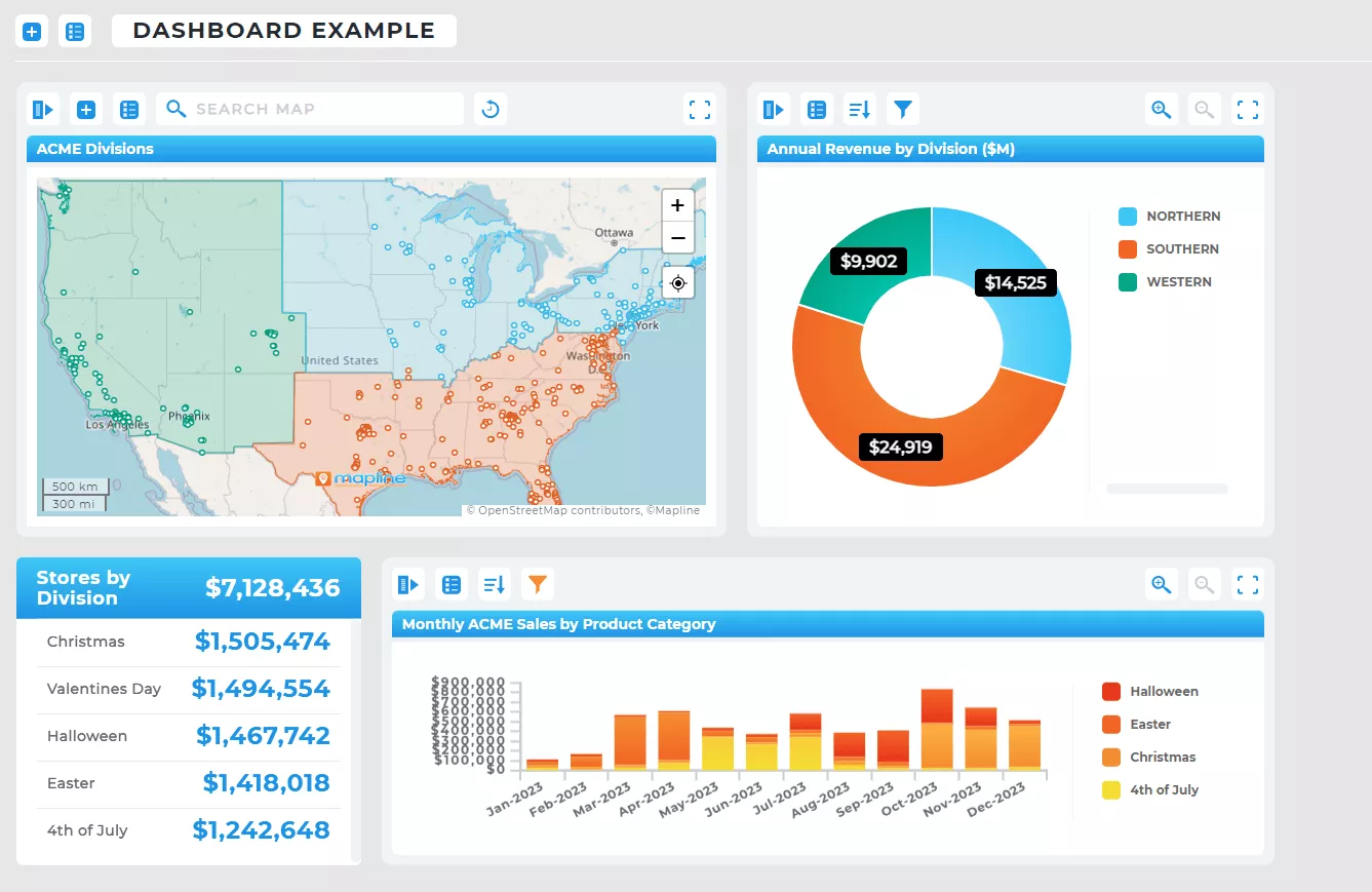
Sales & Territory Planning
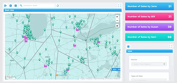
Sales teams use heat maps to identify high-performing regions, rebalance territories, and focus on areas with the highest potential. Instead of relying on static assignments, teams can continuously optimize coverage based on real-world activity and demand.
With Mapline, many sales teams increase visits by 40–50% using the same team—simply by reducing “windshield time” and improving territory alignment. Teams also gain visibility into performance, travel, and expenses, making it easier to track efficiency and improve outcomes over time.

Marketing & Customer Analysis
Marketing teams analyze customer density and engagement by location to refine targeting, campaigns, and expansion strategies. Heat maps make it easy to see where your best customers are—and where similar opportunities exist.
With Mapline, analytics teams can clearly measure and demonstrate the impact of their efforts, while identifying high-value regions to prioritize. This leads to more focused campaigns, better audience targeting, and stronger ROI from marketing spend.

Operations & Logistics
Operations teams use heat maps to evaluate delivery coverage, optimize service areas, and reduce inefficiencies across routes and assignments. Instead of reacting to issues, teams can proactively identify gaps and overlaps in coverage.
Many logistics teams see a 30–40% improvement in operational efficiency by minimizing mileage, reducing routing errors, and improving vehicle or fulfillment assignments. The result is faster delivery, lower costs, and more reliable service.
Retail & Site Selection
Retail and expansion teams use geographic heat maps to determine where to open new locations based on demand, competition, and accessibility. This helps eliminate guesswork and ensures new sites are positioned for success.
By visualizing customer density and filtering out low-value or high-cost areas, many brands see up to a 40% improvement in location-based ROI. Heat maps also help optimize distribution strategies and reduce costly inefficiencies tied to poor site selection.
Across teams, businesses commonly uncover six-figure savings—and in many cases, $100K to $1M+ annually—by eliminating inefficiencies that would otherwise go unnoticed.
Heat Maps from Excel and ZIP Code Data
Most business data starts in spreadsheets—which makes it essential to turn that data into a visual format quickly. Whether you’re working with customer lists, sales data, or ZIP code-level performance, heat maps allow you to instantly identify trends.
Instead of trying to build a heat map directly in Excel (which is often limited and manual), many teams use mapping software that allows them to upload data and generate maps automatically.
The Fastest Way to Create a Heat Map
If your goal is speed and usability, the easiest way to create a heat map is to use a dedicated mapping platform. These tools allow you to upload your data, generate a map instantly, and customize your view without technical setup.
Mapline is designed specifically for business users who need to visualize location data quickly. You can upload spreadsheets, generate heat maps, and analyze patterns—all in one place.
A heat map in business analytics is a visual representation of data where color intensity shows patterns like customer density, sales performance, or activity levels across geographic regions. It helps teams quickly identify trends and make data-driven decisions.
A heat map helps you identify high-performing areas, underserved regions, and patterns in customer behavior or operations. This makes it easier to prioritize resources, optimize coverage, and uncover growth opportunities.
Yes, Excel can create basic heat maps, but it is limited in interactivity and customization. Most businesses use mapping tools to create geographic heat maps from Excel data more quickly and accurately. Learn the fastest way to make maps from Excel data →
Businesses use heat maps to analyze customer distribution, track sales performance by region, optimize delivery routes, and identify market gaps. They are commonly used by sales, marketing, operations, and retail teams.
Yes, you can create a heat map from Excel data by uploading your spreadsheet into a Geo Mapping platform that visualizes your data by location. This is much faster and more flexible than trying to build heat maps directly in Excel.
Yes, you can create a heat map by ZIP code by grouping your data by postal regions and visualizing it using a geographic heat map tool. This is especially useful for analyzing sales, marketing performance, or service coverage.
A pin map shows individual locations as markers, while a heat map visualizes patterns and density across regions. Heat maps are better for identifying trends, while pin maps are better for viewing specific locations.
Yes, most businesses use a heat map generator to create heat maps quickly and accurately. These tools allow you to upload data, generate maps instantly, and customize visualizations without manual setup.
A good heat map should include clear data grouping, accurate geographic boundaries, adjustable intensity levels, and the ability to filter or segment data. This ensures the map is both visually clear and actionable.
Yes, some free heat map generators are powerful enough for business use, especially if they allow you to upload data, customize maps, and analyze patterns without restrictions. It’s important to choose one that doesn’t limit core functionality.


