- Blog
- Geo Mapping
- A Beginner’s Guide to Heat Mapping for Smarter Decision Making
Heat mapping is one of the simplest, most powerful ways to turn raw data into actionable insights. By visualizing your business data on a map, you can instantly spot patterns, outliers, and hidden opportunities that spreadsheets alone can’t reveal. Whether you’re managing sales territories, planning deliveries, or evaluating new market opportunities, heat mapping gives you the visibility you need to make confident, data-driven decisions.
What Is Heat Mapping?
Heat mapping is the process of turning data points into a color-coded visualization that highlights patterns by intensity. Rather than staring at endless rows of numbers, you can see areas of high or low performance at a glance. Hot zones might indicate clusters of sales, heavy delivery costs, or saturated markets, while cold zones may point to untapped opportunities or under-serviced customers. For beginners, this approach offers an accessible entry into analytics—no advanced math or coding required.
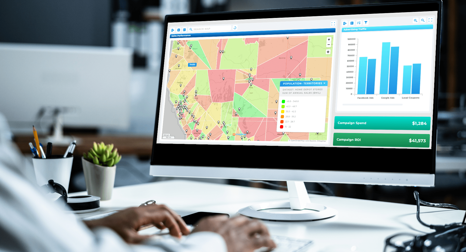

Pro Tip: Don’t stop at one dataset. Leverage Geo Mapping to combine your heat map with demographic overlays, drive-time polygons, or territory boundaries for a multi-layered perspective. This makes it possible to validate strategies from every angle, ensuring your decisions are backed by more than a single snapshot of data.
Why Businesses Should do Heat Mapping
Heat maps are more than a pretty chart; they’re practical tools that guide strategy. Businesses use them to understand customer distribution, optimize delivery routes, and plan smarter expansion strategies. For sales managers, a heat map highlights which regions deliver the highest ROI and which may be dragging down performance. For operations teams, they expose coverage gaps or redundant overlaps in service areas. With every team working from the same visual, communication and alignment improve dramatically.
The Different Types of Heat Maps
Not all heat maps are created equal, and each type is designed to answer a different kind of business question. Some highlight customer density, helping sales teams understand where demand is concentrated, while others reveal cost-heavy delivery zones that may be eating into profitability. Geographic heat maps display insights across ZIP codes or counties, while sales heat maps expose performance patterns that spreadsheets can’t reveal. By understanding the variations, leaders can match the visualization to the specific decision at hand rather than defaulting to a one-size-fits-all approach. This ensures that the insights you pull from your data are not just interesting but also directly actionable. When used strategically, different heat map types combine to give a 360-degree view of your business operations.
Geographic Heat Maps
Geographic heat maps display performance, demand, or costs over a region, such as states, counties, or ZIP codes. These are perfect for identifying growth opportunities or evaluating market saturation. By layering demographic data or customer counts, managers can fine-tune their strategy at the local level.
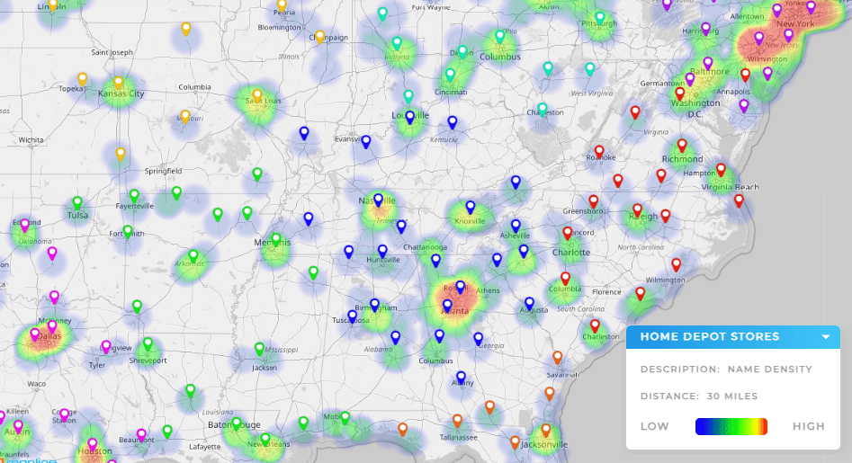
Sales Heat Maps
Sales heat maps highlight where customers are buying and where revenue is strongest. They can expose uneven rep coverage, uncover high-value clusters, or reveal underperforming regions. With this visibility, sales leaders can reassign accounts, rebalance workloads, and target marketing campaigns for maximum impact.
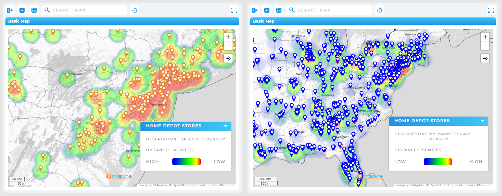
Customer Density Heat Maps
Customer density heat maps highlight where your customers are most concentrated, making them ideal for logistics, marketing, and site selection. By seeing clusters of demand, companies can prioritize where to open new stores, add technicians, or target campaigns.
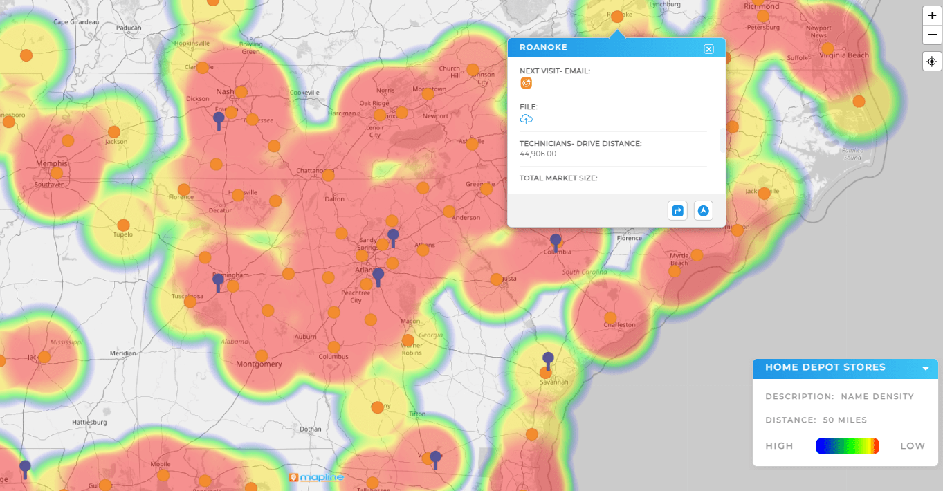
Resource Utilization Heat Maps
Resource utilization heat maps reveal how efficiently teams, vehicles, or equipment are being used across regions. They quickly uncover areas of overuse or redundancy, helping organizations rebalance workloads and cut unnecessary costs.
Heat Map Analytics Tools
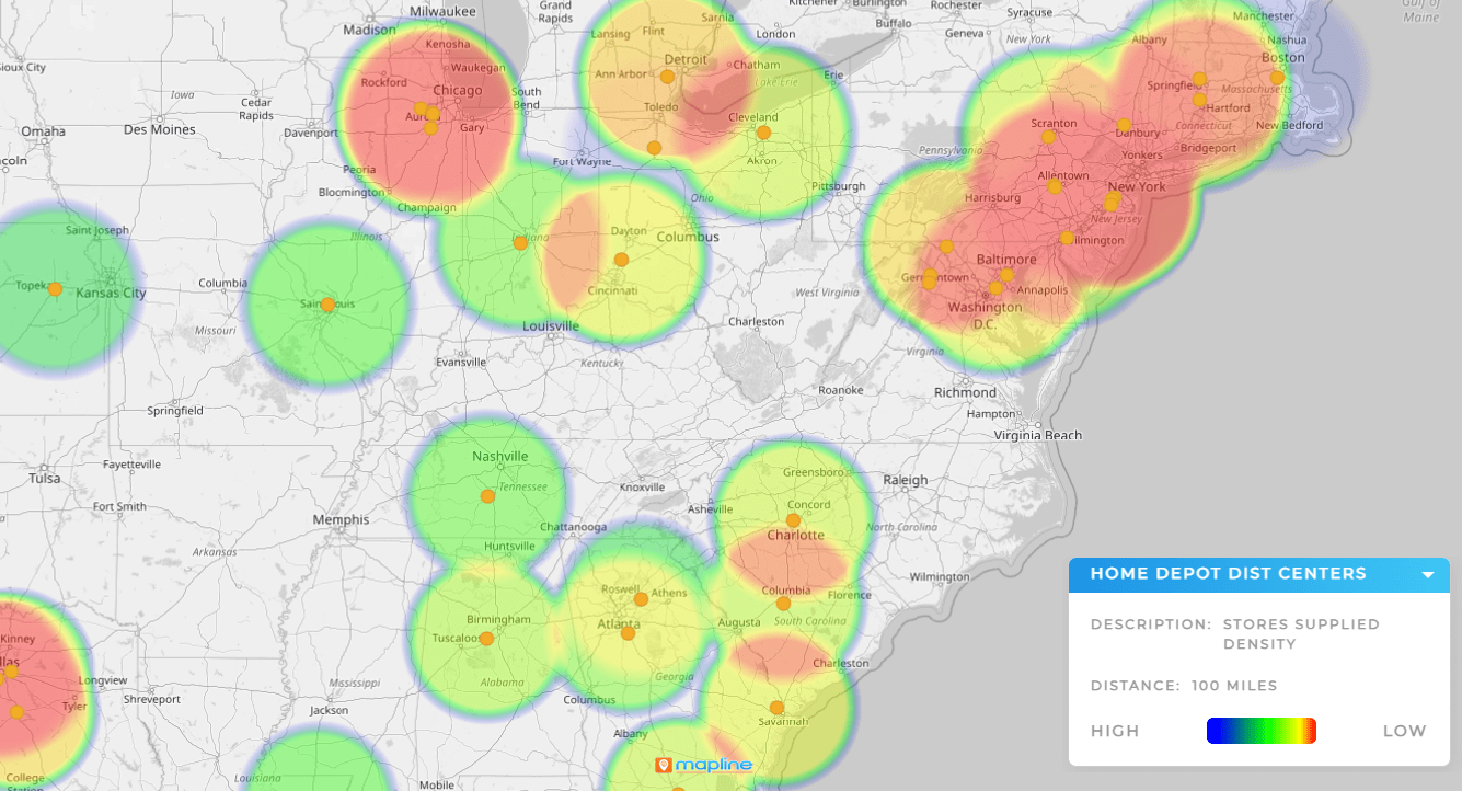
Heat map analytics tools make it possible to move beyond visualization and into decision-making. Instead of just seeing hot spots, you can drill into performance metrics, compare time periods, or layer multiple datasets for deeper context. These tools help transform raw visuals into clear strategies that increase efficiency and revenue.
How to Create a Heat Map Step by Step
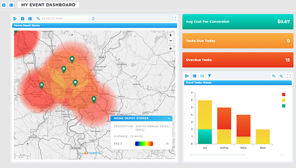
For many teams, the idea of creating a heat map sounds complicated, but it doesn’t have to be. With a heat map generator, the process is streamlined into a few intuitive steps, allowing even non-technical users to generate insights quickly. All it takes is uploading your data—usually from an Excel file or CRM—and selecting the variables you want to visualize. Within minutes, our advanced mapping software converts raw numbers into a clear visual map that highlights trends, patterns, and gaps you might have otherwise missed. This simplicity removes the barrier of needing a GIS background or advanced training, giving decision-makers instant access to meaningful intelligence. When done consistently, creating heat maps becomes a core part of data analysis and operational strategy.
Step 1: Upload Your Data
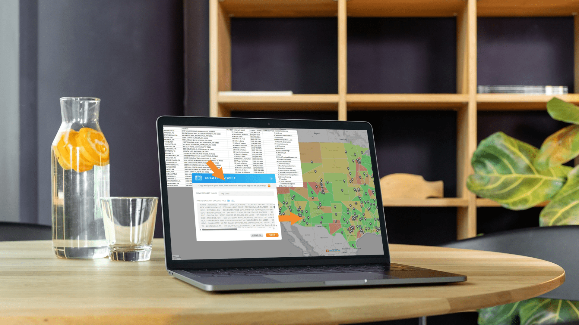
Start with the spreadsheet you already have. Most teams use Excel or Google Sheets with columns for addresses, ZIP codes, or customer names. Once uploaded, each row becomes a pin on the map.
Step 2: Choose Your Heat Map Settings
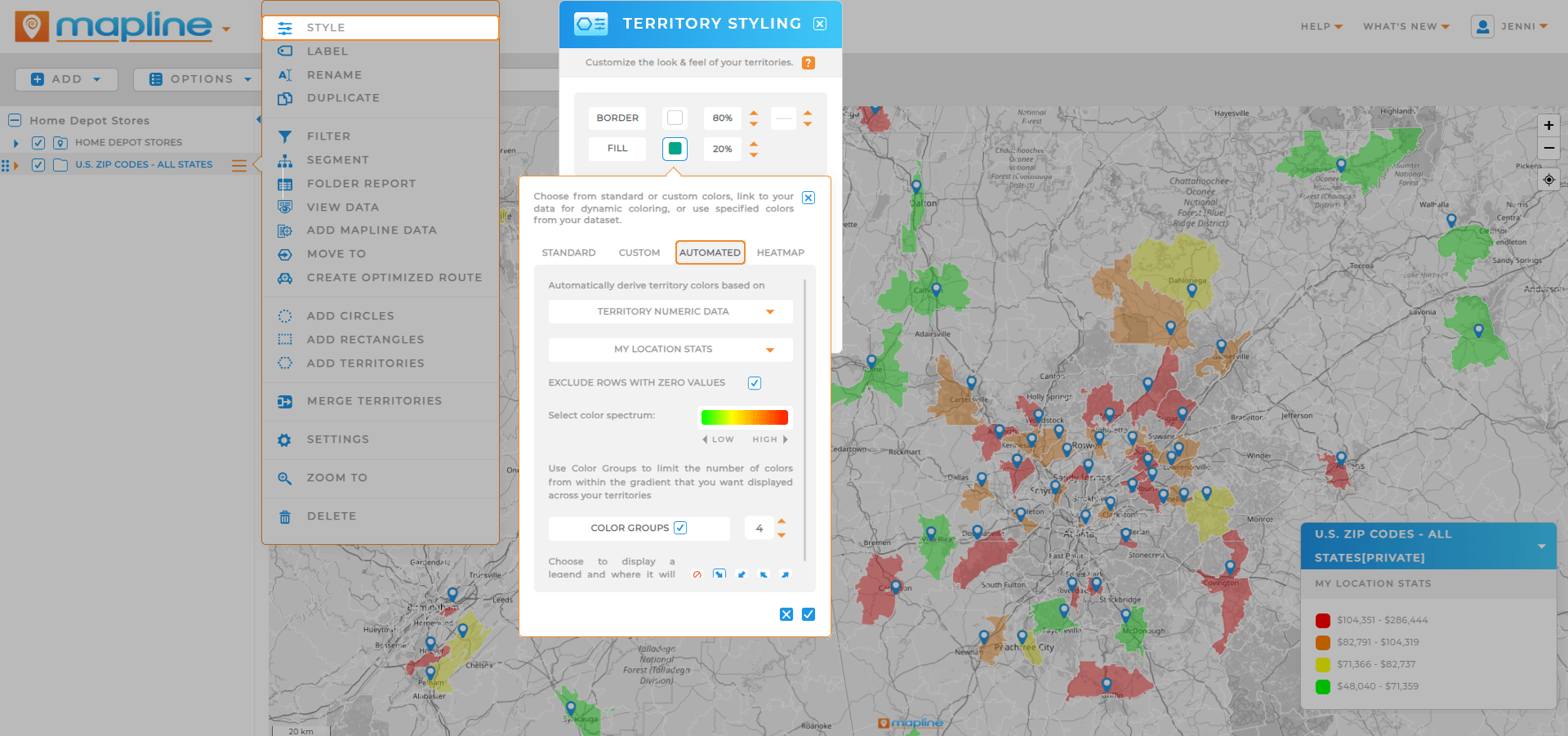
Decide what you want to measure—revenue, visits, delivery costs, or customer counts. Then, select the style of heat map that fits. For example, a ZIP code heat map may highlight clusters of revenue, while a drive-time based heat map shows how far your team can realistically serve customers.
Step 3: Customize and Analyze
Adjust the intensity scale, apply filters, or layer in demographic data to get a clearer picture. From here, the map evolves from a static graphic into a tool for live decision-making.
Key Business Applications of Heat Maps
Heat maps apply across industries, giving organizations the flexibility to adapt them for their unique goals and metrics. A well-designed heat map generator can reveal hidden patterns in sales, customer activity, or operational performance that might otherwise go unnoticed. Retailers use them to identify high-demand locations, while logistics teams rely on them to optimize delivery routes and warehouse placement. Marketing departments leverage heat maps to visualize campaign performance across regions and focus their ad spend where it matters most. The real power doesn’t come from simply creating the map—it comes from understanding what the data is telling you and acting on those insights to drive measurable results.
Heat Mapping for Sales Team Planning
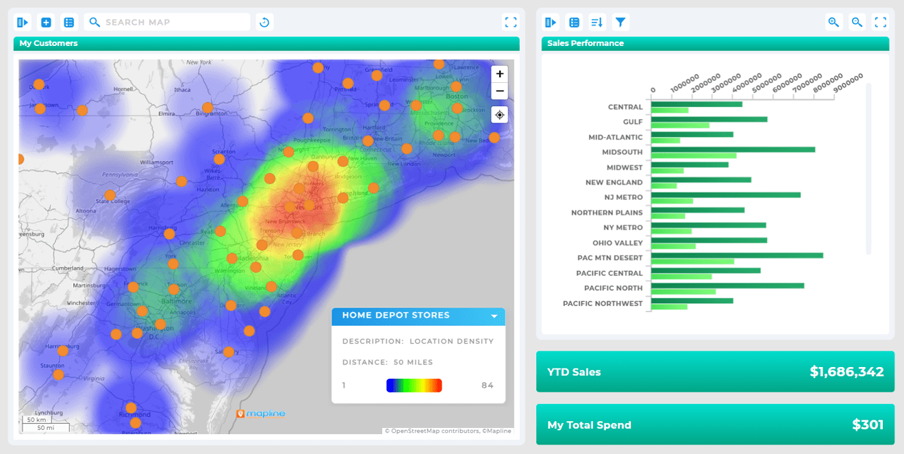
Sales managers use heat maps to ensure reps aren’t stretched too thin or wasting effort in crowded territories. Visualizing accounts by revenue helps teams focus on high-value clients.
Heat Mapping for Logistics and Delivery
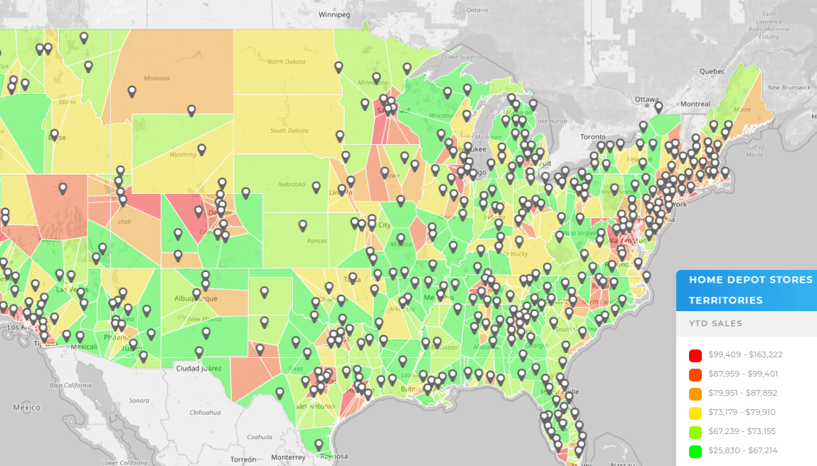
Heat maps show whether deliveries are concentrated in areas that make sense for cost efficiency. Overlapping service zones can be spotted and resolved before they become profit drains.
Heat Mapping for Market Expansion
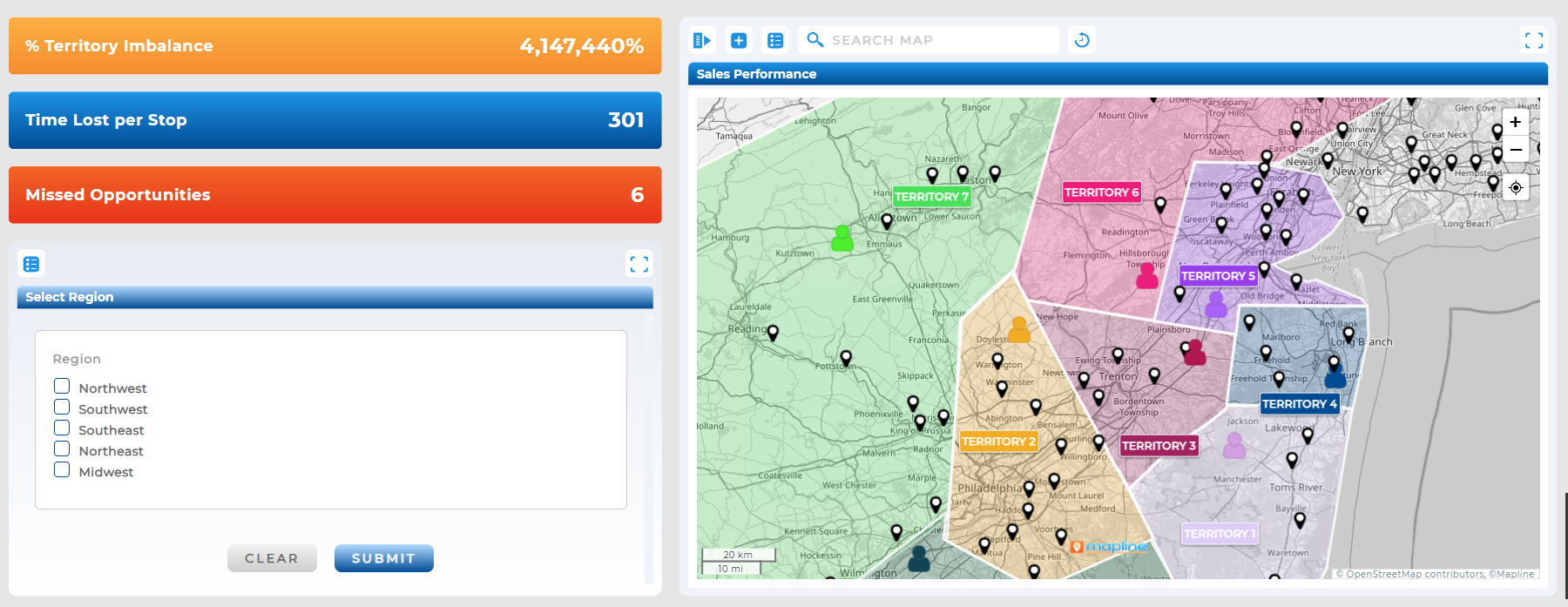
When evaluating new locations, heat maps help identify whether demand is clustered around certain ZIP codes or demographics. This reduces guesswork and helps prioritize profitable markets.

Metrics and Benchmarks to Track From Your Heat Maps
Metrics matter as much as visuals. Businesses that treat heat maps as performance dashboards can measure changes over time and spot red flags before they escalate. Common benchmarks include revenue density, delivery costs per region, or customer acquisition in new markets. Tracking these consistently helps leaders not only spot problems but also prove the impact of changes.
Heat Maps vs. Excel Visualizations
It’s tempting to rely on Excel charts or conditional formatting, but spreadsheets lack the spatial context that maps deliver. Excel might show you that one rep has 100 accounts while another has 40, but it doesn’t reveal whether those accounts are in the same neighborhood or spread across multiple counties. Mapping data bridges this gap, combining performance with geography to unlock insights you’d miss in rows and columns alone.
It turns abstract data into a visual that’s easy to interpret, making patterns obvious.
Yes—heat maps save time and reduce costs for any team, regardless of size.
No. Modern heat map tools let you upload Excel or Google Sheets data directly, so you can build maps in minutes.
Excel has conditional formatting, but it can’t overlay data on a geographic map the way a dedicated tool can.


