- Blog
- Geo Mapping
- How to Plot Locations on a Map and See What Matters
Learning how to plot locations on a map is easy. Learning how to see what actually matters once those locations are plotted is what separates basic mapping from strategic insight.
Whether you need to plot addresses on a map, visualize sales territories, analyze customer density, or upload raw latitude and longitude coordinates, the goal is not just to display pins. The goal is to understand patterns, identify gaps, and make better decisions.
This guide walks through how to plot multiple addresses on a map, how to plot coordinates on map tools, and how modern mapping software turns raw location data into actionable intelligence.
How to Plot Locations on a Map in Seconds
Plotting locations on a map doesn’t have to be complicated or time-consuming. With the right tools and properly structured data, you can go from spreadsheet to interactive map in just a few clicks. The key is following a clear process that ensures your addresses or coordinates are interpreted accurately and displayed in a way that supports real decisions. Below are the essential steps to quickly plot locations on a map and start uncovering meaningful geographic insight.


Pro Tip: If your goal is territory planning or sales optimization, do not stop at plotting pins. Overlay revenue, account tiers, or visit frequency data so your map answers strategic questions immediately.
Step 1: Organize Your Location Data
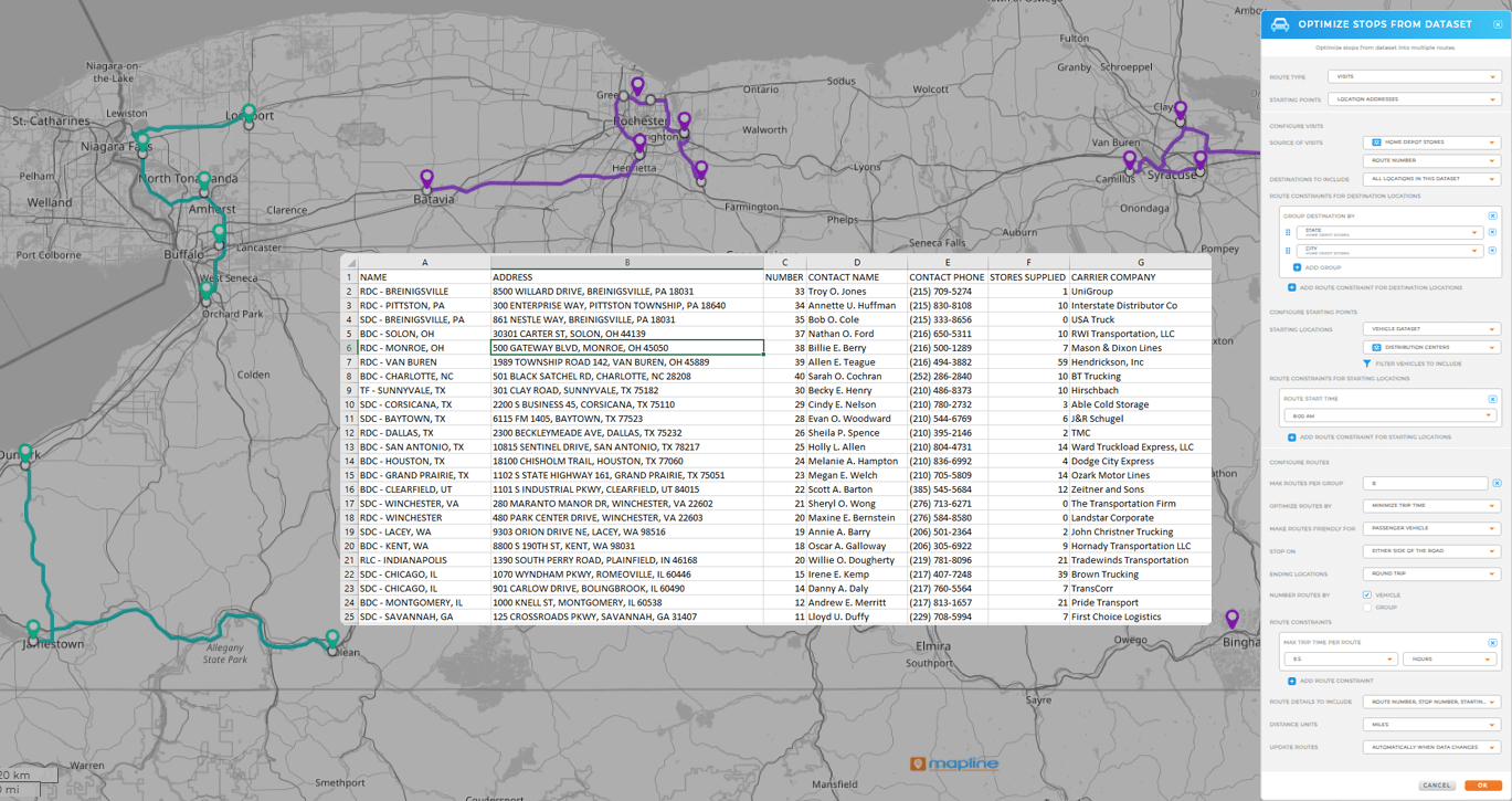
Before you plot points on a map, your data needs structure. Most teams begin with a spreadsheet that includes address fields such as street, city, state, and zip code. Others may already have latitude and longitude coordinates available.
The more consistent your data format, the more accurate your results will be. Clean inputs reduce errors during geocoding and ensure pins appear exactly where they should.
Step 2: Plot Addresses on a Map
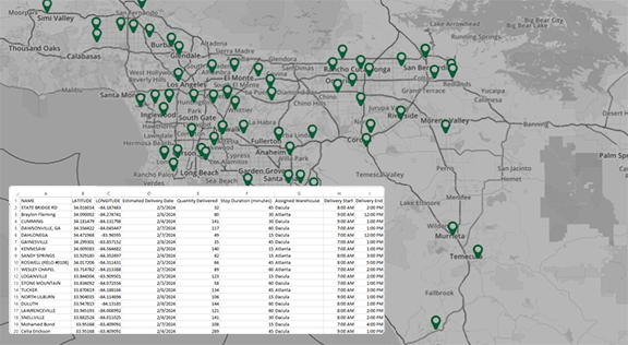
If you have a list of addresses, the simplest method is to upload your spreadsheet directly into a mapping tool. Modern platforms allow you to import Excel or CSV files and automatically convert addresses into map-ready coordinates.
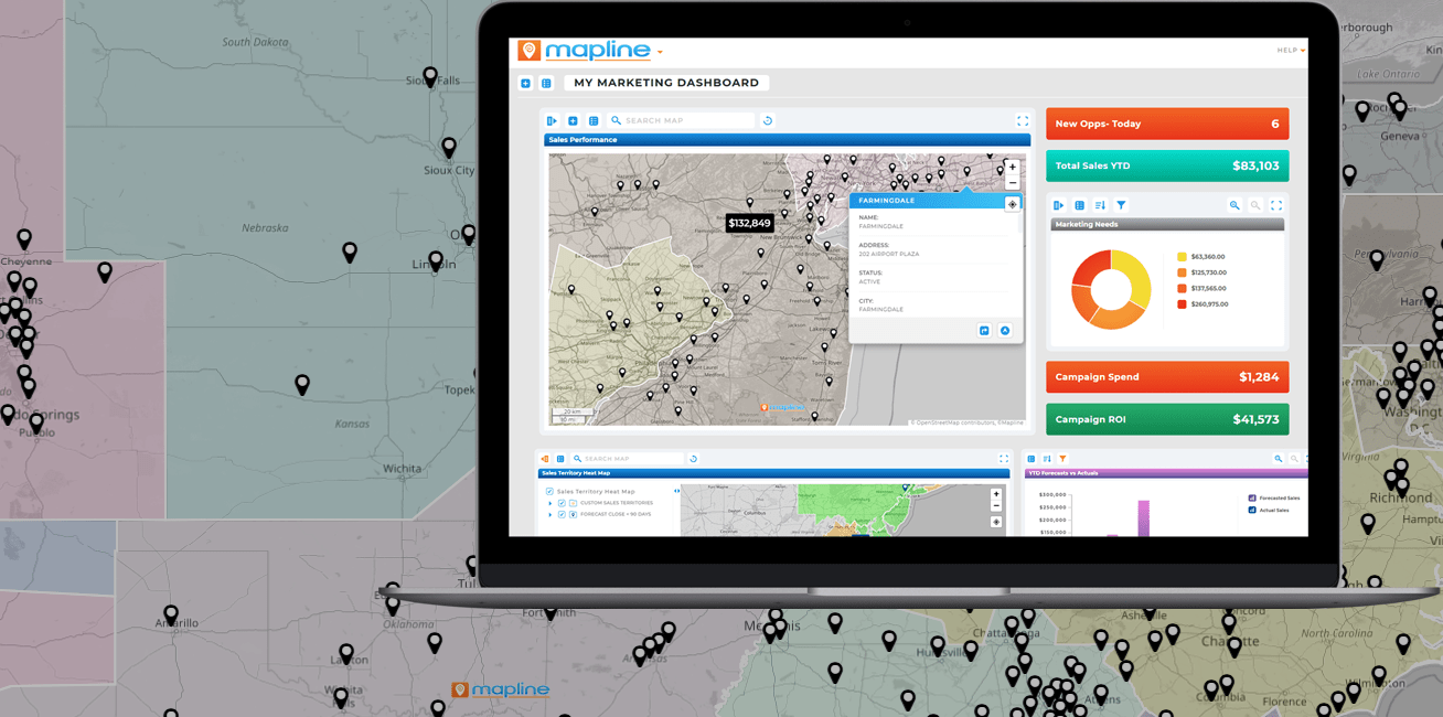
With Mapline, you can instantly create a map with pins by uploading your data. The system processes each address, places pins automatically, and displays your locations visually in seconds.
This eliminates manual entry and makes it easy to plot multiple addresses on a map without technical expertise.
Step 3: Plot Coordinates on Map Tools
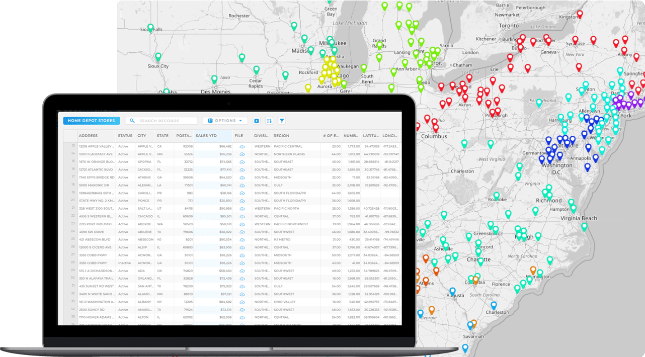
Sometimes you do not need to convert addresses at all. If your dataset already includes latitude and longitude fields, you can plot coordinates on map platforms directly.
Plotting coordinates on map software ensures precise placement, especially for custom locations, facilities, service points, or GPS-collected data. Mapline supports direct latitude and longitude uploads alongside address-based geocoding, giving teams flexibility depending on their data source.
Whether you start with street addresses or raw coordinates, modern mapping software allows both workflows seamlessly.
Step 4: Customize and Filter Your Map
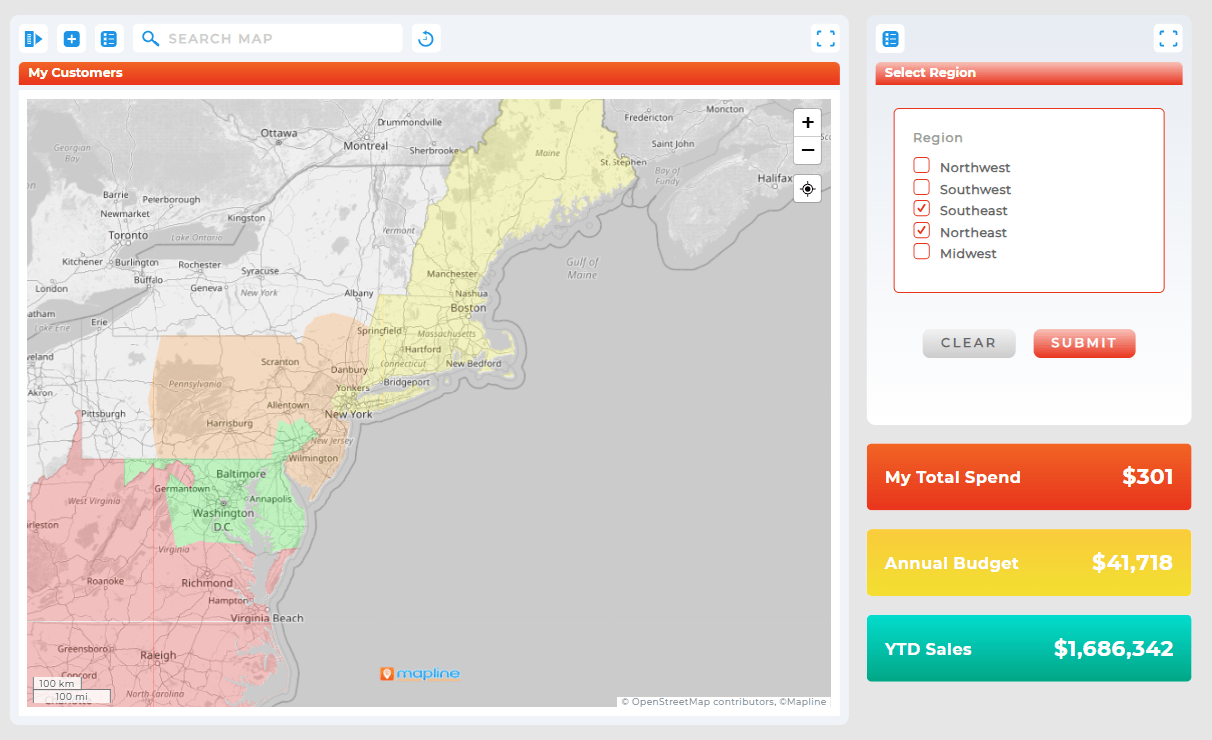
Once you plot locations on a map, the real value begins. Instead of viewing identical pins, you can group, color-code, and filter points based on performance metrics, categories, or territory assignments.
This allows teams to identify revenue clusters, under-served regions, or overlapping coverage instantly. Filtering helps isolate specific customer segments or performance tiers without rebuilding the map.
Mapping becomes powerful when it transitions from visualization to analysis.
Step 5: Identify Patterns That Matter
Plotting points on a map should answer meaningful questions:
Where are our highest-value customers concentrated?
Are certain regions under-served?
Are territories balanced?
Where should we prioritize visits?
With Geo Mapping, teams can overlay performance data, territory boundaries, and clustering insights to move beyond basic plotting into actionable strategy.
The difference between plotting data and understanding it is what drives growth.
When to Plot Addresses vs Coordinates
Both approaches have advantages depending on your workflow:
| Data Type | Best Use Case |
|---|---|
| Street Addresses | Customer lists, sales territories, dealer networks, and prospect databases. |
| Latitude & Longitude | GPS-collected data, facility coordinates, routing analysis, and service coverage planning. |
Mapline supports both address-based and coordinate-based plotting, giving teams flexibility as their data evolves.
Common Mistakes When Plotting Locations
Many teams treat mapping as a one-time visual project. Common mistakes include:
Uploading messy or inconsistent address data
Ignoring coordinate precision
Failing to filter or categorize pins
Using maps without connecting performance metrics
Plotting multiple addresses on a map is simple. Extracting meaningful insight requires structured data and analytical layering.
Upload your spreadsheet into a mapping platform that automatically geocodes addresses and places pins.
Yes. Modern tools allow bulk uploads of thousands of addresses at once.
Simply upload latitude and longitude fields directly into the system for precise placement.
Plotting points shows locations. Territory mapping adds boundaries, workload balancing, and performance overlays.
Absolutely. It helps identify revenue clusters, travel inefficiencies, and under-served regions.


