- Blog
- Geo Mapping
- How to Create a Custom Map with Pins That Actually Tells a Story
Anyone can create a custom map with pins. The real question is whether that map actually tells you something useful. Too often, teams plot locations and stop there. They end up with a screen full of markers but no clear insight into patterns, priorities, or next steps.
A well-designed map with pins should answer questions. Where are we over-served? Where are we under-performing? Which accounts deserve attention first? When your map moves beyond decoration and becomes decision-support, it transforms from a visual to a strategy tool.
This guide walks through how to create a map with pins that does more than display locations. It helps you build a map that reveals meaning, drives action, and supports smarter decisions.
Start With the Question, Not the Map
Before you create a map with multiple pins, define what you are trying to understand. Are you analyzing customer density? Evaluating territory balance? Tracking service coverage? The goal determines how the map should be structured.
For example, if you are measuring sales performance, your pins should reflect revenue tiers or account priority. If you are planning logistics, proximity and clustering matter more than static labels. A story-driven map starts with intent and builds visualization around it.
Without a guiding question, even the most customizable map with pins becomes noise. With clarity, it becomes a lens.


Pro Tip: If your map looks impressive but does not change a decision, it is incomplete. Always tie your custom pin map to a workflow—whether that is territory planning, route optimization, or performance analysis.
Import Clean Data Before You Plot
Strong maps begin with structured data. Whether you are mapping addresses or latitude and longitude, your spreadsheet should include clear headers and consistent formatting. Clean inputs prevent geocoding errors and ensure pins land where they should.
Modern mapping software allows you to upload Excel or CSV files directly, automatically translating addresses into mapped points. This removes manual plotting and speeds up the process dramatically.
When data is clean and structured, creating a map with pins becomes a scalable workflow rather than a one-off task.
Customize Your Map With Purpose
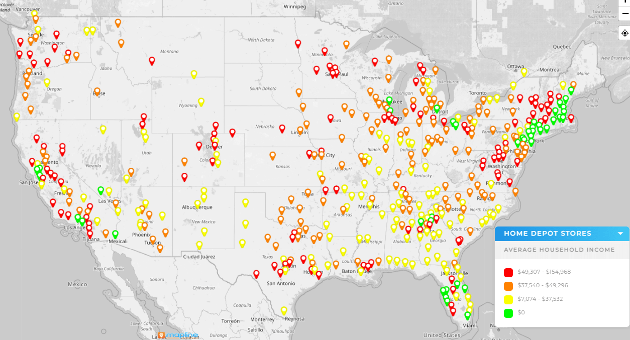
To truly make your own map with pins, customization must serve meaning. Change pin colors to reflect account type. Adjust size to indicate revenue. Add labels only when they clarify rather than clutter.
If you want to create a map with pins and labels, use labels selectively. For small datasets, visible labels work well. For larger datasets, consider hover tooltips or filter-driven labels to maintain readability.
Customization is not about decoration. It is about emphasis. Every visual choice should reinforce the story you want the map to tell.

Add Filters to Reveal Patterns
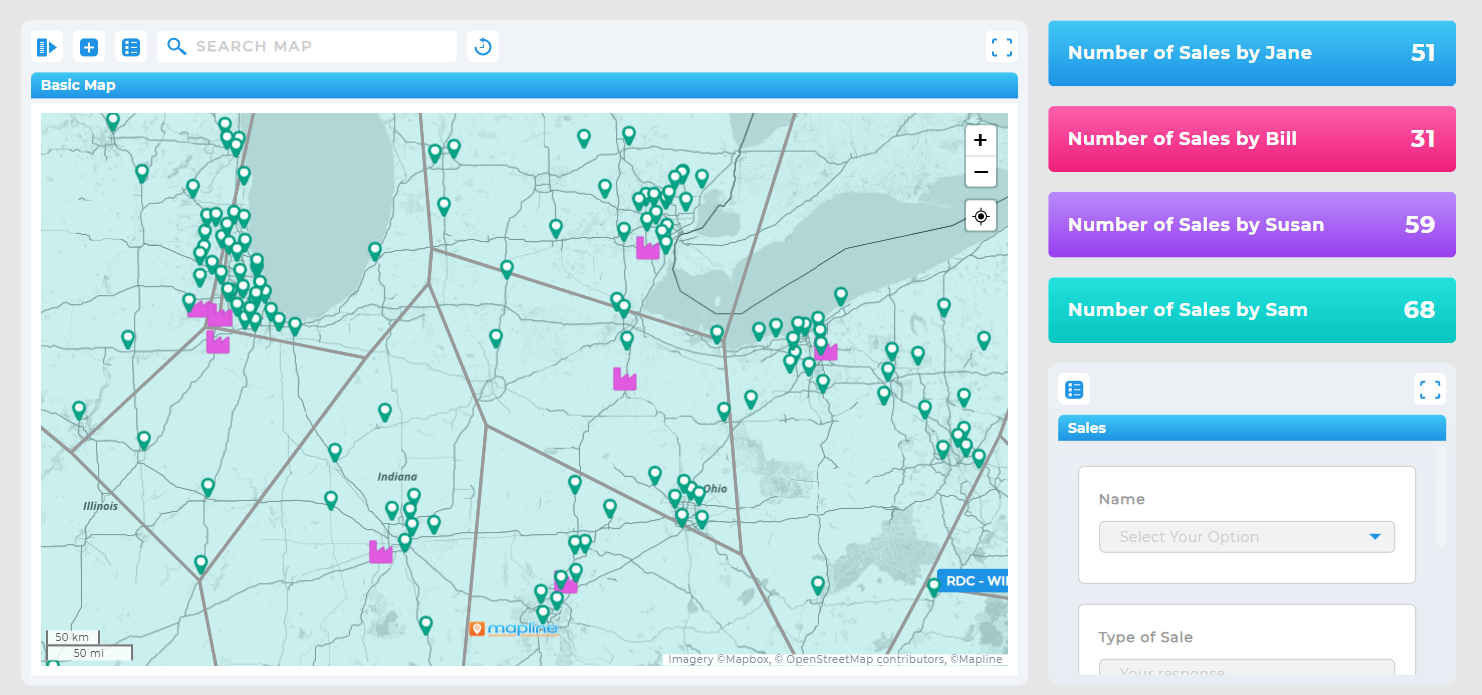
Plotting points is only step one. The real power comes when you can isolate variables. Filters allow you to view subsets of data instantly—by region, revenue band, customer type, or sales rep.
When you create a map with pins that includes dynamic filtering, you move from static visualization to interactive exploration. Instead of asking, “Where are our customers?” you can ask, “Where are our high-priority customers this quarter?”
This is where storytelling becomes interactive. The map responds as your questions evolve.
Turn Pins Into Territories
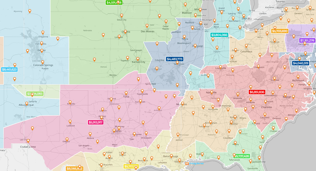
Individual pins show activity. Boundaries show strategy. Overlaying territories, zip codes, or custom regions helps you see whether coverage aligns with demand.
Using Geo Mapping, teams can layer performance metrics on top of mapped pins. This combination reveals whether certain regions are overloaded, underserved, or underperforming.
When pins are viewed in geographic context, patterns emerge. That context is what transforms data into insight.

Create an Interactive Map With Pins
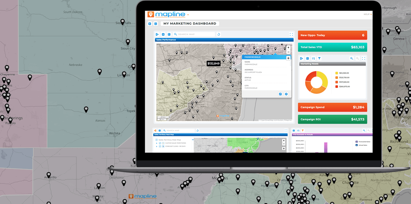
If your goal is collaboration, you need to create an interactive map with pins rather than a static screenshot. Interactive maps allow users to zoom, click, filter, and explore details directly.
This is particularly valuable for sales leaders reviewing territories or operations teams planning service routes. Instead of sending spreadsheets back and forth, stakeholders can engage with the same live map.
An interactive map shifts the conversation from interpretation to action.
Design for Action, Not Just Visibility
A story-driven map should lead somewhere. After creating a custom map with pins, ask what decision it informs. Should territories be redrawn? Should routes be optimized? Should marketing spend shift?
When maps are tied to workflows—whether routing, scheduling, or territory management—they become operational tools rather than visual references.
The difference between a good map and a powerful map is what happens next.

Tell a Better Story With Your Map
When you create a custom map with pins, you are not just plotting data—you are building a visual narrative. With clean inputs, purposeful customization, filtering, and interactive features, your map becomes a decision engine.
Start with a clear question. Build with structure. Customize with intention. Then let the map reveal what spreadsheets cannot.
The easiest way is to upload an Excel or CSV file into mapping software that automatically geocodes your addresses. This eliminates manual plotting and ensures accuracy.
Yes. Most modern mapping tools allow you to import spreadsheets and instantly plot hundreds or thousands of addresses.
Labels can be pulled directly from a column in your data, such as account name, revenue, or zip code. For larger datasets, consider hover-based labels to avoid clutter.
Absolutely. Grouping by category, revenue tier, or account type allows you to visually differentiate segments and highlight patterns.
Yes. Interactive maps allow users to zoom, filter, and explore data collaboratively rather than relying on static images.


