- Blog
- Geo Mapping
- From Spreadsheets to Strategy: How Creating a Map from a Spreadsheet Drives Growth
Spreadsheets are the backbone of most business data. From customer lists to sales reports, companies rely on Excel to manage critical information. But rows and columns only tell part of the story. To reveal true insights, businesses need to see how their data looks on a map. By learning how to create a map from a spreadsheet, leaders can transform static data into actionable strategies. Visualizing data geographically uncovers patterns, gaps, and opportunities that would otherwise remain hidden in a table of numbers.
Why Businesses Should Create a Map From a Spreadsheet
Traditional spreadsheets capture the “what,” but not the “where.” When companies create a map from Excel, they add context that drives smarter decisions. Instead of guessing which regions need more attention, teams can visualize exactly where sales are happening or where customers are concentrated. A simple step like learning how to map addresses from Excel can make the difference between reactive decisions and proactive strategy. By layering data onto geography, leaders unlock a new dimension of analysis that directly impacts growth.


Pro Tip: Geo Mapping empowers you to instantly create a map from Excel data. With features like heat maps from Excel data and pin mapping tools, you’ll uncover growth opportunities faster and move from raw spreadsheets to strategy.
Turning Excel Data into Actionable Maps
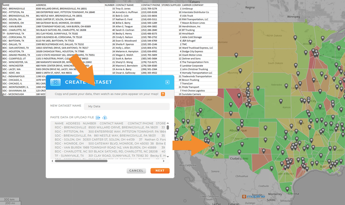
Creating maps from spreadsheets is about more than plotting points. The right Excel mapping tool transforms raw data into interactive visuals. With just a few clicks, you can create a map from Excel data that highlights customer density, sales performance, or market coverage. Tools like Mapline go a step further, enabling users to build heat maps in Excel or even generate a heat chart in Excel that visually compares regional activity. This turns a basic spreadsheet into a dynamic decision-making resource.
Business Benefits of Creating a Map from Excel Data
When businesses take the time to create a map from a spreadsheet, they unlock insights that would otherwise stay hidden in rows and columns. Visualizing data geographically reveals customer clusters, sales trends, and regional performance patterns that are easy to miss in static reports. Mapping Excel data also helps organizations identify coverage gaps, streamline territory planning, and allocate resources more effectively. For sales and operations teams, this means better decision-making and faster responses to changing conditions. By leveraging powerful mapping software to transform spreadsheets into interactive maps, companies gain a clearer view of opportunities and risks, ultimately driving smarter strategies and measurable growth.
Create a Map from a Spreadsheet to Reveal Customer Concentration
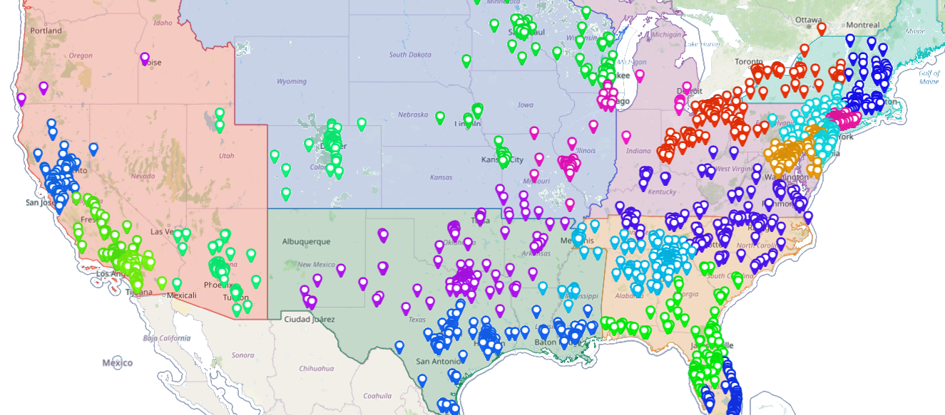
By mapping addresses directly from a spreadsheet, companies can see where their customers are clustered. This helps identify underserved regions or high-demand areas where additional resources could drive revenue.

Map From Excel to Optimize Sales Territories
A map built from Excel data makes it easier to balance sales territories and assign reps efficiently. Leaders can spot overlaps, reduce gaps, and ensure fair workload distribution — all with a simple Excel mapping tool. That’s the power of having the right mapping software in your arsenal!

Improve Site Selection with a Map from Excel Data
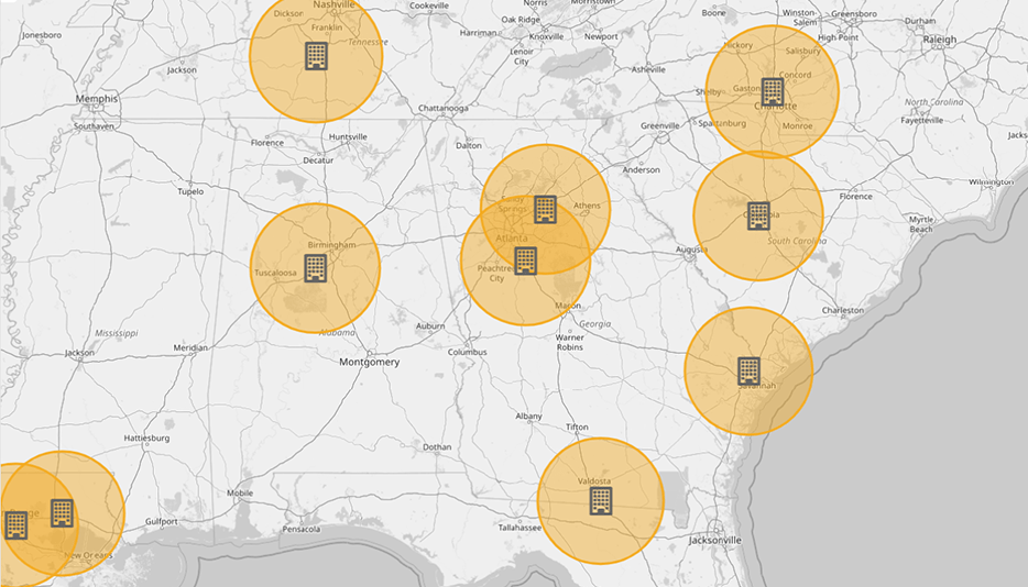
When expanding into new markets, maps reveal which areas offer the best opportunities. By plotting data with a create pin map from Excel file workflow, companies can make confident site selection decisions backed by data.

Create a Map from Excel to Track Performance Trends
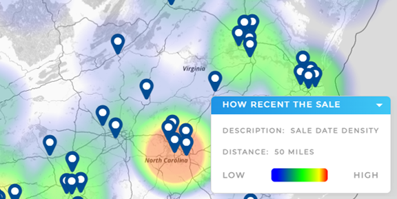
With a heat map Excel or heat chart Excel, businesses can track sales, service, or operational performance over time. This visualization makes it easier to compare regions and identify where improvements are needed.

It means transforming Excel data into a geographic map, making trends and opportunities easier to see.
Yes. Tools like Mapline simplify the process, allowing users to upload a file and generate maps instantly.
By uploading an Excel file with address or postal code data into mapping software, you can plot those addresses on a map.
The best tools allow you to create pin maps, heat maps, and interactive charts directly from spreadsheet data.
Yes. With the right mapping software, you can create a heat map Excel or heat chart Excel for visualizing regional performance.
Sales, logistics, retail, and service businesses all benefit from turning spreadsheets into maps.
A create pin map from Excel file workflow helps visualize exact locations, making it easier to plan routes, territories, or customer visits.
Yes. You can start free and upgrade as your mapping and analysis needs grow.


