- Blog
- Geo Mapping
- Excel Data Mapping Hacks: How to Turn Rows Into Insights
When you look at your customer or business data in a spreadsheet, it’s easy to get lost in the rows and columns. Excel is great for storing information but not so great at showing you the bigger picture. That’s where data mapping comes in. By visualizing your spreadsheet data on a map, you can uncover hidden opportunities, spot inefficiencies, and make smarter decisions without drowning in numbers.
With the right approach, Excel data mapping turns static tables into actionable insights your team can use immediately. Many teams are shocked to learn how easy it is to create a map from excel. Let’s explore why:
Why Excel Alone Isn’t Enough
Excel spreadsheets are powerful for organization, but they limit how quickly you can see patterns in your data. Searching through thousands of rows to answer questions about territory coverage, customer distribution, or performance benchmarks takes time—and often leads to missed opportunities. Data mapping removes this friction by instantly transforming your spreadsheet into a visual map that highlights what matters most. Instead of searching, you’re spotting patterns at a glance, saving hours and improving accuracy.
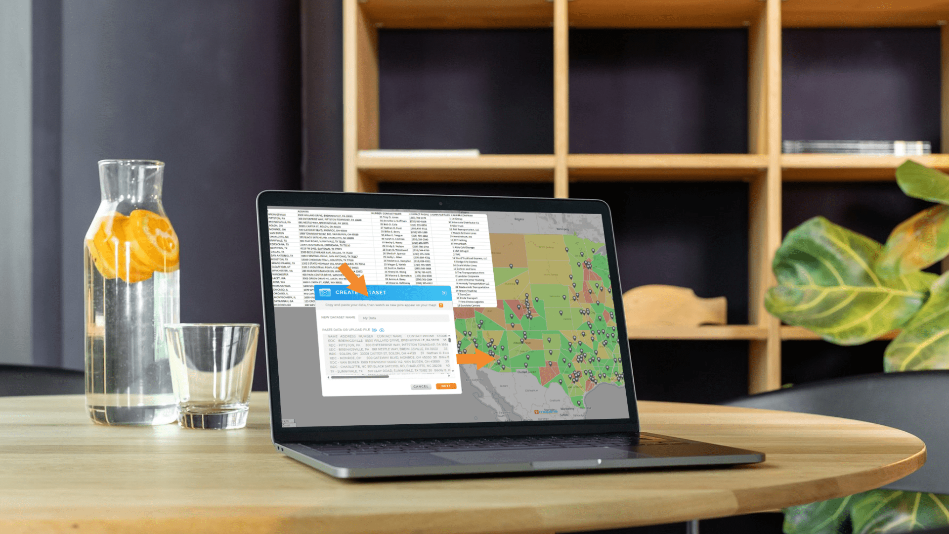

Pro Tip: Don’t just stop at plotting your data—use advanced mapping tools like demographic layers and drive time or drive distance polygons to uncover trends you can’t see in Excel. This is where real competitive advantages emerge.
Limited Visualization Capabilities
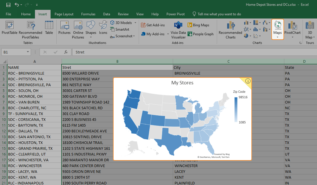
Excel does a great job with tables and charts, but it was never built for spatial visualization. At best, you can color-code cells or use a static chart to approximate geographic patterns. These options lack the interactivity needed to explore data dynamically, which means trends are harder to spot and easy to misinterpret. Without actual maps, location-based insights often remain buried in raw numbers. This limitation can cost teams valuable opportunities to adjust strategy quickly.
No Territory or Boundary Support
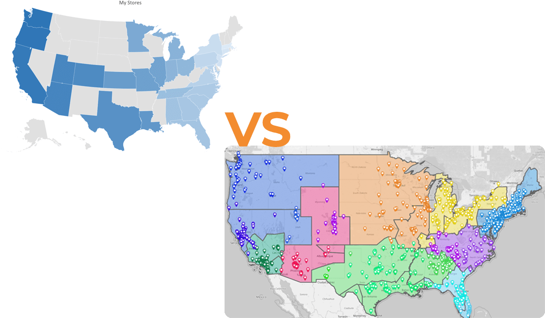
Spreadsheets don’t offer built-in tools to create custom territories, define boundaries, or compare regions side by side. Attempting to draw territories manually—whether in Excel or through linked images—is clunky and prone to human error. Without clear boundaries, businesses can’t see overlaps, gaps, or areas of opportunity in their coverage. This lack of precision makes it difficult to allocate resources fairly or strategically. True territory mapping requires specialized software that automates the process and updates dynamically.
Weak Distance and Travel Analysis
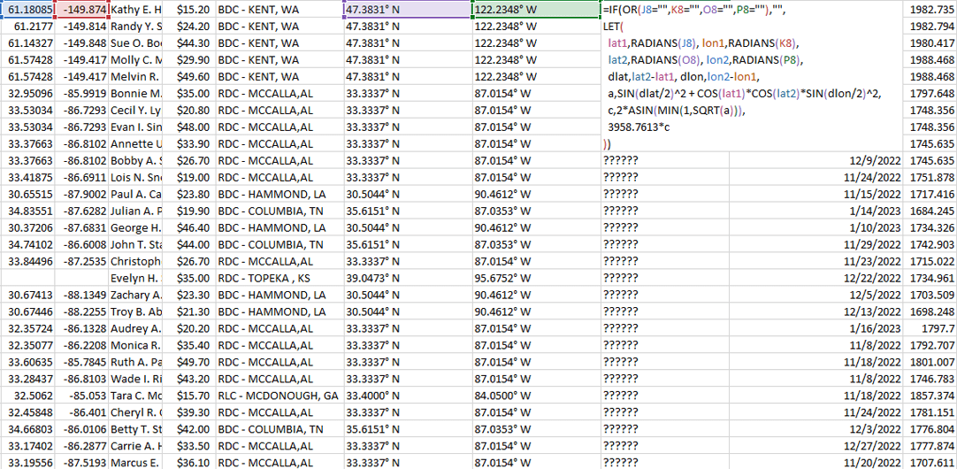
Excel can handle math functions, but it can’t calculate realistic drive times, distances, or optimized travel routes across hundreds of points. Sales and service teams often rely on location-based calculations to understand efficiency, but spreadsheets require manual formulas that become unmanageable at scale. Even if you enter distances, they remain static and disconnected from real-world traffic patterns. Without accurate travel insights, businesses risk underestimating costs or overpromising service.
Data Overload and Errors
As datasets grow, spreadsheets become harder to manage—let alone visualize effectively. Large customer or location lists often lead to scrolling endlessly through rows and columns, which increases the likelihood of missing trends. Manual data entry and formulas also create opportunities for mistakes that can throw off an entire analysis. When data management becomes overwhelming, decision-making slows down and confidence in the numbers drops. Mapping platforms are designed to eliminate this friction by layering data onto an intuitive visual format.

Why Mapping Software Solves These Limitations
The challenges of relying on Excel alone make it clear that spreadsheets aren’t enough for location-based decision-making. Mapping software fills these gaps by automating calculations, visualizing data in real time, and giving teams powerful tools like territory creation, drive-time analysis, and dynamic pin styling. Instead of static rows and formulas, businesses get living maps that adapt as their data changes. This shift from reactive number-crunching to proactive visualization empowers organizations to move faster, plan smarter, and capture opportunities that spreadsheets simply can’t reveal.
Hacks for Smarter Excel Data Mapping
Turning Excel data into maps isn’t just about dropping pins—it’s about making your information actionable. A well-structured map uncovers patterns, inefficiencies, and opportunities that remain hidden in spreadsheets. With the right approach, mapping transforms static data into insights that guide real-world decisions, from balancing sales territories to optimizing delivery routes. The best part is that many of these hacks take only minutes to apply, yet can save hours of manual analysis. By mastering these techniques, teams gain faster answers, clearer visibility, and stronger confidence in their strategies. These hacks will help you move from rows of numbers to clear business intelligence.
Segment Data by Category
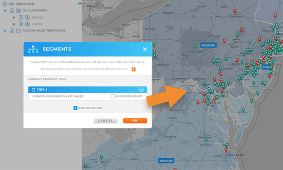
Mapping allows you to color-code pins by attributes like region, rep, revenue, or product. Instead of scrolling through filters in Excel, you see categories instantly visualized on your map. This makes it easier to identify gaps, overlaps, or underperforming areas.
Use Drive-Time and Drive-Distance Polygons
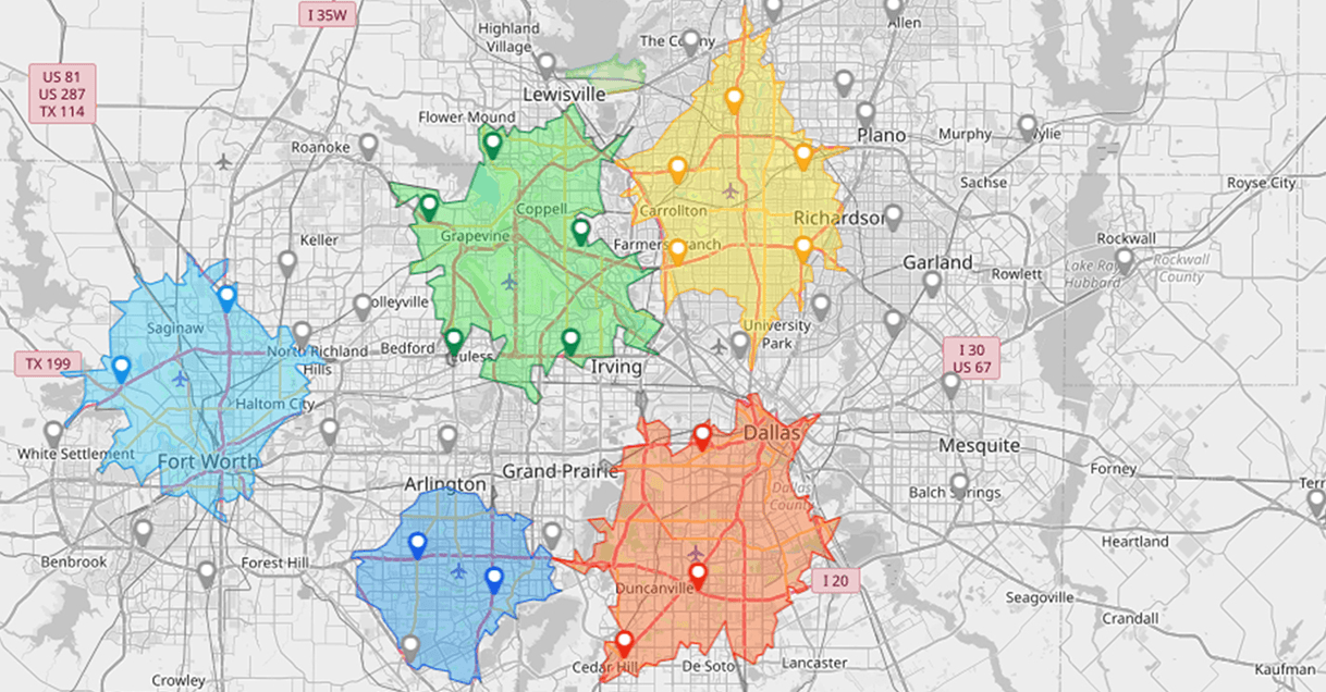
Instead of guessing whether reps or technicians can cover a region, use polygons to show exactly how far they can travel within a certain timeframe or distance. Overlaps indicate wasted coverage, while empty areas signal where to add staff. This helps optimize costs and improve customer satisfaction.
Layer in Demographic Data
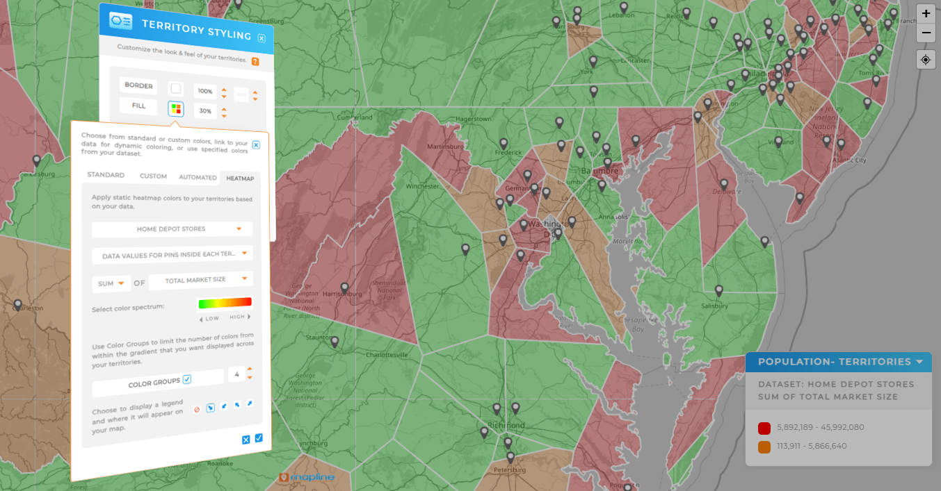
By adding demographic or census layers to your Excel data, you can analyze not just where your customers are but who they are. This reveals market potential and helps prioritize the right areas for sales and marketing campaigns.
Generate Territories Automatically
Manually assigning accounts by ZIP code in Excel is time-consuming and often unbalanced. With mapping software, you can auto-generate fair territories based on rules like revenue, number of accounts, or workload. Balanced territories drive higher productivity and reduce rep burnout.
Spot Hidden Revenue Opportunities with Heat Maps
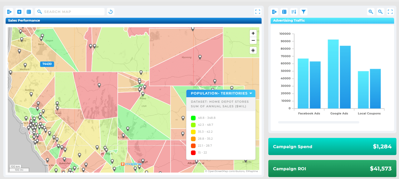
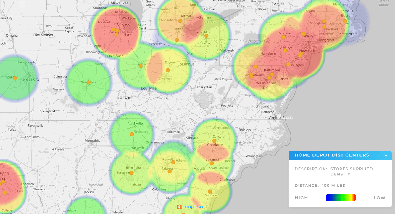
Heat maps transform Excel data into gradients that show customer density or sales volume. This makes it easy to identify underserved markets, overextended delivery zones, or profitable regions that deserve more investment.
How to Create a Map From Excel (Step by Step)
Creating a map from Excel data is much easier than most teams expect. Here’s how to build your maps in 3 easy steps:
- First, upload your spreadsheet and confirm the columns for addresses or coordinates
- Next, name your map and choose your visualization options
- Finally, add layers like demographics, polygons, or heat maps to reveal deeper insights
It’s as easy as that! In just minutes, you have an interactive tool that goes beyond the limits of spreadsheets.
Excel Data Mapping in Action
Teams across industries are using Excel data mapping to improve strategy and operations. Sales teams balance workloads more fairly, service organizations plan routes more efficiently, and retailers spot gaps in their market coverage. These real-world applications prove that mapping isn’t just a visualization—it’s a decision-making advantage.
Here are some common questions users have about creating a map from Excel:
Excel offers some charting features, but they are limited. To create interactive maps with advanced features, you’ll need a dedicated mapping tool.
Anything with location data—such as addresses, ZIP codes, cities, or coordinates—can be mapped. You can also layer in revenue, categories, or performance metrics for deeper insights.
Not at all. Small businesses use mapping to save time, cut costs, and grow smarter. The benefits scale no matter the team size.
With modern mapping platforms, you can go from uploading your data to generating a map in just minutes.
Visualization. It turns rows into clear patterns, helping you act on information faster and with more confidence.


