- Blog
- Geo Mapping
- How Heat Maps Reveal Revenue Gaps You Didn’t Know Existed
If you manage sales, marketing, delivery, or field service, there’s a good chance your best opportunities are hiding in plain sight. Tables can tell you what happened, but they rarely show you where and why. Heat maps flip the script by turning raw location data into an immediate picture of performance, demand, and cost-to-serve. With the right setup, you can spot underperforming pockets, overloaded crews, and expansion-ready zones in minutes. This guide goes deep on how to build and use heat maps that surface revenue gaps fast, plus the specific actions that turn those visuals into results.
What Is a Heat Map, Really?
A heat map is a geographic visualization that colors regions or points based on a variable you care about, such as revenue, orders, churn, or cost. Darker or “hotter” areas indicate higher values so your eye instantly finds patterns that are hard to see in rows and columns. Heat maps can be point based, polygon based, or grid based depending on the dataset and the question you’re answering. They can be static snapshots or time based to highlight trends. When you layer multiple signals, heat maps become a decision engine rather than just a pretty picture.
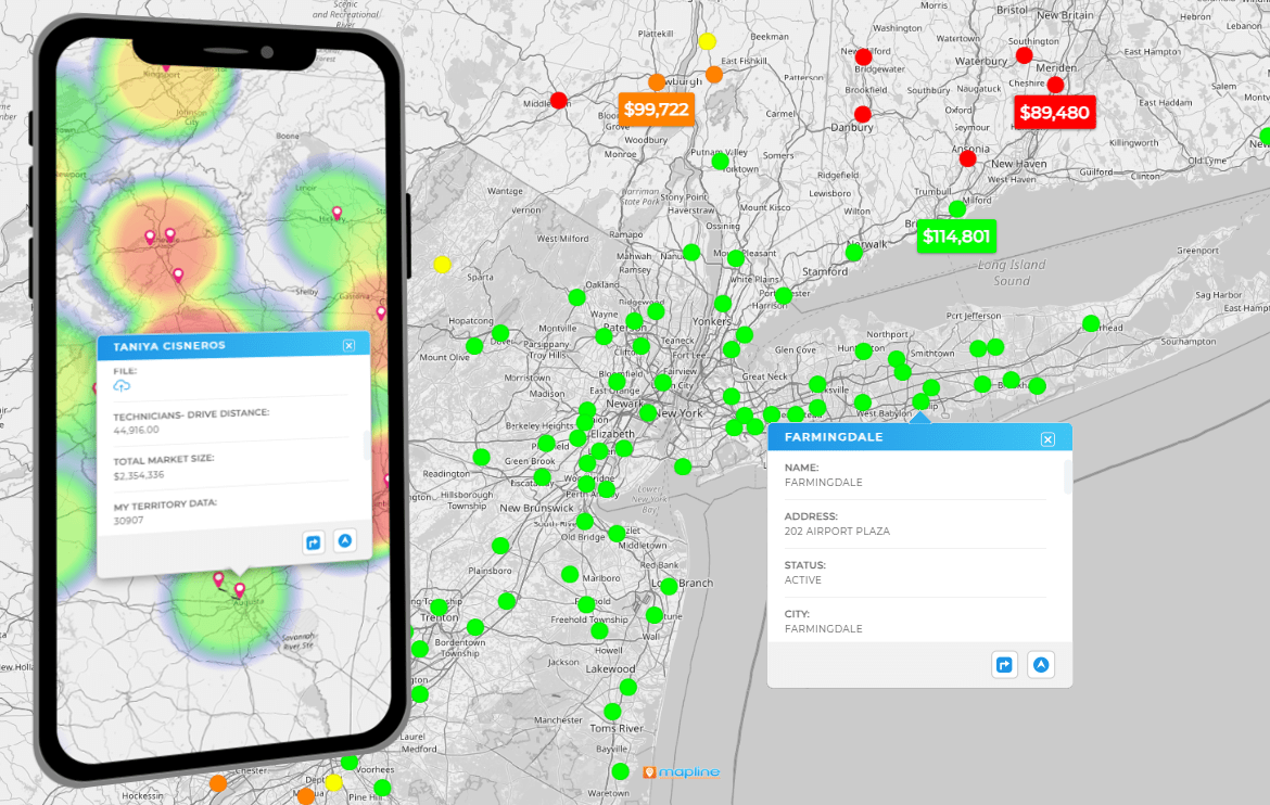

Pro Tip: Pair your heat maps with Geo Mapping features like territory mapping or drive-time polygons. By layering these tools, you’ll see not only where opportunities exist, but also whether your team can realistically cover them. That combination of visibility and feasibility is what turns insight into sustainable revenue growth.
Why Heat Maps Expose Revenue Gaps Faster Than Tables
A single “hot vs cold” view is only the beginning. The real value of heat maps comes from using the right type of visualization to answer the specific business question in front of you. Different formats—ZIP code, density, cost-to-serve, or time-based maps—highlight different patterns and blind spots. Choosing the wrong map can lead to false conclusions, while the right one points directly to opportunities for margin improvement, coverage adjustments, or expansion. By aligning heat map types to your team’s real-world challenges, you go beyond pretty visuals and start generating insights that shift strategy and execution.
The Heat Maps That Matter Most for Revenue
A single “hot vs cold” view is only the beginning. The biggest value of heat map software comes from using the right type of visualization to answer the specific business question in front of you. Different formats—ZIP code, density, cost-to-serve, or time-based maps—highlight different patterns and blind spots. Choosing the wrong map can lead to false conclusions, while the right one points directly to opportunities for margin improvement, coverage adjustments, or expansion. By aligning heat map types to your team’s real-world challenges, you go beyond pretty visuals and start generating insights that shift strategy and execution.
ZIP Code Heat Maps
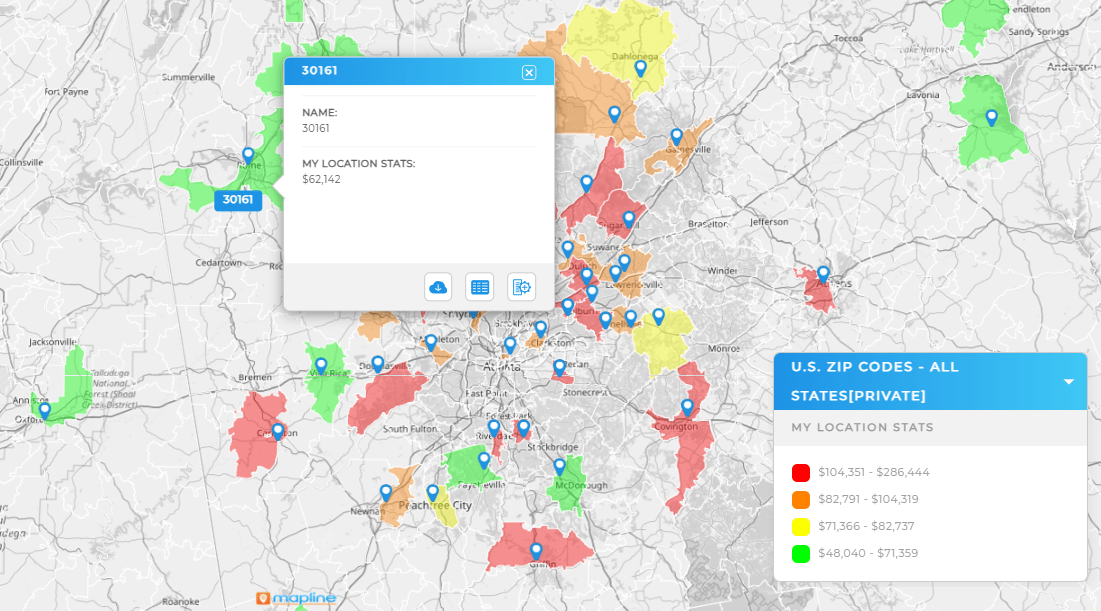
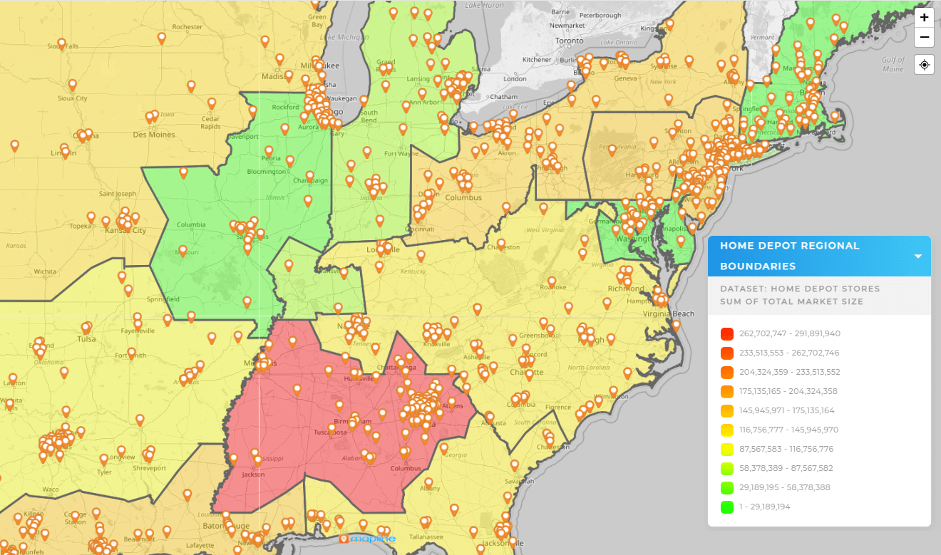
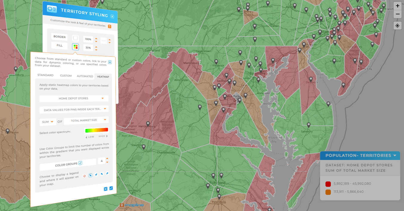
Color ZIPs by revenue, orders, average order value, or win rate to see micro-markets at a glance. Overlay competitor locations or store sites to explain why some ZIPs lag. Add demographic layers like income or household density to separate potential from performance. This is the fastest way to see where you’re overinvested or underpenetrated. It’s also perfect for retail assortment, local offers, and new store forecasting.
Point Density Heat Maps
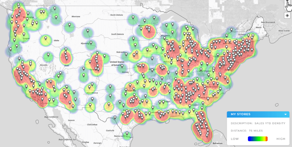
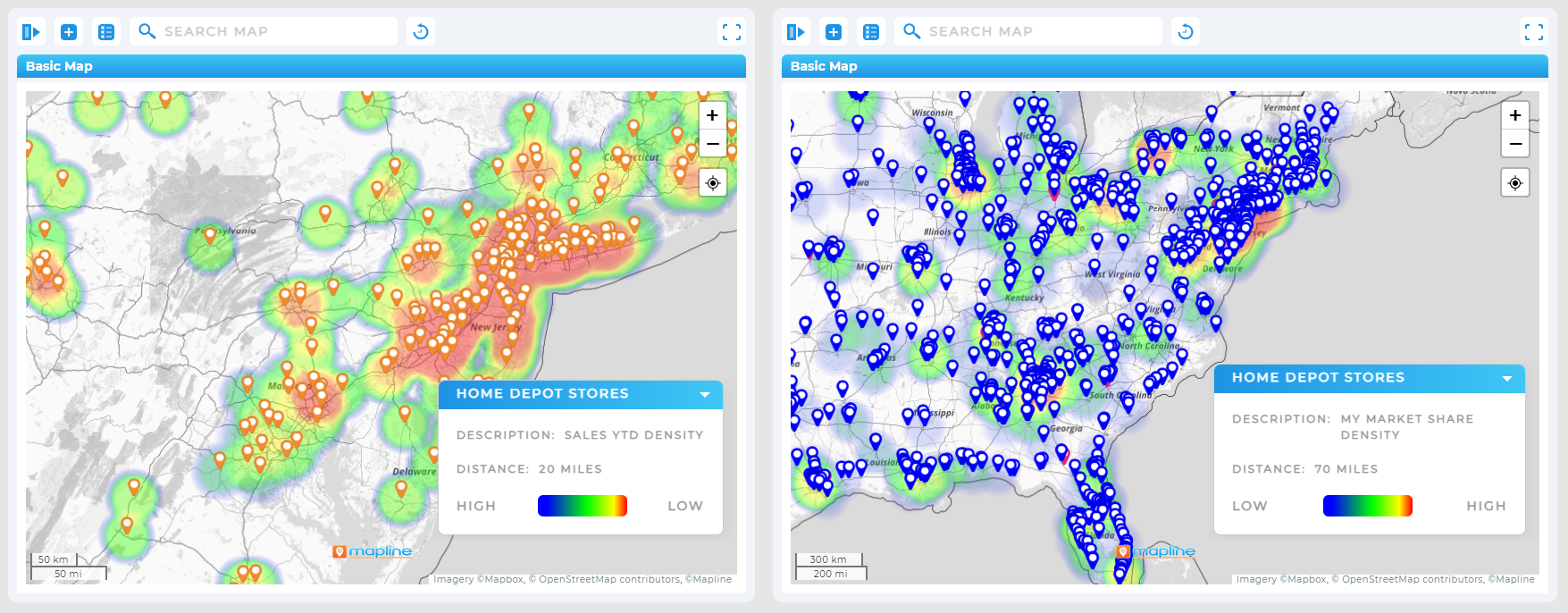
If you track customers, leads, or deliveries as points, density heat maps reveal clusters and gaps without needing predefined boundaries. Great for early-stage market scans or when boundaries don’t match how your team actually operates. Use density views to spot sales coverage voids, over-saturated service zones, or pockets of high-value leads.
Cost-to-Serve Heat Maps
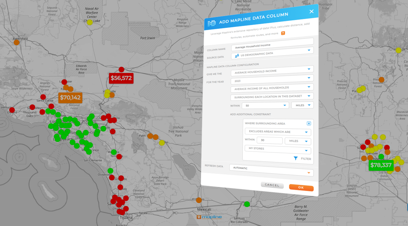
Blend travel time, fuel, labor rates, and stop duration to visualize where you make or lose money. Color by gross margin or contribution margin to prioritize which routes, ZIPs, or service types to keep, fix, or phase out. This is invaluable for delivery programs, home services, and any operation where distance dictates dollars.
Time-Series Heat Maps
Animate or compare periods (week over week, season over season) to spot trend shifts by area. Use this for promo lift analysis, new-store cannibalization checks, or early churn detection. When a zone is cooling while a neighbor heats up, you know where to focus field work or marketing.
Drive Time and Drive Distance Polygons
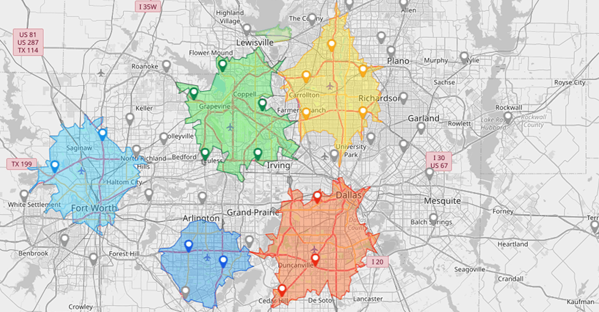
Build 10, 20, or 30 minute travel-time polygons around hubs, warehouses, and technicians. Distance-based polygons are useful when speed limits or traffic data are incomplete. Overlay your customers or leads to see who falls inside standards. Overlaps suggest redundancy, while uncovered pockets point to staffing needs, new depot sites, or third-party partners.
How to Create a Heat Map in Excel vs a Dedicated Too
Excel can produce basic geographic visuals if you massage the data, but there are tradeoffs. You’ll often need to normalize location names, find lookup relationships to boundaries, and rely on add-ins to get beyond simple choropleths. That makes version control and repeatability difficult. Dedicated mapping and analytics tools ingest addresses directly, snap them to boundaries, and let you switch between heat types without rebuilding charts. You also get filters, layers, and performance at scale, which matters once you’re beyond a single market or a few thousand rows.
Actions to Turn Heat Maps Into Revenue
Seeing a hotspot is useful, but acting on it is where the real gains come from. Many teams stop at the visual, nodding at what looks “interesting” without assigning ownership or making adjustments. Turning those insights into revenue means connecting heat map signals to territory shifts, staffing changes, pricing tweaks, or marketing campaigns. Each play you run should have a clear hypothesis (“this area should generate more with targeted outreach”), a defined owner, and a follow-up window to measure impact. By treating your heat maps as a trigger for fast, data-driven action, you close the loop between analysis and results.
Identify High-Potential ZIPs Your Team Isn’t Touching
Create a ZIP code heat map of revenue and overlay population, income, or category-relevant demographics. Sort for ZIPs with strong potential but low revenue or visit counts. Assign targeted outreach, events, or partner activations to those areas. Track lift over the next two cycles to validate the play and refine your thresholds.
Rebalance Sales Territories With Objective Metrics
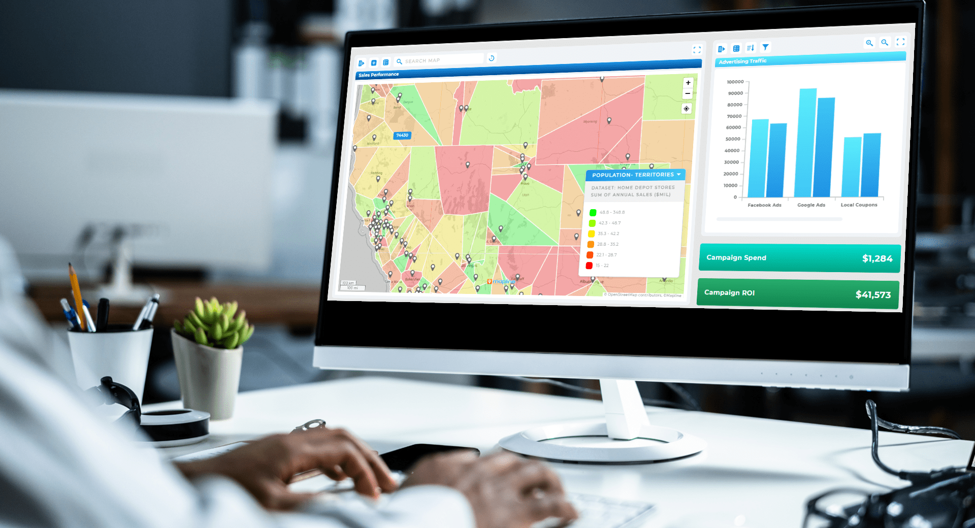
Color territories by workload indicators such as active accounts, qualified leads, or drive time per week. If one territory is “hot” on workload but “cool” on results, rebalance by shifting border blocks or specific account clusters. Use drive time or distance polygons to keep weekly travel manageable after the change.
Optimize Delivery Zones to Protect Margin
Overlay cost-to-serve heat with your current delivery promise. If certain zones light up for high cost, tighten the delivery polygon, introduce fees, or move those orders to pickup partners. If zones near a warehouse are profitable but underused, target them with free-delivery windows to increase order density.
Pinpoint Store Expansion or Consolidation Moves
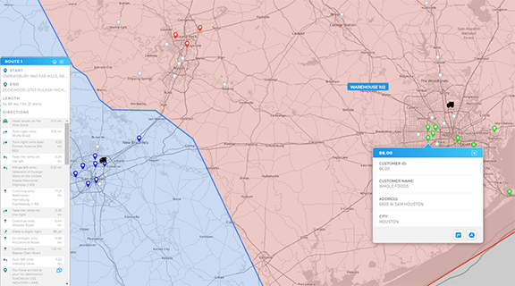
Build a demand heat map from customer density or lead volume, then layer competitor locations and drive-time coverage from existing stores. High demand outside current 20 minute reach suggests expansion. Areas where your own coverage overlaps heavily and margins are thin may justify consolidation or a smaller-format concept.

Target Promotions With Micro-Market Precision
Segment ZIPs by performance and potential, then tailor offers. A cool performance/high potential zone might get a first-purchase incentive, while a hot performance zone gets a loyalty bump. Tie promo calendars to seasonality visible in your time-series heat maps so spend follows actual demand curves.
Protect Service SLAs by Preempting Overload
For field service or installation, build a heat map of open work orders and overlay technician drive-time polygons. If “hot” backlogs sit outside practical travel windows, pull in float techs, shift appointment windows, or spin up a temporary micro-depot. Track backlog heat weekly to see whether staffing and routing changes stick.
Surface Churn-Risk Pockets Early
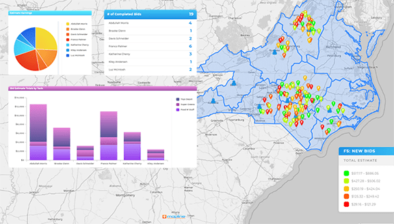
Map support tickets, late deliveries, or negative NPS by area. When a region heats up on risk indicators, pair operations fixes with proactive outreach. This mix lifts customer lifetime value and prevents expensive win-back campaigns later.
Visualize Price Elasticity by Geography
Color ZIPs by average discount depth or promo reliance, then overlay lifetime value and margin. If a zone only moves on steep discounts and LTV is weak, rework the offer strategy there. Conversely, zones that stay hot on full-price sales justify premium assortment or faster service.
Building a Revenue-Gap Heat Map: Data You Actually Need
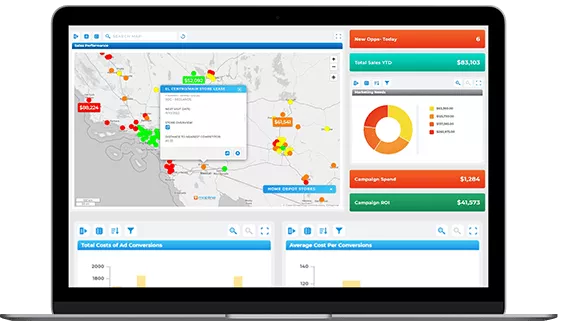
When used correctly, a heat map generator can uncover powerful revenue insights hiding in plain sight. But when mistakes slip in, even the best data can be misread—leading teams to chase trends that don’t exist or overlook high-performing regions entirely. Many businesses unknowingly bury revenue opportunities under messy data, poor scaling choices, or inconsistent visualization settings. The key is learning to spot and fix these issues before they skew your results. By refining how you build and interpret maps, you’ll turn your heat map generator into a precision tool for identifying real revenue growth opportunities.
- Start with a clean location key.
- Addresses are fine if your tool can geocode, but ZIP or customer ID with coordinates is best.
- Decide on your primary metric (revenue, orders, AOV, margin, visits) and the period to analyze.
- Add at least one potential proxy such as population, households, or business density to separate “we can’t sell it” from “we haven’t sold it yet.”
- If you run field operations, include travel time or distance, stop duration, and service outcomes.
- Keep an event flag to mark promos, openings, or competitor moves so your analysis accounts for context.
Best Practices for Trustworthy Heat Maps
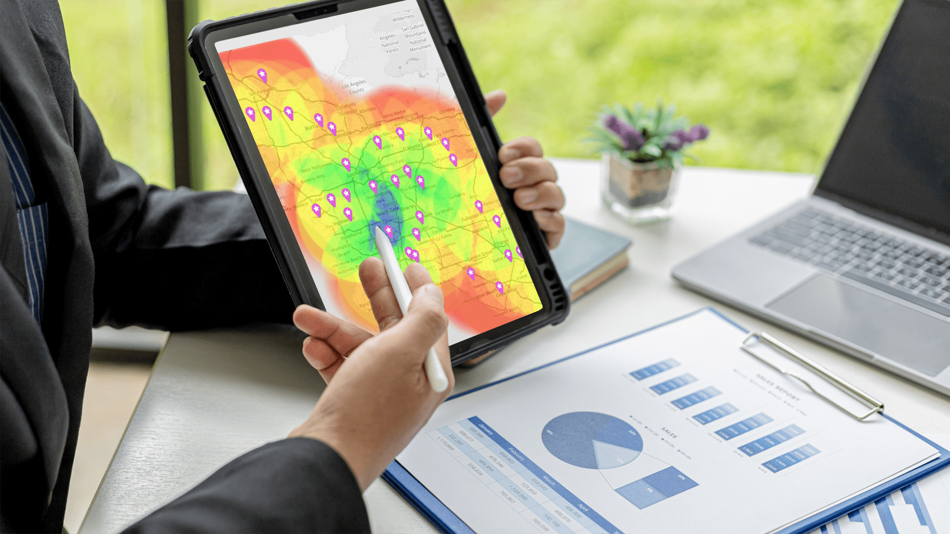
Here are some quick tips to ensure your heat maps deliver results you can actually trust. Start by using clean, accurate data—errors or duplicates can distort your results and lead to misleading visuals. Always choose an appropriate radius and intensity setting so that hot spots reflect real patterns, not random clustering. Use consistent color gradients that make differences easy to interpret at a glance. And finally, pair your heat maps with supporting data like sales numbers or demographic layers to give context to what you’re seeing. When built thoughtfully, a heat map becomes one of the most reliable tools for data-driven decisions.
- Normalize by population or account count when appropriate so high-volume areas do not always look best by default.
- Use consistent binning rules across periods so week-to-week comparisons mean something.
- Label layers clearly and document how you calculated cost-to-serve or margin so decisions are defensible.
- Add filters for channel, product line, or account tier to avoid averaging away critical patterns.
- Most importantly, pair every view with an action checklist so teams know exactly what to do with what they see.
Common Mistakes That Hide Revenue
Even the most well-intentioned heat maps can lead teams astray if they’re not built carefully. Small oversights in data quality, setup, or interpretation can easily mask valuable opportunities—or worse, point you toward the wrong ones. Many businesses unknowingly hide their strongest revenue insights behind cluttered maps, missing context, or inconsistent data inputs. The good news? These mistakes are easy to fix once you know what to look for. By avoiding common pitfalls and following best practices, you can turn every heat map into a clear, trustworthy source of truth for your revenue strategy.
- Over-smoothing density can blur real pockets of demand.
- Using only revenue hides low-conversion zones that could improve with targeted activation.
- Treating heat maps as decoration in presentations rather than a living tool leads to one-and-done insights.
- Ignoring time means you miss seasonal flips where playbooks should change.
- Finally, building visuals that only a data team can maintain slows response time across the business.
Metrics and Benchmarks to Track From Your Heat Maps
Heat maps are powerful on their own, but the insights stick when paired with clear metrics. Tracking penetration, cost-to-serve, drive-time coverage, promo lift, or churn risk provides a scoreboard that validates whether your adjustments are working. Benchmarks make comparisons easy—are you trending above average for conversion in high-potential ZIPs, or falling behind in certain service zones? They also help teams prioritize; not every hotspot deserves equal attention, but the metrics show where ROI potential is highest. By tying your heat maps to quantifiable benchmarks, you can move past guesswork and build accountability into your growth strategy.
- Penetration by ZIP: customers or revenue per thousand households or businesses
- Cost-to-Serve Index: travel time plus labor and fuel per order, relative to target
- Drive-Time Coverage: percent of target accounts within standard travel time of a store, depot, or tech hub
- Promo Lift by Area: period-over-period revenue change within targeted polygons
- Territory Balance: variance in workload and opportunity across reps
- Churn or Risk Heat: tickets, late orders, or negative NPS per area vs baseline
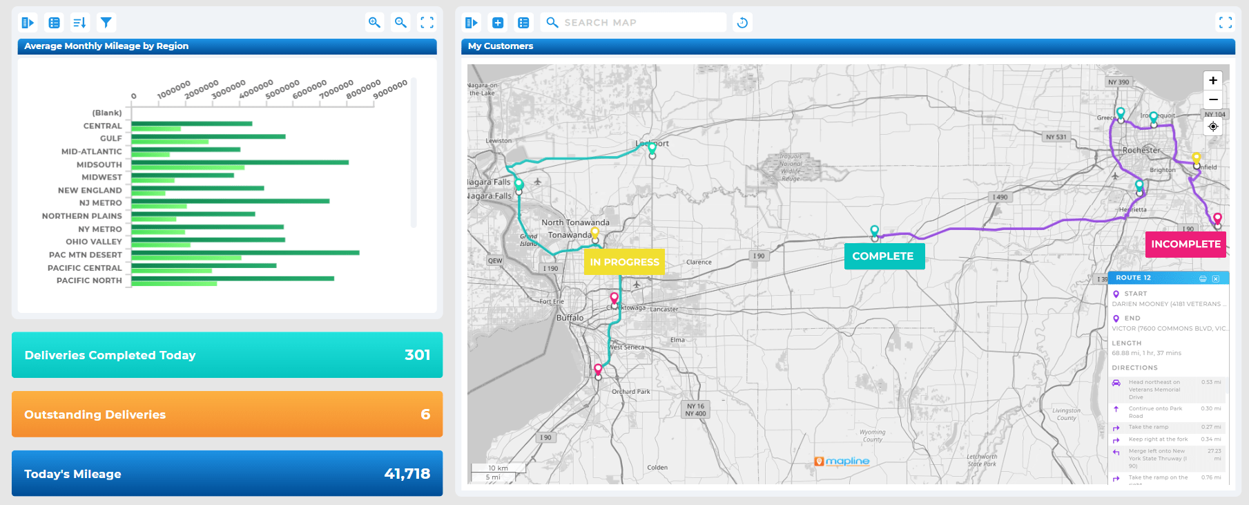
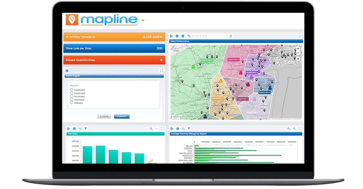
Use these as scoreboard tiles alongside the map so leaders can pivot from “what” to “what next” without hunting through tabs.
How to Create a Heat Map That Drives Action (Step by Step)
Building a heat map that truly drives business impact starts with intention. You’re not just creating a visualization—you’re answering a question and setting up a decision. This means defining the decision first, then collecting the right data, layering on relevant context, and setting clear thresholds so everyone knows what “good” or “bad” looks like. The process also requires ownership; each heat map should end with action items and a review plan so insights don’t get lost in presentations. With a step-by-step framework, teams can move from scattershot mapping to repeatable, high-value workflows that consistently improve performance.
- Define the decision. Pick the question you’re answering, such as “Where can we add revenue without new headcount?”
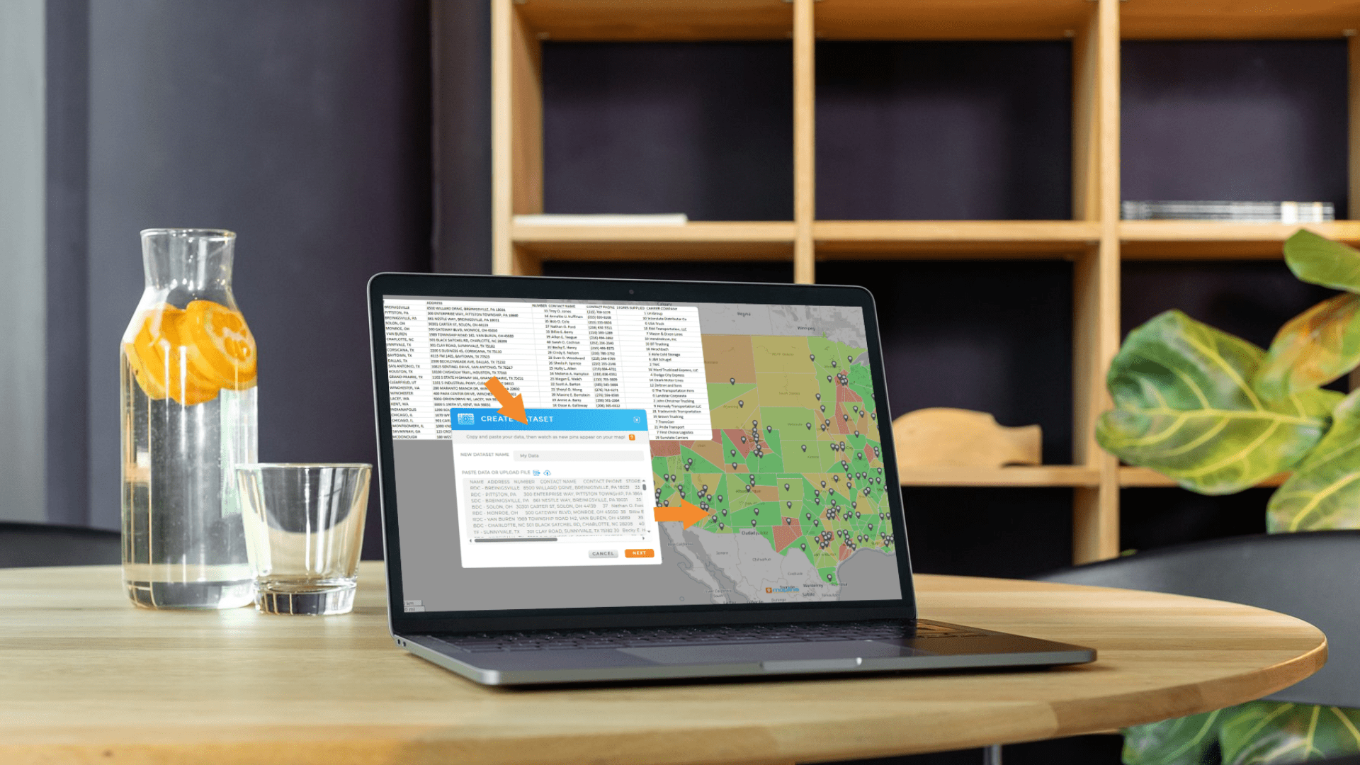
- Assemble the data. Location keys, your metric, at least one potential proxy, and any cost or service fields.
- Choose the map type. ZIP choropleth for region comparisons, density for point clustering, cost heat for margin.
- Layer context. Competitors, stores, depots, territories, or drive-time polygons.
- Set thresholds. Decide your bins and target ranges so “good” and “bad” are unambiguous.
- Attach actions. For each pattern, write the next steps, owners, and a review date.
- Measure lift. Re-run the same view after changes and compare against your baseline period.
From Pretty Pictures to Profit
Heat maps are more than just colorful visuals; they’re tools that expose inefficiencies, highlight opportunities, and point the way to profitable growth. With the right approach, you can move from reactive firefighting to proactive planning, ensuring your team’s energy and resources go exactly where they’ll make the biggest impact. Start using heat maps not just to see your business more clearly, but to act decisively and close revenue gaps you didn’t even know existed.
A ZIP code heat map of revenue or orders is the fastest first win, especially if your tool can geocode addresses and join to boundaries automatically.
No, but demographics help separate performance problems from potential problems. When a low-revenue ZIP has high household income and dense population, you’ve found a priority area.
Weekly or biweekly is typical for sales and service operations. Daily is useful for delivery programs and promotions where volume fluctuates quickly.
Keep bins and colors constant and add a “change” layer or a small multiple view. That way a warming or cooling zone jumps out immediately.
You can build a static choropleth with effort, but iterative analysis, layering, and performance at scale will be limited. Dedicated mapping and analytics tools speed up everything from joins to actioning.


