- Blog
- Geo Mapping
- How to Instantly Create Maps From Excel Data
Map addresses from Excel instantly with Mapline! Turn raw spreadsheets into actionable insights shouldn’t require a degree in GIS. For many businesses, Excel is where location data lives—customer addresses, delivery points, store locations, or service areas. But trying to make sense of that data inside Excel alone can feel like staring at endless rows of cells with no real context. That’s where map visualization changes the game.
By instantly converting Excel data into a map, teams can uncover patterns, optimize routes, and make smarter decisions without the complexity of traditional GIS platforms. Best of all, this process is now quick, intuitive, and scalable for companies of any size.
Why Businesses Struggle with Excel Data Alone
Excel is a powerful tool, but it was never built for geography. Businesses often run into the same limitations: it’s hard to visualize trends across locations, impossible to spot clusters or gaps at a glance, and tedious to calculate distances between points. While pivot tables and charts work well for numbers, they don’t tell the spatial story behind customer distribution or delivery inefficiencies.
This gap can cost organizations valuable time and money, especially when managing multiple locations. By linking spreadsheets to mapping tools, companies can move from reactive reporting to proactive strategy, turning raw data into clear, geographic insights.
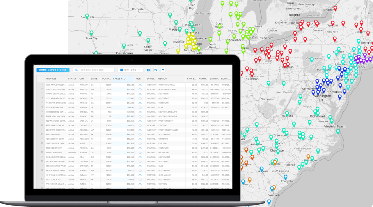

Pro Tip: With Geo Mapping, just upload your Excel file and watch as your customer addresses instantly become an interactive map. Add demographic overlays, draw territories, or calculate distances—all without leaving the platform.
Map Addresses from Excel in Seconds
Most modern mapping tools now allow you to copy and paste or upload spreadsheets directly into a mapping interface. But not all of them empower you to turn hundreds or even thousands of addresses into a live map, instantly revealing patterns that were just waiting to be discovered.
Mapline makes it simple to map addresses from excel in the blink of an eye. Then, instead of scrolling through rows of city names and ZIP codes, you can see every location in context, filter by attributes, and even group pins by variables like sales volume or delivery type. This simple step turns Excel from a static record-keeping system into a launchpad for location intelligence.
Plot Multiple Locations Without Extra Effort
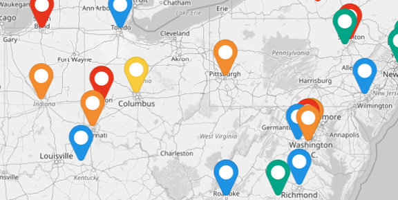
One of the most common needs businesses face is visualizing more than one address at a time. In Excel, this means endless scrolling and cross-referencing—but on a map, it becomes a visual network of connections.
Plotting multiple addresses at once enables teams to identify the most efficient service routes, assign reps to balanced territories, and visualize customer density. Whether you’re tracking 50 delivery stops or 5,000 store locations, this process eliminates the manual work of reviewing each record individually and creates a single source of truth that the entire team can use.
How to Make a Map From ExceL Data in Seconds
You don’t need GIS training, complicated software, or hours of setup time. In fact, most users are up and running in less than a minute, no technical expertise required. Here’s how to create a map from Excel in just three simple steps:
- Upload your spreadsheet
- Name your map
- Customize and explore your results
That’s it— your data instantly comes to life as interactive map pins. From there, you can layer on radius circles, filter or segment your audience, and even auto-generate territories based on custom rules. It’s the fastest way to turn raw data into actionable insights without a steep learning curve.
Businesses across industries rely on Geo Mapping to spot trends, optimize operations, and close performance or coverage gaps in minutes. Here are some of the most common ways teams put it to work:
Spot Gaps with Heat Mapping
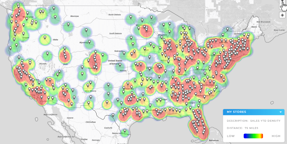
Heat mapping takes your spreadsheet data and instantly shows where activity is concentrated — or where it’s completely missing. By layering customer addresses, sales figures, or service calls, you can quickly identify underserved regions or territories that are overloaded.
Instead of scanning endless rows of data, heat maps bring clarity in seconds. Businesses often discover imbalances like too many reps clustered in one area or high delivery costs to outliers. This makes it easy to realign resources and capture opportunities that were invisible in Excel alone.
Reveal Service Overlaps with Drive Time + Drive Distance Polygons
Drive time and drive distance polygons help you visualize the true reach of your team from any starting point. Whether you’re mapping a 30-minute service radius or a 20-mile delivery zone, these tools show exactly how far your resources can go under real-world conditions.
Overlapping polygons make inefficiencies like redundant coverage stand out immediately, while gaps reveal underserved areas or customers who may be costing more than they’re worth. With this insight, businesses can rebalance territories, adjust service areas, or add new facilities to maximize coverage. It’s one of the fastest ways to align strategy with the realities of travel time and distance.
Highlight Imbalances with Territory Mapping
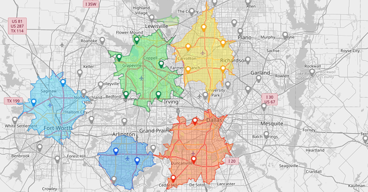
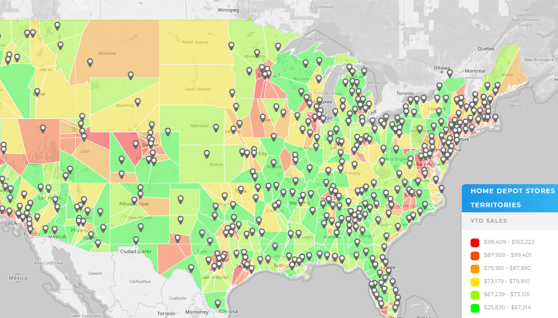
Territory mapping transforms spreadsheet lists into clearly defined sales or service regions. Instead of just plotting pins, you can group customers by geography, performance, or demographic factors to create fair and balanced assignments. Businesses often find that some reps are spread too thin while others are competing for the same accounts.
With territories visible, you can rebalance workload, reduce travel costs, and boost morale by giving every team member a fair shot at success. It turns raw data into a strategy tool that drives both efficiency and accountability.
Uncover Inefficiencies with Distance Calculations
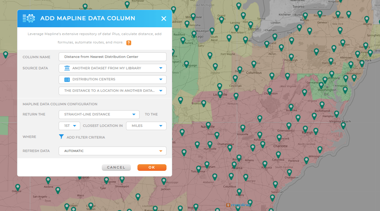
Distance calculation tools reveal the hidden costs buried in your spreadsheet. By measuring miles between warehouses, stores, and customers, you can quickly determine if certain deliveries or visits are too expensive to justify. Many companies discover that a handful of outlier customers are consuming disproportionate resources.
With these insights, you can adjust minimum order sizes, reset delivery zones, or find smarter routes. It’s an eye-opening way to make sure every mile your team drives adds real value to the business.
From Spreadsheets to Strategy: The Real Value of Mapping
Once locations are mapped, businesses can start layering in deeper insights. By combining spatial data with performance metrics, it’s possible to highlight which regions generate the most revenue, where service requests are clustering, or where market opportunities may be missed.
This isn’t just about seeing points on a map—it’s about connecting data to real-world strategy. For example, mapping sales addresses against competitor locations can highlight under-served areas, while combining service calls with technician routes can uncover wasted travel time. This is how world-class map software unveils new insights that directly impact ROI by cutting costs and improving resource allocation.
Practical Applications Across Industries
The benefits of mapping Excel data span industries, from retail to logistics to field services:
Retailers use it to pinpoint ideal locations for new stores or analyze customer distribution. Logistics teams rely on maps to design delivery zones and optimize last-mile efficiency.
Field service companies turn address data into dispatch-ready routes that reduce travel time and maximize technician availability.
Even nonprofits and public organizations leverage mapped Excel data to allocate resources fairly and ensure service coverage. This adaptability makes mapping one of the most versatile tools in any organization’s toolkit.
Final Thoughts
Mapping addresses from Excel isn’t just a convenience—it’s a competitive advantage. Businesses that turn spreadsheets into visual insights can make faster, data-driven decisions that competitors still buried in rows of data can’t. By plotting multiple locations, combining datasets, and layering additional context, organizations can see both the big picture and the fine detail. This shift from static spreadsheets to interactive maps drives efficiency, improves customer service, and uncovers opportunities that were invisible before. For companies ready to move beyond Excel’s limitations, mapping is the smartest next step.
The easiest method is to upload your spreadsheet to a mapping platform like Mapline that supports Excel uploads. This lets you instantly plot addresses on a map without manual entry or coding.
Yes. Mapline allows you to upload entire spreadsheets and automatically plot thousands of addresses in a single step, saving hours of manual work.
No. While GIS software can handle complex analysis, it’s unnecessary for most business needs. Simple mapping tools can convert Excel data into interactive maps quickly and without training.
Mapline offers a free plan that allows you to upload a spreadsheet and create a basic map. This version often includes pin plotting, basic territories, and customization options.
Spreadsheets are great for storing data but not for spotting trends. Mapping Excel data provides instant visualization, helping businesses uncover geographic patterns, optimize operations, and make smarter decisions.


