New Heat Mapping Legend
Be wowed again for yet another face of Mapline! Our new and improved logo comes with improved performance and features as well. Along with the logo we’ve updated our heat maps. Learn more about that and check out the other new enhancements.
 Although our we’ve changed some things and made improvements, we are still looking for more ways to make Mapline better. So be on the lookout for more updates and improvements because they are coming!
Heat Map Performance Improvements
When you tried creating a heat map before, it may take minutes before you see the result. Now, because of the enhanced performance improvement, the time to create your heat maps is considerably reduced from a few minutes to seconds!Heat Map Legend
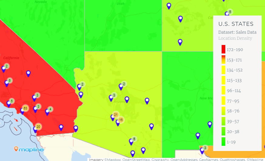
Now it is much easier to interpret your heat maps based on territories on your map! When you create a heat map, you’ll have the option to show the legend. It will automatically appear at the bottom-right of your map. So no more guessing what each color means!
Demo Links
Caught up with something and you don’t know how to start? The demo link will help get you going. Now instead of leaving your map to learn more about a feature, you can do it all on the same page! When you feel lost, just click the link of the feature demo and a lightbox will pop out to help you get through.Column Sorting on Dataset Page
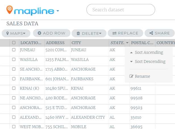
Now when you go to the dataset page and select a dataset, you will notice an arrow next to all of the columns. This is a drop down menu that will make sorting your data much easier. You can sort in ascending or descending order, and you can also rename your headers. Although our we’ve changed some things and made improvements, we are still looking for more ways to make Mapline better. So be on the lookout for more updates and improvements because they are coming!


