Quick Reference Guide
Maps: Territory Styling
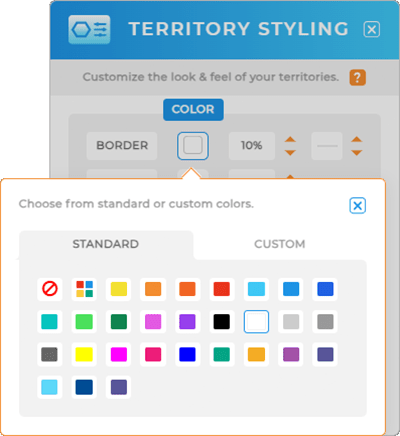
STATIC COLORS
Here, you can quickly select your border color, opacity, and border thickness.
If you want static colors, choose the fill color you like, set your fill opacity, and if everything looks good in the PREVIEW window, click OK.
BAM! You have custom-colored territories on your map.
But don’t stop there–that’s just the tip of the iceberg.
DYNAMIC COLORS
Here’s where your maps become a true data powerhouse.
Dynamic colors are tied directly to your data. That way, whenever your datsets update, so do your map territories.
It might sound complicated, but it’s super easy to configure! Under FILL color, just select the AUTOMATED tab and determine which type of data you’d like to pull in.
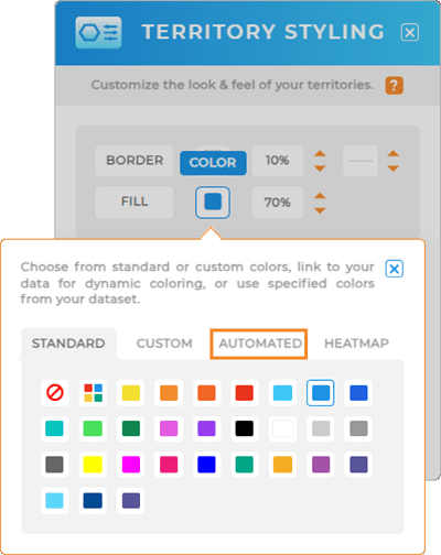
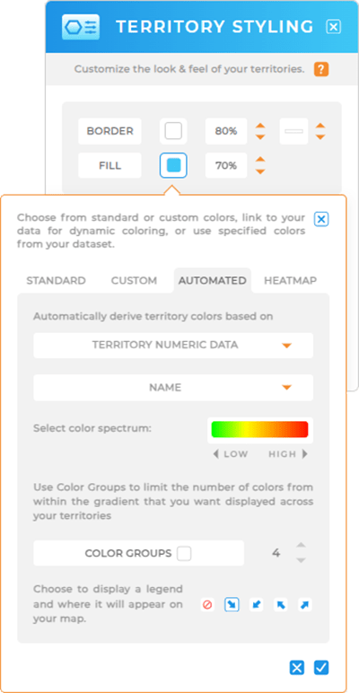
Territory Numeric Data
Easily assign colors to your territories based on numerical data from any column in your dataset. This allows you to transform sales figures, location stats, or any other metrics into visually informative color-coded territories!
Simply select the dataset column you’d like to visualize, then choose your preferred color spectrum gradient. You can even opt to activate color groups if you want to limit the number of colors displayed within your territories.
Finally, decide where you want your territory color legend to appear on your map (or disable it by selecting the NO sign) and click the blue check mark to apply your changes. It’s that easy!
Here are some common ways businesses visualize territory numerica data on their maps:
- Color-code territories based on sales figures to quickly identify successes and opportunities.
- Represent delivery times, shipment volumes, or operational metrics.
- Visualize market saturation or penetration to identify areas with growth potential.
- Display inventory levels or turnover rates, aiding in inventory management and supply chain optimization.
- Represent employee assignment or workload distribution for efficient resource allocation.
- Differentiate service areas by assigning unique colors, making it easy to identify regions covered by different teams or service levels.
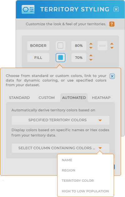
Specified Territory Colors
Or, maybe you already have pre-defined territory colors you’d like to use? Under SPECIFIED TERRITORY COLORS, it’s easy to bring in specific HTML names or Hex codes directly from your dataset.
Just select the dataset column that already contains your pre-defined colors, then click the blue check mark to apply your changes.
And voila! Your territories are now colored according to your preferences.
Here are some common ways that other businesses apply specified territory colors to their maps:
- Display territories assigned to different sales reps by using pre-definied colors tie to the rep’s name or ID.
- Manage franchises by assigning unique colors to territories, making it easy to identify and analyze franchise territories on the map.
- Represent territories assigned to different regional offices, aiding in efficient regional management and inter-office coordination.
- Visualize distribution center zones for streamlined logistics and optimized supply chain operations.
- Bring in pre-defined colors based on customer segmentation criteria, such as VIP status or purchasing behavior, to tailor marketing efforts for different customer groups.
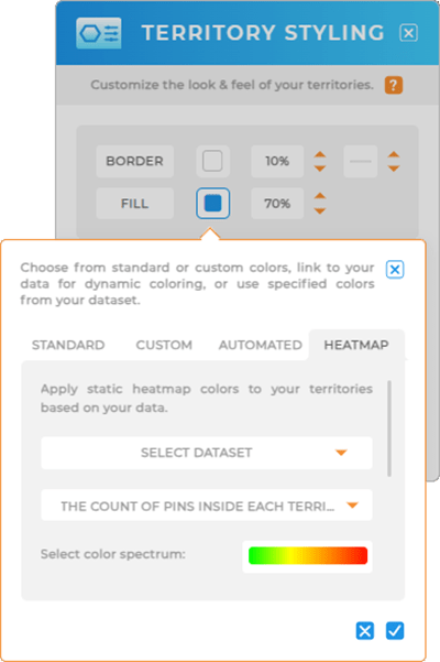
STATIC HEAT MAP
Give your territories a visual boost by applying a static heat map based on your current data. This is the prefect way to generate a stunning representation of data density around your pins. Create captivating presentations, compelling proposals, and visually-striking reports that leave a lasting impression on clients and stakeholders.
Here’s how. First, select the type of heat map you need:
COUNT OF PINS INSIDE EACH TERRITORY: Visualizes the number of pins within each territory.
DATA VALUES FOR PINS INSIDE EACH TERRITORY: Displays data values associated with pins within each territory.
Next, select your preferred color spectrum gradient and activate color groups (if desired), then decide where you want the territory color legend to appear on your map. Click the blue checkmark, and there you have it—an eye-catching heat map directly tied to your dataset, always updating with each data refresh.
Now you have an impactful heat map that’s tied directly to your dataset– AND it updates whenever your data refreshes. It’s as cool as it sounds!
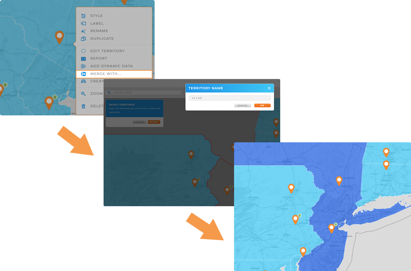
DO MORE WITH YOUR TERRITORIES
Now that you’ve customized your territories, unlock the power of visual insights and do more with your maps! Here are some common ways that brands leverage custom territory styling in Mapline:
- Edit existing territories or add new territories to an existing layer
- Add demographic data to your existing territories for key customer insights
- Quickly combine territories on your map or create duplicate versions of territory maps to compare and contrast insights
- View a territory report with a full breakdown of the data contained within each territory