Quick Reference Guide
EDIT CALCULATION
- Quick Reference Guide
- EDIT CALCULATION
Let’s talk numbers—your numbers. With Mapline’s powerful charting capabilities, the Calculation function lets you customize the data on your charts, transforming your insights into something truly actionable. Need to adjust what shows up on the X or Y axis? No problem. With just a few clicks, you can edit any calculation to reflect exactly what you need to see. It’s like adding a turbo boost to your data analysis—and who doesn’t love a good turbo boost?
EDIT CALCULATION
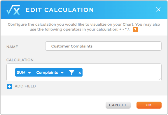
Here’s where the fun really begins. From the Calculation lightbox, you can give your calculation a name that’s as bold and descriptive as you want. Then, dive into configuring your formula with simple operators like +, -, *, or /. It’s your data, and this is your chance to tell it exactly what to do. But we’re not stopping there. You’ll also find a suite of predefined functions to bring even more power to your charts:
- Sum: Adds up all the values in a column
- Average: Calculates the mean value
- Median: Finds the middle value in your dataset
- Maximum: Identifies the highest value
- Minimum: Identifies the lowest value
- Count: Counts the total number of rows in a column
- Count of Unique Values: Counts distinct entries in a column
- Product: Multiplies all the values together
- Standard Deviation: Measures the spread of your data (sample)
- Standard Deviation of Population: Measures the spread of your data (entire population)
- Variance: Calculates how far values spread out from the mean (sample)
- Variance of Population: Same as variance, but for the entire dataset population

Need to factor in multiple columns from your dataset? Just click ADD FIELD to bring in additional columns and incorporate them into your formula. The dataset that’s linked to your chart is your playground, so experiment to your heart’s content!
FILTER YOUR CALCULATION
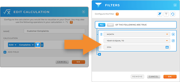
Sometimes, you need to focus on a specific slice of your data. That’s where filtering your calculation comes in. For example, let’s say you’re summing up sales, but you only want to include sales over $10,000. Easy peasy—just apply a filter to your calculation to fine-tune the results. Whether you’re filtering by thresholds, categories, or conditions, you’ll get pinpoint precision without breaking a sweat.

ANALYZE YOUR DATA
Mapline charts aren’t just about calculations—they’re a command center for your data. Ready to explore even more capabilities? Here’s what you can do:
- Segment your chart to split your data into categories and reveal deeper insights
- Customize your chart styles to make your visuals stand out and align with your team’s needs
- Share or embed your chart on a webpage, giving your team and stakeholders access to the information they need


