- Blog
- Geo Mapping
- What a Heat Map Generator Should Show (But Usually Doesn’t)
Most heat map generators promise insight but deliver decoration. They visualize density without explaining meaning, show color without context, and leave teams guessing what to do next.
A truly useful heat map generator should do more than create gradients. It should surface patterns that matter, expose blind spots, and support real decisions. Unfortunately, many tools stop short of that.
This article breaks down what most heat map generators miss—and what to look for instead.
What Most Heat Map Generators Get Wrong
Many tools focus on appearance instead of usefulness. The result is a map that looks impressive but fails under real operational questions. Instead of helping teams make decisions, these visualizations often stop at surface-level color gradients without meaningful context. They rarely incorporate thresholds, segmentation logic, or business rules that clarify what the data actually represents. Without the ability to filter, compare time periods, or layer additional datasets, the map becomes static rather than strategic. A heat map generator should do more than display intensity; it should guide action.
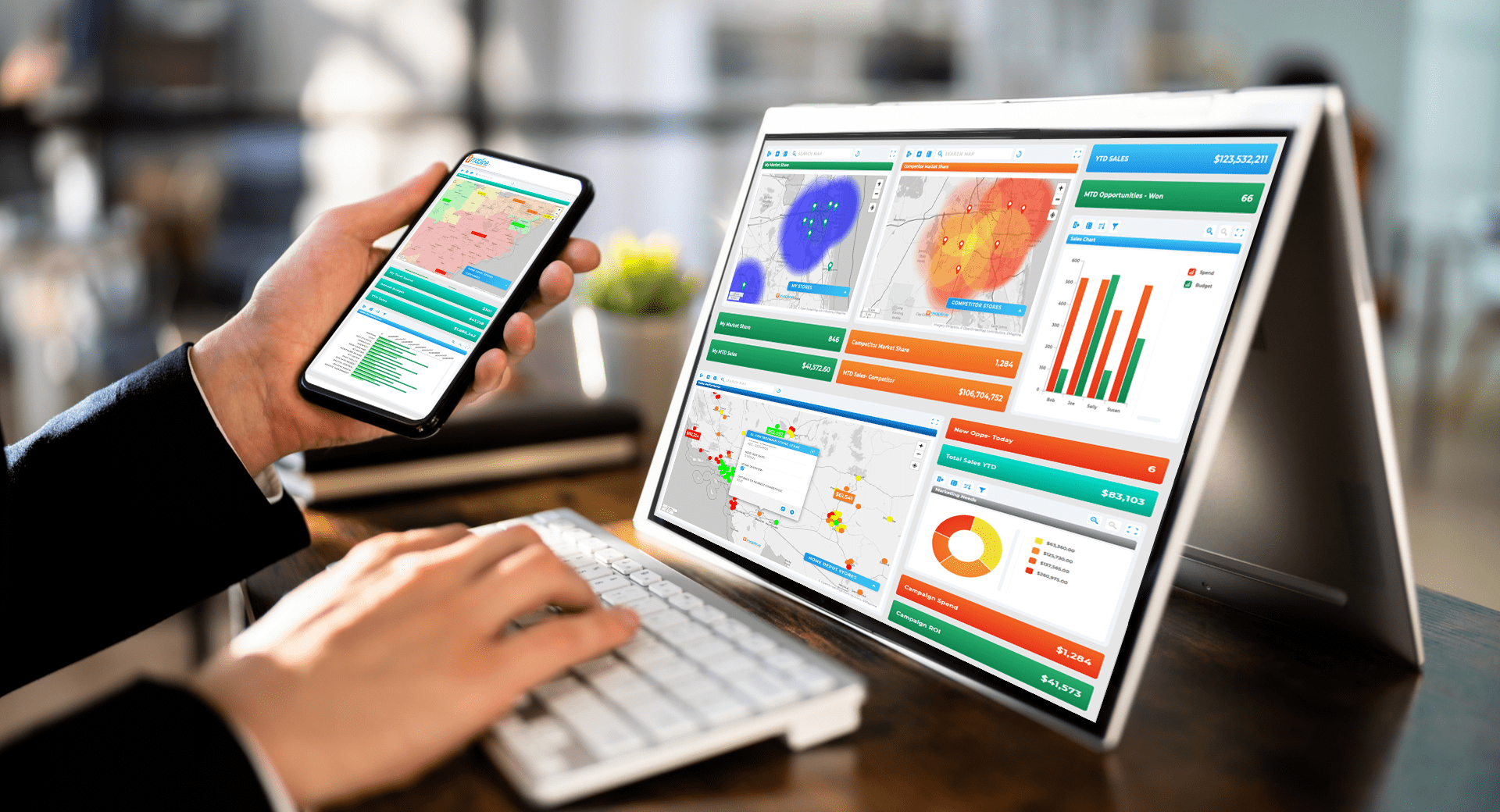

Pro Tip: Don’t evaluate a heat map by how dramatic it looks—evaluate it by how quickly it answers a real business question. The best heat map generators make gaps, inconsistencies, and opportunities obvious without requiring extra analysis or manual cleanup.
They Treat All Data Points as Equal
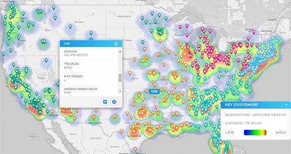
Most heat map generators apply uniform weight to every point. A single low-value record influences the visualization just as much as a high-impact one.
Without weighting or prioritization, heat maps obscure reality. High-value activity blends into noise, and decision-makers can’t distinguish signal from volume.
They Optimize for Color, Not Clarity
Color gradients are often chosen for aesthetics rather than interpretability. Overlapping ranges, unclear legends, or aggressive color ramps can exaggerate or hide patterns.
A heat map should make differences obvious, not subjective.
They Stop at Visualization
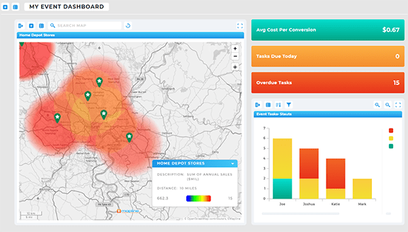
Many tools assume the job is done once the heat map is generated. There’s no way to filter, segment, or act on what the map reveals.
A static heat map forces users back into spreadsheets to do real work—defeating the purpose entirely.
What an Effective Heat Map Generator Should Reveal
Free tools and Excel heat maps are popular entry points, but they come with structural limitations. While they may work for quick, one-off visualizations, they often struggle with large datasets, geographic accuracy, and dynamic updates.
Excel heat maps, in particular, rely heavily on manual formatting and static data ranges, making them difficult to scale or maintain. Free online generators frequently limit customization, filtering, or integration with other systems. As soon as teams need segmentation, automation, or real-time updates, these tools become bottlenecks instead of solutions.
Where Activity Is Missing, Not Just Where It’s Concentrated
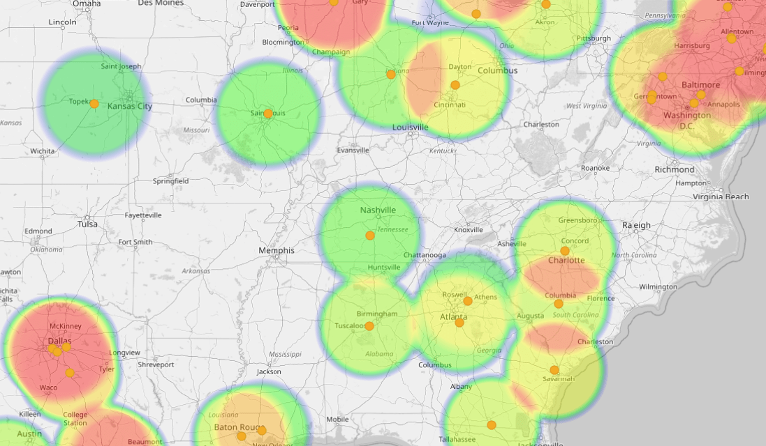
Most tools highlight hotspots. Fewer help identify cold zones.
Market gaps, under-served regions, and inconsistent coverage often matter more than high-density areas. A useful heat map makes absence visible.
This is where a true heat map generator adds value—by showing where effort isn’t happening but should be.
Patterns Across Defined Geographic Boundaries
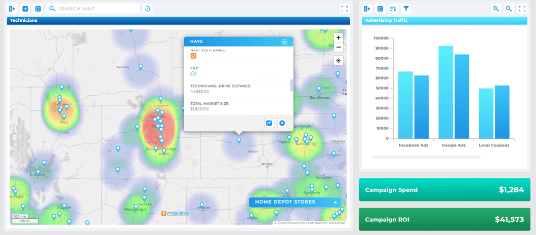
Heat maps should respect real geographic units like zip codes, territories, or regions, not arbitrary pixel clusters.
When patterns align with business boundaries, insights become actionable instead of abstract.

How Density Changes Under Different Filters
A single heat map rarely tells the full story. Teams need to filter by time period, account type, performance tier, or activity category.
Effective tools allow users to explore multiple views without rebuilding maps from scratch.
Why Free and Excel-Based Heat Map Generators Often Fall Short
Free tools and Excel heat maps are popular entry points—but they come with structural limitations.
Limited Geographic Accuracy
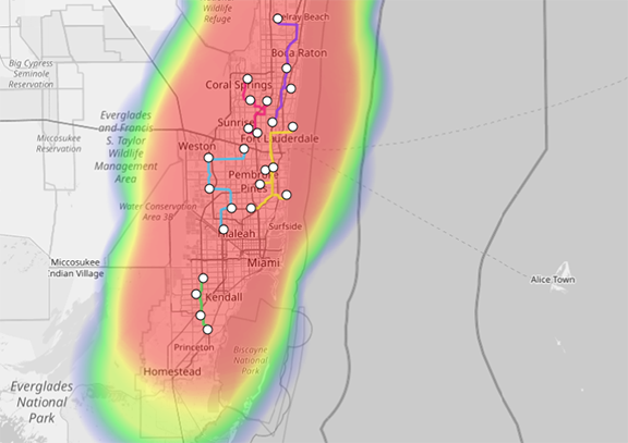
Excel heat maps and basic online generators often approximate location rather than accurately mapping it. Zip code centroids, rough polygons, or inconsistent boundaries can distort results.
Small inaccuracies compound quickly at scale.

No Support for Large or Evolving Datasets
As data grows, Excel-based heat maps become slow, fragile, and difficult to maintain. Updates require manual steps, and errors are easy to introduce.
This makes them unsuitable for ongoing analysis.
No Connection to Downstream Decisions
Most free tools generate visuals with no path forward. There’s no way to link heat map insights to routing, territory planning, or scheduling workflows.
Teams see the problem but can’t act on it.
Turning Heat Maps Into Decision Tools With Mapping Software
Heat maps reach their full potential when paired with systems designed for action.
Using dedicated mapping software, teams can move beyond visualization and into execution.
Layering Heat Maps With Business Data
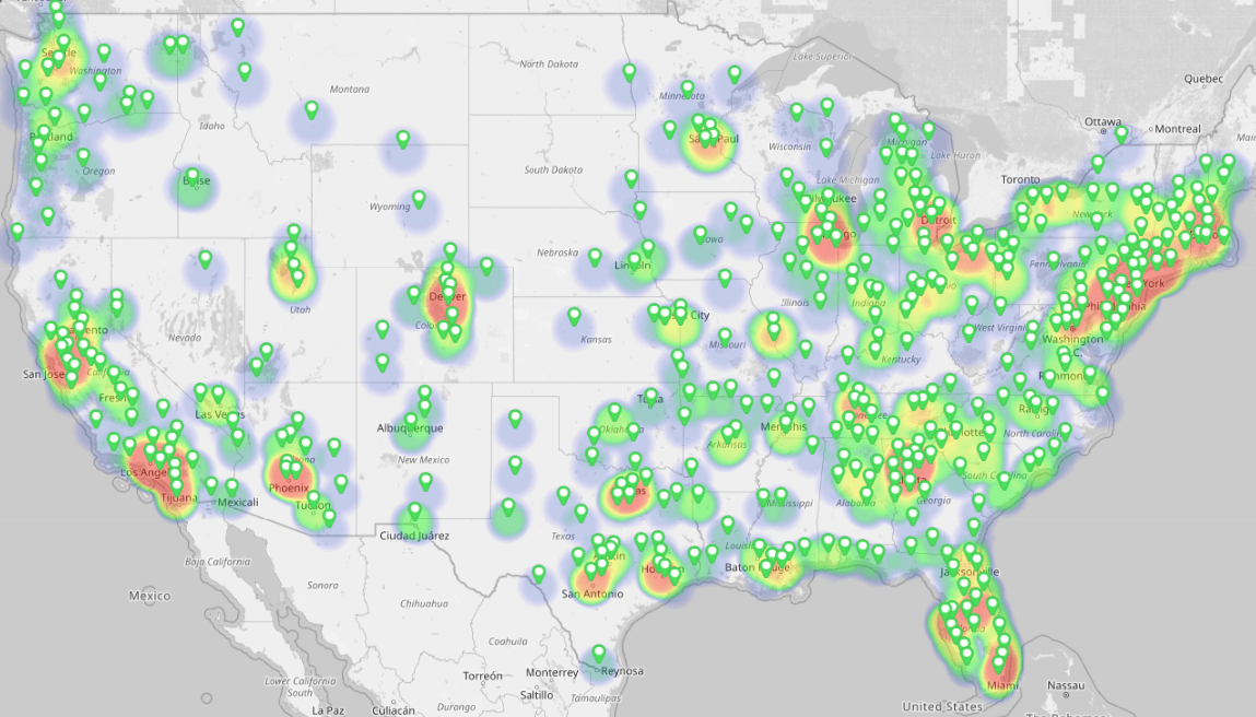
Overlaying sales performance, visit frequency, or customer tiers transforms heat maps from descriptive to diagnostic.
Patterns gain meaning when they’re connected to outcomes.

Aligning Heat Maps With Territory Strategy
When heat maps reflect territory structures, managers can evaluate coverage balance, workload distribution, and expansion opportunities.
This bridges the gap between insight and planning.

Enabling Scalable, Repeatable Analysis
With Geo Mapping, heat maps become repeatable tools rather than one-off visuals. Data updates automatically, insights stay current, and teams trust what they’re seeing.
That’s when heat maps stop being interesting—and start being useful.
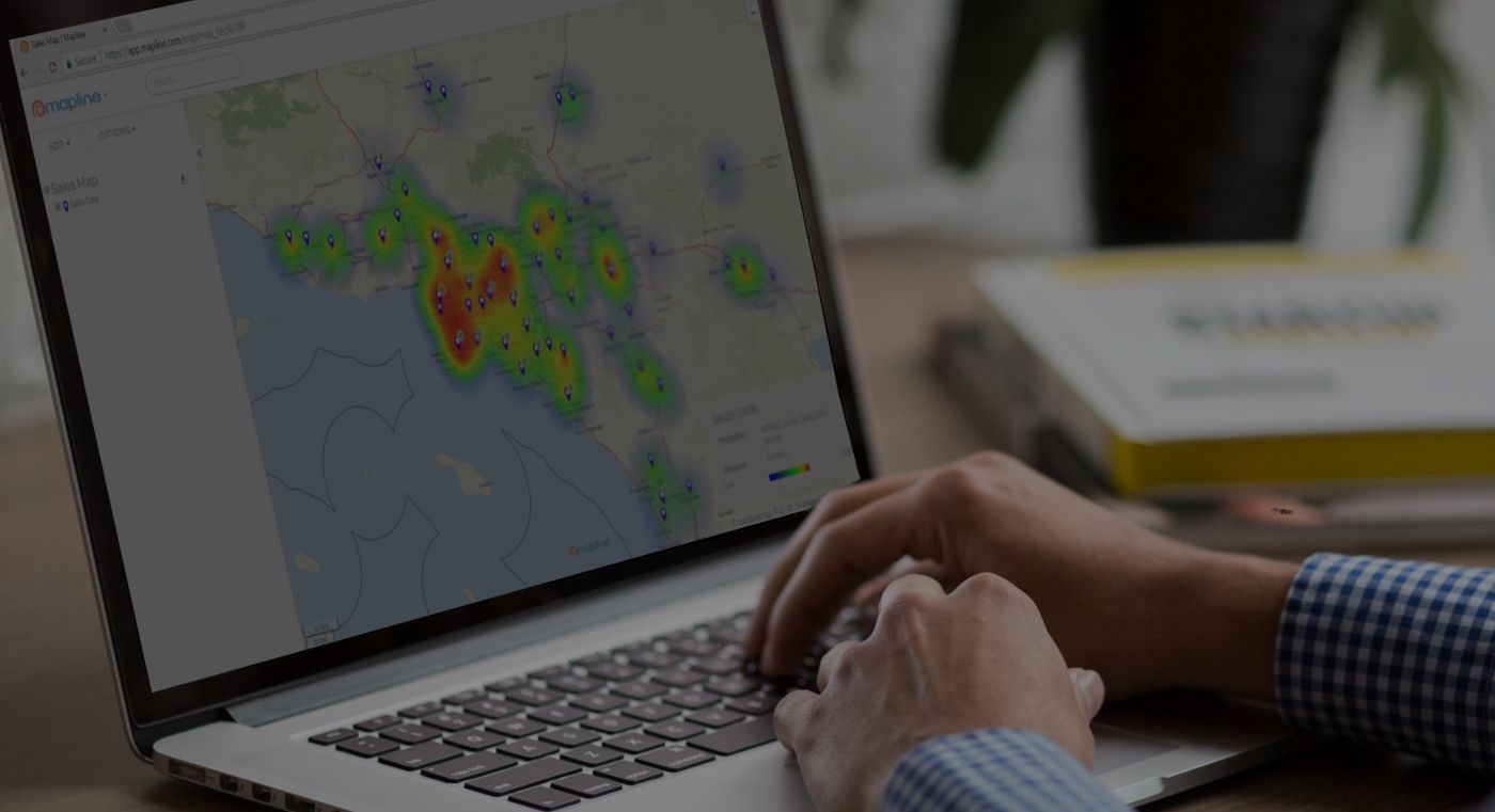
A heat map generator visualizes the concentration or absence of activity across geographic areas, helping teams identify patterns, gaps, and opportunities.
Free tools can be useful for basic exploration, but they often lack accuracy, scalability, and integration with business workflows.
Excel can approximate heat maps using zip code data, but it struggles with accuracy, updates, and large datasets.
Actionable heat maps allow filtering, layering, and alignment with real business boundaries like territories or regions.
If you need repeatable analysis, accurate geography, or the ability to act on insights, dedicated mapping tools are a better fit.


