- Blog
- Geo Mapping
- Why Custom Map Pins Are the Secret to Smarter Data Visualization
When it comes to mapping, sometimes the smallest details make the biggest difference. That’s exactly the case with custom map pins. Instead of settling for default pins that all look the same, creating a map with pins designed around your needs makes your data instantly more intuitive. Custom pins let you highlight what matters most, whether that’s sales performance, service locations, or customer density. By upgrading to smarter visuals, you unlock a clearer way to analyze patterns, spot opportunities, and make confident decisions. Here’s why custom map pins are the secret weapon of smarter data visualization.
WHAT ARE CUSTOM MAP PINS?
Custom map pins are visual markers that you can design to represent specific data points on a map. Instead of relying on generic, identical pins, you can customize each pin with colors, shapes, icons, or labels that make the information clearer and more meaningful. For example, you might use one icon for customer locations, another for distribution centers, and color-code them by performance level. By tailoring your pins, you create maps that are instantly easier to interpret and more useful for decision-making. In short, custom map pins transform ordinary maps into powerful data visualization tools that highlight exactly what you need to see.
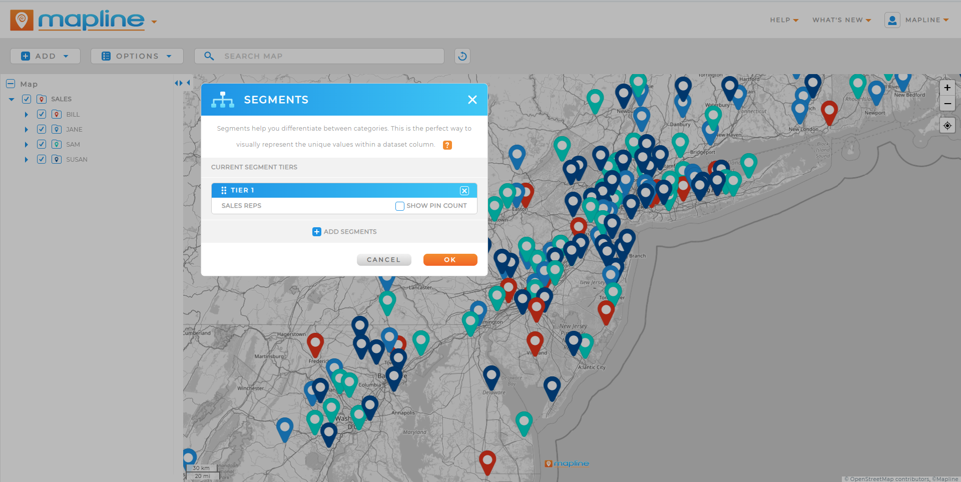

Pro Tip: Don’t stop at just customizing the color of your pins. With Geo Mapping, you get access to custom shapes, labels, and icons that turn your pins into meaning. For example, use different icons for customer types, add labels for revenue tiers, or color-code service coverage. With just a few tweaks, your pins stop being mere markers on a map and start becoming a strategy dashboard.
THE POWER OF CUSTOM MAP PINS
At first glance, map pins may seem like a small design choice. But when you create a map with pins tailored to your business data, you transform simple visuals into powerful insights. Think about how much faster your team can scan a map when each pin color, icon, or label tells a story. Sales managers can instantly see which regions are hitting targets. Operations leaders can spot supply chain bottlenecks. Even marketing teams can visualize campaign results at a glance. Custom pins don’t just make maps look better—they make them work harder for you.
HOW TO CREATE A MAP WITH CUSTOM PINS
Building a custom map with pins doesn’t have to be complicated. With the #1 mapping software, you can upload your Excel data and choose exactly how your pins appear. Want to create a map with pins and labels? Just select the data fields you want displayed, and Mapline automatically generates pins with the right identifiers. Looking to create a digital map with pins for a presentation or report? Customization makes it easy to brand your visuals, making them as professional as they are insightful. Whether you’re mapping territories, customers, or assets, your pins are always tailored to your goals.
Create a map with pins that reflect performance data
When you create a map with pins designed to reflect performance, your visuals instantly tell a story. Instead of generic markers, you can use custom shapes or icons that show at a glance which locations are thriving and which need attention. This approach makes it easier to compare territories and identify trends without needing to dig through spreadsheets. For managers and analysts, these visual cues save valuable time and bring clarity to complex datasets. A map filled with custom performance pins becomes a dashboard your entire team can act on.
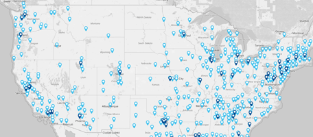
Make a custom map with pins that highlight priorities
Color coding your pins is one of the simplest but most effective ways to visualize priorities. You might use green pins for top-performing regions, yellow for mid-tier, and red for areas needing improvement. With this approach, trends and gaps jump off the screen, helping your team focus resources where they matter most. It’s a quick, intuitive method that makes your map not just informative but actionable. When priorities are visually obvious, decisions get made faster and with more confidence.
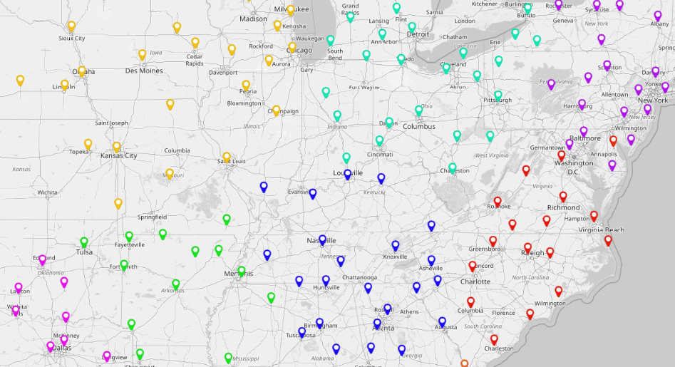
Create a map with pins and labels
Sometimes the best insights come from adding just a little more context. By creating a map with pins and labels, you can display details like location names, revenue, or assigned reps directly on the map. This eliminates the need to constantly cross-reference outside documents or spreadsheets. Labeled pins add a deeper layer of meaning, making it easy to spot patterns, overlaps, or opportunities right on the map itself. For presentations, labeled pins also give stakeholders immediate clarity and confidence in the data being presented.
Together, these options give your team instant clarity without the frustration of interpreting raw rows of data. Instead of reading spreadsheets, your team sees the story your data is telling—clearly and visually.
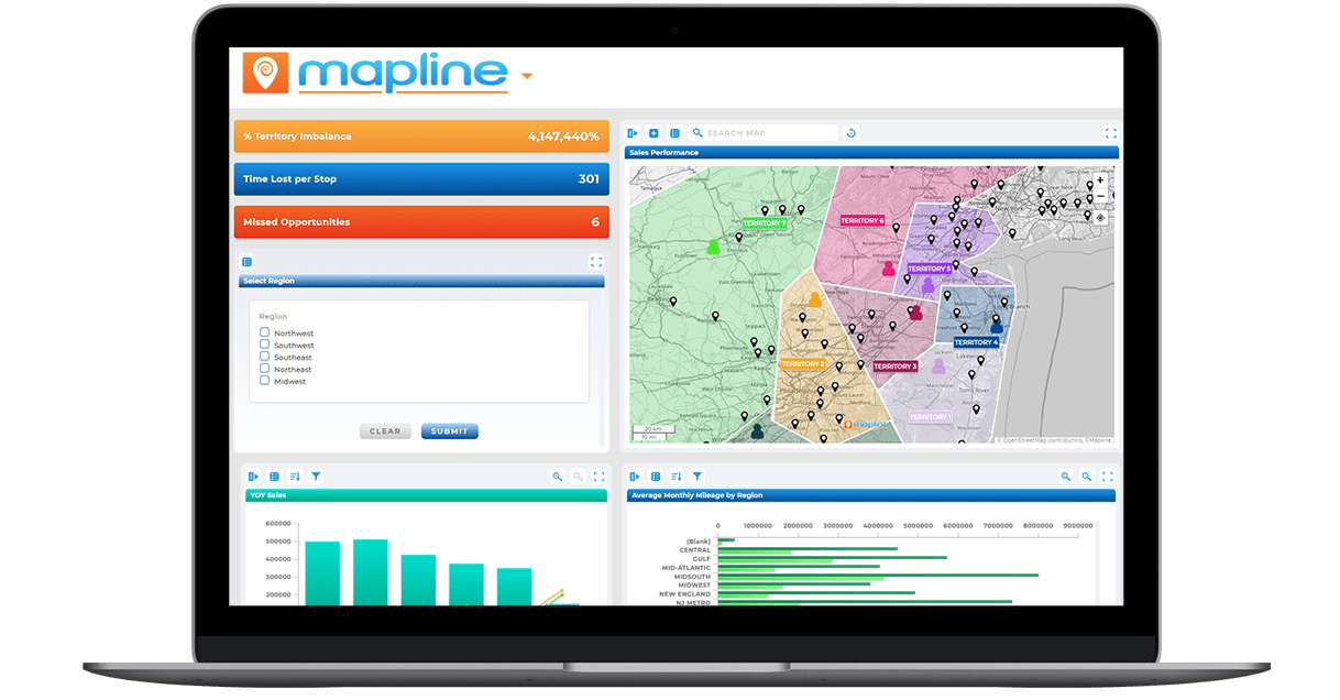
CUSTOM PINS VS. GOOGLE MAPS PINS
Many businesses start by trying to create a map with pins in Google Maps. While that works for simple plotting, it’s limited when you need advanced analysis. Google Maps pins are static, basic, and don’t connect to broader business data. By comparison, Mapline’s custom pins are built for decision-making. When you create a Google map with pins, you can drop markers—but when you create a map with pins in Mapline, you can link them to live data, filter them by criteria, and analyze them in real time. That’s the difference between basic visuals and strategic insights.
Limitations of Pin Mapping in Google Maps
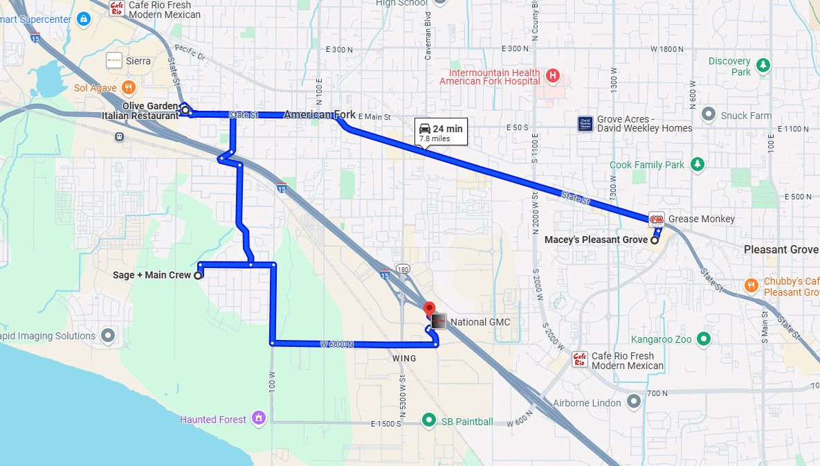
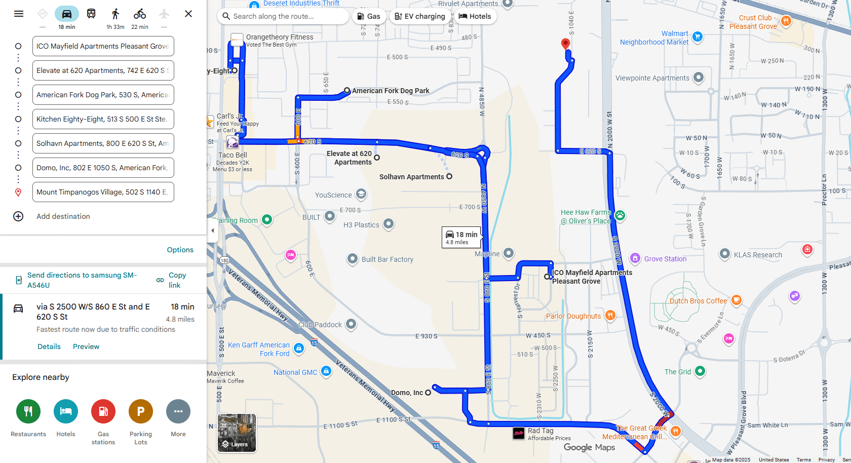
Google Maps pins are basic markers with limited customization options. You can drop them on a map or change their color, but they don’t scale well when you’re managing hundreds or thousands of locations. There’s no way to dynamically link pins to live data or filter them by performance, making it difficult to get meaningful insights. For businesses that need to track sales, operations, or customer activity, Google Maps pins simply don’t provide the depth required. This makes them better suited for simple directions, not data-driven decision-making.
Bulk Mapping Challenges with Google Maps
When you try to plot large datasets in Google Maps, things get messy fast. Uploading bulk data is limited, and even when it works, the result is often cluttered with identical pins that don’t tell a story. Without labels or categories, it’s nearly impossible to differentiate between types of locations or performance levels. For companies that manage territories, deliveries, or large customer bases, these challenges make Google Maps an inefficient tool. Mapline solves this problem by allowing bulk imports from Excel and instantly turning rows of data into clear, customized pins.
Instant Maps + Pin Customization
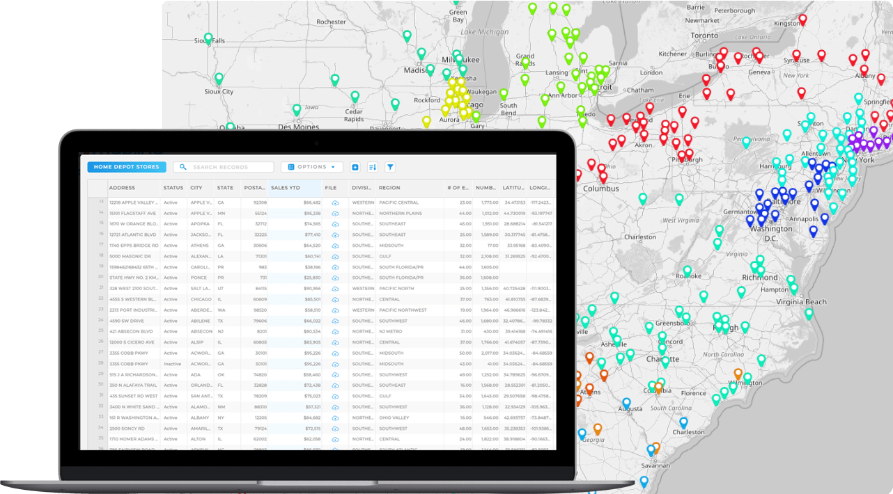
With Mapline, creating instant maps with custom pins takes just a few clicks. You can import your data, choose how you want your pins to appear, and immediately see meaningful patterns emerge. Want to highlight sales territories? Use color-coded pins. Need to track store performance? Add labels or custom icons that reflect revenue tiers. Unlike Google Maps, Mapline’s customization isn’t just cosmetic—it’s functional, giving your team insights at a glance. The ability to combine instant mapping with advanced pin customization makes Mapline a clear winner for businesses looking to go beyond the basics.
TURN MAP PINS INTO STRATEGIC INSIGHTS
Custom map pins aren’t just about better design—they’re about smarter strategy. A pin can represent a high-value customer, a low-performing region, or a critical delivery point. When you layer that data with heat maps, territories, or routes, your pins become the foundation for advanced analysis. You’re not just making a custom map with pins—you’re building a decision-making tool that adapts to your business. The more tailored your pins, the faster your team can act on what the map is telling them.
Color-Coded Data Visualization
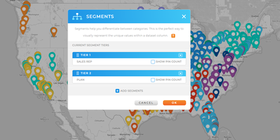
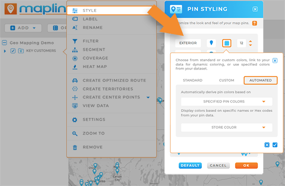
One of the most powerful features of Mapline’s custom pins is the ability to color-code your data. You can assign specific colors to represent sales performance, customer segments, or service tiers. This makes it easy to scan a map and instantly understand where you’re doing well and where improvement is needed. Color-coding isn’t just visually appealing—it’s a fast, intuitive way to turn raw numbers into insights your entire team can act on. Instead of combing through spreadsheets, you see your story at a glance.
Custom Icons and Shapes
With Mapline, you’re not limited to one standard pin design. You can use custom icons and shapes to represent different types of data points, from distribution centers to retail stores to client offices. This flexibility helps your maps tell a clearer story by visually distinguishing between categories. For example, a star icon could highlight top accounts, while a triangle might identify underperforming locations. By customizing pins in this way, you give your maps depth and context that generic pins can’t match.
Dynamic Labels on Pins
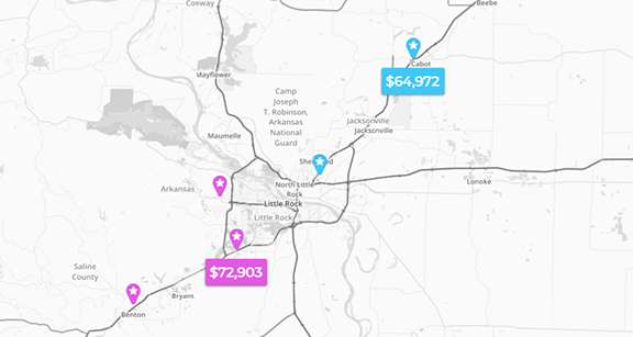
Adding labels to your pins provides context right on the map without the need to cross-reference outside data. You can display key information like revenue, assigned reps, or customer names directly on each location. This makes presentations more engaging and analysis more efficient since stakeholders can instantly see the data that matters. Labels also help uncover patterns—such as clusters of high-value accounts or regions with similar performance metrics. With labeled pins, your maps do more than look good—they become interactive reports.
Bulk Uploads from Excel or CSV
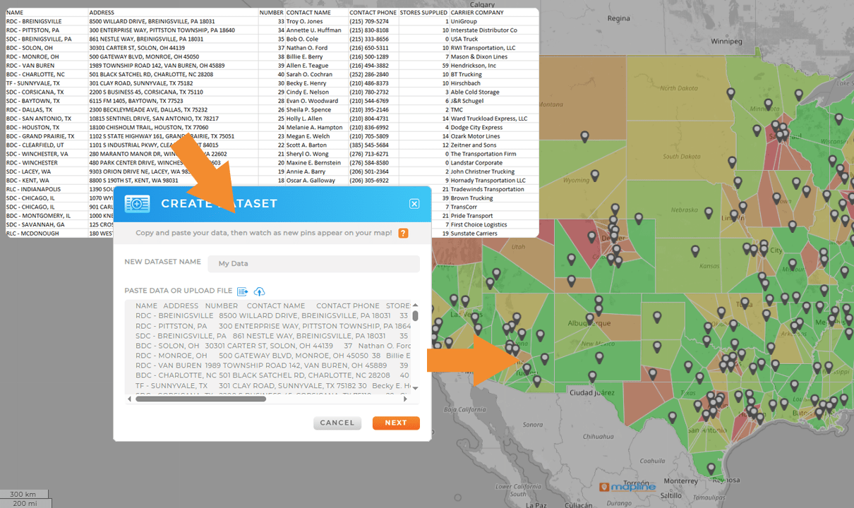
Mapline makes it simple to create maps with pins from large datasets. By importing an Excel or CSV file, you can plot hundreds or thousands of locations in seconds. Once your data is on the map, each pin can be customized based on the values in your spreadsheet. This bulk capability is especially useful for sales, logistics, or operations teams who need to visualize large amounts of data quickly. Instead of manually adding pins one by one, Mapline automates the process and gives you a map that’s ready for analysis.
Real-Time Filtering and Analysis
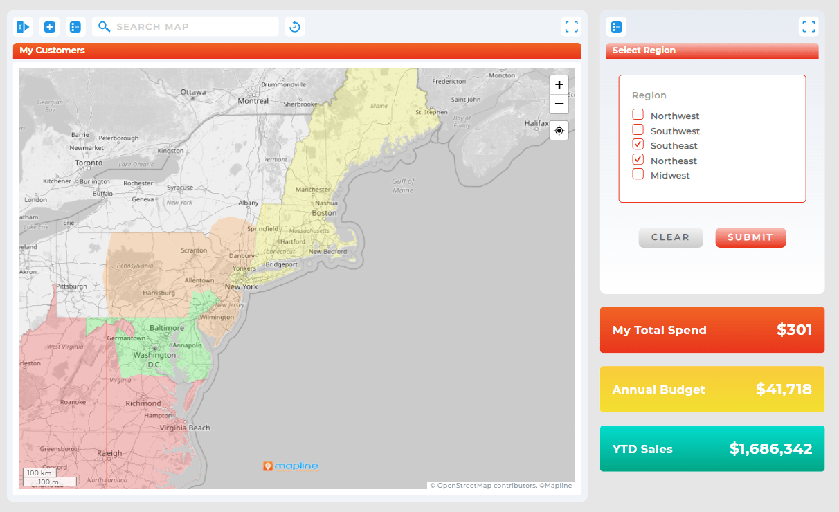
Custom pin mapping in Mapline goes beyond static visuals. With real-time filtering, you can adjust your map to highlight only the data that matters in the moment. Want to see only high-revenue accounts? Filter pins by sales tier. Need to focus on active service tickets? Filter by status and instantly see what’s open. This flexibility ensures your maps adapt as your questions change, turning them into living tools for smarter decision-making. It’s all about giving you control to analyze your data on demand.
THE FUTURE OF DATA VISUALIZATION STARTS WITH CUSTOM PINS
When you create a map with pins that reflect your actual business priorities, you empower your team to see opportunities faster and take action with confidence. Custom pins are the bridge between raw data and clear insights. They make your maps smarter, your reports more effective, and your decisions more data-driven. The future of visualization is simple: smarter pins mean smarter business.
Custom map pins are location markers that you can design with colors, icons, and labels to represent specific data points. Unlike generic pins, they provide context at a glance and help you interpret your data more effectively.
You can create a map with custom pins in Mapline by importing your data from Excel or CSV, then choosing how each pin should appear. You can color-code by values, add labels like customer names or revenue, and even assign custom icons for different categories.
Yes! Mapline allows you to display labels directly on pins to show details like location names, performance metrics, or assigned reps. This makes it easy to spot patterns and share insights without constantly switching between your map and spreadsheets.
Google Maps pins are basic and limited to simple markers. In Mapline, custom pins are tied to live data, can be filtered in real time, and support bulk uploads. This makes them far more powerful for business analysis and decision-making.
Businesses use custom pins to track sales performance by region, highlight top accounts, monitor service coverage, and visualize customer density. Each customized pin turns location data into a visual story that drives faster, smarter decisions.


